How to Brush-Letter a Beautiful Lowercase “a”
The letter “a” might be the first in the alphabet, but it’s often one of the most challenging to master in brush lettering. Between its oval structure, pressure changes, and connector strokes, this little letter packs a lot of complexity. But once you get the hang of it, the “a” becomes a gateway to smoother, more polished hand-lettering.
In this guide, we’ll break down the brush-lettered lowercase “a” step by step. You’ll learn how it’s constructed, common mistakes to avoid, style variations to explore, and practical drills to help you improve — plus a FREE downloadable practice sheet to help you get started.
Tap to jump to a topic:
Anatomy of the Brush-Lettered “a”
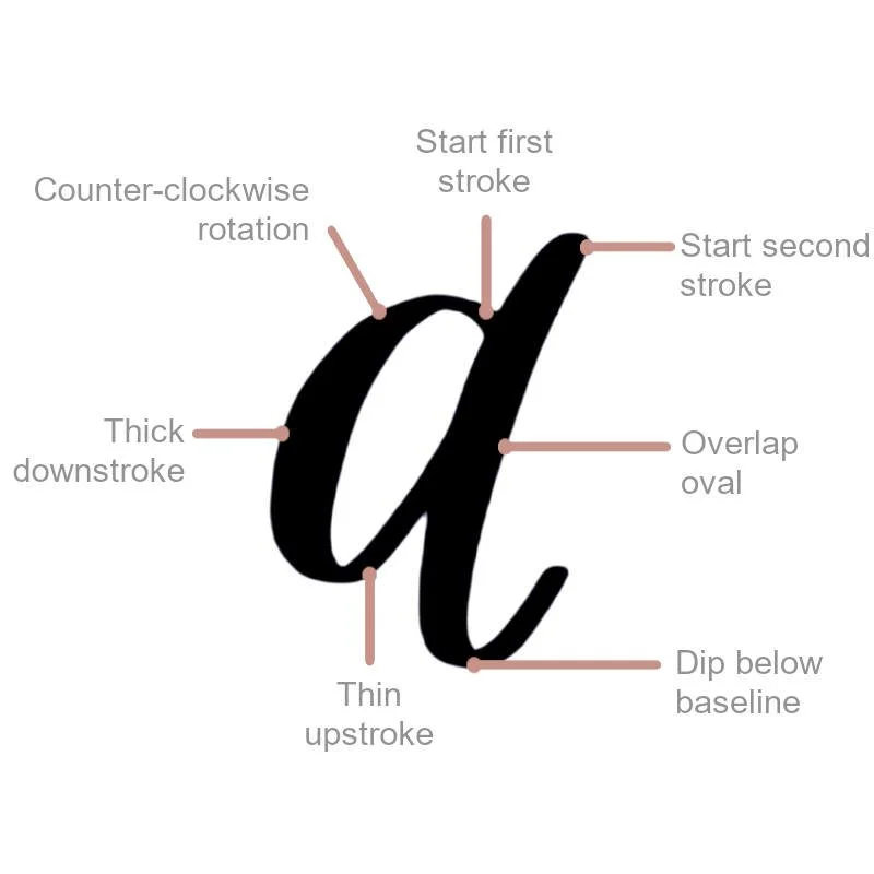
The lowercase “a” in brush lettering is typically made up of two parts:
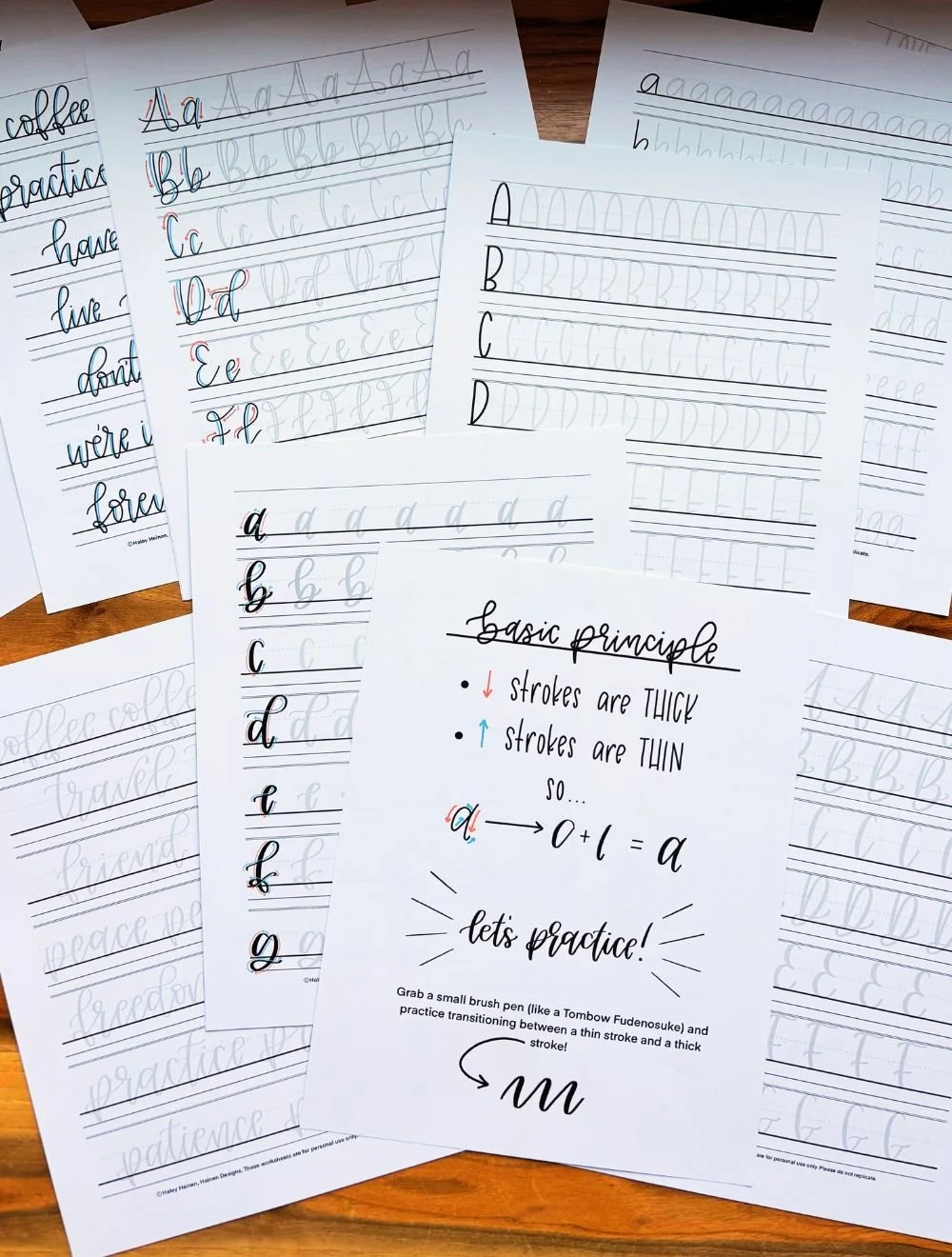
The Oval Shape – This is the foundation of the letter and one of the trickiest shapes to master. It includes both a light upstroke and a heavy downstroke, forming a closed loop.
The Connecting Underturn Stroke – A tall stroke that runs along one side of the oval and curves around to lead naturally into the next letter in a word.
When executed well, the “a” has rhythm, balance, and flow. But because it’s built with directional changes and contrasting pressure, it takes patience and repetition to feel natural.
Step-by-Step: How to Draw a Brush-Lettered “a”
Here’s a simple breakdown of how to draw the lowercase brush-lettered “a”.
Start in the top-right quadrant of the oval. Begin with a slight upstroke. Move your pen upward lightly but curve downward as you reach the 12 o’clock position.
Form the oval. Curve the slight upstroke around into a heavy downstroke on the left-hand side. Apply pressure as you descend and complete the oval shape by curving back up to the starting point.
Add the underturn. From just above the top right of the oval, draw a thick downstroke with a slight upward stroke at the bottom, angled gently toward the right. This connects smoothly to the next letter in your word.
Tip: Try drawing the oval and underturn separately at first, then combine them once each part feels comfortable. If you need more help with understanding the ovals and underturns, check out our basic strokes guide.
Common Mistakes & How to Fix Them
Even experienced letterers struggle with “a” from time to time. Here are some common issues and how to correct them.
Wobbly ovals: This usually comes from rushed strokes or uneven pressure. Slow down and draw your ovals intentionally. Use guide lines or dot grid paper for support.
Unbalanced downstrokes: If your thick stroke is off-center or too wide, practice applying pressure gradually and consistently as you curve downward.
Disconnected joins: Your underturn stroke should feel like a natural extension of the oval. If it feels sharp or disconnected, lighten your pressure and practice smoother transitions.
Open loops: If your oval doesn’t close properly, your letter will look incomplete. Slow down and focus on meeting the start and end of the oval with precision.
Practice Drills for the Letter “a”
Ready to improve your “a”? Here are a few drills to incorporate into your practice sessions.
Warm-Up Strokes: Before jumping into full letters, warm up with ovals and underturns, as well as basic upstrokes and downstrokes. These will prep your muscles for smoother letterforms.
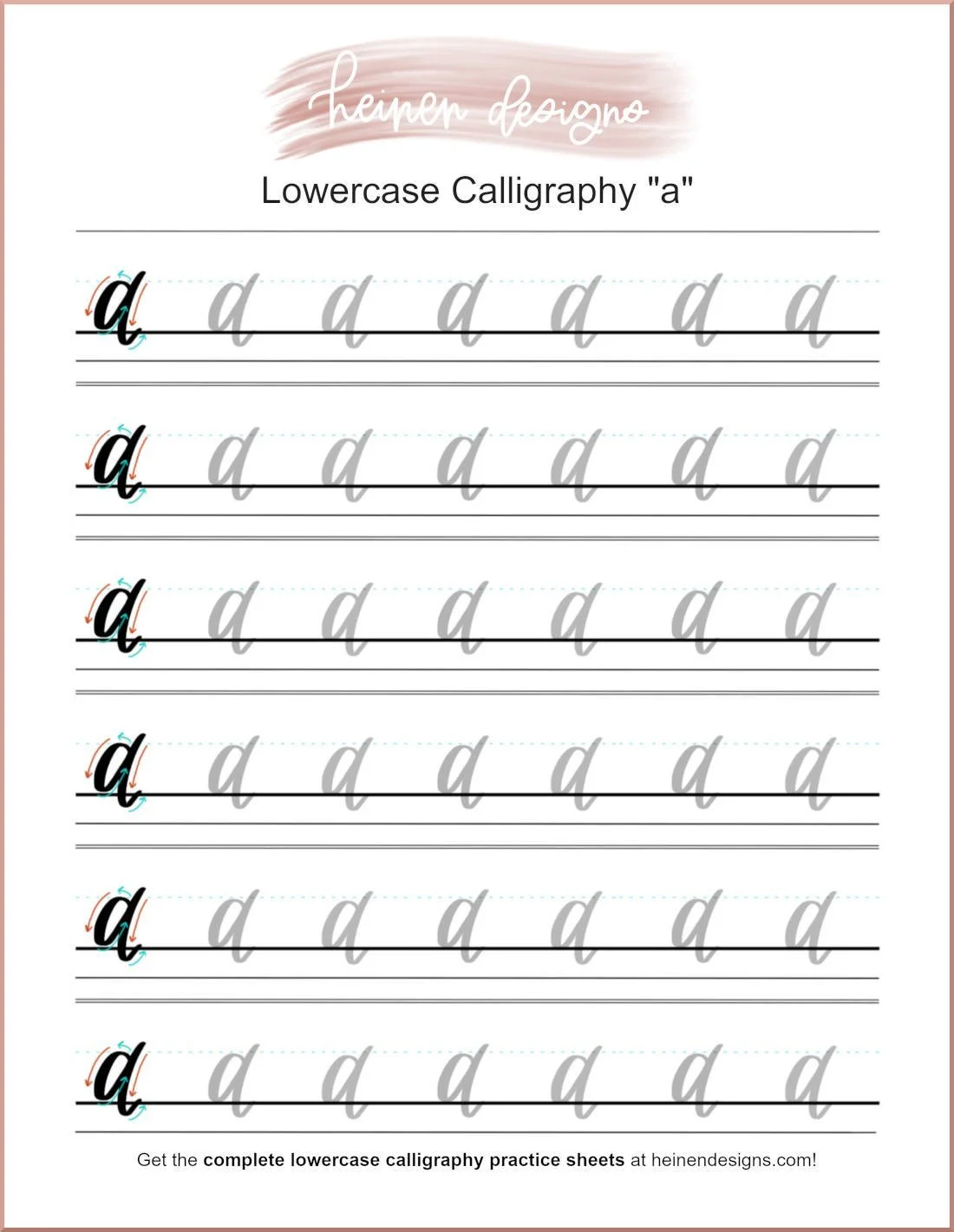
“a” Repetition Rows: Fill a page with consistent lowercase “a”s. Use guidelines to maintain uniform size and spacing. Aim for 10–15 clean, consistent letters per row.
Word Practice: Practice writing words that begin with or contain the letter “a,” such as:
art
amazing
brave
grace
create
Letter Combinations: Pair “a” with common next letters like “n,” “m,” “l,” and “t” to strengthen your connector strokes.
Want help staying consistent? Download our free “Letter a Practice Sheet” here to trace, repeat, and refine your strokes. Keep scrolling to the bottom!
Making “a” Consistent with Your Style
The best hand-lettering happens when your letters work together, not just in isolation. Once you’ve practiced your “a” on its own, try writing it within full words and alongside other letters in your style. Consider:
The slant or angle of your overall alphabet
Your preferred x-height (how tall the main part of your lowercase letters is)
The weight and flourish you use in other letters
Consistency takes time, but focusing on just one letter at a time (like you're doing now!) is a powerful way to improve your entire alphabet.
The letter “a” may look simple, but don’t underestimate it. It’s one of the most versatile — and trickiest — letters in brush lettering. If your ovals are off or your connectors feel clunky, don’t worry. Everyone starts there.
Stick with small, consistent practice sessions, and over time, you’ll see big improvements.
Download your FREE copy of the lowercase brush-lettered “a” practice sheet below!