Improve Your Lettering with 8 Basic Calligraphy Strokes
Don’t Miss Our Free Downloadable PDF!

Understanding the basic strokes of calligraphy is like taking time to smell the spices. Perhaps you’ve been cooking your favorite dish for a while. But once you take time to set down the recipe and experience each ingredient individually, suddenly the dish comes alive in a new way. New flavors emerge and new possibilities are presented. You’re no longer just following a recipe. You’re starting to think like a master chef.
In this guide, we’ll walk through the eight basic calligraphy strokes and why they’re important to your hand-lettering artistry. The goal is to give you a solid understanding of the building blocks that make up all calligraphy letters and words and to provide you with tools to master these basic strokes.
Contents:
Start Learning Right Now with Lettering Leap™
A guided course that teaches you confidence hand-lettering in just 30 days
What is a Stroke in Calligraphy?
Let’s start with a definition. A stroke in modern calligraphy is a single motion of the pen with its start and end uninterrupted on the page. It can be long, stretching from the very bottom of a letter, all the way to the top. Or it can be short and sweet. It can even be curved or curl around on itself. The key is that a stroke is one fluid motion.
In the example below, the lowercase letter a is made up of two strokes: an oval and a downstroke.

Every hand-lettering font is made up of basic strokes. However, the eight calligraphy strokes we’ll cover in this guide are largely used for brush lettering, both the uppercase and lowercase alphabets.
Why are Basic Strokes Important?
The eight basic strokes of calligraphy shouldn’t be thought of as a starting point for the hand-lettering artist. They really ought to be learned, studied and practiced in tandem with your regular hand-lettering activities. In fact, it’s better to get a taste of full letters and words before you break things down into their more technical components. Going back to our cooking metaphor, you eat first, then learn about mixing ingredients together, and then perhaps, study the chemistry of those ingredients.
If you want to improve your hand-lettering and become a proficient artist, the basic strokes are very important. Because all calligraphy letters are made up of these eight basic building blocks, you begin to see patterns and make unique connections between your letters that produce mastery in style, consistency and creativity.
Taking time to study and practice the eight basic strokes takes your calligraphy from the quirky irregularity of beginner art to the smooth finesse of a pro.
A Quick Note about Thick-to-Thin
In traditional calligraphy and modern brush-lettering, line thickness varies depending on the direction of the stroke. This is the principle of thick-to-thin. Don’t worry. It’s not as complicated as it sounds. It’s actually ridiculously fun to try!
Downstrokes are thick, and upstrokes are thin. That’s it.

It should be noted that the basic strokes below are not only for calligraphy alphabets that use the thick-to-thin principle. They can be applied to any cursive-style hand-lettering font. However, in the illustrations below, you’ll observe line thickness changing, depending on the direction of its path.
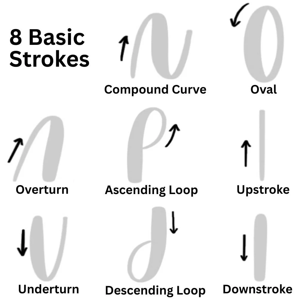
The 8 Basic Calligraphy Strokes Explained
Now let’s get into what the basic calligraphy strokes actually are. These eight strokes make up all modern calligraphy letters. It should be noted that each stroke can have its own unique variations. Think dog breeds – some are long and lanky, others are small and fluffy, but they’re all dogs. However, despite its variations, the essence of the stroke – the path of its motion – does not change.
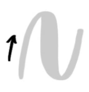
1. Upstroke
An upstroke is a simple line that goes from bottom to top, from a lower point to a higher point. It is a thin stroke and progresses only upward, toward the capital height, without any shift to a downward trajectory.

An upstroke can be a near-perfectly vertical line, but most of the time, it is used at an angle, pitching forward or backward. As long as it is traveling upward and doesn’t veer down or curl around on itself, it can be considered an upstroke.
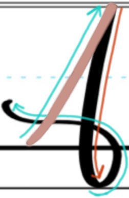
Example Upstroke in the Letter A
Notice in this example of the capital letter A how the upstroke curves slightly as it starts off from the baseline. An upstroke does not need to be a perfectly straight line.
2. Downstroke
A downstroke is a thick stroke that progresses only downward, toward the baseline, without any shift to upward movement.

Like an upstroke, a downstroke does not need to be perfectly vertical. It can be pitched to the right or left. It can be curved slightly like an arc, and it can even shift directions mid-path. As long as the stroke moves downward and only downward in a relatively constant path, it can be considered a downstroke.
Example Downstroke in the Letter B
Notice how the downstroke of the uppercase B curves slightly in an arcing motion as it descends from top to bottom.

3. Overturn
An overturn is a “hill-like” stroke that begins as a thin line in upward progression, but shifts into downward progression, becoming a thick line.

An overturn stroke may begin or end at varying heights. For example, the thin line may start at the baseline, at the X-height or even near the capital height. The line may overturn at the X-height, the capital height or even above that. The thick line may descend to the X-height, the baseline, the descender line or somewhere in between. All of these combinations may be considered overturn strokes, as long as they produce the hill-like curve that starts thin and arcs into thick.
Example Overturn Stroke in the Letter M
Notice the smooth transition from thin to thick at the top of the overturn in this capital letter M. Also, notice how the entire stroke is pitched forward. An overturn may be pitched forward, backward or it may be nearly vertical.

4. Underturn
An underturn is a “valley-like” stroke that begins as a thick line in downward progression, but shifts into upward progression, becoming a thin line.

An underturn stroke is essentially the opposite of an overturn. It begins with a thick downstroke that curves back upward, transitioning into a thin upstroke. Underturns can vary in balance and pitch; that is, the thick line can begin at the capital height, X-height or lower, and the thin line can end at virtually any height, as long as that height is above the turn.
Example Overturn Stroke in the Letter U
Notice from this example letter U that the underturn is one stoke, not two, meaning the tip of the pen does not lift off the page.

5. Ascending Loop
An ascending loop is a curling stroke that wraps around on itself, beginning with a thin, upward-progressing line but shifting to thick as it wraps around and descends.
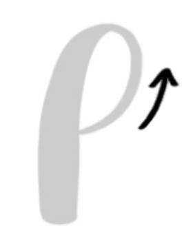
The key to an ascending loop is thin to thick. This means the beginning of the stroke must be an upstroke and the ending must be a downstroke. However, somewhere in the middle, the stroke must make a complete curl.
Example Ascending Loop in the Letter L
Notice in this example letter L how the ascending loop begins on the left side and progresses upward first. It wraps around counterclockwise, shifting into a thick downstroke as it passes through the first line, making a loop at the top.

6. Descending Loop
A descending loop is a curling stroke that wraps around on itself, beginning with a thick, downward-progressing line but shifting to thin as it wraps around and ascends.

As you might guess, a descending loop is just the opposite of an ascending loop. Instead of thin-to-thick, it’s thick-to-thin – the downstroke first, then the upstroke. Additionally, a descending loop places the curl at the bottom of the stroke, instead of at the top.
Example Descending Loop in the Letter L
Taking the capital letter L again, it also offers a good example of the descending loop. Notice how the letter begins with an ascending loop, but halfway through, the final downstroke of the ascending loop becomes the first downstroke of the descending loop.

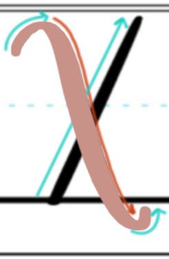
7. Compound Curve
A compound curve is a wavy stroke that shifts from thin, to thick, to thin again or vice versa as it progresses from left to right.
A compound curve always makes a wave, but that doesn’t mean the wave is necessarily high. Some compound curves are very shallow, resembling an almost horizontal line with only slight variation in line thickness. Most compound curves, however, have a clear waviness with a hill that transitions into a valley (or a valley into a hill).
Example Compound Curve in the Letter X
The letter X offers a prime example of the compound curve in action. Notice that the stroke alters from thin at the beginning, becomes thicker as it curve downward, and then returns to thin as it curves back up again at the end.
8. Oval
An oval is a round stroke that shifts from thick to thin as it makes a complete counterclockwise circuit, ending at virtually the same point at which it began.

A calligraphy oval stroke may be a perfect oval or circle, or it may be pitched slightly to one side. Sometimes the oval ends exactly where it began, and other times the ending point is minorly offset. Additionally, an oval does not always make a complete circuit. For some letters, such as the letter C or letter G, the oval is left open, ending before it completes its rotation.
Examples Oval Stroke in the Letter Q
Notice the perfect oval stroke that is used to create the calligraphy letter Q. It is thick on one side where the line is a downstroke, and thin on the other where the line is an upstroke.

Practicing Your 8 Basic Calligraphy Strokes
As important (and fun!) as it is to practice hand-lettering with a beautifully written word or phrase, it is just as important (yep, and fun!) to practice basic calligraphy strokes. Be sure to take time in your daily or weekly routine just for basic strokes. It doesn’t have to be long, five minutes is plenty. When you do, you’ll strengthen your muscle memory for those vital building blocks to improve your lettering skills all that more.
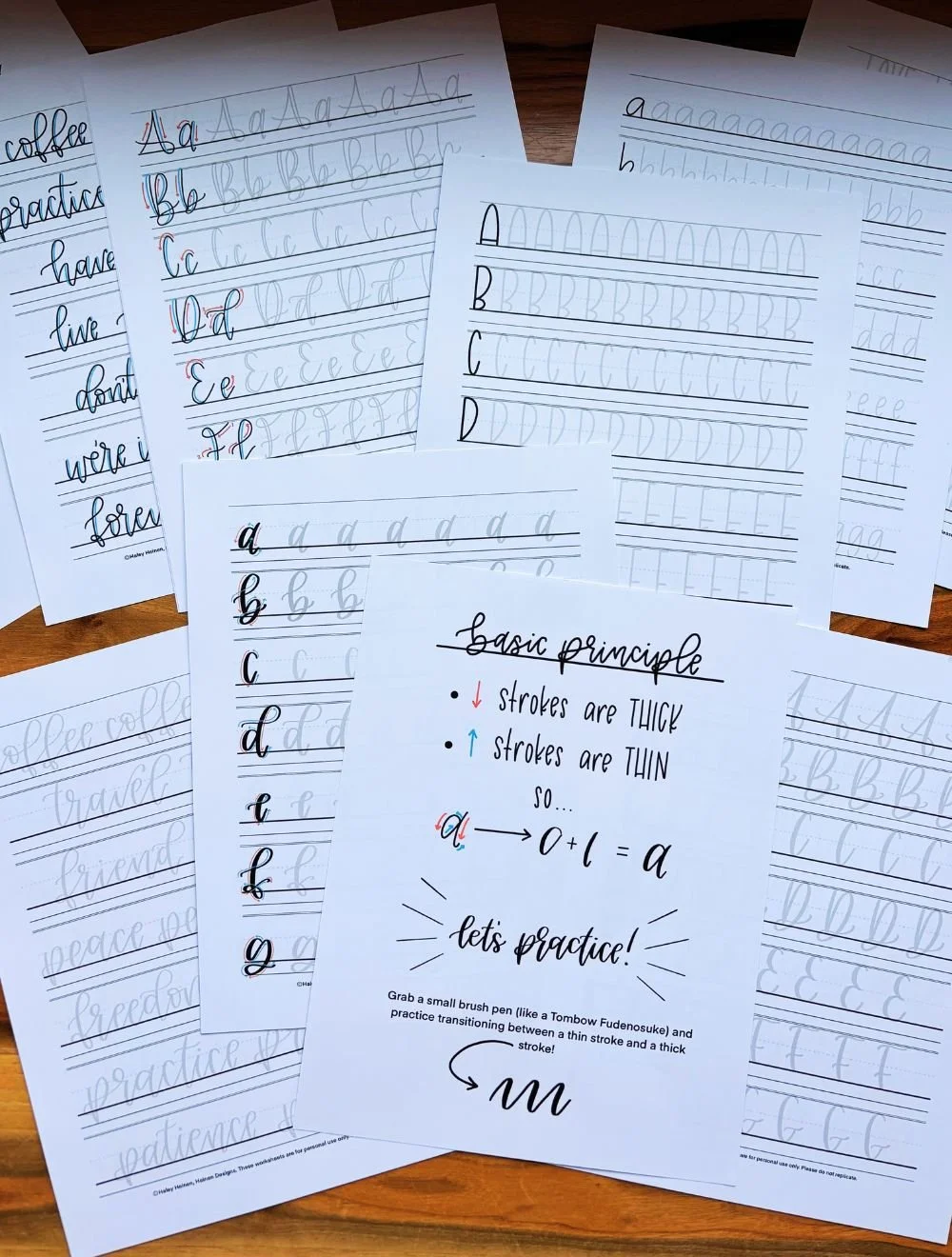
Free Basic Calligraphy Stroke Download
Download the basic calligraphy strokes worksheet below. This PDF file is from our free practice sheet library and makes it easy to practice the eight strokes by tracing the lines over and over again. Download the file and print it out for pen-and-paper practice or pull it up on your tablet for digital exercise.