Top 10 Mistakes Beginners Make with Hand-Lettering Practice (And How to Avoid Them)
Whether you're picking up a brush pen for the first time or testing out your Apple Pencil in Procreate, learning hand-lettering is an exciting creative journey. But if you’re like most beginners, you might find yourself feeling stuck or frustrated at times, and that’s totally normal.
Most of us are self-taught lettering artists, and we’ve been there. In fact, many people make mistakes when they’re first starting out. The good news? With just a few small tweaks to your approach, you can see big improvements, faster than you think.
In this guide, we’ll share the most common hand-lettering mistakes beginners make and how you can avoid them so your practice time is fun, encouraging, and actually works.
Tap to jump to a topic:
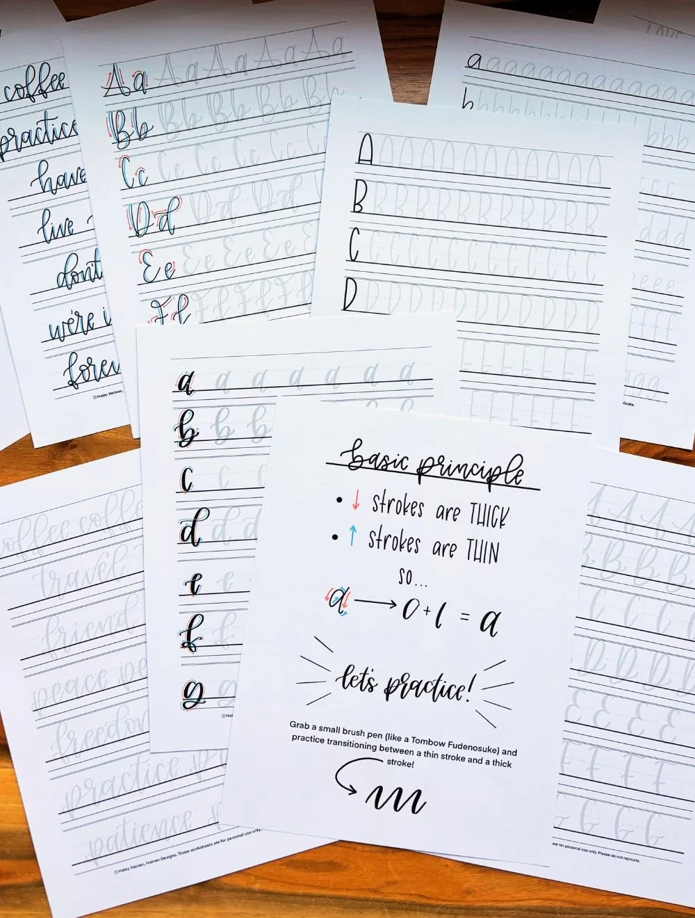
1. Skipping the Basic Strokes
One of the most common mistakes beginners make is jumping straight into full alphabets or fancy words before ever learning the foundational strokes of brush lettering. It’s tempting to want to write your favorite quote or letter a birthday card right away, but the truth is, brush lettering is built on a set of just eight basic strokes. These are the building blocks of nearly every letter in the alphabet.
Skipping this step can lead to inconsistent shapes, shaky lines, and a lack of control over your pen. Instead, start with simple drills that help build your muscle memory. Think of it like scales for a pianist; repeating these shapes helps you build fluid motion and clean up your lines over time. It’s a good idea to start each practice session with 5–10 minutes of stroke drills.
The Mistake:
Sometimes beginners jump right into writing full letters or fancy quotes without practicing the fundamentals.
Why It Matters:
Brush lettering is built on eight basic strokes. These foundational shapes are repeated throughout all the letters of the alphabet. If you skip them, your letters will feel wobbly, unbalanced, and inconsistent.
How to Fix It:
Start your practice sessions with stroke drills, just like a musician warms up with scales. Even just 5–10 minutes a day can build the muscle memory you need to gain control over your pen and make your letters look more polished.
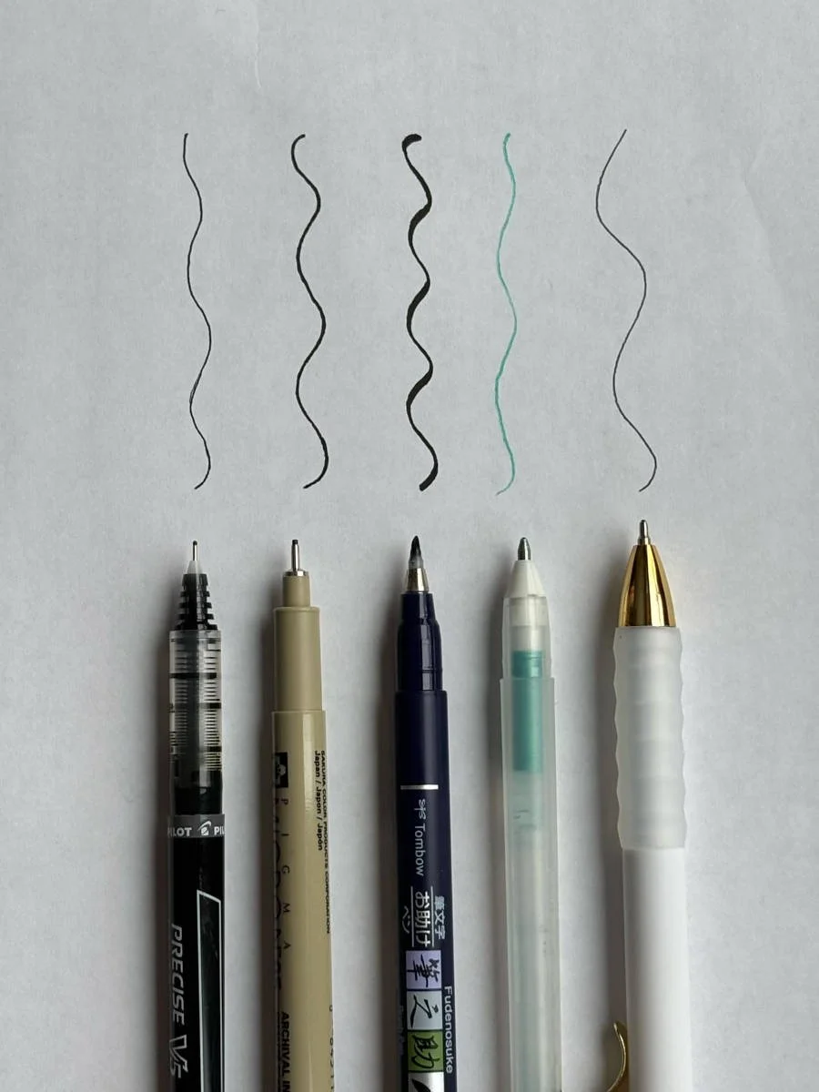
2. Using the Wrong Tools
The tools you use matter more than you might think. A lot of beginners grab whatever paper is nearby and pair it with any marker or pen they can find. But not all materials are created equal. Using rough paper can cause brush tips to fray quickly, and cheap markers might bleed, feather, or skip. To get the best results, use smooth, high-quality paper or marker paper designed for brush pens.
When it comes to pens, beginners often do best with something small and firm like the Tombow Fudenosuke or Pentel Touch. And if you’re working digitally, be sure your brushes in Procreate are set up for pressure sensitivity to mimic real brush pen dynamics.
The Mistake:
Beginners sometimes use rough paper or the wrong kind of pen, which leads to fraying, ink bleed, and frustration.
Why It Matters:
Not all pens and paper are created equal. Cheap materials can make it harder to get clean, smooth lines and might discourage you before you’ve even started.
How to Fix It:
Use smooth paper and beginner-friendly pens like the Tombow Fudenosuke, Pentel Touch, or even Crayola markers. For digital artists, set up Procreate with pressure-sensitive brushes and guide layers.
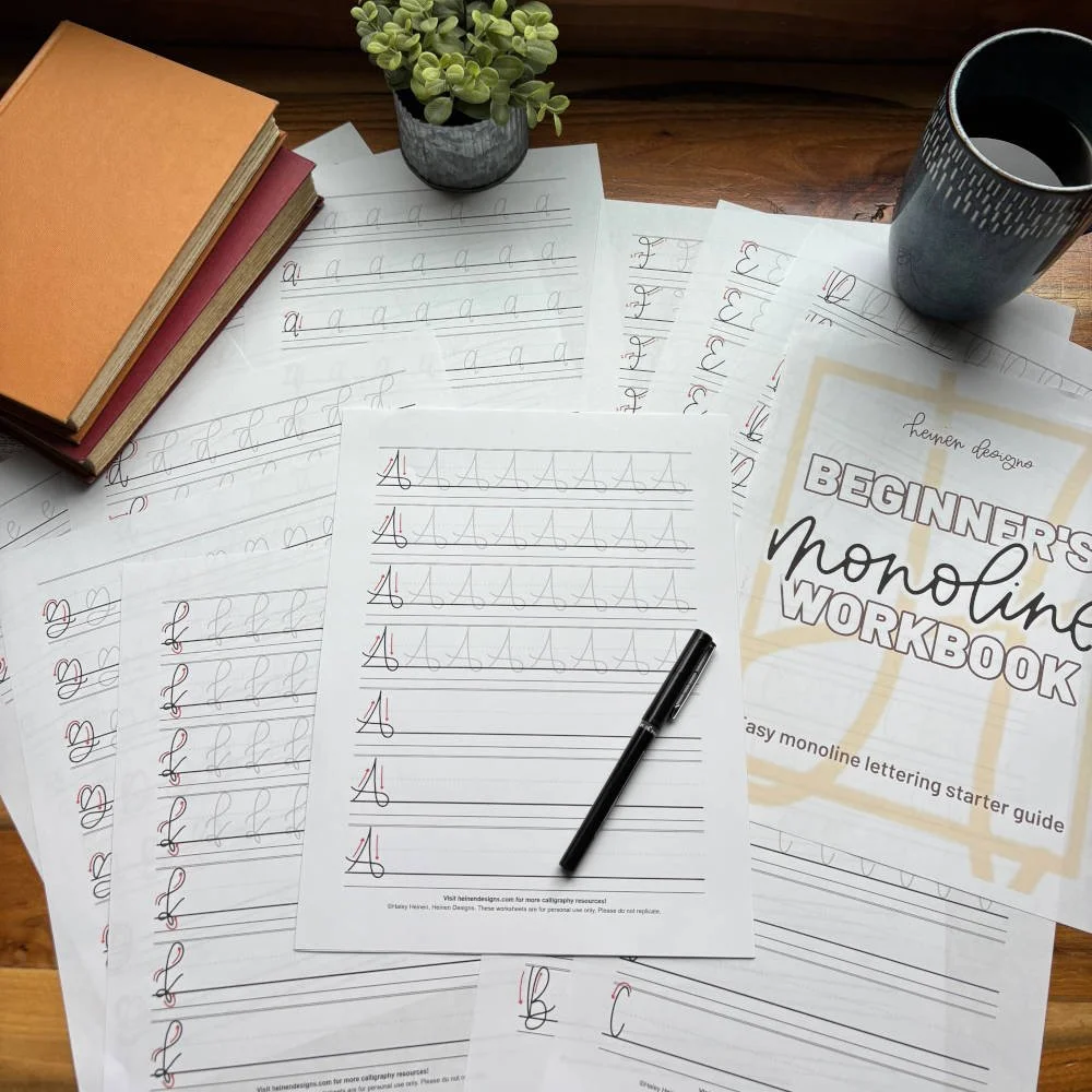
3. Ignoring Guidelines
Guidelines might seem optional at first glance, but they’re essential to creating consistent, well-proportioned letters. Without visual boundaries like the baseline, x-height, ascender, and descender lines, it’s easy for your letters to look unbalanced and uneven from word to word.
Practicing without guidelines is a lot like baking without measuring — some results might turn out okay, but it won’t be consistent. Instead, use practice sheets with built-in guidelines or draw your own lightly with a pencil. These will help you keep your letters aligned and give your writing structure. Once you internalize where each part of the letter should fall, your hand-lettering will instantly look more polished.
The Mistake:
Beginners may want to freehand letters without using guides like the baseline, x-height, and ascender lines.
Why It Matters:
Guidelines help your letters stay consistent in size and proportion. Without them, your work may feel chaotic, even if your strokes are strong.
How to Fix It:
Use practice sheets that include these guides, or draw your own if you’re working on blank paper. Understanding what each line means (baseline, x-height, ascender, descender) gives your lettering structure and polish.
4. Practicing Inconsistently
Another common mistake is treating hand-lettering like a weekend project instead of a regular habit. Practicing once in a while may feel productive in the moment, but it’s not enough to build long-term skill. Like learning an instrument or working out at the gym, consistency is key.
Even just 10 minutes a day can have a bigger impact than one long session every couple of weeks. When you practice regularly, you start to build muscle memory and develop better control over your strokes. Try setting a timer, keeping your supplies nearby, or using a daily prompt calendar to keep your practice routine simple and fun.
The Mistake:
Beginners may make the mistake of practicing only once in a while, expecting big results from short bursts.
Why It Matters:
Like any art form, hand-lettering relies on muscle memory. Practicing sporadically makes it harder for your hand to build precision and control.
How to Fix It:
Make practice part of your weekly routine. Even just 10 minutes a day is more effective than an hour once a week. Use a 30-day lettering challenge, a themed worksheet pack, or write one word a day in your planner.
5. Comparing Yourself to Others
It’s easy to fall into the trap of scrolling Instagram or Pinterest and feeling like your work will never measure up. You see perfectly polished pieces, stunning scripts, and professional-level flourishes, and suddenly, your own work feels clumsy in comparison.
But here’s what you don’t see: the rough drafts, the abandoned pages, and the years of practice behind those polished pieces. Every hand-lettering artist started somewhere, and comparing your Day-1 to someone else’s Year-5 will only discourage you. Instead, track your own progress. Save your first practice sheet and look back after 30 days of consistent effort. You’ll be surprised how far you’ve come.
The Mistake:
A beginner might look at professional artists’ work online and feeling like they’re not good enough.
Why It Matters:
Comparison kills creativity. Everyone starts somewhere, and what you see on social media is usually the final polished version, not the practice sheets and messy drafts that came before it.
How to Fix It:
Celebrate your own progress. Keep your first practice sheet and look back after 30 days. You’ll be amazed! Surround yourself with other learners and focus on your own growth. Lettering is supposed to bring joy, not pressure.
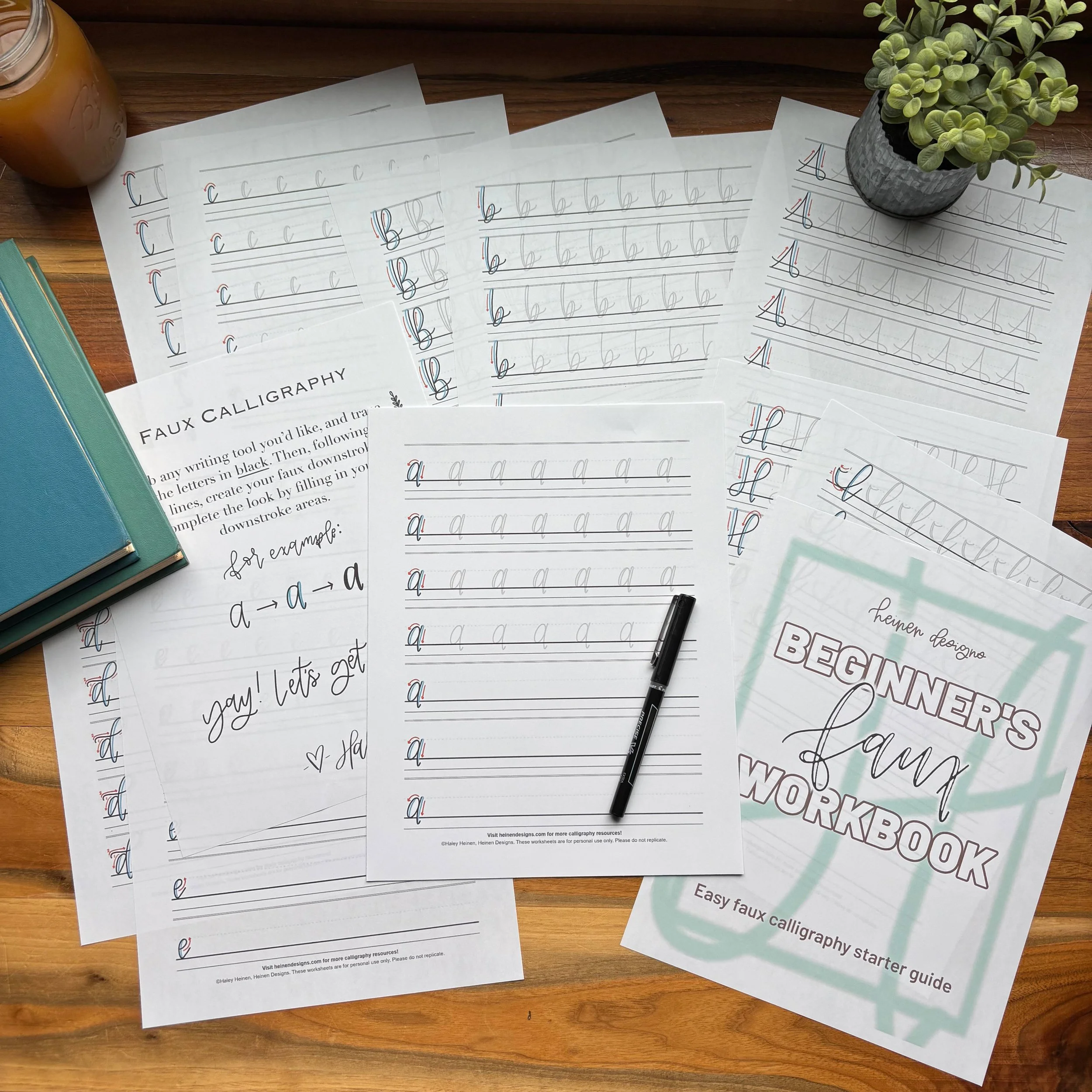
6. Trying Too Many Styles at Once
There are so many fun hand-lettering styles — bounce lettering, faux calligraphy, monoline, brush script, and more. It’s natural to want to try them all. But switching between styles too quickly can slow down your progress, especially when you haven’t fully grasped the basics of one.
Choose one style — like modern brush lettering — and focus on building consistency and confidence with that style before moving on. Once you’ve mastered the structure and rhythm of one script, transitioning into other styles will feel much smoother.
The Mistake:
Beginners tend to jump from style to style — bounce lettering one day, faux calligraphy the next, then switching to monoline script — without mastering any one technique.
Why It Matters:
Each lettering style has its own rhythm, spacing, and stroke techniques. When you switch styles too often, you don’t give yourself enough time to build muscle memory or recognize patterns that lead to consistency. Instead of growing your skill, you stay stuck in the early learning curve.
How to Fix It:
Pick one lettering style to start with and stick with it for a while. Focus on getting comfortable with the alphabet, spacing, and pressure before moving on to new styles. This builds a solid foundation that makes it easier to explore other styles later on.
7. Not Slowing Down
Unlike regular handwriting, which we’re taught to do quickly and automatically, calligraphy is more like drawing than writing. If you're rushing through your strokes, your letters will look sloppy, your curves won’t connect, and your downstrokes might come out uneven.
Slow down and be intentional with every stroke. Take your time on each upstroke and downstroke, especially when learning new letters or words. Practicing slowly not only improves your technique but helps you notice subtle things like stroke pressure, pen angle, and spacing.
The Mistake:
Sometimes beginners treat hand-lettering more like regular handwriting — quick, rushed, and on autopilot.
Why It Matters:
Lettering is more like drawing than writing. When you rush, your letters can end up crooked, disconnected, or messy. Speed often overrides control, and that leads to frustration with how your work looks.
How to Fix It:
Slow down and be intentional with every stroke. Take your time as you move through each curve and transition. Over time, your speed will increase naturally, but your precision and confidence will grow even faster if you focus on control first.
8. Pressing Too Hard
When you're first learning to use a brush pen, it’s easy to press too hard, especially when you’re trying to get those bold downstrokes. But too much pressure can damage your pen tips, lead to uneven strokes, and make it hard to transition between up and down strokes smoothly.
Instead, focus on controlling pressure with intention. Light pressure for thin upstrokes, and firmer — but not forceful — pressure on the downstrokes. Practicing this control will give your letters a beautiful contrast and help your brush pens last much longer.
The Mistake:
Beginners tend to use excessive pressure on your pen, especially during downstrokes, which leads to worn-out tips and blotchy ink flow.
Why It Matters:
Brush pens are delicate tools. When you press too hard, especially with soft or flexible nibs, they break down quickly and lose their bounce. You also risk creating inconsistent strokes with jagged transitions between thick and thin lines.
How to Fix It:
Practice light, controlled pressure. Upstrokes should feel gentle, while downstrokes should be firm but not forceful.

9. Practicing Full Words Before Mastering Letters
When you’re excited to create something beautiful, it’s tempting to skip ahead to full words and quotes. But if your individual letters are still inconsistent, those words won’t look as clean or cohesive as you want them to.
Break it down. Start by mastering each individual letter. Then move to letter pairs or short blends, then full words. This approach helps you strengthen spacing, alignment, and flow. Plus, it makes the jump to longer phrases feel much easier.
The Mistake:
Beginners usually try to letter entire words and quotes when their individual letters still need work.
Why It Matters:
Full words require consistency, spacing, and flow. If you haven’t yet mastered individual letters, the final result will look uneven and unfinished, which can be discouraging. It’s like building a house without knowing how to lay bricks.
How to Fix It:
Take a step-by-step approach. Master each letter on its own first, then move on to letter pairs, and finally to full words. This helps you learn spacing and how letters interact. It also builds confidence one layer at a time.
10. Not Printing or Using Practice Sheets Properly
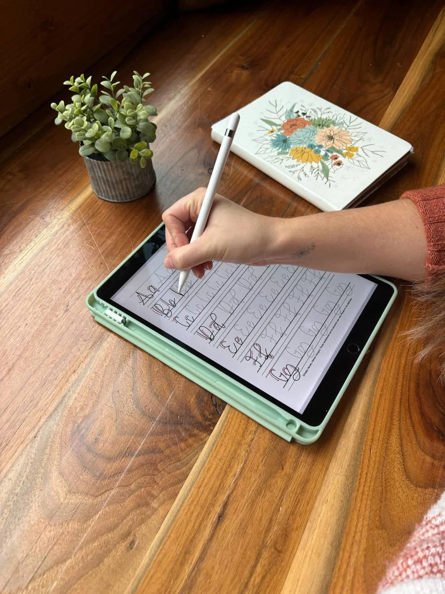
Downloading a practice sheet is one thing; using a practice sheet effectively is another. Printing on low-quality paper, tracing over sheets without guide lines, or using a worn-out pen can limit your progress. And if you’re working digitally, tracing too dark or using brushes without pressure sensitivity can reduce the benefit of the worksheet.
Always print on smooth, high-quality paper and be sure to use the right size and scale for your practice. If you’re using an iPad, import the sheet into Procreate, lower the opacity, and use a pressure-sensitive brush to trace and draw.
The Mistake:
Beginners might use the wrong type of paper or brush settings, or failing to use the worksheet correctly.
Why It Matters:
Even the best-designed worksheet won’t help if you can’t trace it smoothly or your pen keeps catching on the paper. Frustration with your setup can lead to giving up before you even get into the flow of practice.
How to Fix It:
Print your worksheets on smooth, high-quality paper, and use fresh pens with fine tips. If you’re practicing digitally, make sure the worksheet layer is in the background and your brush settings are optimized for pressure sensitivity.
Bonus Tip: Use the Right Practice Sheets
The right practice sheets make a huge difference. They’re designed to help you learn step by step, with built-in guides, stroke direction arrows, and consistent letterforms to trace and practice.
If you’re ready to build better habits and ditch these mistakes, start here: