5 Key Hand-Lettering Styles You Should Learn

How many hand-lettering styles would you say there are? I think depending on how you define a style, you could argue there are hundreds or even thousands.
Whether you’re a hand-lettering beginner looking to grow or a seasoned artist, that number can be overwhelming.
In this blog post, we will walk through five basic lettering styles that every hand-lettering artist should know. These are the essentials – and the only ones you need to be successful! We’ll cover the nuances that make each one unique and provide resources for practicing and perfecting each alphabet, including a free downloadable worksheet!
Why You Only Need 5
I want to start off by saying that you don’t need to learn hundreds of font styles to be a good hand-lettering artist. Learning different styles is essential to becoming a better artist, but that doesn’t mean you need to memorize hundreds of styles.
Having the five unique fonts below tucked into your toolbelt allows you to vary your lettering within any art piece, adapt for different moods and ultimately be a more versatile artist. It’s quality over quantity. It’s far better to be a master of five unique fonts than to be a novice of ten.
What happens when you get very good at a handful of key styles is that you begin to notice every little nuance. You notice the subtle facets that make the font unique.
Then, something very exciting begins to happen.
You start to invent your own style. As you recognize those nuances, you’re able to manipulate and change them, tweaking the details to actually make it your own and create an entirely new style. It’s no longer someone else’s alphabet. It’s yours.
So, without further ado, here are five hand-lettering styles you should learn:
The Essentials: 5 Different Hand-Lettering Styles
1. Lowercase (Modern Calligraphy)

The Lowercase alphabet is truly the starting point and foundation for any hand-lettering artist. There are many fonts out there, but Lowercase is the most basic and essential to learn if you wish to break into the hand-lettering craft.
It draws on many elements of traditional calligraphy, while exploring new, modern possibilities. The font is both elegant and sophisticated, being built on the concept of thin-to-thick: thin upstrokes and thick downstrokes.
Lowercase is also very easy to customize. It opens the door to imaginative curves and flourishes with almost every letter.
2. Monoline

The Monoline lettering alphabet is also great for beginner hand-lettering artists. Whether you’re just starting out or already a master of thin-to-thick, this alternative font style broadens your skill level and creates the possibility of more one-of-a-kind art pieces.
Monoline is a simple but intriguing font. It strives for a clean approach to modern calligraphy, focusing on the minutia of each line, while exploring creative curves and flourishes.
Monoline is one of the most versatile fonts in my opinion. Not only is it easy to learn and start applying in your art, it also provides a helpful stepping stone for other fonts, including Lowercase, Uppercase and Faux Calligraphy.
3. Tall & Thin

Tall & Thin is a simple font that’s bursting with character. It lends itself to whimsy and nostalgia, while presenting in clear, clean, determined strokes. It’s both lighthearted and wildly confident, adding a note of individual style to any piece of art.
The Tall & Thin font is a vital alphabet to learn for all hand-lettering artists. It’s perfect for those just starting out in their lettering journey, especially if you’re already familiar with the cursive styles. It can be an excellent way to branch out and diversify your skillset.
Together with Lowercase and/or Monoline, the Tall & Thin font gives you the necessary variability in your artwork to create truly beautiful designs.
4. Faux Calligraphy

Faux calligraphy is a unique hybrid of monoline and the lowercase or uppercase lettering style. It is created using a consistent line thickness and a custom treatment of the letters to add the thin-to-thick effect of traditional calligraphy.
First, the word is lettered in monoline. Then, a second stroke is applied to each letter to thicken the downstrokes.
Faux calligraphy can take multiple forms on the page, making it one of the most customizable fonts. The secondary downstrokes can be left open for an elegant, airy feel. They can be filled in solid to create the modern calligraphy look. Or, they can be filled in with the pattern of your choosing – polka dots, horizontal lines, angled lines, stars – whatever suits the flavor of your piece.
5. Uppercase (Modern Calligraphy)

Uppercase (or capital) calligraphy letters may seem like a beginner’s alphabet, but in fact, it is more advanced than most realize. Hand-lettering capital letters is a skill best learned at the intermediate level, and it is ideal for lettering artists who already have a mastery of the Lowercase alphabet.
Like Lowercase, Uppercase is modeled after traditional calligraphy, but the font carries with it a modern flare. Each letter is a bold statement, following the classic pattern of thin upstrokes and thick downstrokes. The flourishes are bold, the curves generous, and the result is undeniably elegant. As you might expect, this font works very well in tandem with the Lowercase alphabet, but it can stand on its own.
Try Each One for Free!
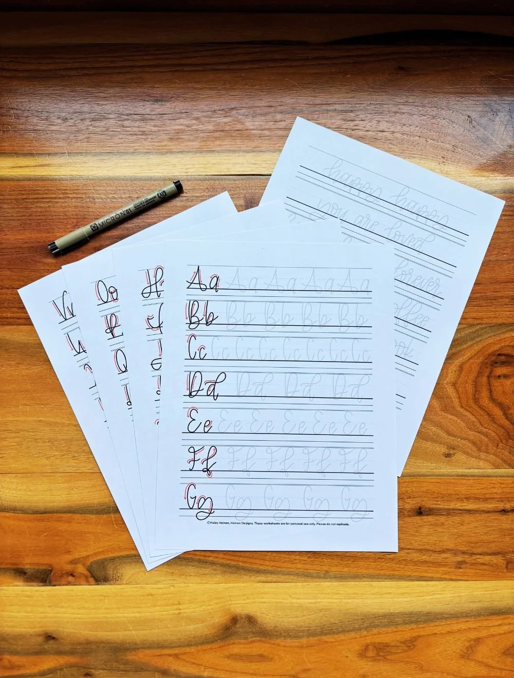
Try your hand at each of these calligraphy styles using this free downloadable worksheet. Some lettering artists prefer one font over another, and it can be a lot seeing all five of these essential styles at once. Download the PDF, print it out, and find out which one it your favorite! Heinen Designs also has tons of other free calligraphy resources to help you get started on your lettering journey.


The Lowercase Lettering Worksheets PDF by Heinen Designs is a beginner’s guide to hand-lettering. It provides a step-by-step walkthrough of how to craft each letter in the beginner calligraphy alphabet. You can print off the pages or use them digitally on your tablet.
This is a digital download only. You will not be receiving any physical item.
If you want to get serious about hand-lettering, this worksheet is for you! The Monoline Lettering Worksheets PDF by Heinen Designs helps you learn a clean, simple hand-lettering font. It guides you through the strokes of each letter and provides plenty of space to practice. Print the pages out to letter on paper or drop the files into the app of your choice for a digital option.
This is a digital download only. You will not be receiving any physical item.