The Ultimate Guide to Monoline Lettering

Monoline lettering is one of the simplest and cleanest hand-lettering fonts. And yet, it can be tricky to figure out the right technique unless you take time to learn the proper steps.
In this ultimate guide to monoline lettering, we’ll walk through everything you need to know to become a monoline hand-lettering master.
What is Monoline Lettering?
Let’s start with a definition. Whether you’re new to hand-lettering or already an up-and-coming, it’s important that we’re all on the same page about what monoline lettering actually is?
Monoline lettering is a basic hand-lettering font that utilizes a single, uniform line thickness throughout any given word. That is, the strokes of your pen don’t change from thick to thin depending on the direction. Every stroke and line has the exact same thickness.
Monoline means “one line”, the prefix mono- meaning one or singular, and -line referring to the lines making up the letters.
This is the Monoline Alphabet:

Here are some examples:
Examples of Monoline:
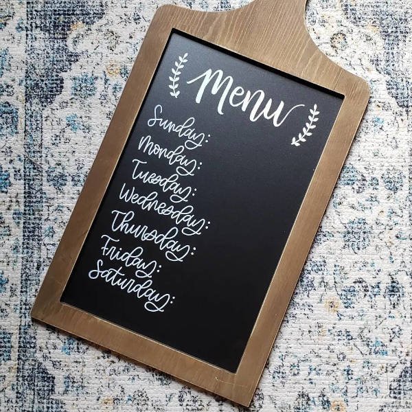
Weekly monoline-lettered chalkboard menu

Cute monoline-lettered framed sign
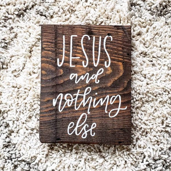
Rustic monoline-lettered wood sign
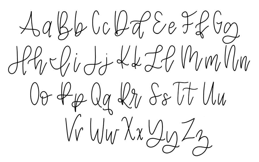
The Monoline Alphabet
A monoline font is easy to recognize once you understand the basic principle of singular line thickness. Pretty much as long as the line has the same thickness throughout – every curve, every dash, every dot – it can be called monoline. While the font itself can vary from artist to artist, the principle remains the same and is applied to both capital letters and lowercase letters.
Here is an example of a monoline lettering alphabet:

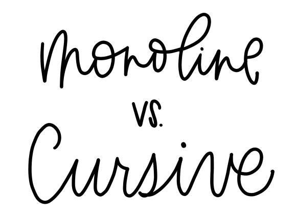
Monoline vs. Other Types of Lettering
Monoline is an extreme versatile lettering style, and an essential skill for any hand-lettering artist to learn. It has its own unique character from the other major styles, and within the monoline style, there are amazing opportunities for creative license and even different sub-fonts.
Monoline: Not the Same as Cursive
Before we get into learning how to write monoline letters, it’s important to know that monoline is not the same as cursive. If you scan the alphabet above for a minute, you’ll quickly realize that it’s not simply a type of cursive writing.
Unfortunately, this means you can’t just jump in with your cursive knowledge expecting to be a monoline master. You might just end up ripping up your paper in frustration, or worse, throwing your tablet across the room.

Differences between Monoline & Cursive
Let’s lay out the differences between monoline and cursive:
Monoline is more artistic and stylized, while proper cursive follows a very specific set of rules.
Monoline is usually a hybrid between cursive-like letters and print letters.
Monoline always maintains a uniform line thickness, while cursive can vary thick-to-thin.
Monoline is meant for art, while cursive is meant for handwriting and signatures.
Monoline is entertaining. Cursive is practical.
To be sure, there are similarities between monoline and proper cursive handwriting. Monoline borrows many of its themes and stroke paths from cursive but applies a more free-form, subjective flavor.
Also like cursive, monoline calligraphy letters in any given word are usually strung together as if they were one continuous stroke.
Monoline Word vs. Cursive Word
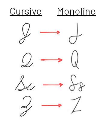
Furthermore, notice the key difference between these letters written in cursive and again in monoline.

Print Monoline vs. “Calligraphy” Monoline
As stated already, the monoline alphabet can vary extensively from artist to artist. However, there are basically two types of monoline letters: print monoline and “calligraphy” monoline or cursive monoline.
Print monoline follows the pattern of printed letters, those that you use in everyday handwriting. The uppercase A is a peak with a line through the middle. The lowercase b follows the bat-before-ball rule, rather than a standing curlicue. The uppercase G is a standing oval with a tabbed opening. You get the picture.
Monoline can’t be thought of as merely a type of cursive because it breaks too many rules. Also, when monoline is written in the print style, it means the letters in a word don’t bridge. They aren’t strung together in one continuous line.
Calligraphy monoline or cursive monoline, on the other hand, echoes the rules and style of standard cursive (the handwriting method many of us learned in grade school) though creatively modified. For example, the lowercase g loops around at the bottom to connect to the next letter. The uppercase I is a tall loop-de-loop, and the top of the o does a curlicue. The lowercase z is almost identical to a standard cursive z.
Note the difference between the two fonts shown in the example below. The top portion is purely print monoline (actually it’s tall and thin – more on this in a minute), and lower word is calligraphy monoline. Different fonts but both maintain the same uniform line thickness throughout.

This is Where Things Get Tricky… or Fun!
Where things get tricky in terms of specific definitions or categories is that the rules are so often broken. But that’s a good thing! Most monoline alphabets (including Heinen Designs monoline) are a melding of both print letters and cursive letters. Even within a single letter, elements can be borrowed from both styles. The uppercase J might not have a large, upper loop-de-loop, but the bottom tail still sweeps around in a stylized curve. The uppercase H isn’t really like either print or cursive, but a hybrid of both. The Ses break all the rules, being a simple snake-like curlicue, but looping around to connect to the next letter.
Take look at these additional comparisons between cursive and monoline, and notice the important distinctives:
This is the beauty of monoline and hand-lettering in general. It’s meant to be artistic. You’re not just writing out words. You’re creating pieces of art, and so putting some of your own personal style and flare into it is encouraged.
Like this!

Monoline vs. Modern Calligraphy
The term modern calligraphy can be used to refer to so many different things, including bounce lettering, faux and even monoline. It is unique from traditional calligraphy in that it’s much more free-form and subjective in its guideline. However, in this case, what we mean by modern calligraphy is the thick-to-thin style fonts used by most hand-lettering artists today, also called brush lettering.
And therein lies the biggest difference. Monoline, as we’ve said, maintains a single line thickness throughout. Modern calligraphy, on the other hand, a.k.a. brush lettering, varies in line thickness based on the stroke. To put it simply, downstrokes are thicker and upstrokes are thinner. The resulting style is usually quite different from the monoline style, depending on how much variance there is in the thick-to-thin strokes.

Other Variations of Monoline Lettering
The possibilities with monoline hand-lettering are virtually limitless – it’s that versatile of a font! But there are some key styles worth noting as cousins of the proper monoline lettering alphabet.
Tall & Thin
Tall and thin is a font style that uses the monoline principle; that is, consistent, uniform line thickness throughout. Unlike traditional monoline, however, tall and thin is almost always print letters only, and more importantly, the overall height of the letters is raised, while the X-height remains relatively lower.
Note: X-height refers to the middle line in a typeface row. Or another way to think of it is, the X-height always marks the very top of your lowercase letters.
Tall and thin letters are usually all-caps, and with a lowered X-height, they take on a childlike quality.

Faux
Faux calligraphy should also be noted as a sort of hybrid between monoline and modern word calligraphy. To create faux (meaning “false”) calligraphy letters, you basically start with monolines, writing out the entire word, and then work your way back through each letter, adding an extra stroke to each downstroke, giving it a thick-to-thin look. Filling in the extra downstrokes is optional.

Stretchy
Finally, the Stretchy font should be called out as a popular, modified variation of monoline. Stretchy, as you might guess, consists of stretched out letters, wherein the bridge lines between each letter in a word are lengthened. The result is that each word grows to take up more horizontal space, without growing vertically, giving the final piece an airy look.
The Stretchy font, despite its exaggerated spacing, is built on the same single-line-thickness principle that all monoline fonts use.

How to Hand-Letter in Monoline
Hand-lettering in monoline takes regular practice. It may look simple enough to the up-and-coming letterer, but it’s best not to rush in without the right tools, preparation and step-by-step guidance.
Once you’ve gotten familiar with the lettering alphabet and experience with each letter, you’ll be able to freely and confidently draw in monoline whenever and wherever you want. You may even wish to develop your own variation of monoline hand-lettering to reflect your personality.
Tools Needed for Lettering in Monoline
The best tools for drawing letters in monoline, especially if you’re just learning the font, are a pen and paper. Starting on the tablet is not recommended because you may be tempted to cheat to get perfect letters every time. This doesn’t lend itself to good practice.
You will work your way up to other, less conventional methods and mediums – chalk on the driveway, sharpie on a Dixie cup, crayons on the tablecloth at your favorite restaurant, a stick in the sand. But for the process of learning monoline lettering, the best tools are as follows:
Sakura Pigma Micron Fineliner pen
Use either a 03 (0.35mm) or 04 (0.4mm) when you’re first starting out. The numbers refer to the thickness of the pen tip and therefore the thickness of the line. These pens are a top choice for many hand-letterers, and investing a little bit in a premium pen versus using a ballpoint from the junk drawer will boost your confidence and help you get into the artistic headspace.Strathmore sketch spiral paper pad 5.5” x 8.5”
A dedicated lettering journal is a must-have for any aspiring lettering artist (or veteran for that matter). The Strathmore 5.5” x 8.5” sketch pad is an excellent choice, but others will work. Just make sure it’s not a basic $1 notepad from the school supplies aisle. You’ll want something with quality paper and no lines – blank pages only.

One more thing to note about tools: the beauty of the monoline lettering font is that the singular line thickness affords the use of many, many different writing utensil choices. Pretty much any regular pen or pencil will work to draw monoline letters, unlike calligraphy which requires a brush pen or some other tip that can vary the line thickness.
However, as stated above, a dedicated pen and journal are best when you’re just starting out. But it’s okay if you can’t wait very long before trying the kids’ chalk on the driveway!
How Thick Is Too Thick?
You might think that as long as your line thickness doesn’t change, it’s monoline, right? Well, kind of.
There is a point at which the lines can become too thick. The point depends somewhat on the size of your piece (the page or wood sign or window you’re writing on) and on the preferences of the artist.
Obviously if the piece is larger, thicker lines are acceptable, if not necessary. A nice fat chalk pen should be used on a storefront to make sure the words are visible.
Some artists prefer thicker lines, even on smaller pieces. However, if the lines are too thick, the font can lose its essence. It may start to look like bubble letters. You can absolutely play around with this look and experiment, but if you’re aiming for proper monoline – especially if you’re just learning how! – you’ll want a writing instrument that offers a balanced line thickness. As mentioned above, a Micron 03 or 04 is the recommended tool of choice.
How to Write Monoline Lettering Step-by-Step
Now that you know what tools you’ll need, let’s get into an actual step-by-step monoline lettering tutorial.
Find your corner
Find a spot where you can focus on your work. If you’re distracted, your results will suffer. It doesn’t need to be a physical corner, but it should be a “place” that let’s you get away. A quiet desk in the office or a table in the spare room is ideal. It could even be a high countertop in the kitchen if young children don’t allow you to step away.Sit down
This one comes with an asterisk. Sitting down to letter is ideal because it will make your hand more stable and encourage proper technique. Obviously if sitting isn’t an option, it’s not a deal breaker.Check your posture
Sit up straight, in a chair if possible, so that your lower arm and hand can comfortably rest on your writing surface. Curling up on the couch or hunching over your notepad on the floor will quickly lead to a sore back, fatigue and poor results.Warm up your hand and brain
You can do some quick hand stretches to warm up, but one of the best ways to begin a lettering session is with practice worksheets. A practice worksheet for monoline is a traceable page with each individual letter repeated several times. The idea is for you to trace the letters (yup, just like in kindergarten) to build that muscle memory and familiarize your hand and brain with the lettering alphabet. Plus, practice sheets come as a printable PDF, so once you download it, you can print the pages out as many times as you want.Choose your word or phrase
Once you’re ready to start your piece, pick a word or phrase to write. You can choose one that another hand-letterer has already written and use it as a reference. This makes it easier to learn the nuances of each stroke and how the letters connect. You can also borrow a bonus word from your monoline lettering worksheet. Or pick your own word.Follow the proper stroke patterns
Let’s say you’ve selected the word hopeful. There is a specific progression and order of strokes that each letter follows, and it’s important to follow this order or you’ll get lost along the way. There are plenty of little places to fall off the tracks, especially between letter combinations. More on this in a bit.Write it again and again and again!
Once you’ve finished lettering your word, avoid moving onto another word right away. Try again. Start from the beginning further down the page or on a new page, and write hopeful from start to finish. You’re here to learn, and as you rewrite the word, you’ll begin to memorize it. The important thing isn’t so much memorizing the word itself, it’s more about absorbing the individual letters and lettering combinations.
Monoline Hand-Lettering Patterns Explained
As mentioned in step 6 above, the pattern of your monoline hand-lettering is very important. It’s important to know which path you’re going to take as you draw out the word and move from one letter to the next.
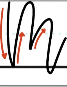
Let’s take our work hopeful again. For this word, you need to start at the left-side “tail” of the h, rather than at the bottom. When you come to the o, be sure to go down and around, not up and over. The p can be a little tricky because the middle portion makes a gentle sweep over to the e. Coming into the e, make sure you go around the eyelet first, before going down and curving over to the f. Gracefully descend down and over twice to make the u, and then finish off by going up and around the loop of the l, concluding with the lower tail.
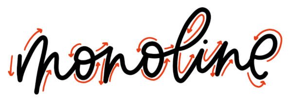
Lettering Diagram for the Word Hopeful

If you follow the arrows in order from left to right, your pen will move in the correct pattern to properly write out the word. As you practice more and more, the stroke patterns and line paths will become ingrained in your memory to the point where you’ll hardly need to think about your next step.
The Monoline Alphabet Letter-by-Letter
The best way to learn monoline is to practice using traceable worksheets, especially if those worksheets include help lines showing the direction of each stroke. For additional help with individual letters, refer to the letter-by-letter hand-lettering guide below.
Note, the very top line in the diagrams below is known as the capital height or cap height. The middle blue dotted line is the X-height or X-line. The thick lower line is called the baseline. And the very bottom line is the descender line.
Jump to a specific letter:

Uppercase Monoline A
The uppercase monoline A is written by starting in the bottom left corner. The first stroke angles forward and upward to the capital height, bowing slightly inward. Then drop back down and forward for the second stroke, making a point at the top and following a mirror angle from the first. The second stroke is completed by curving around as it dips beneath the baseline and crossing through each of the vertical lines, ending once again on the left side.

Lowercase Monoline a
Begin on the right side, almost to the X-height. The first stroke goes up and around counterclockwise, circling all the way around to create an offset oval. Finish the stroke at the X-height, even with the top of the oval. The second stroke then drops nearly straight down, dipping below the baseline and ending with a small, curled tail.

Uppercase Monoline B
The uppercase monoline B starts at the top left of the letter. The first stroke goes down to the baseline, bowing slightly to the left. Stroke two reverses direction, following a similar bow but deviating to the right. After pausing slightly at the capital height, the first bump of the B wraps downward and pivots into the second bump halfway down. The lower bump should be slightly more plumb than the upper and dips below the baseline. Conclude with a broad flourish undergirding the letter and ending with a tail to the right.

Lowercase Monoline b
Begin at the top. The first stroke should bow slightly to the left and end on the baseline. Then, pivot back up, making a pointed bottom. The oval of the bump should be offset to the right and should follow a clockwise path. Finish with a tighter flourish at the bottom of the letter and a tail trailing to the right.

Uppercase Monoline C
Begin at the top and work counterclockwise, finishing about halfway to the X-line. Your uppercase C should look like a tall, simple oval with three-fifths of the center portion missing.

Lowercase Monoline c
The lowercase c also begins at the top, wrapping around counterclockwise. At the bottom, once you’ve hit the baseline, straighten out the stroke more to the right, favoring the connection to the next letter.

Uppercase Monoline D
Begin at the top left and drop the first stroke down almost vertical, but curving more to the right as you reach the baseline. Immediately change directions, bringing the second stroke up with a more pronounced curvature to the right. At the top, swing the stroke around, creating a graceful curve that dips all the way down below the baseline. Finish off the letter with a large flourish, undergirding the D and trailing off to the right.

Lowercase Monoline d
Start with the d’s tail on the far left. Place your pen just below the X-line, and move horizontally, curving in a drawn-out s-pattern to the right. Bring the stroke up and around the top loop, reaching the cap height and quickly descending in a graceful arc. End the stroke by dipping below the baseline and curving back up again. Next, draw the d’s oval. Begin at the top right side of the oval and wrap counterclockwise, ending at the starting point.

Uppercase Monoline E
Begin two-thirds of the way between the X-height and cap height. Wrap counterclockwise, emphasizing the top curve to the upper left. At the X-height, reverse direction to make a point and curve the lower portion with an emphasis to the bottom left. Bring the stroke back up at a near-45-degree angle, ending just below the X-height once more.
Lowercase Monoline e
To make the lowercase monoline e, start slightly higher than halfway between the baseline and the X-line. Wrap counterclockwise to create the eye of the e, and arcing all the way to the baseline. In the same stroke, curve back upward to and with a tail angled around 45 degrees.
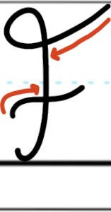
Uppercase Monoline F
Start at the top right. Make the F’s hat by pitching slightly down and to the left, then looping around clockwise to create an eye. Descend at a near-perfect vertical but veering to the left as you approach the baseline. Curl the tail slightly at the bottom. Cross the F with a gradual, horizontal S-stroke, beginning on the left and ending at the X-height.

Lowercase Monoline f
Lowercase f can be completed in a single, albeit lengthy, stroke. Begin on the left side, halfway between the baseline and X-line. Curve up and to the right, creating the cross of the f first. Loop around counterclockwise, grazing the capital height and then descending swiftly in a graceful arc that curves to the right. To make the pretzel at the bottom, twist the stroke around, continuing in a tight counterclockwise loop that dips below the baseline. Wrap the loop around, keeping the curves tight, and pass back up through the center. End with a trailing stroke on the right side.

Uppercase Monoline G
To write the uppercase G, begin at the top, wrapping counterclockwise. Round the stroke at the baseline and come back up to the X-height, making a tall, open oval. Finish the G with a second stroke back and to the left, dipping slightly.

Lowercase Monoline g
Lowercase g can also be completed in a single, long stroke. Start in the center, just below the X-height. Wrap counterclockwise to create the eye, touching the baseline and extending upward at a near-45-degree angle. Gently crest the X-line and then sweep back down in a generous arc, clockwise and dipping well below the baseline and descender line. Bring the back up slightly and around in a horizontal S-curve to undergird the g.

Uppercase Monoline H
Begin at the top left. Drop the stroke straight down to make the first leg of the monoline H, curving clockwise as you dip below the baseline. Wrap back up and to the right, making a wide, generous S-curve that reach all the way back up to the capital height. Bring the same stroke back down, wrapping counterclockwise and then straightening out to pass through your S-curve, making the second leg of the H. Allow the stroke to dive below the baseline, almost to the descender line, and finish with a small tail, hopping upward and to the right.

Lowercase Monoline h
To make the lowercase h, start on the far-left tail, about halfway between the baseline and the X-line. Ascend up and to the right in a gentle S-curve, grazing the cap height at the top. Curve around counterclockwise and drop swiftly back down, stopping at the baseline. The second stroke then hops back up and slightly to the right, only to curve down once more before reaching the X-height. Drop below the baseline, almost touching the descender line, and curve again upward, concluding with a tail off to the right.

Uppercase Monoline I
Start on the left side, at the X-height. Use the first stroke to draw the tab, moving to the left but with a pronounced dip. For the second stroke, drop down and to the right, leveling out the curve as you reach the baseline, only to course back upward to create the large vertical loop. Graze the capital height, and drop quickly back down, diving just below the descender line. In the same stroke, curl around at the bottom to finish with a sharp upward tail on the right.

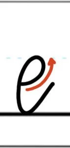
Lowercase Monoline i
Begin the lowercase i at the X-height. Stroke down and slightly to the left, curving rightward as you dip just below the baseline. Bring the tail back up and to the right. Finish by placing a dot above your starting stroke.

Uppercase Monoline J
Begin at the capital height, coursing nearly straight down until you approach the baseline. Veer leftward, passing below the baseline and touching the descender line, then looping generously around clockwise. About one-third of the way to the X-line, level off and cross the J with a slender S-curve.
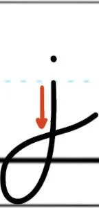
Lowercase Monoline j
To make a lowercase j, start at the X-height. Stroke downward, gradually curving to the left as you dip below the baseline and graze the descender line. Wrap back upward, clockwise, and pass through the vertical line to create a loop. S-curve slightly upward to finish with the tail. Punctuate the j with a dot above the starting stroke.

Uppercase Monoline K
The first stroke begins at the capital height and descends to the baseline, bowing slightly to the right. Make the second stroke by starting again at the cap height, to the right of the first stroke. Drop down and to the left, passing below the X-line and making a tight, clockwise curlicue that passes through the first stroke. Conclude with a slight S-curve on the bottom kickstand, hovering above the baseline.

Lowercase Monoline k
Like the uppercase K, the lowercase begins with a nearly vertical arc, starting at the capital height and stroking down to the baseline. For the second stroke, start at the X-height to the right of the first stroke. Curve down toward the first stroke, passing through it and making a clockwise curlicue. Finish with a slightly S-shaped tail off to the right.

Uppercase Monoline L
Start on the far-left side. Place your pen a hair above the X-height, and move swiftly to the right, making a slight S-curve as you begin. Loop upward, counterclockwise, and crest the capital height. In the same stroke, descend swiftly toward the baseline, curving slightly to the left. Loop the baseline in a clockwise path, and end with an S-curve laid gently along the baseline.

Lowercase Monoline l
The lowercase l begins on the left side, halfway between the baseline and the X-height. Sweep up and to the right, making a slender S-curve as you ascend. Wrap around counterclockwise, brushing the cap height and descending again to create the large upper loop. Dip the vertical stroke just below the baseline, and curve back up again with a straight tail off to the right.
Uppercase Monoline M
Uppercase monoline M starts at the top left. Make an initial stroke from the capital height down to the baseline, curving slightly to the right at the bottom. Immediately course upward again, making a point at the bottom. Make the first arch of the M graze the cap height and drop halfway below the X-height. Allow the second arch to rise a third of the way above the X-height and descend just below the baseline. In the same stroke, conclude with a trailing tail off to the right.

Lowercase Monoline m
Start the lowercase m at the X-height, making a small arc down to the baseline for the initial stroke. Next, make the first arch of the m, curving back up to the X-line and down again about a third of the way up from the baseline. The second arch should ascend above the X-height and dip down below the baseline. Finish with a trailing tail off to the right. Note the point at the bottom where the two arches meet but a curve where the second arch drops below the baseline.


Uppercase Monoline N
Start with an initial, slightly arced stroke from capital height to baseline. Then, pivot upward, cresting the cap height and curving back down to create the arch. The descending stroke should angle slightly inward and should dip just below the baseline. In the same stroke, curve back upward to finish with a tail on the right.

Lowercase Monoline n
To draw the lowercase n, make your initial stroke from the X-line to baseline, bowing the line slight to the left. For the second stroke, ascend quickly back up to the X-line, grazing it, only to curve back down and dip below the baseline. Make a tight curve upward again, concluding with a tail toward the next letter.

Uppercase Monoline O
Begin at the top, at the capital height, and move counterclockwise. Touch the baseline, and curve back upward to finish where you started. Your uppercase O should be a tall, uniform oval.

Lowercase Monoline o
For the lowercase o, begin on the left side, close to the center, just below the X-height. Curve down and around counterclockwise, touching the baseline and bring the stroke all the way back up above the X-height. The oval should be slightly offset. Finish by curling the same stroke in on itself, passing through both sides of the oval.

Uppercase Monoline P
Start with vertical stroke, beginning at the capital height and dropping in a swift arc to the baseline. Come up again off the baseline, veering to the right and curving increasingly to the right as you approach the cap height once more, so that you only brush it. Curve back down and around, keeping a clockwise motion. Dip well below the X-line, and pass through the vertical lines. Make a tight loop back again to the right, undergirding the top loop and ending with a tail hovering just below the X-line.

Lowercase Monoline p
Start the lowercase p at the X-height, bringing a subtle arc down to the descender line. Pop back up again, veering more rightward, and loop around clockwise in a large, offset oval that grazes the X-line. As you pass through the vertical lines, dip below the vertical lines, and wrap around once more, continuing clockwise. Conclude with a narrow S-stroke and tail that hover well above the baseline.
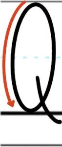
Uppercase Monoline Q
Like the capital O, begin at the top and gently curve down and around counterclockwise, grazing the baseline and returning again to the top to make an even oval. To make the tail of the Q, start a second stroke halfway between the baseline and X-line, slightly off-center of the oval. Graceful carve down and to the right, ending just below the baseline.

Lowercase Monoline q
The lowercase q is made up of two strokes. First, make the eye of the q, starting at the top, just below the X-height and curving around counterclockwise. Straighten out the oval slightly after cresting the baseline and finish the first stroke even with the X-height. For the second, drop swiftly downward, veering left, then right. Dive deep below the baseline and descender line, and curl the stoke around at the bottom, counterclockwise. Conclude with a horizontal, leftward S-stroke, with a small tail that curls up toward the eye.

Uppercase Monoline R
Place your pen at capital height and draw downward to the baseline in a slight left-leaning bow. Pause at the bottom, angling your second stroke aggressively back up to the cap height, veering right as you approach the top. Loop back downward clockwise, aiming for about a third of the way up from the baseline to the X-line. Pass through the first stroke, and make a tight curl, continuing your clockwise trajectory. Finally, angle a narrow S-stroke down at about 45 degrees, ending below the baseline with a subtly curled tail.

Lowercase Monoline r
To make the lowercase r, begin at the bottom left. Arc upward and to the right, bending the line nearly backward on itself as you break through the X-height. Tightly loop around, counterclockwise, and end your first stroke, dipping slightly below the X-height line. Next, drop immediately downward, curving softly back and dipping below the baseline. Finish by curving upward once more with a tail off to the right.

Uppercase Monoline S
Start at the top of the letter. Carve backward, counterclockwise, and curl around without touching the capital height. S-curve down and begin to shift to clockwise as you approach the baseline. Make a medium-size loop at the bottom, curving back up to pass through the S-curve. Finish with the tail touching the X-line.

Lowercase Monoline s
To draw a lowercase monoline s, start just beneath the X-height. Curl around counterclockwise, and make an S-curve as you descend toward the baseline. Crest the baseline and bring your stroke back up in a clockwise direction, passing through the S-curve and making a tight loop at the bottom. Finish the tail about two-thirds of the way up to the X-line.


Uppercase Monoline T
Begin with the vertical stroke. Drop straight down to the baseline, curving sharply as you reach the bottom. Bring the stroke back up to make a tail that ends slightly below the X-line. Conclude by crossing the top of the T with a slender, horizontal S-curve.

Lowercase Monoline t
Like the monoline capital T, start at the top and make a vertical stroke, slightly arced and curving sharply as you reach the baseline. Bring the same stroke back up and to the right, allowing the tail to connect to the next letter. Finish with a slender S-curve to cross the t about a third of the way between the X-line and the cap height.

Uppercase Monoline U
Start at the top left. Drop quickly down, barely arcing the first stroke and curving tight as you near the baseline. Sweep the stroke back upward and to the right, pausing at the capital height once more. Drop down again, following a similar trajectory as the first stroke. As you round the baseline touchpoint, finish with a short, curled tail.

Lowercase Monoline u
The lowercase u is very similar to the uppercase, only that falls within the boundaries of the X-height. Start even with the X-line and drop down, making a tight curve at the baseline. Bring the same stroke back up to the X-height, angling the path more rightward. Pause at the X-height and drop again down to the baseline. Make another tight curve, and finish with a short tail.

Uppercase Monoline V
Making a capital V in monoline is quite simple. Begin at the top left. Draw a fairly straight line down to the baseline, angling the stroke to the right. Change directions at the baseline, bringing a second stroke up, angled to the right again and bowing slightly more than the first. Break through the capital height to finish with a tight clockwise curl at the top.

Lowercase Monoline v
Again, similar to its uppercase counterpart, the lowercase monoline v starts with an initial, angled stroke down and to the right. Be sure to start at the X-line and trace all the way to the baseline. Pivot your second stroke back upward and to the right, rising above the X-height to conclude with a tight, clockwise curl at the top.

Uppercase Monoline W
Start at the top left, descending swiftly toward the baseline. As you approach, veer sharply to the right, grazing the baseline only to rise once more with an angled line to the X-height. Pause and drop again, this time letting the stroke fall beneath the baseline. Make another sharp turn, and bring your line all the way back up to the capital height.

Lowercase Monoline w
To write a lowercase w, start at the X-line on the left side. Draw nearly straight down, but curve sharply as you reach the baseline. Angle the upward stroke more pronounced to the right, and pause below the X-height. Drop again, letting the second stroke dive below the baseline. Turn sharply back up once more, and pause at the X-height. Finish the letter with a curt tab-like tail jutting to the right with a subtle dip.

Uppercase Monoline X
Begin at the top left, a third of the way down from the capital height to the X-height. Course upward, wrapping the stroke around as it grazes the cap height. Descend immediately, angle to the right and curling off only as you reach the baseline. Finish with a second stroke, starting at the top right. Draw a straight line backward and down, passing through the first stroke at the middle to crisscross the X.

Lowercase Monoline x
The first stroke for lowercase x starts at the top left, just below the X-line. Arc up and to the right, touching the X-line, and then descending at a steep angle, rounding out in a tight curve at the baseline. Make a second stroke, starting at the top right, even with the X-height, angling back down and to the left, ending on the baseline.

Uppercase Monoline Y
Start the uppercase monoline Y at the top left corner. The entire letter can be completed in a single stroke. Dip down aggressively on the descent, passing below the X-height and then curving back upward more gradually to tickle the capital height. Make a fairly tight turn back down again, sweeping out to the right as you plummet below the baseline. Wrap around clockwise to make a loop that undergirds the letter, surfacing above the baseline and concluding with a slender, S-curved tail that passes through the vertical arc.
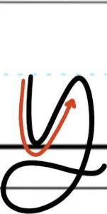
Lowercase Monoline y
The lowercase y can also be completed in a single, lengthy stroke. Start at the X-height, dropping quickly to the baseline. Graze it and curve back up at a more gradual angle, headed for the X-height again. Make another tight curve and dive back down in a gentle arc that dips below the descender line. Loop back up and around clockwise to undergird the letter. Finish with a narrow S-curve that passes through the vertical arc.

Uppercase Monoline Z
Start on the top left side, just above the halfway point between the X-height and the capital height. Make a slanting line to the right, arcing softly and pausing at the cap height line. Zag downward and to the left, touching the baseline at a point even with your starting point. The downward zag should only bow ever so slightly to the right. Conclude with a third stroke that hovers above the baseline in a very slender S-curve.

Lowercase Monoline z
To make the lowercase z, begin halfway between the baseline and the X-line. Make an offset arch that leans rightward, touches the X-height and drops down to the baseline. Pause and make another, lower arch to the right, wrapping down and diving well below the baseline and even the descender line. Continue clockwise, undergirding the arches and passing through the vertical arc in an S-shape, creating a loop with a tail trailing to the right.

Tips for Mastering Monoline Lettering
Now that you know the basics steps to lettering monoline, let’s talk tips and tricks. The list of tips below will help you develop your skills faster as a monoline hand-lettering artist.
Take your time
When you sit down to letter, treat it like art. You’re not there to jot down a quick note or scribble out a grocery list. You’re there to create an art piece. Draw one letter at a time, one stroke at a time. Feel each stroke individually, leaning into the curves and subtle flourishes. Let your hand dance across the page. Don’t rush it!Keep your pen on the paper
As you complete each stroke or letter, you may instinctively want to lift your pen off the paper, whether out of habit or simply to check your work. Resist the urge. There are times in the monoline calligraphy alphabet and in various lettering combinations when you’ll need to lift your pen (dotting an i, crossing a t), but the idea behind this font is to make it appear as one continuous stroke. Instead of lifting off the page, take short pauses between strokes, keeping your pen on the paper but only long enough to get your bearings and launch into the next stroke.Avoid over-flourishing
Flourishes are the curling lines at the end of a stroke to embellish your lettering. There’s a place for flourishes, even in monoline. But, when you’re just learning, try to avoid placing a flourish on every letter or even every word. Focus on getting the basics right and developing solid technique. There will be plenty of time later on to experiment with flourishes.Do your drills
Letter drills are just for beginners, right? Wrong! Not only are drills a great way to warm up, but they also help you perfect the basic strokes that make up every single monoline or modern calligraphy letter. Instead of putting them off until tomorrow, get excited about drills! Make them a regular part of your lettering warm-up every day and watch how they take your work to the next level.Know your alphabet
Hand-lettering fonts aren’t the same as the cursive we learned in school. Monoline is no exception. It’s more stylized and unique. For that reason, you need to study the alphabet. The monoline capital A is more like a printed A than a cursive one. The same is true of lowercase b. Capital D really doesn’t fall into either camp, and the same is true for J, P and S. The point is, study the nuances of the letters and letter combinations, one of the best ways of doing this is with practice worksheets.
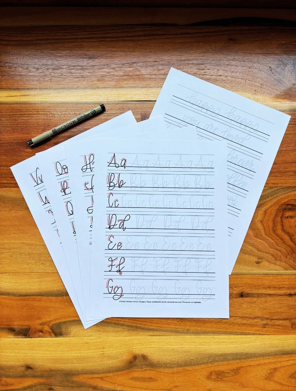
Ready to get started? Download the Monoline Lettering Worksheet bundle!
If you want to get serious about hand-lettering, this worksheet is for you! The Monoline Lettering Worksheets PDF by Heinen Designs helps you learn a clean, simple hand-lettering font. It guides you through the strokes of each letter and provides plenty of space to practice. Print the pages out to letter on paper or drop the files into the app of your choice for a digital option.
This is a digital download only. You will not be receiving any physical item.
Also Check Out These Other Lettering Styles!
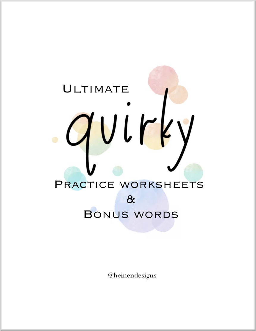
This Quirky alphabet is perfect for lettering artists seeking to branch out and try something outside their comfort zone. The font is fun and carefree! This digital PDF download includes the entire Quirky alphabet on a practice sheet template, and it includes bonus practice words.
This is a digital download only. You will not receive any physical item.
This hand-lettering guide by Heinen Designs features a whimsical, tall skinny font, teaching you how to complete the strokes of each letter in the alphabet. The PDF can be printed out or kept as a digital file to practice the tall letters as much as you need.
This is a digital download only. You will not receive any physical item.

The Lowercase Lettering Worksheets PDF by Heinen Designs is a beginner’s guide to hand-lettering. It provides a step-by-step walkthrough of how to craft each letter in the beginner calligraphy alphabet. You can print off the pages or use them digitally on your tablet.
This is a digital download only. You will not be receiving any physical item.
Monoline Lettering FAQs
Is monoline the easiest hand-lettering style?
Monoline is considered one of the easiest hand-lettering styles to learn because it is fairly one-dimensional compared to other types of lettering. Because the line thickness doesn’t change, you don’t need to worry about varying strokes from thick to thin and you can focus simply on writing the letters.What does the word monoline mean?
Mono- means one or singular, and -line refers to the thickness of the stroke. Monoline, therefore, means one line thickness.What’s the difference between monoline and brush lettering?
Monoline lettering and brush lettering differ in their use of line thickness. In monoline, the line thickness does not change from stroke to stroke. In brush lettering, the general rule for line thickness is thinner upstrokes and thicker downstrokes.Do I need a special pen for monoline lettering?
You don’t need a special pen for monoline lettering. Many different writing instruments can be used to write monoline letters as long as the tip creates a uniform line. Ballpoint pens, marker pens, fountain pens and even pencils can all be used to create monoline letters. Crayons and chalk work too.What is a monoline pen?
A monoline pen is any pen that writes with a uniform line thickness; that is, the pen tip does not respond to pressure differences applied by the artist. The pen makes a consistent line, without any variation of thick-to-thin, regardless of the stroke.What is monoline lettering best for?
Monoline lettering is an extremely versatile hand-lettering font, partially because of its simplicity but also because of the multitude of styles within the monoline family. Monoline lettering is great for hand-lettering signs, digital work, sketching in a notebook, writing on windows, drawing on sidewalks, decorating glassware, designing T-shirts and much more.
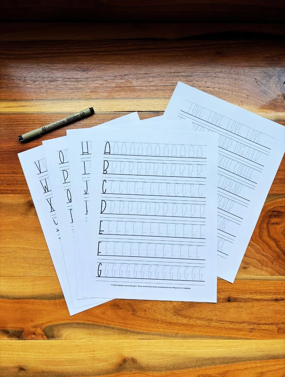
Start building strong monoline lettering skills through focused practice that improves control and precision. With repetition-based drills, this workbook helps you refine consistency and develop clean, even letterforms.
54-page printable PDF with instant download access
Drill-style practice designed to build real skill and muscle memory
Beginner-friendly resource that helps you learn the right way from the start
Step-by-step tutorial for mastering the monoline lettering technique
52 dedicated tracing pages covering every letter of the alphabet
Includes both uppercase and lowercase monoline lettering styles
Color-coded guide lines to reinforce proper stroke direction
Built-in guidelines for consistent letter proportions and spacing
Multiple rows of traceable letters plus open space for freehand practice