Secrets to Mastering Lowercase Calligraphy

Master lowercase calligraphy and you’ll master hand-lettering. Actually, this isn’t far from the truth. One of the first things you’ll discover when you start down the hand-lettering road is that lowercase calligraphy is at the heart of what it means to be a hand-lettering artist – yes, lowercase specifically. Not capital letters, not fancy flourishes – we’re talking about ordinary, thick-to-thin brush lettering.
In this guide, we’ll take you through the journey of what it means to master lowercase calligraphy and provide you with a FREE download to practice your skills! We’ll cover…
Ready to Start Lettering Right Now?

Start building real brush-lettering skills with focused, repetition-based practice designed to help your strokes stick. This workbook gives you the extra reps you need to reinforce technique, build consistency, and turn practice into progress.
57-page printable PDF with instant download access
Drill-style practice designed to build real skills and muscle memory
Beginner-friendly resource that helps you learn the right way from the start
Step-by-step tutorial for mastering the thick-to-thin brush lettering technique
Foundational basic strokes practice to set you up for success
52 dedicated tracing pages covering every letter of the alphabet
Includes both uppercase and lowercase brush lettering styles
Color-coded guide lines to reinforce proper stroke direction
Built-in guidelines for consistent letter proportions and spacing
Multiple rows of traceable letters plus open space for freehand practice

What Is Lowercase Calligraphy?
Whether you’re new to hand-lettering or already an adept, we need to start with a proper definition. If you hear, “Apples are great,” you might think Apple devices like computers and phones, or you might think apples like Gala and Granny Smith. When you hear “calligraphy,” you might think ancient Japanese culture or something else.
Lowercase calligraphy is a type of hand-lettering font, usually written with thick-to-thin strokes and comprised of the smaller letters of the alphabet, as opposed to their uppercase or capital counterparts.
When we talk about lowercase, we’re talking about the little version of the alphabet -- little a, little b. little c and so on – not big A, big B, big C, etc.
When we talk about calligraphy, we’re talking about modern calligraphy, and even more specifically, modern calligraphy in the brush lettering style. More on this in a bit.
Complete Lowercase Calligraphy Alphabet
The lowercase calligraphy alphabet can be recognized by its thick-to-thin brush strokes, bouncing curves and playful flourishes. There are, of course, many variations of this alphabet, depending on the artist’s style, preferences and pen choice. However, they all share a common secret: using the principle of thick-to-thin.

Lowercase vs. Uppercase Calligraphy
Lowercase calligraphy is different than uppercase calligraphy, not just in shapes and style but in usefulness. In general, the lowercase calligraphy alphabet is a melding of standard lowercase cursive and printed letters. The lowercase b is a printed b with both an ascending loop and descending loop. The lowercase e is not a simple loop but borrows the raised loop form from the printed version. The lowercase o is almost a match to the cursive o, but the s is nothing like the cursive s. You get the idea.
Likewise, uppercase calligraphy borrows elements from both standard uppercase cursive and printed capital letters. For example, the capital A in cursive looks a lot more like its lowercase counterpart, while the capital calligraphy A looks more similar to a printed A.
However, one of the biggest differences between lowercase and uppercase calligraphy is that lowercase letters connect much more naturally and consistently. Most lowercase letters have a “tail” that is designed to connect to the next letter. Many uppercase letters don’t have this tail.
In the word lowercase, for example, the bottom of the l curves around into a tail the flows into the o. The o loops around and flows into the w. The w flows into the e, which flows into the r, and so on.

On the other hand, in the word UPPERCASE, each letter is designed to stand on its own. The U could connect to the first P, which connects to the second P, which connects to the E, etc., but the connections feel unnatural at best.

Why Learn Lowercase?
But the biggest difference in terms of learning the two alphabets – lowercase versus uppercase – is that lowercase is used much more often than uppercase. This makes it far more essential for the lettering artist to master.
Just think about the way written language is structured. The first letter of the word may be capitalized, but the rest of the letters are not. Oftentimes in hand-lettering, the first letter isn’t even capitalized, unless it’s at the beginning of a sentence. This applies to English, Spanish, French and most of the romance languages.
As a rule of thumb, you should anticipate using your lowercase letters far more regularly as you create hand-lettered pieces. For that reason, it pays to know what you’re doing!
Do I Need to Learn Cursive First?
You don’t need to learn regular cursive in order to hand-letter the lowercase calligraphy alphabet. It might help to be familiar with it. However, it’s possible that knowing cursive too well in the beginning could hinder your lettering progress.
Why? Because you may rely too much on your cursive habits, restricting your openness to creativity.
Don’t worry. No matter where you’re at, you can learn to become a modern calligraphy expert with the right steps, practice and the secrets provided further on in this guide.
Modern Calligraphy vs. Traditional Calligraphy
It’s also worth noting that modern calligraphy is different than traditional calligraphy. In this guide, you won’t need a classic calligraphy pen and ink well. While this type of lettering is an intriguing art form, it’s not the same a modern calligraphy.
Traditional calligraphy is quite rigid in its form, following very specific guidelines in terms of typography lines, spacing, angles, serifs, flourishes, stroke patterns and sizing. Yes, there are different font styles within traditional calligraphy, but they still follow a more calculated approach.

Traditional Calligraphy Pen and Script
Modern calligraphy is more relaxed. There are still rules to follow, but they are frequently bent and modified in pursuit of playful, artistic freedom.
A helpful way to think of it is right-brain versus left-brain. Traditional calligraphy is more right-brained – mathematic, geometric, logical. Modern calligraphy is more left-brained – artistic, creative, emotional.
Both fall under the category of art, but the approaches are different.
Examples of Modern Lowercase Calligraphy


The First Secret to Lowercase Calligraphy: Thick-to-Thin
Let’s get into the secrets of lowercase calligraphy and how you as a lettering artist can start to create those gorgeous letters for yourself. The idea is actually very simple. Anyone can understand it and even apply it immediately. However, perfecting the technique so that your letters are consistent and flow naturally from your hand takes more time.
The first secret is this: thick-to-thin strokes.
What does this mean? Thick-to-thin is the hand-lettering principle of shaping lines based on their orientation. Thick-to-thin means the downstrokes are thick lines, and the upstrokes are thin lines. Every letter has downstrokes and upstrokes, and when the thick-to-thin principle is applied, it creates the calligraphy effect, resulting in elegantly artistic, stylized hand-lettering, or “brush lettering.”

You can actually create a similar effect with a chisel-tip marker. Perhaps you’ve tried it before. Place the marker on the paper so that the angle of the tip is flush with the surface. Keep that same orientation constant as you begin to write a word. As you do, you’ll notice the lines vary in thickness, depending on the direction your hand is moving.
This creates a similar effect but is actually quite different from modern calligraphy or brush lettering. In brush lettering, the variations in line thickness are created by you, the artist, and the amount of pressure you place on your brush pen.
How Thick & How Thin?
Once you begin to grow in your basic calligraphy skills, it’s fun to expand out and try all kinds of different styles and variations of the font. After all, the principle of thick-to-thin lines is just that, a principle. So, is there a limit to how thick or how thin the lines can be as long as they correspond to the downstrokes and the upstrokes respectively?
The answer is, not really. Sure, there could be a point when the downstroke becomes so thick that it absorbs the entire letter, but line thickness is by and large a subjective preference. That means it’s up to you! If you want to experiment with the relationship between ultra-fat and razor-thin lines, you can.
That said, when you’re first learning hand-lettering, it helps stick within a few boundaries until you have a firm grasp of the basics. That means selecting the right tools.
Tools Needed for Writing Lowercase Calligraphy
Unlike monoline lettering that can use almost any garden-variety pen out there, lowercase calligraphy (and every other brush lettering font) requires a certain type of pen to get the thick-to-thin principle just right.
Here are the recommended tools for writing lowercase calligraphy.
Tombow Fudenosuke Brush Pen
The Fudenosuke is one of the best pens for modern calligraphy. It is what’s called a brush pen, meaning that the tip is long but relatively thin and semi-flexible. It’s a little bit like a Sharpie tip, only narrower and pointier. The purpose of this tip is to bend when under pressure. If you apply a little pressure, the tip remains straight, and it creates a fine line. Press the tip more firmly into the page, and the tip will start to bend, creating a broader line. Thick to thin.Strathmore Sketch Spiral Paper Pad 5.5” x 8.5”
You can draw lowercase calligraphy letters on pretty much any paper, but every lettering artist should have a journal. This is a blank sketch pad with quality paper that serves as a dedicated lettering journal. The smaller size (5.5” x 8.5”) makes it more portable and easier to fit into a purse or backpack for lettering on the go.

Beginner’s Lowercase Calligraphy Exercise
With the proper tools in hand, let’s get into a quick exercise of lettering in lowercase calligraphy.
1. Start with a simple squiggle.
With your paper laid flat on the table and your brush pen in hand, make a wavy line across the page, applying slightly more pressure on the downstrokes and slightly less on the upstrokes. Remember, you’re going for thick-to-thin.
Your line should look something like this.

2. Let’s try a letter.
Once you get a feel for the pen tip and the balance of pressure it takes to create consistency, you’re ready to jump into a letter. Let’s do the letter a. Now, your letters won’t be this formulaic, but the equation below demonstrates how to form the lowercase a by its stroke paths and thick-to-thin pattern. A red arrow means a downstroke, and a blue arrow means an upstroke.

3. Draw the oval of the a.
Following the stroke path in the diagram above, we’ll start at the top blue arrow. This is an upstroke, so it should be thin. As you round the top of the oval, however, you’re moving into a downstroke. Apply more pressure as you bring the pen down. At the bottom of the oval, gently decrease the pressure as you round back up to complete the oval. Remember, upstroke equals thin. With the oval closed, you can lift your pen.
4. Draw the leg of the a.
Begin the second stroke at the top of the leg. We’re going right into a downstroke, so this will be a thicker line. Bring the stroke all the way to the bottom, keeping the pressure on, but carefully release it as you round the bottom curve and finish with the thin-stroked tail.
5. Repeat the letter.
Practice several more times on the same letter. This is an important part of growing in your lettering skills. It’s not just about getting the thick-to-thin stroke pattern down but knowing where to apply that principle in each letter. Repeated practice of the same letter will lock that pattern into your memory, allowing full words to flow naturally later on.

6. Let’s try a word.
Next, let’s write the word practice.
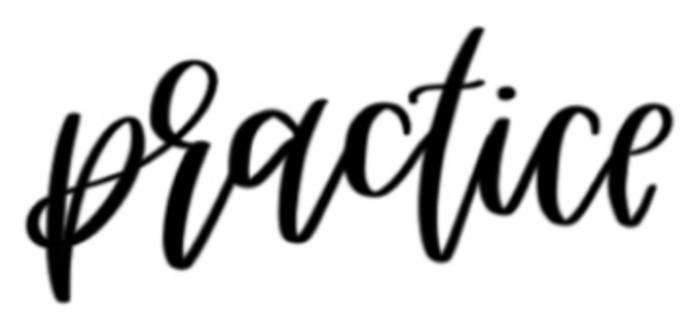
Keep the word up in front of you as you write it. It’s okay to go slowly and take pauses between strokes to make sure you’re following the right path. Start with the p, making a thick downstroke for the leg. Follow the pattern of arrows for each letter – thick downstrokes for the red arrows and thin upstrokes for the blue arrows.
With the t crossed and the i dotted, step back and take a look at your work. How did you do? Maybe you’re pleasantly surprised with the results. Maybe you’re totally annoyed that it didn’t quite turn out.
Either way, just like the word says, you’re going to need practice if you want to truly hone your lettering skills to the point of mastery.

Free Lowercase Calligraphy Worksheet
To help you practice, here’s a downloadable, printable PDF of the lowercase calligraphy alphabet. Print it out as many times as you want or load it onto your tablet to try your hand at lowercase letters!

Download more free worksheets and purchase full calligraphy alphabets to truly hone your skills!
Secrets to Better Lowercase Calligraphy
Practice is one of the most important aspects to becoming a better lettering artist. However, as you’re practicing, there are also several tips and tricks that can help jumpstart your progress to the next level. Here are the secrets for better lowercase calligraphy letters.
1. Take Your Time
As a lettering artist, it’s important to pace yourself, not so much in how often you practice, but in the actual action of lettering – your strokes. Before your pen even touches the page, pause to envision where the word will be written, how the letters will be spaced out, how much padding it will need in relation to the edges or other words on the page.
When you start your first letter, think through what your hand will do – thick-to-thin, remember. Will your first stroke be a downstroke or upstroke? How will it curve as it progresses? Where will it end? As you make the first stroke, move in slow motion. Feel the pressure changes in your hand as you press the pen into the paper.
Before you turn into your next stroke, pause. You can even lift your pen off the page to formulate your next plan of action. Where will the second stroke lead? Will it start thick or thin? Reference your practice worksheets if needed to make sure you’re starting each stroke in the right place.
2. Treat It Like Art
Any time you come to the lettering table, you need to get into the artist mentality. Hand-lettering is art after all. You’re not just writing words. You’re not scribbling in a journal. You’re not taking notes during a lecture (although all of those things can involve hand-lettering). You’re creating an art piece.
If you stop and take time to get yourself into this mentality every time you begin a lettering session, your results will improve. Every stroke becomes more intentional. Every line and curve matters. When you treat it like art, you put more passion into your work. It forces you to slow down and invest in the piece, not just scrawl out a quick word in fancy script but to truly be purposeful with your efforts.
3. Relax & Breathe
Have you ever been sitting, working at your computer or on a hand-crafted project, and you suddenly realize your shoulders are pulled into a tight knot? Sharp focus on your work can cause you to forget your posture and can create tension in your muscles as you pour over your project. This happens to hand-lettering artists too.
When your muscles are tight and you’re taking short, shallow breaths, that stress finds its way into your pen. Instead of clean, fluid stokes, you make mistakes, your lines are shaky, and your results suffer.
Any time you sit down to letter and regularly throughout the session, make a conscious effort to check your posture. Drop your shoulders. Relax your elbows. Straighten your back. Take a deep breath – in through the nose, out through the mouth. This will encourage better muscle control, a steadier hand and more endurance during your lettering sessions.
4. Be Choosy with Your Tools
It’s always fun to test your lowercase calligraphy skills on unlikely mediums – the chalk on the sidewalk, the Sharpie on the coffee cup. As lettering artists, we can’t resist, right? But, when it comes to an official lettering session – that is, when you’re sitting down at your desk to get in some regular practice or create a piece – it’s important to use the right tools.
Be picky with your lettering instruments! It makes a world of difference for your work and for you as an artist. If you’re looking to jump in quickly, grabbing a Sharpie from the junk drawer and a piece of printer paper, you’re doing yourself a disservice.
The great thing about choosing quality tools is not only the quality they produce, but the confidence they instill. With the right pen in hand, it means something. You’re here to create something. This is no common pen because you’re no common writer. You’re a lettering artist.
5. Drill Your Basic Strokes
There are eight basic strokes that make up all lowercase calligraphy letters. No matter which letter or word you’re writing, they can all be boiled down to a combination of these eight rudimentary components. The eight basic strokes are:
Upstroke
Downstroke
Overturn
Underturn
Ascending loop
Descending loop
Compound curve
Oval
Because these are so foundational to hand-lettering, they should be practiced as regularly as your lettering alphabet. In the lettering community, this is what’s known as drills. The idea is to draw each stroke several times to the point that the stroke becomes locked into your muscle memory.
If you can train your hand to make these eight basic strokes flawlessly, you can carry this flawless technique into your letters.
6. Absorb Your Alphabet
Lowercase calligraphy is a unique alphabet. It has a distinctive style of its own, different from classic cursive, basic print handwriting and other lettering styles. For that reason, you can’t expect to become a lowercase calligraphy master without knowing the alphabet intimately.
Confident, graceful strokes will come from hours of familiarizing yourself with the lowercase alphabet, and this should be done in several different ways, from watching videos of other lettering artists and mimicking their work, to practicing with worksheets repeatedly and writing any and every word that inspires you.
Be intentional when you scroll your social media feed. Don’t just watch and mentally check out. Study the lines, curves, loops, pauses, hand position, writing instrument, paper, spacing – watch carefully so you can take what you learn and apply it to your own work.
7. Be Consistent with Each Letter
Consistency is extremely important for mastering calligraphy. Yes, it’s an art form, and that means it’s subject to your own subjective style, but only to an extent. There are boundaries, and one of those boundaries is consistency.
You want your lowercase a to look the same whether it’s at the beginning of the word, in the middle or at the end. This is especially true if the a appears in all three places, such as in the word banana. If one of the a’s is significantly bigger or taller than the others or doesn’t lean enough or has a completely different style, the final word will have an amateur feel.
8. Observe Key Lettering Combinations
Knowing your lowercase calligraphy letters is only half the battle. It’s vital to absorb the entire alphabet through focused practice, but you can’t leave it there because letters connect. They combine to form words, and in calligraphy, that means most letters are literally strung together with bridging strokes.
Lowercase calligraphy letters combine in all sorts of ways, such aa, ab, ac, bb, ba, th, qu, es, etc. At times the connecting stroke is simple, a simple underturn that touches the next letter perhaps. Other times, the combination is less obvious. This is when a good lettering combination guide comes in handy because it lays out virtually all of the possible letter combos, allowing you to practice them and reference back as needed.
9. Pay Attention to Your Typography Lines
Typography lines are the horizontal lines that define the spatial dimensions of a letter. There’s the capital height which is the top of the letter, the baseline which is the bottom, the descender which allows letters to dip below the baseline (like the descending loop of the lowercase p), and the X-height which defines the top of many lowercase letters and the middle of most uppercase. There’s also the ascender height above the capital height.

Why do these matter for hand-lettered calligraphy?
In modern calligraphy, these lines are a little more flexible or at least less definitive. The capital height may vary somewhat as the word bounces across the page. However, what you need to pay attention to is general consistency. A disjointed baseline is problematic, especially if the first half of the word follows one baseline, and the second half drops down to follow a different baseline.
The same is true for the X-height. If the tops of your lowercase letters vary slightly, it’s okay. They could even follow a curved X-height, as long as that curve maintains a consistent trajectory. What you don’t want is for one letter to stand noticeably taller than all the rest or a cluster of letters to drop down lower than the rest of the word.
Typography lines are especially susceptible to inconsistencies in a bouncing hand-lettering font like lowercase calligraphy. However, the best way to avoid this is to simply pause throughout your word. Take a moment after each letter to note the baseline height, and visualize your next letter accordingly.
To learn more, check out our complete guide to typography lines in calligraphy!
10. Make Your Weakest Points the Strongest
When something is lacking in your work – a recognizable weak point – the tendency is to ignore it. Most of us just want to get it over with, so we can move onto what we know is strong. But that’s not how you improve.
The same is true in hand-lettering. You can’t expect your skills to get better if you ignore the weak points. Instead, recognize your weak points and invest the time to make them your strongest points.
Take the lowercase letter s for example. Maybe you hate the way your lowercase s looks. Every time you letter it, you’re gritting your teeth, and when it’s finally over, the ugly s sticks out to you like a sore thumb.
Don’t keep ignoring it!
First, recognize the fact that you hate your lowercase s. It’s okay because it’s about to get better. Next, identify what you hate about it. Is it a specific stroke? The height? The way it combines with other letters? The overall style? Then, experiment with other s’s. Set yourself a challenge of finding 20 completely different ways of lettering s. Watch other artists and how they write their letter s. Don’t stop until you’re totally in love with your lowercase letter s, like you can’t wait to write it again, and it stands out in your words, not like a sore thumb but as a crown jewel.


The Lowercase Lettering Worksheets PDF by Heinen Designs is a beginner’s guide to hand-lettering. It provides a step-by-step walkthrough of how to craft each letter in the beginner calligraphy alphabet. You can print off the pages or use them digitally on your tablet.
This is a digital download only. You will not be receiving any physical item.