What is Hand-Lettering?

Jumping into the world of hand-lettering can be both exciting and overwhelming. There are countless artists, a range of skill levels and seemingly endless font styles.
Just browse Instagram #handlettering and you’ll see.
So, where do you begin? If you’re new to the lettering community, you’ll quickly realize there is more than one way to do it. Which way is the right way?
In this post, we’ll define hand-lettering: what it is and what it isn’t. We’ll look at the general principles that guide hand-lettering, and how they differ from those of traditional calligraphy, faux calligraphy and regular cursive writing.
A Definition of Hand-Lettering
Hand-lettering is the art of writing words by hand in a stylized font. That font may vary with flowing, curvy letters or tall, thin strokes, all lowercase, all capitals or a combination of both.
Hand-lettering is artistic in nature, taking ordinary words or phrases and arranging them in such a way that they become a piece of art. They can be colorful, using colored brush pens, or black and white, using a simple pencil.

As the name so clearly suggests, hand-lettering must be done by hand. Artistic fonts can be typed up on a computer screen or arranged in a digital graphics program, but real hand-lettering is created by the free-flowing strokes of the artist’s pen, pencil or even digital writing instrument, such as an Apple Pencil.
Hand-Lettering vs. Regular Cursive: It’s All about Thin-to-Thick
While hand-lettering encompasses a wide range of font styles, one common thread is the concept of making thin-to-thick strokes.
When you write in your normal handwriting, cursive or print, you write with a monoline stroke, meaning all of the lines that make up the letters have the same thickness.
In hand-lettering, most artists use a stylized font, drawing from traditional calligraphy (more on this in a second) to vary the line thickness from thin to thick. The general rule is: upstrokes are thin lines and downstrokes are thick lines.

Exceptions to this rule exist in fonts like monoline, Tall & Thin and others, but if you understand this basic principle – thin on the upstrokes and thick on the downstrokes – you have what it takes to become a hand-lettering artist!
What is Calligraphy?
Calligraphy – that is, proper calligraphy – can be thought of as a subset of hand-lettering. Traditionally, calligraphy is done using a special pen with a metal, diamond-shaped tip (called a fountain pen) and an inkwell or cartridge. Words are written in a highly stylized font, similar to classic cursive but following a thin-to-thick stroke pattern and typically embellishing the letters with elegant flourishes.

Traditional Calligraphy vs. Modern Hand-Lettering
Traditional calligraphy has its roots in ancient Asian cultures and can be recognized for its uniform albeit highly embellished look. Each letter may have a beautiful flourish, but the As will always look like the other As, the Bs like the other Bs and so on.
In modern hand-lettering, highly embellished fonts also exist, but the artist is not limited to just one font. Tall & Thin lettering is just as qualified as classic lowercase.
What about Modern Calligraphy?
Most lettering artists today, when they refer to calligraphy, mean modern calligraphy. Like traditional calligraphy, modern calligraphy is an art form that creates stylized letters and words on a page. However, modern calligraphy is much broader in scope. While traditional calligraphy requires the artist to use a fountain pen and ink, modern calligraphy employs the use of brush pens, markers or even pencils.
It’s like traditional calligraphy but without as many rules!
In that sense, modern calligraphy is much more like a synonym for hand-lettering because the choice of writing utensil and style of font can vary extensively. However, the common thread once again is thin-to-thick. In modern calligraphy, the font almost always follows the pattern of thin upstrokes and thick downstrokes.

What is Faux Calligraphy?
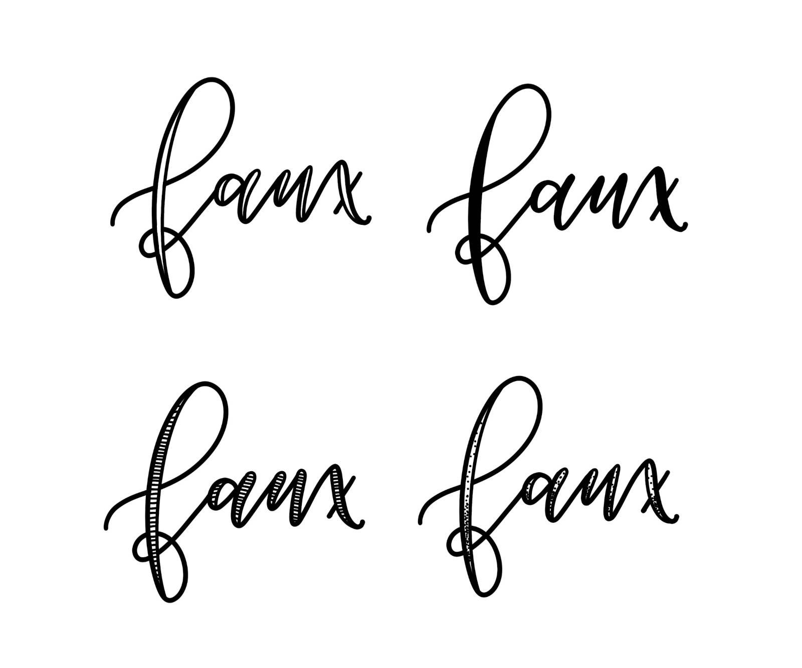
Faux calligraphy is another variation of modern calligraphy that creates the illusion of thin-to-thick strokes. It draws on the styles of traditional calligraphy but uses a different approach to get there.
To create faux calligraphy, the artists first writes the word with flowing, cursive-like letters, using a uniform line thickness (called monoline). Then, to create the effect of thin-to-thick, the artist then goes back through each letter, identifying the downstrokes. The downstrokes are given an extra stroke either by filling in using a monoline tip or thickening with a brush pen. They can also be left open for a unique alternative look.
Faux calligraphy = Monoline + extra downstrokes
It’s All Hand-Lettering!
Today, hand-lettering covers a wide variety of fonts and styles, everything from Tall & Thin capital letters to Stretchy cursive. Whatever font you choose to begin with or master next, it’s all hand-lettering when it’s created by you, by hand, with a passion.
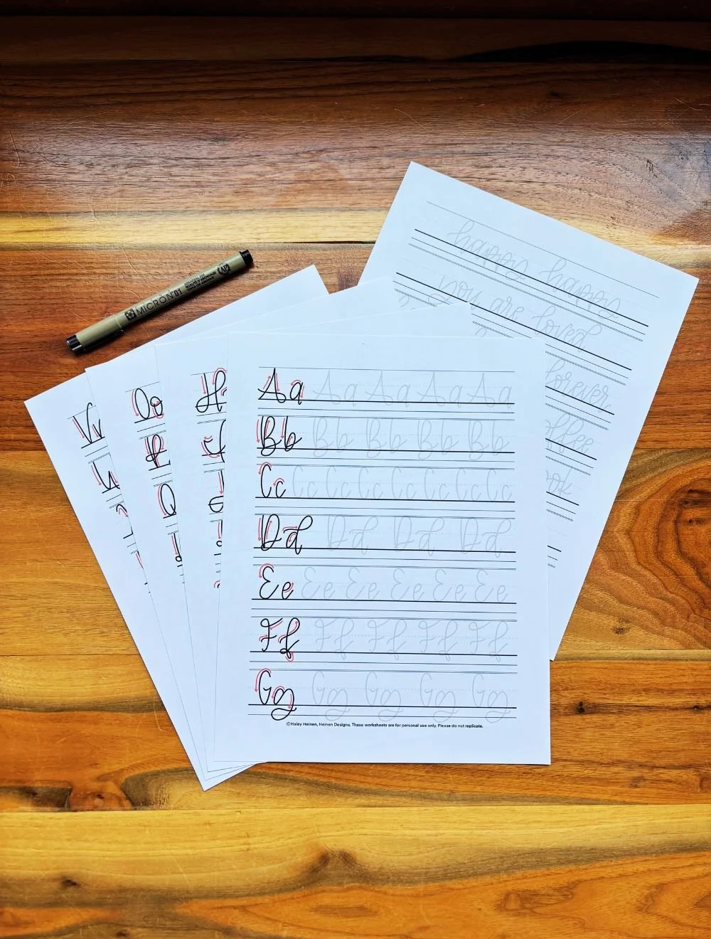
Ready to take that next step? Start with some free lettering worksheets or upgrade to full-alphabet practice sheets to develop your skills!

The Lowercase Lettering Worksheets PDF by Heinen Designs is a beginner’s guide to hand-lettering. It provides a step-by-step walkthrough of how to craft each letter in the beginner calligraphy alphabet. You can print off the pages or use them digitally on your tablet.
This is a digital download only. You will not be receiving any physical item.
If you want to get serious about hand-lettering, this worksheet is for you! The Monoline Lettering Worksheets PDF by Heinen Designs helps you learn a clean, simple hand-lettering font. It guides you through the strokes of each letter and provides plenty of space to practice. Print the pages out to letter on paper or drop the files into the app of your choice for a digital option.
This is a digital download only. You will not be receiving any physical item.
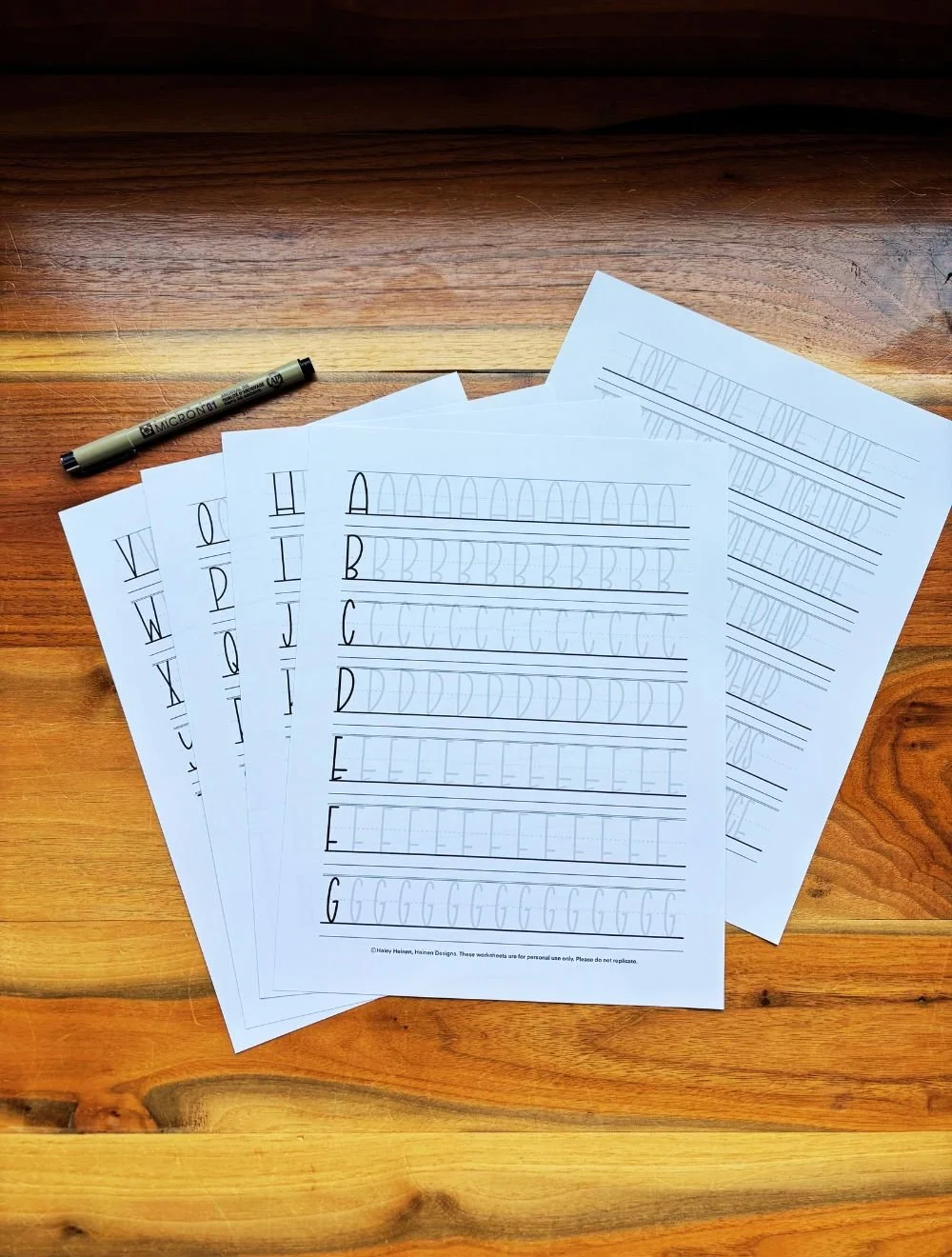
This hand-lettering guide by Heinen Designs features a whimsical, tall skinny font, teaching you how to complete the strokes of each letter in the alphabet. The PDF can be printed out or kept as a digital file to practice the tall letters as much as you need.
This is a digital download only. You will not receive any physical item.