The Key Aspects of Hand-Lettering: What Every Beginner Should Know
Hand-lettering is a beautiful blend of creativity, structure, and muscle memory. Whether it's a bold serif alphabet or a delicate script quote, strong lettering is built on more than just inspiration; it's rooted in understanding the fundamentals. And for beginners, grasping these key aspects early on can make the difference between frustration and progress.
In this guide, we’ll break down the essential building blocks of hand-lettering. Whether practicing with brush pens or creating digital designs, these elements form the foundation for clean, consistent, and expressive lettering.
Tap to jump to a topic:
1. The Principle of Calligraphy Letter Anatomy
At first glance, hand-lettering may seem like a freeform art, but it actually follows a predictable structure. Understanding the basic anatomy of letters helps create uniform, legible, and well-balanced work.
Key terms to know include:
Baseline – the line where most letters sit
X-height – the height of lowercase letters like “a,” “e,” and “x”
Ascender – the part of a letter that rises above the x-height (e.g., “h,” “l”)
Descender – the part that falls below the baseline (e.g., “g,” “y”)
Cap height – the height of uppercase letters
Using guides that reflect these lines ensures that every letter aligns and maintains proper proportions. Whether working on paper or in a digital app like Procreate, guides are a must-have for beginner practice.
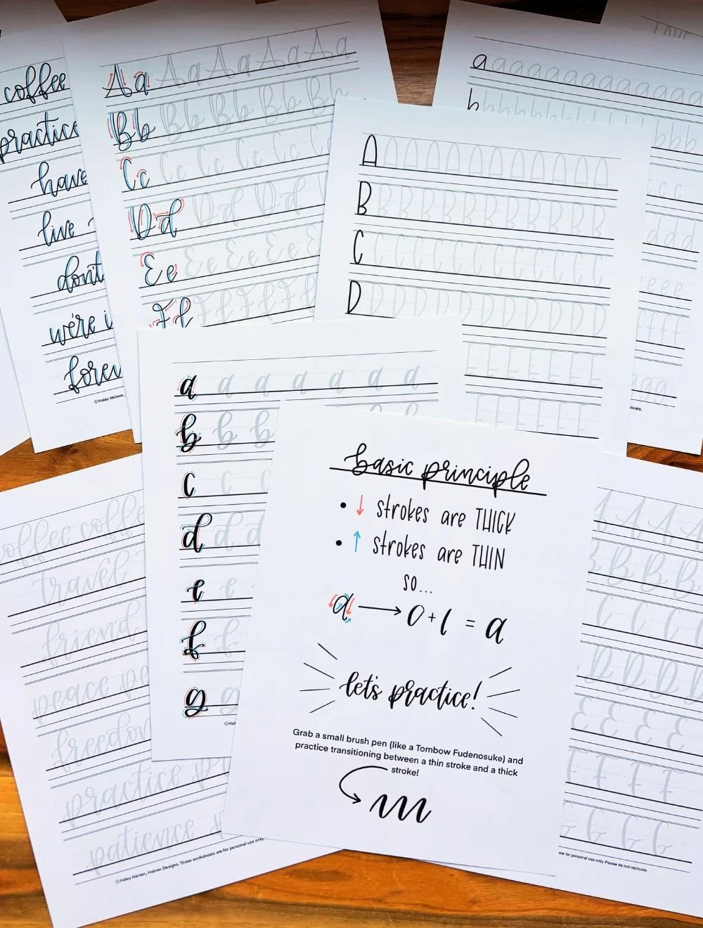
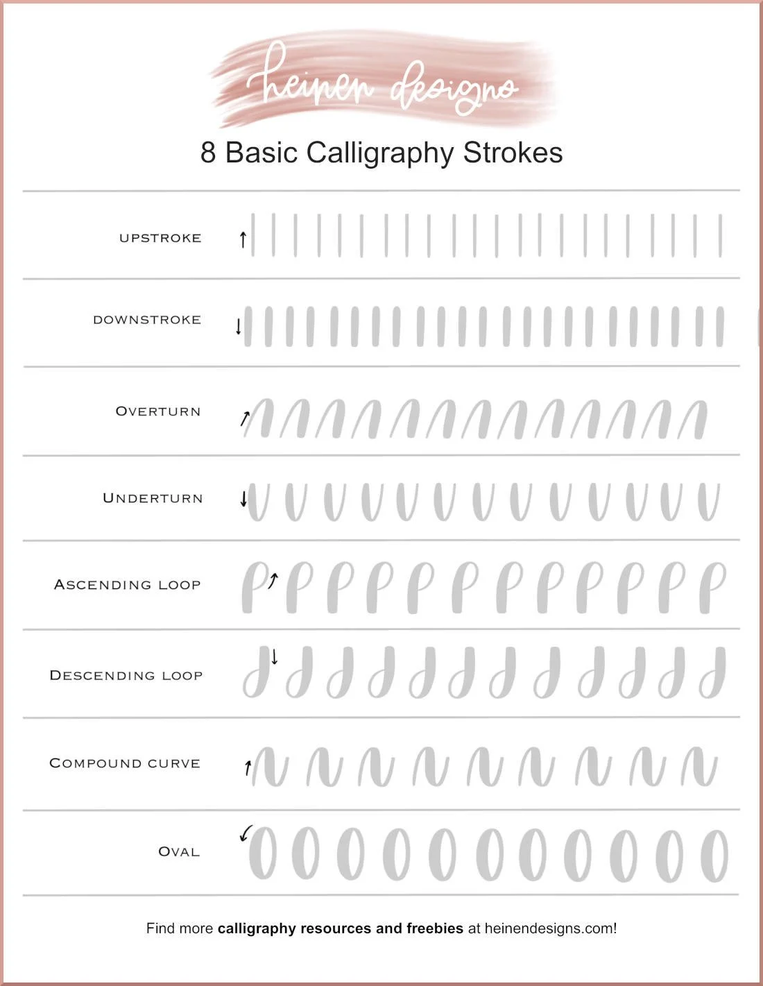
2. The Principle of Calligraphy Stroke Types
Before jumping into full alphabets, it’s helpful to understand the strokes that make up each letter. In modern brush lettering, there are eight basic strokes, including the upstroke, downstroke, overturn, underturn, compound curve, etc.
Upstrokes are typically thin and created with light pressure, while downstrokes are thicker and formed with heavier pressure. Curves, loops, and connections between letters also rely on precise control of these strokes.
Practicing strokes individually helps build hand control, especially when using brush pens or pressure-sensitive digital brushes.
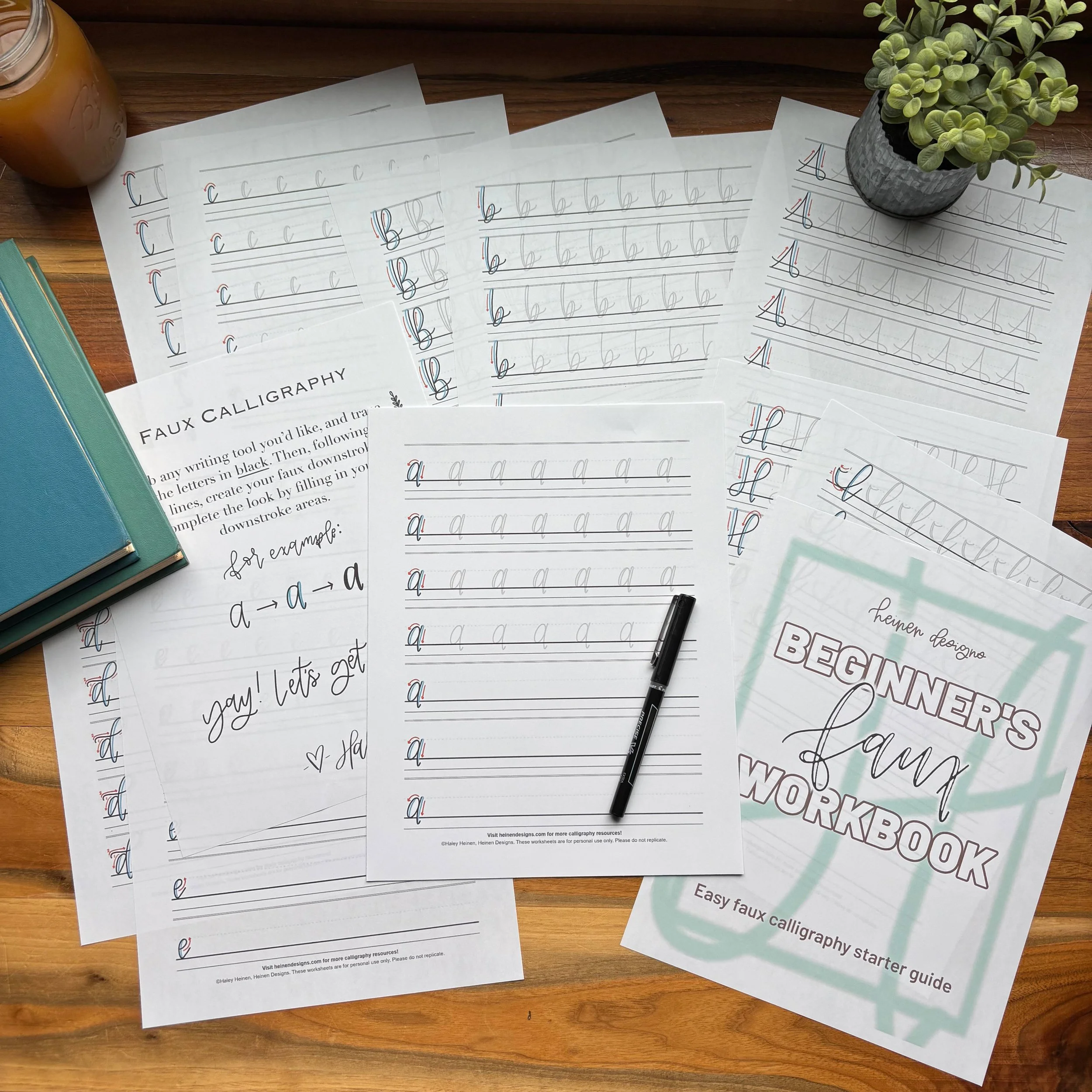
3. The Principle of Pen Pressure & Line Variation
One of the most distinctive features of hand-lettering is the contrast between thick and thin lines. This contrast is created through pen pressure. Light pressure produces thin upstrokes; firm pressure creates bold downstrokes.
Mastering pressure control not only improves visual appeal but also prolongs the life of brush pens. Beginners often press too hard too soon, leading to frayed tips and choppy transitions.
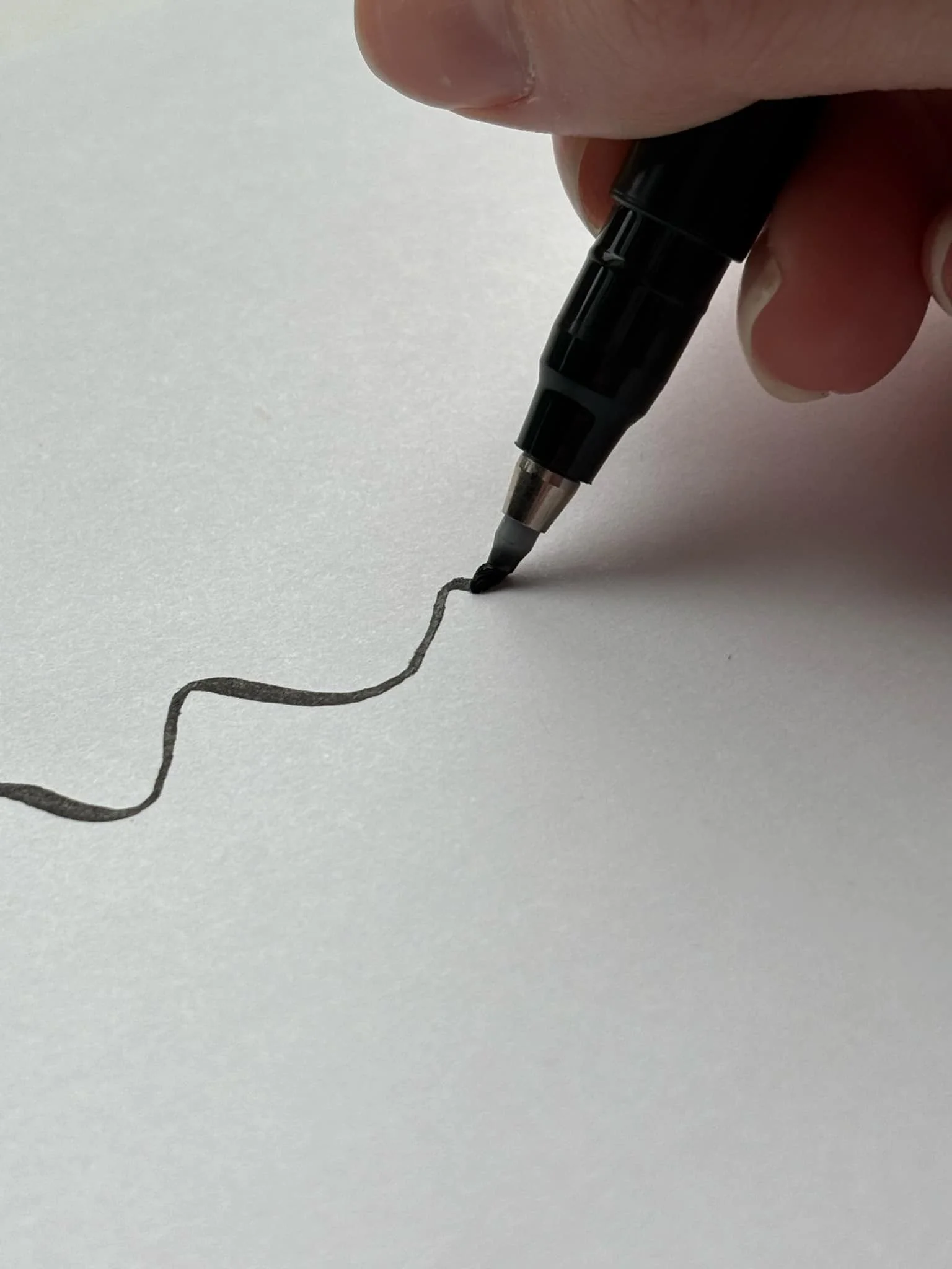
For better control, start slow and practice pressure drills. Tools like the Tombow Fudenosuke pen offer firm nibs that help with learning pressure sensitivity, while digital brushes can be customized for different pressure thresholds.
4. The Principle of Letter Spacing & Alignment
Even with perfect strokes, uneven spacing can make a finished piece feel unbalanced. Spacing refers to the distance between letters, while alignment ensures that letters sit uniformly on a line.
Consistent spacing creates better readability and a more professional look. Use practice sheets with grid lines or dot guides to help maintain equal letter widths and heights.
On digital platforms, grid overlays or guides within Procreate or Illustrator help create harmony across compositions. Don’t be afraid to zoom in and adjust letter spacing manually. It’s worth the extra effort.
5. The Principle of Calligraphy Rhythm & Flow
Rhythm refers to the visual pacing of strokes and how they repeat across a word. Flow describes the smooth, natural movement from one letter to the next.
Together, rhythm and flow bring life to lettering. Without them, even well-drawn letters can feel disjointed. Using a consistent slant, even spacing, and smooth transitions helps letters feel connected and dynamic.
One way to develop rhythm is by writing the same word multiple times, focusing on uniform motion. Pay attention to how the hand moves across the page and where natural breaks occur between strokes.
6. The Principle of Calligraphy Composition & Layout
Hand-lettering isn't just about single letters. It's about how letters, words, and phrases come together on the page. Good layout creates balance, visual interest, and clarity.
Key elements of composition include:
Hierarchy – making certain words or phrases stand out
Spacing – between lines, words, and letters
Balance – distributing visual weight evenly in a piece
Before finalizing a layout, try sketching small thumbnails. Plan out the design with light pencil marks or digital layers. Consider where flourishes, embellishments, or icons will go. A well-composed layout draws the eye and enhances the message.
7. The Principle of Calligraphy Style & Personality
One of the best parts of hand-lettering is its versatility. Different styles communicate different moods, from elegant and classic to bold and playful. Understanding the basics of style helps lettering feel more intentional and expressive.
Some common lettering styles include:
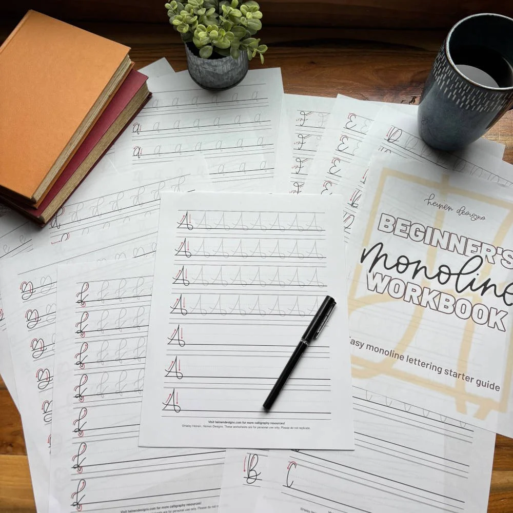
Brush lettering – flowing, connected letters
Monoline – even line weight throughout
Bounce lettering – playful, irregular baseline style
Serif – traditional letters with small extensions or “feet”
Sans serif – clean, modern block letters
Experimenting with different styles can help develop a unique visual voice. Style doesn’t have to be perfect. It just needs to feel cohesive and consistent within a piece.
Strong Lettering Starts with a Solid Foundation
While hand-lettering is an expressive art form, the most beautiful work is rooted in structure and practice. By understanding core elements like letter anatomy, stroke techniques, pen pressure, and layout, beginners build a toolkit for consistent improvement.
Focus on one or two of these areas at a time and come back to this guide as skills evolve. With practice, patience, and the right resources, any artist can develop confident, polished hand-lettering that reflects their unique style.