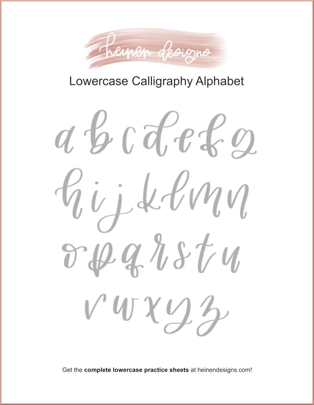
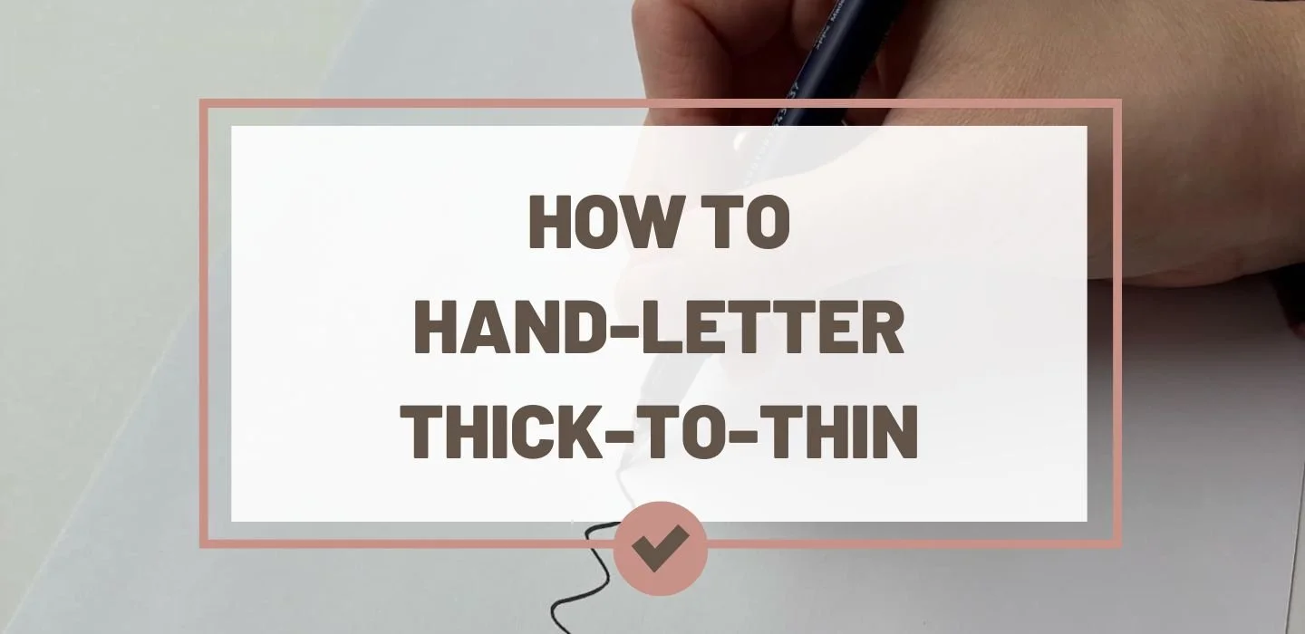
The Principle of Thick & Thin Strokes in Brush Lettering
If you’ve ever admired a beautifully lettered word and wondered how it looks so elegant and balanced, you’ve probably been admiring the thick-to-thin magic of brush lettering. This principle — thick downstrokes and thin upstrokes — is the heartbeat of modern calligraphy. Once you understand it, your letters will instantly look more polished, even if you’re just starting out.
In this guide, we’ll cover everything you need to know about thick-to-thin calligraphy strokes: what they mean, why they matter, how to create them, and how to practice until they become second nature.
Tap to jump to a topic:
Be sure to grab your FREE download too!
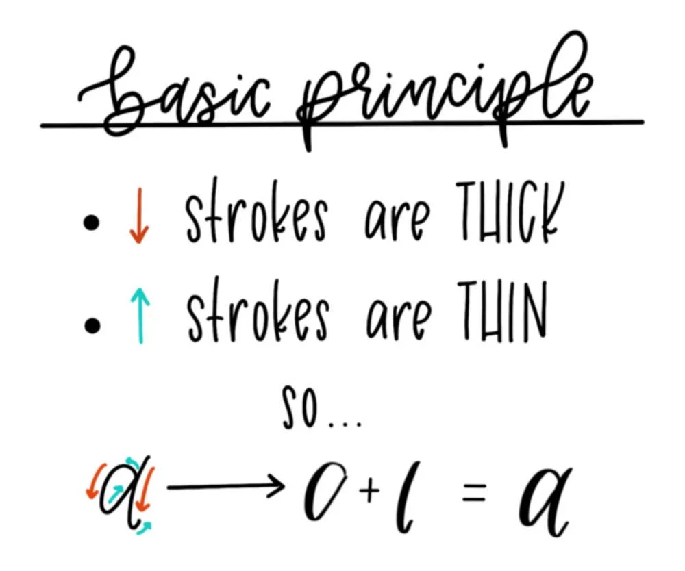
What Does “Thick-to-Thin” Mean in Brush Lettering?
In modern brush-lettered calligraphy, the “thick-to-thin” principle refers to the intentional contrast in stroke width that happens as you change the direction of your pen. Rather than having all your lines be the same thickness (as in monoline lettering), you vary them to create a flowing, dynamic look.
Here’s how it works:
Downstrokes — Any time your pen moves downward on the page, you add pressure to the brush tip. This spreads the bristles or flexible tip, creating a bold, thick line.
Upstrokes — When your pen moves upward, you ease off the pressure so that only the very tip touches the paper. This produces a delicate, thin line.
This simple pressure shift is the foundation of brush calligraphy. It’s what gives each letter a sense of rhythm and movement, almost like the letters are dancing across the page. Without this contrast, your lettering can look flat and lifeless, but with it, your words come alive with personality and elegance.
The “thick-to-thin” rule also connects brush lettering to traditional pointed-pen calligraphy, where the metal nib naturally creates line variation depending on the pressure applied. With a brush pen, you mimic that same visual effect, only with the flexibility of a felt or synthetic tip instead of ink and nibs.
When you master this technique, you’ll notice that your letters don’t just look better; they also feel more balanced when you write them. Your hand will start to anticipate the shifts in pressure, and your calligraphy will gain a smooth, consistent flow.
Why Thick-to-Thin Is So Important
The thick-to-thin contrast isn’t just a stylistic choice; it’s the heartbeat of brush lettering. Without it, your letters would lack the graceful flow and elegance that make hand-lettering so visually captivating.
First, it creates rhythm and movement. Thick downstrokes and thin upstrokes work together like musical beats, guiding the eye naturally from one letter to the next. This rhythm makes your lettering more pleasing to read and instantly recognizable as calligraphy rather than ordinary handwriting.
Second, it adds visual interest. The human brain is naturally drawn to patterns with contrast, and the shift from thick to thin provides that. Even a single word can become a piece of art when the strokes have a balanced, harmonious variation.
Third, it improves legibility. In calligraphy, the contrast between thick and thin helps define the shape of each letter. The bolder downstrokes anchor the letters, while the lighter upstrokes give them breathing room. This balance keeps your script from looking cramped or heavy.
Finally, it gives your work personality. The way you transition between thick and thin, how much pressure you use, and how dramatic your contrast is — all of these are part of your unique lettering style. Two artists could write the same word in brush calligraphy and produce entirely different results, simply because of their personal approach to the thick-to-thin principle.
In short, thick-to-thin isn’t just a “rule” of calligraphy; it’s the magic ingredient that transforms basic strokes into expressive, artful letters. Master it, and your lettering will instantly level up.
How to Create Thick-to-Thin Strokes with a Brush Pen
One of the defining skills in modern brush lettering is learning how to control the pressure on your pen so your strokes flow naturally from thick to thin. While it might feel awkward at first, this muscle memory becomes second nature with consistent practice and the right technique from the start.
1. Hold the Brush Pen at an Angle
Before you start, it’s important to check that.you’re holding your brush pen the right way. Instead of holding the pen straight up and down like a regular writing pen, tilt it slightly so the brush tip touches the paper at an angle. This allows the flexible nib (or bristles) to respond to pressure changes more smoothly.
A 45-degree angle is a good starting point for most calligraphy styles.
2. Apply Pressure on Downstrokes
When your pen moves downward on the page, press gently but firmly to bend the nib and create a thick line. The more pressure you apply, the bolder the stroke, but avoid pressing so hard that you fray the tip or lose control. Think of it as a steady, even push rather than a jab.
3. Lighten Pressure on Upstrokes
As your pen moves upward, release most of the pressure so that only the very tip of the pen touches the paper. This creates a thin, hairline stroke that balances the thickness of your downstrokes.
In calligraphy, this light touch is key to achieving elegance and contrast.
4. Practice the Transition Points
The magic in brush lettering happens in the transition between thick and thin.
Smooth transitions are created by gradually easing off pressure at the end of your downstrokes, maintaining a consistent and light touch through the upstrokes, and gently applying pressure again at the start of your next downstroke. Avoid abrupt changes, which can make your letters look choppy.
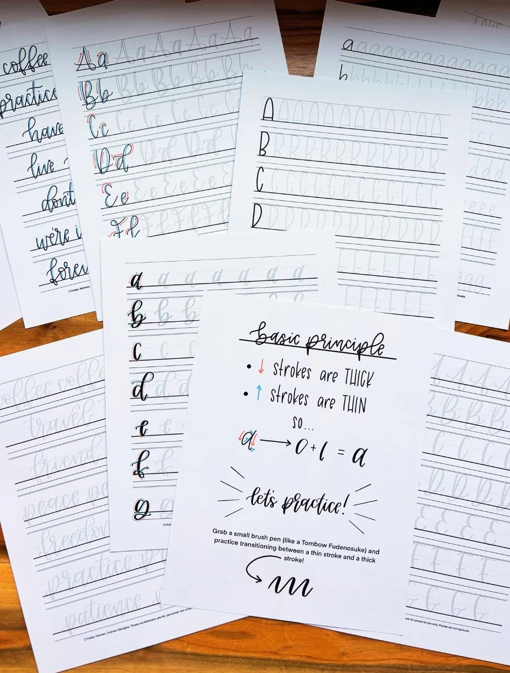
5. Use Practice Sheets to Build Muscle Memory
Structured drills — such as repeating “U” and “N” shapes or tracing sample alphabets — help your hand and brain work together to create consistent thick-to-thin contrasts. Many modern calligraphy practice sheets are designed specifically to teach pressure control.
6. Slow Down Your Movements
Speed can make your strokes uneven and your transitions sloppy. Especially in the beginning, go slower than feels natural. Smooth, deliberate movements will give you cleaner results and help you develop control over your brush pen.
With regular practice, these techniques will become second nature. Before long, you’ll be able to apply beautiful thick-to-thin contrasts to any word or phrase, whether it’s for a calligraphy project, a hand-lettered quote, or a client commission.
Common Mistakes Beginners Make with Thick-to-Thin
Even though the concept of “press down for thick, lift up for thin” sounds simple, a lot of beginners in brush lettering and modern calligraphy run into the same hurdles. Being aware of these common mistakes can help you avoid frustration and improve your technique faster.
Pressing Too Hard on Downstrokes
Some beginners press so firmly that the brush tip splays excessively or even frays. This not only damages your pen but also makes your strokes look clumsy. Remember, you only need enough pressure to widen the stroke, no more.
Forgetting to Lighten Up on Upstrokes
A lot of beginners create “medium” strokes instead of crisp, thin upstrokes because they never fully release the pressure. Without that contrast, your calligraphy loses its signature elegance. Think of it like barely touching the paper during an upstroke.
Inconsistent Pressure
Switching from thick to thin too abruptly or unevenly makes letters look shaky. This usually happens when you’re tense or rushing. Focus on smooth transitions, almost like slowly easing on and off a brake pedal.
Holding the Pen Vertically
If your brush pen is straight up and down, it’s much harder to control pressure changes. Keeping the pen at a slight angle allows the tip to flex naturally, which is crucial for achieving clean thick-to-thin contrast.
Writing Too Fast
Trying to write at regular handwriting speed often leads to wobbly, uneven strokes. Brush lettering should feel slower and more intentional until you’ve built enough muscle memory for speed.
Skipping Warm-Up Drills
Jumping straight into full words without warming up is like sprinting without stretching. You’re more likely to trip up. Simple practice drills like “U” shapes, “O” loops, and pressure lines can get your hand ready for smoother thick-to-thin strokes.
Ignoring Pen Quality
Cheap or dried-out brush pens don’t respond well to pressure changes. You don’t need the most expensive tools, but starting with a good-quality brush pen (and smooth paper) makes learning far easier.
Not Watching Stroke Direction
Downstrokes should always be where your pressure increases. Beginners sometimes reverse this or apply pressure at the wrong time, which creates inconsistent lettering.
Gripping the Pen Too Tightly
A stiff grip makes it harder for your hand to glide over the paper. Loosen your grip slightly so you can make smooth, flowing transitions between thick and thin.
Forgetting to Breathe and Relax
It sounds silly, but tense shoulders and holding your breath can cause shaky lines. Relax your posture, breathe normally, and let your movements flow.
Exercises to Master Thick & Thin Strokes
Mastering the principle of thick-to-thin in brush lettering and calligraphy takes deliberate, consistent practice. The goal is to train your hand to apply the right amount of pressure at the right time, until it becomes second nature.
Here are some targeted exercises that will help you build muscle memory, improve control, and gain confidence with every stroke.
Basic Pressure Lines
Draw a straight downward line, pressing firmly to create a thick stroke. Then draw a straight upward line, using the lightest possible touch for a thin stroke. Repeat this sequence — thick down, thin up — across the page. This simple drill builds the foundation for all calligraphy letterforms.
Pro tip: Listen for the quiet “whisper” sound your pen makes on upstrokes; if you hear a heavy scratch, you might be pressing too hard.
“U” & “N” Shape Drills
These shapes are perfect for practicing smooth transitions between thick and thin strokes. On the downstroke of the “U” or “N,” press for thickness; on the upstroke, lift for thinness. Try to make each curve fluid and consistent.
Why it works: Many lowercase letters (like “u,” “n,” “m,” and “y”) in modern calligraphy are built on these shapes, so mastering them pays off immediately.
Oval & Loop Drills
Draw continuous ovals, applying pressure on the side that moves downward and releasing pressure as the stroke curves upward. This teaches you to transition smoothly within a single shape, a key skill for letters like “o,” “a,” “d,” and “g.”
Variation: Practice small loops for flourishes, keeping the downstroke side thick and the upstroke side thin.
“Push & Pull” Strokes
Make alternating short strokes — one downward (thick) and one upward (thin) — in a row. This is less about making letters and more about training your hand to instantly switch between pressure levels.
Tip: Keep your wrist steady and let your fingers and arm control the movement.
Word Practice with Intentional Pressure
Once you’re comfortable with drills, start writing short words like “love,” “hope,” or “create.” Focus on where each downstroke and upstroke falls. This helps you translate isolated stroke skills into full calligraphy words.
Optional Challenge: Write the same word in different sizes. Scaling up or down forces you to adjust your pressure control.
Drill Sheets & Traceable Guides
Using printable practice sheets designed for brush calligraphy can speed up your progress dramatically. These guides show you exactly where to apply pressure changes and can help train muscle memory through repetition.
Bonus: If you use smooth, bleed-proof paper (like marker paper), your pens will last longer and your strokes will look cleaner.
Timed Transition Exercises
Set a timer for 5 minutes and focus on one drill—pressure lines, “U” shapes, or ovals. The repetition builds rhythm, which is essential for even, consistent thick-to-thin transitions.
If you commit to these exercises a few minutes a day, you’ll see dramatic improvements in the sharpness, elegance, and control of your brush lettering. Over time, the thick-to-thin stroke contrast will feel less like a conscious effort and more like second nature—a sign that your calligraphy skills are truly taking root.
Applying the Principle in Actual Lettering
Once you’ve practiced thick and thin strokes in isolation, the next challenge is integrating them seamlessly into your actual lettering and calligraphy work. This is where your practice turns into artistry—where deliberate pressure control transforms into natural, expressive writing.
Consistency — your thick strokes should be roughly the same width throughout a piece.
Style Variation — different lettering styles (modern, flourish-heavy, casual) use different degrees of contrast.
Spacing — thick-to-thin isn’t just about the strokes, but how they balance within the word.
Practice Makes the Principle Stick
The thick-to-thin principle is simple in theory but takes practice to master. The good news? You’ll see progress quickly if you dedicate just a few minutes a day to focused drills.
Start every lettering session with warm-ups, slow down your strokes, and use quality tools that set you up for success. Before long, you’ll find your thick-to-thin transitions happening naturally—and your lettering will look more polished than ever.
Want a head start? Grab our free brush lettering practice sheet designed specifically for mastering thick and thin strokes.