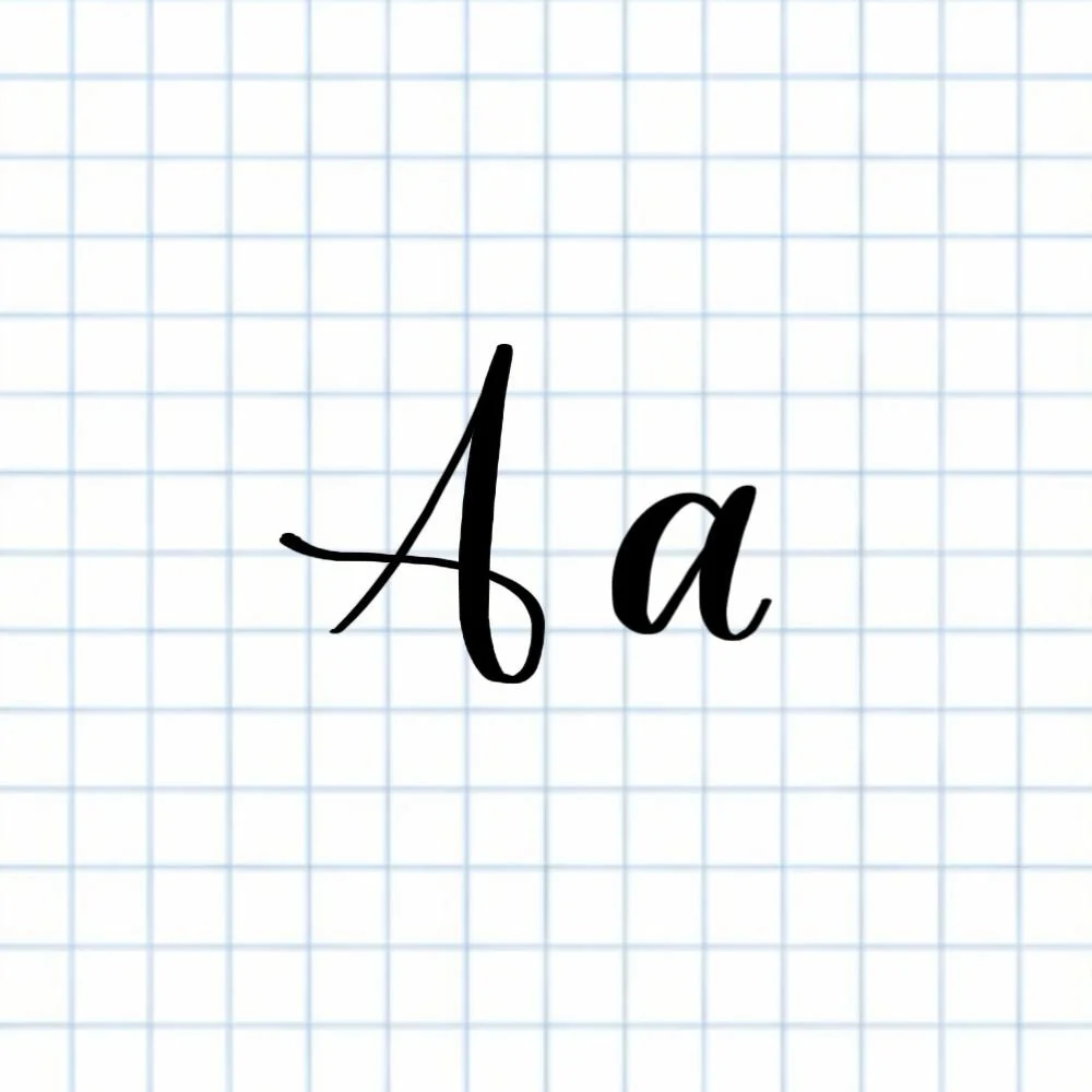
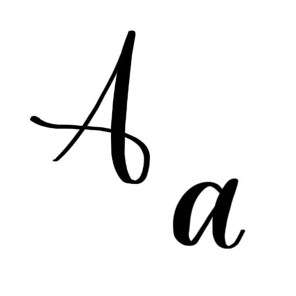
Calligraphy A: Uppercase, Lowercase, Strokes & Practice
A complete guide to calligraphy A, showing how to form it with brush lettering techniques

How to Write the Calligraphy Letter A
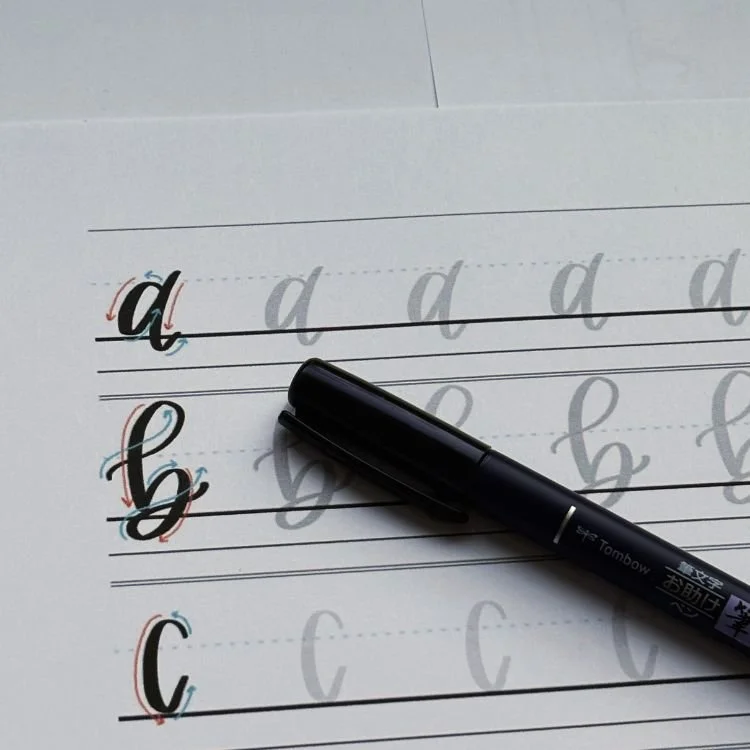
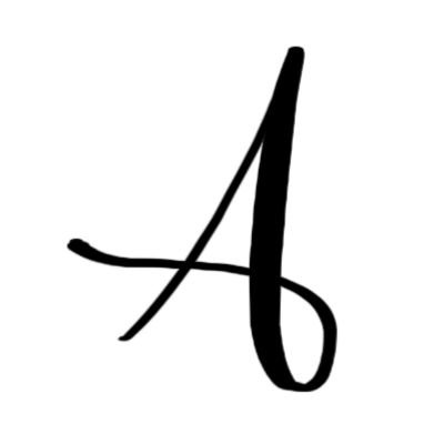
Uppercase A: Upstroke to the top, loop down counterclockwise, finish with a light flourish.

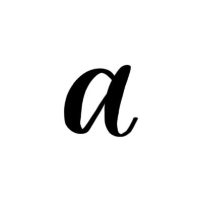
Lowercase a: Counterclockwise oval that starts and ends in the top right corner, then a thick downstroke with a light underturn.
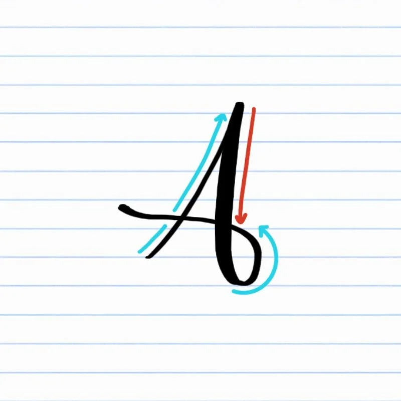
How to Write Uppercase Calligraphy A Step-by-Step
Start at the baseline with a light upstroke.
Place your brush pen on the baseline and begin a thin, right-leaning upstroke. Use very light pressure as you move upward, aiming for the full height of the letter. Focus on a smooth, steady motion rather than speed.Curve over the top and begin a descending loop.
Once you reach the top of the letter, gently curve the stroke to the left and transition into a counterclockwise motion. Gradually add pressure as the stroke turns downward so the line becomes thicker and more defined.Continue the loop down below the baseline.
Keep steady pressure as the stroke descends, allowing the loop to open naturally as it dips slightly below the baseline. The shape should feel rounded and balanced, not tight or pinched.Release pressure and finish with a swirling flourish.
As you complete the loop, slowly ease off the pressure and guide the pen into a soft flourish that trails to the left. Let the stroke taper naturally at the end for a clean, elegant finish.
How to Write Lowercase Calligraphy a Step-by-Step
Begin near the top and start an oval.
Place your pen near the top of your space and begin a light, rounded stroke. Move smoothly downward and around, letting the bottom of the oval gently touch the baseline. Keep your pressure light on the upstroke and heavier on the downstroke to create contrast.Complete the oval and close the shape.
Continue the oval back upward until you reach the starting point. As you move upward, ease off the pressure so the line becomes thin again. Aim for a balanced, open oval that doesn’t feel squished or uneven.Lift into a thin stroke along the right side of the oval.
From the top right of the oval, transition into a light, upward motion that follows the outer edge of the shape. This stroke should feel delicate and controlled, setting up the next movement.Finish with an underturn that dips slightly below the baseline.
Gradually add pressure as the stroke curves downward, then guide it into a gentle underturn that dips just below the baseline. Release pressure at the end so the stroke tapers smoothly, creating a natural exit for connecting to the next letter.
Experience a Clear Path to Lettering Confidence
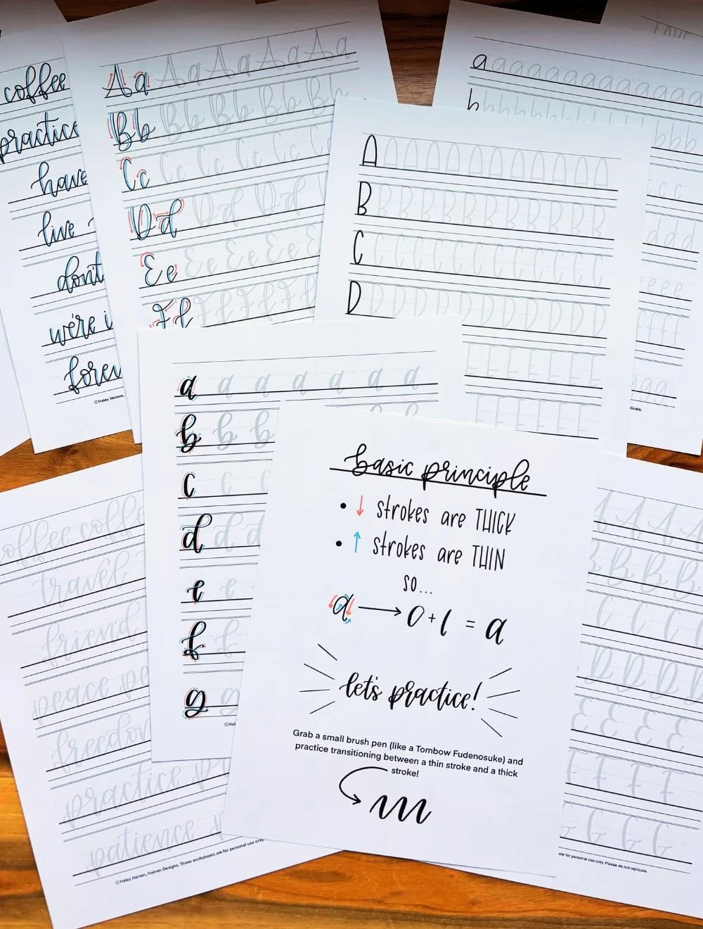
Basic Strokes for Calligraphy A
Basic Strokes That Make Up Uppercase A
The uppercase calligraphy A is built from two core strokes. When you understand these shapes on their own, the full letter becomes much easier to write — and easier to repeat consistently.
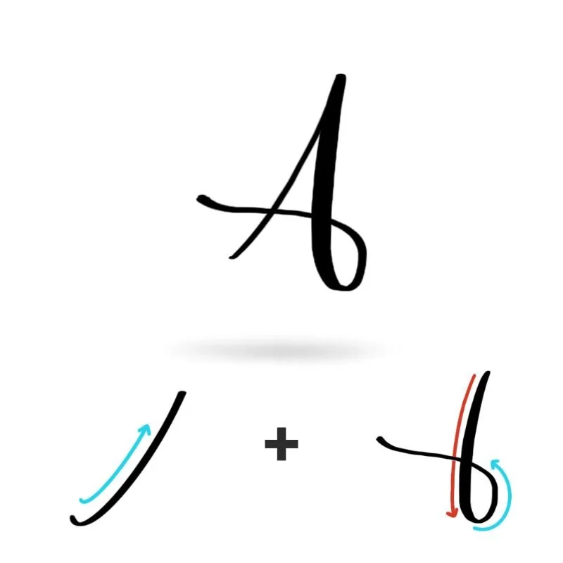
Stroke 1: Light Upstroke
The letter begins with a thin, upward stroke. This stroke sets the height and direction of the letter, so focus on keeping it smooth and controlled. Use very light pressure and let the pen glide upward without rushing. A clean upstroke gives the letter a graceful start and helps the rest of the shape feel intentional.
Stroke 2: Descending Loop
From the top of the upstroke, the letter flows into a large, counterclockwise loop. This stroke makes up the main body of the uppercase A. As the stroke curves downward, gradually increase pressure to create a thicker line, then maintain that pressure as the loop opens and dips below the baseline. The goal is a rounded, balanced shape — not tight or pinched.
As the loop finishes, pressure is released into a light flourish that trails to the left. This taper gives the letter its signature movement and keeps the ending from feeling heavy.
Basic Strokes That Make Up Lowercase a
The lowercase calligraphy a is built from two simple strokes that appear again and again throughout the alphabet. Once these strokes feel familiar, many other letters will start to feel easier too.
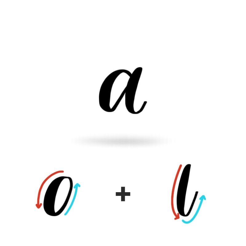
Stroke 1: Oval
The first stroke is a rounded oval that forms the body of the letter. This stroke begins with a light upstroke and transitions into a thicker downstroke as the pen curves around. The bottom of the oval should gently touch the baseline, giving the letter a grounded, stable feel.
Focus on keeping the oval open and evenly shaped. Ovals that are too narrow or rushed often make the letter feel cramped or heavy.
Stroke 2: Underturn
The second stroke is an underturn added along the right side of the oval. This stroke begins lightly, then gradually increases in pressure as it curves downward. The line dips just below the baseline before tapering off, creating a smooth exit stroke.
The underturn gives the lowercase a its forward movement and makes it easy to connect to the next letter. Keeping this stroke relaxed and fluid helps the letter feel natural rather than stiff.
Want to learn calligraphy without guessing letter by letter?
Lettering Leap™ teaches modern calligraphy step by step — starting with basic strokes and building through the entire alphabet with guided daily practice.
Practice Drills for Calligraphy A
Practicing the letter A in calligraphy is all about building muscle memory for smooth curves, consistent pressure, and clean transitions. Instead of jumping straight into full letters, these drills break the letter down into repeatable movements so your hand learns what correct feels like.
Warm-Up Strokes
Start with a few minutes of warm-ups to loosen your hand and control pressure.
Light upstrokes moving upward and to the right
Slow, controlled downstrokes with heavier pressure
Small oval motions to prep for the lowercase a
These strokes show up repeatedly in both uppercase and lowercase A.
Partial Letter Drills
Next, isolate the core movements of the letter.
Repeating ovals that touch the baseline evenly
Underturns that start thin and finish with a smooth curve
Looping downstrokes for the uppercase A, focusing on flow rather than speed
This step helps eliminate wobble and uneven thickness before forming the full letter.
Full Letter Repetition
Now bring the pieces together.
Write rows of uppercase A, focusing on consistent height and spacing
Practice lowercase a in slow, intentional strokes
Alternate between uppercase and lowercase to reinforce contrast and control
Aim for steady rhythm instead of perfection.
Skill-Level Variations
Beginner: Trace over examples, then write slowly with plenty of space
Intermediate: Write smaller, tighten spacing, and experiment with bounce or slight flourishes
Want guided daily drills?
Lettering Leap™ includes 30 days of structured practice that builds every letter step by step — so you’re not guessing what to practice next.
What Guidelines Are Used by the Letter A?
Understanding how the letter A fits within the guidelines helps you create consistent, readable calligraphy. These lines act as visual anchors, showing where each part of the letter should begin, end, and flow.
The letter A relies on the guidelines to feel balanced and consistent in both uppercase and lowercase forms. The uppercase A starts on the baseline, stretches taller, and flows into a looping downstroke that dips below before finishing with movement. The lowercase a stays more compact, with its oval resting on the baseline and an underturn that dips slightly below to create a clean exit stroke.
Key things to watch for:
Both uppercase and lowercase A should sit cleanly on the baseline
The uppercase A has more height and movement, while the lowercase stays contained
Descending strokes should dip below the baseline without feeling heavy
Consistent spacing keeps the letter A readable and easy to connect
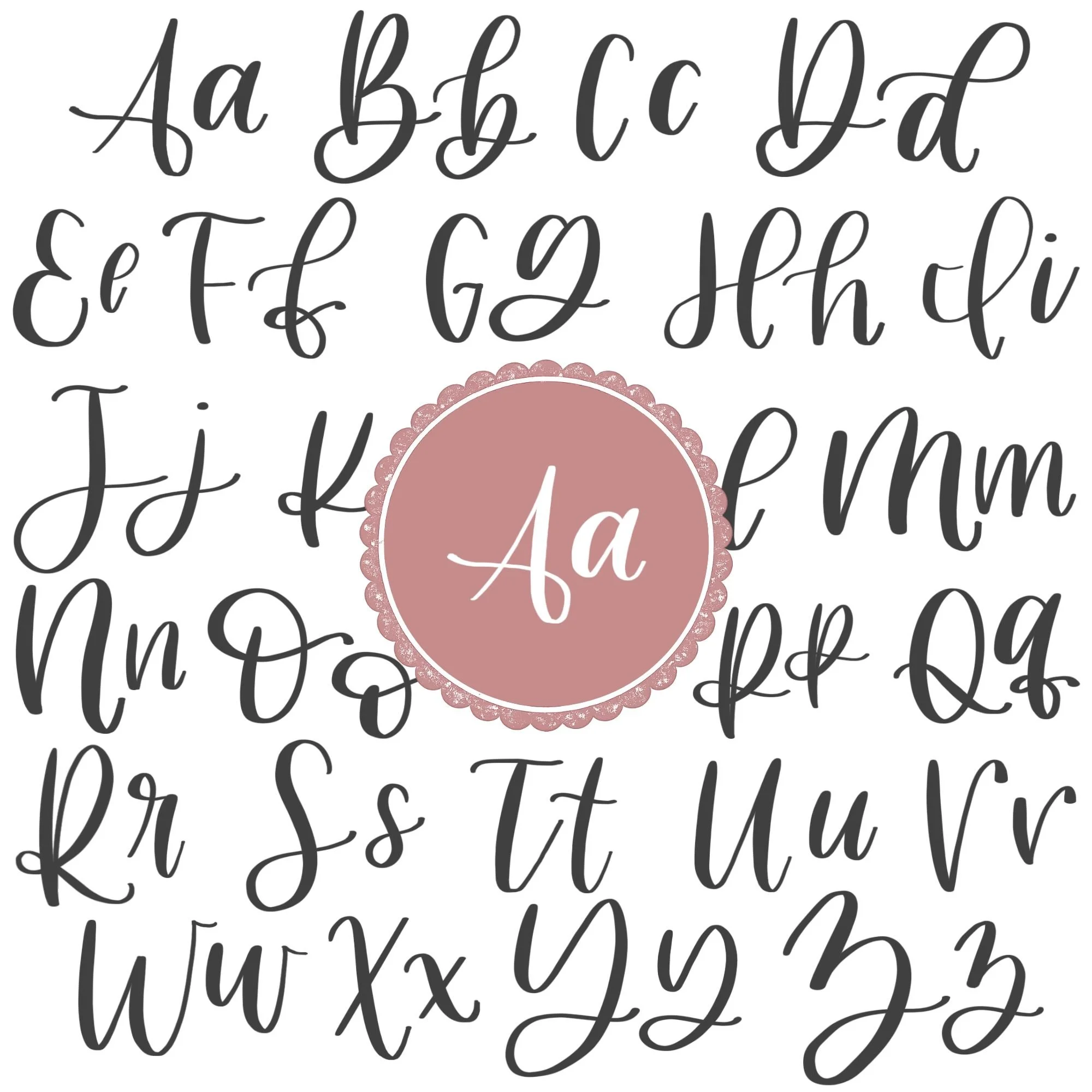
Letter A in the Complete Calligraphy Alphabet
The letter A is a foundational shape in modern calligraphy and brush lettering. Many of the strokes you learn here show up again and again throughout the alphabet, which makes mastering A especially valuable as you move forward.
Letters That Share Similar Strokes
Lowercase a is built from an oval and an exit stroke—two movements that appear in several other letters.
a ↔ o: Similar oval shape, with different exits
a ↔ d: Same oval, plus a taller ascending loop stroke
a ↔ g: Oval base with an added descending loop below
If your a feels inconsistent, you’ll likely notice the same issues in these letters.
Uppercase A also shares movement with other looped letters.
A ↔ f: Counterclockwise rotation of the descending loop
A ↔ q: Same counterclockwise rotation
Many letters are constructed with a descending loop, but only the lowercase f and q have a counterclockwise loop.
Ready to learn?
Common Mistakes When Lettering A
The letter A looks simple, but small issues in pressure, spacing, and stroke order can make it feel messy or uneven. If your A doesn’t look quite right yet, you’re not alone — these are some of the most common pitfalls learners run into.

1. Inconsistent Pressure
One of the biggest issues is uneven thickness throughout the letter.
Upstrokes that are too heavy can make the letter feel clunky
Downstrokes that are too light can make it look weak or shaky
Focus on clear contrast: light on the way up, heavier on the way down.
2. Misshapen Ovals (Lowercase a)
Lowercase a depends heavily on a clean oval.
Flattened or too perfectly upright throw off balance
Corners instead of curves make the letter feel stiff
Slow down and think “round leaning rightward” as you draw the shape.
3. Overcrowded or Collapsed Counters
When strokes are too close together, the inside of the letter can close up or get too squished together.
Uppercase A loops may collapse inward
Lowercase a can lose its open center
Leave a little breathing room inside the letter.
4. Awkward Entry or Exit Strokes
Poor transitions make A harder to connect in words.
Entry strokes that start too abruptly disrupt flow
Exit strokes that dip too far or stop too suddenly break rhythm
Aim for smooth, gradual curves instead of sharp stops.
5. Rushing the Letter
A often looks worse when written too quickly.
Fast strokes exaggerate wobble
Skipped steps lead to inconsistent shapes
Speed comes later—control comes first.
How to Improve Your Letter A Faster
Improving your letter A doesn’t come from writing it endlessly — it comes from practicing it with intention. Small changes in how you approach practice can make a noticeable difference in a short amount of time.
Focus on One Version at a Time
Begin by practicing either the uppercase or lowercase A on its own rather than switching back and forth. Allowing your hand to fully learn one version at a time builds confidence and prevents hesitation mid-stroke.
Practice the Pieces Before the Letter
Instead of jumping straight into full letters, spend time practicing the individual movements that make up A. Repeating ovals, underturns, and descending loops trains muscle memory and makes the complete letter feel more natural when you put it together.
Slow Down and Write Larger
Writing at a slower pace and slightly larger than normal gives you more control over pressure and curves. Bigger movements make it easier to see inconsistencies and correct them before they become habits.
Review and Adjust as You Go
After finishing a line of practice, pause and look closely at your letters. Choose the strongest A you wrote, then identify one small adjustment to apply on the next line. This focused feedback loop turns repetition into progress.
Follow a Guided Learning Path
While self-guided practice can lead to improvement, following a structured learning path often helps you improve faster. Guided instruction removes guesswork and ensures you’re practicing the right skills at the right time.
Practice Resources for Calligraphy A


Frequently Asked Questions about Calligraphy A
How do you write the letter A in calligraphy?
To write the letter A in calligraphy, begin with slow, controlled strokes and clear pressure changes. Uppercase A uses flowing movement and contrast, while lowercase a is formed by combining an oval with a smooth exit stroke. Practicing each movement on its own before combining them helps improve consistency and control.
What strokes make up a lowercase a?
A lowercase a is created using an oval followed by an underturn. The oval forms the main body of the letter, and the underturn creates the exit stroke that allows the letter to connect naturally to the next letter in a word.
Why does my calligraphy A look messy?
A messy-looking A is usually caused by uneven pressure, rushed strokes, or misshapen curves. Common issues include flattened ovals, heavy upstrokes, and collapsed spacing inside the letter. Slowing down and practicing the strokes individually often fixes these problems quickly.
Is the letter A hard to learn in brush lettering?
The letter A is one of the easier letters to learn, but it introduces foundational movements that can feel tricky at first. Because it relies on ovals and pressure control, it plays an important role in building skills that carry over to many other letters.
Should I practice uppercase or lowercase A first?
Lowercase a is usually the best place to start because it appears more often in words and helps develop smooth, connected lettering. Uppercase A becomes easier once you’re comfortable with basic pressure control and curved strokes.
Why does my lowercase a look different every time?
Inconsistent lowercase a shapes often come from uneven ovals or changing pressure mid-stroke. Practicing ovals slowly and intentionally helps stabilize the shape and makes each repetition more consistent.
How do I make my calligraphy A smoother?
Smoother calligraphy of A comes from slowing down and reducing tension in your hand. Writing slightly larger and focusing on continuous motion instead of stopping between strokes can also help improve flow.
What pen should I use to practice the letter A?
A brush pen with a flexible tip is ideal for practicing the letter A because it clearly shows contrast between thin and thick strokes. A firmer brush pen can be helpful for beginners who want more control.
How do I connect the letter A to other letters?
Lowercase a connects easily thanks to its natural exit stroke. Letters like b, n, m, t, and l follow smoothly when the exit stroke stays light and controlled. Practicing a inside simple words helps reinforce clean connections.
Why does my A look shaky?
Shaky strokes usually come from gripping the pen too tightly or moving too slowly without confidence. Relaxing your grip and practicing continuous motion helps smooth out the letter.
How often should I practice the letter A?
Practicing the letter A for a few focused minutes each day is more effective than long, infrequent sessions. Regular repetition helps build muscle memory and improves consistency faster.
Will practicing A help me improve other letters?
Yes, practicing A improves several other letters that use similar strokes. Ovals and underturns appear in letters like o, d, g, and q, so strengthening A often improves those letters at the same time.
Do I need to master A before moving on?
You don’t need to perfect the letter A before learning other letters, but having a solid foundation makes progress easier. Many learners refine A as they continue working through the alphabet.
Ready to learn?