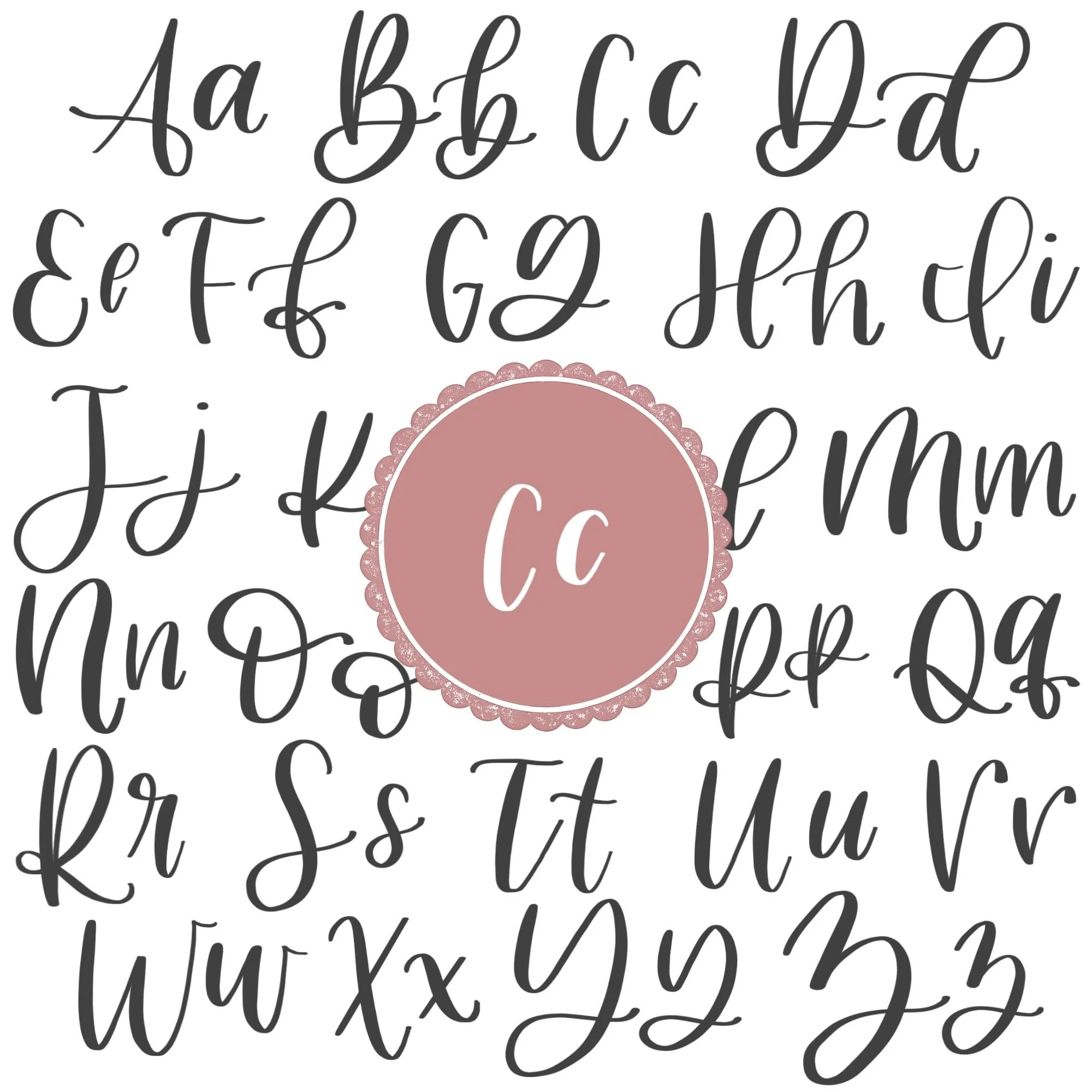
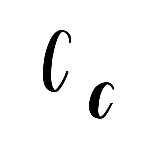
Calligraphy C: Uppercase, Lowercase, Strokes & Practice
A complete guide to calligraphy C, showing how to form it with brush lettering techniques
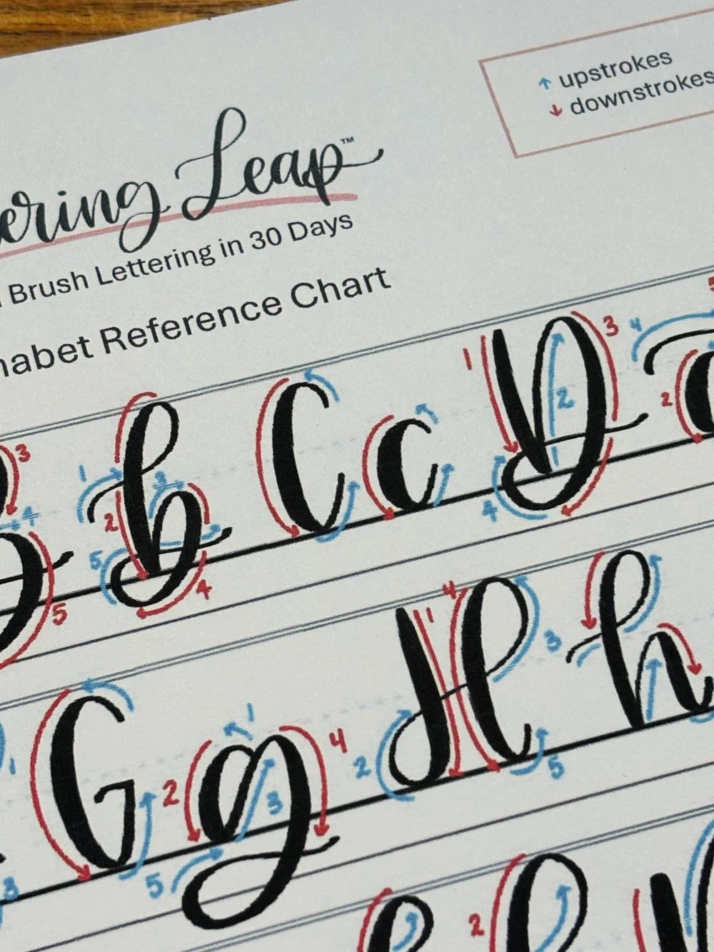
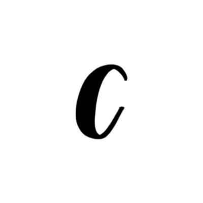
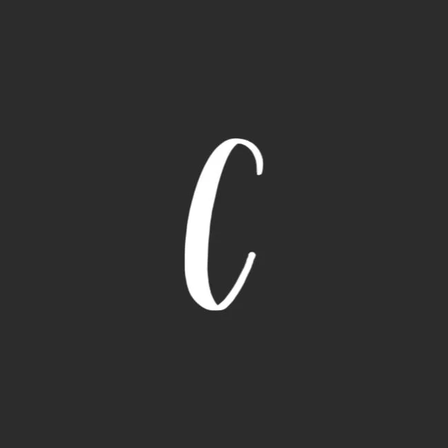
How to Write the Calligraphy Letter C
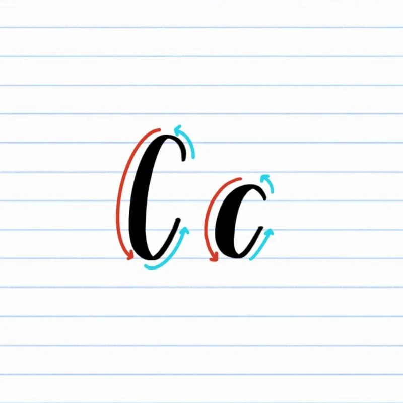
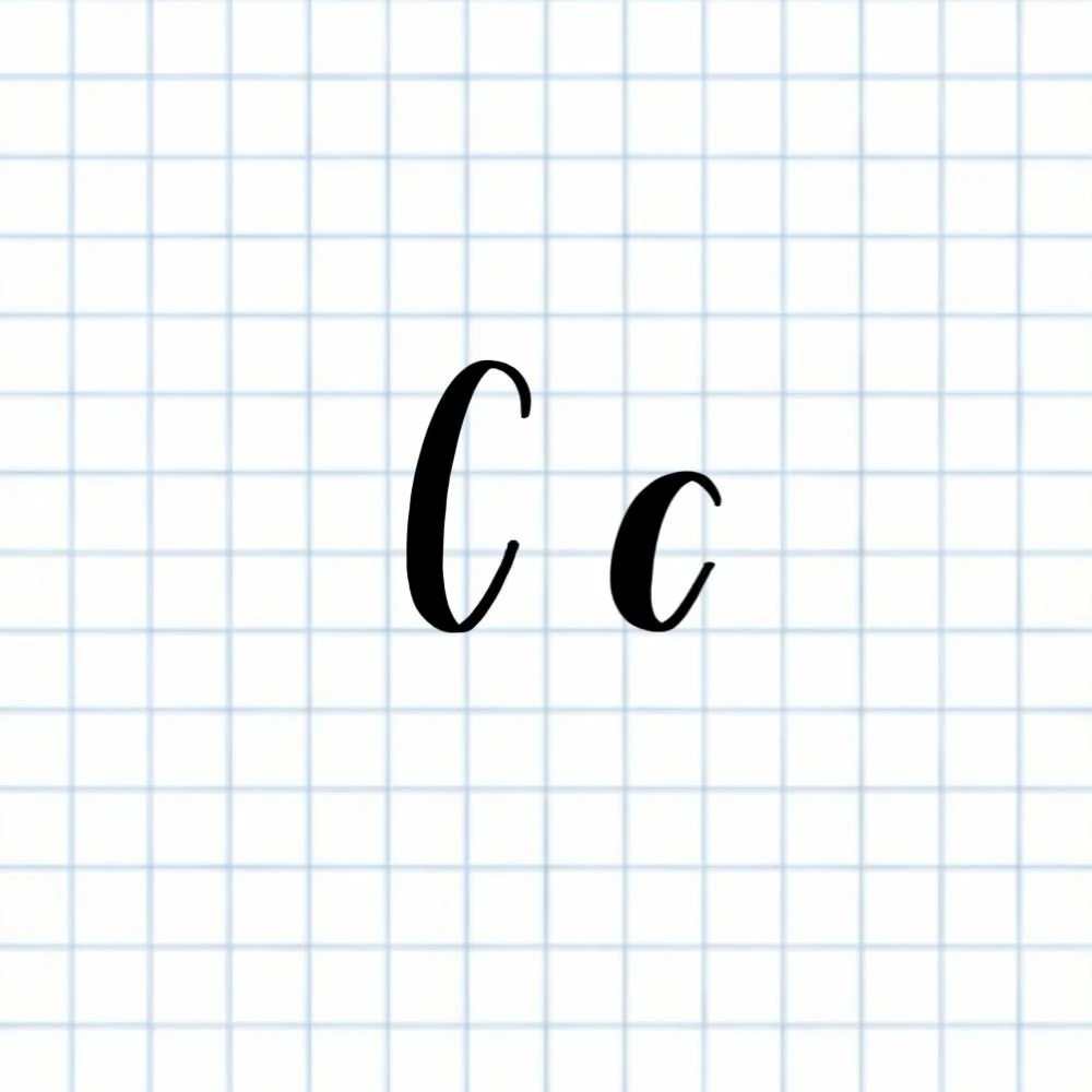
Uppercase and lowercase C: Counterclockwise oval left open.
How to Write Upper & Lowercase Calligraphy C Step-by-Step
Start just below the top of the letter with a light upstroke.
Place your brush pen slightly below the top guideline, whether it’s the uppercase or lowercase letter you’re writing. Begin a thin, controlled upstroke moving gently to the left. Keep your hand relaxed and focus on smooth, steady motion rather than speed. This sets the starting point for your oval shape.
Curve into a counterclockwise motion.
As you reach the top of your initial upstroke, transition into a soft leftward curve, moving your pen in a counterclockwise direction. Gradually add pressure as the stroke arcs downward toward the baseline, creating a gentle thickening of the line.
Descend to the baseline with consistent pressure.
Continue the counterclockwise curve until the stroke reaches the baseline. Maintain smooth, even pressure, letting the bottom of the oval gently touch the baseline. The curve should feel open and flowing — not tight or pinched.
Finish the oval open, ending before the close of the oval.
Rather than closing the oval completely, taper your stroke as you lift the pen, stopping slightly before the midpoint. This creates the classic open C shape, leaving room for connecting letters in words and maintaining a balanced, elegant appearance.
Experience a Clear Path to Lettering Confidence
Basic Strokes for Calligraphy C
Basic Strokes That Make Up Uppercase C
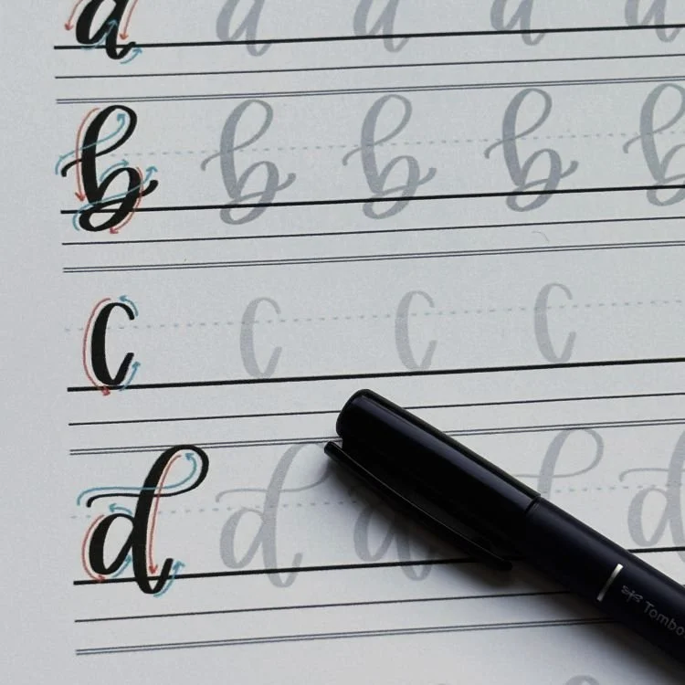
The uppercase calligraphy C is built from a single foundational stroke: an open oval. While it’s technically one continuous movement, understanding how pressure and motion shift throughout the stroke is what makes the letter feel smooth, balanced, and intentional rather than stiff or uneven.
Stroke 1: Open Oval (Counterclockwise)
Uppercase C is formed by drawing a large, counterclockwise oval that remains open on the right side. The stroke begins just below the capital height with a light upstroke. Use minimal pressure as you guide the pen upward and slightly left, setting the top curve of the letter.
As the stroke rounds the top and begins to descend, gradually increase pressure. This thicker portion of the stroke creates the main visual weight of the letter and gives the C its presence. Continue the curve smoothly down until it gently touches the baseline, keeping the motion fluid and unbroken.
As the oval travels back upward on the right side, slowly release pressure so the line becomes thinner again. Instead of closing the shape, lift the pen just before reaching the X-height, leaving the oval open. This open ending is what defines the C and keeps it airy, readable, and easy to connect to surrounding letters.
A successful uppercase C feels rounded and spacious, with clear contrast between thick and thin sections. The goal is a relaxed, open curve — not a tight circle or a sharp hook at the end.
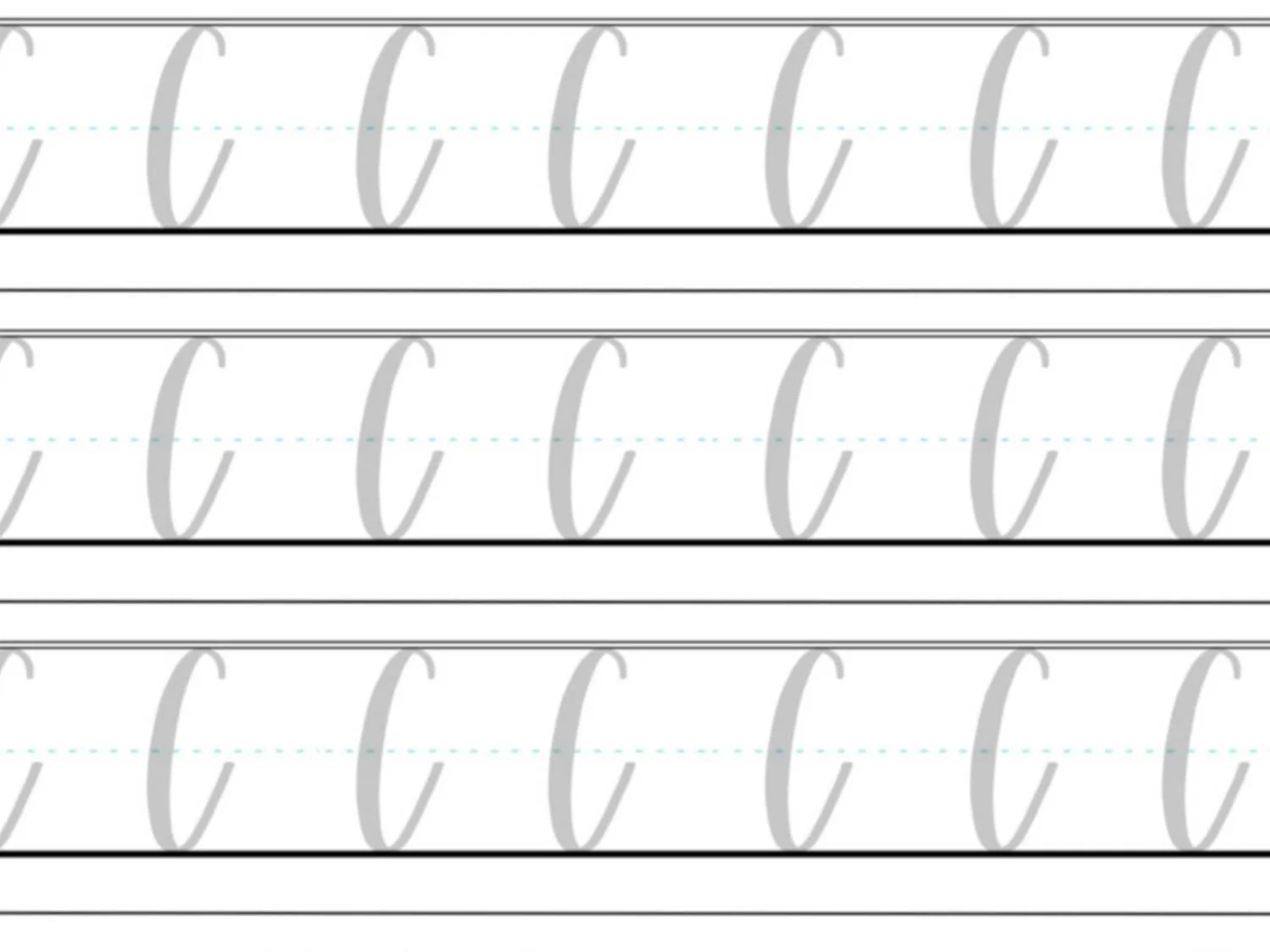
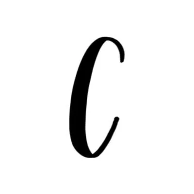
Basic Strokes That Make Up Lowercase c
The lowercase calligraphy c uses the same core movement as the uppercase C, just at a smaller scale. Both letters are built from an open, counterclockwise oval, which makes lowercase c a great place to reinforce smooth curves and pressure control.
Lowercase c begins just above the X-height with a light, thin upstroke. As the stroke curves counterclockwise and descends, gradually increase pressure to create a thicker line that reaches the baseline. Keep the motion smooth and relaxed, allowing the oval to feel rounded rather than tight.
As the stroke travels back upward on the right side, slowly release pressure and lift the pen about halfway up to the X-height, leaving the oval open. This open ending mirrors the uppercase C and keeps the letter light, balanced, and easy to connect to the next letter.
Want to learn calligraphy without guessing letter by letter?
Lettering Leap™ teaches modern calligraphy step by step — starting with basic strokes and building through the entire alphabet with guided daily practice.
Practice Drills for Calligraphy C
Practicing the letter C in calligraphy is all about building confidence with smooth, open curves and consistent pressure. Because both uppercase and lowercase C rely on the same counterclockwise oval motion, these drills focus on refining that shape before repeating full letters.
Warm-Up Strokes
Start with a few minutes of warm-up to loosen your hand and establish control.
Small overturns moving toward the left
Slow, curved downstrokes with gradually increasing pressure
Large counterclockwise oval motions without lifting your pen
These warm-ups prepare your hand for the continuous curve used in both uppercase and lowercase C.
Partial Letter Drills
Next, isolate the key movement that defines the letter.
Repeating open ovals that touch the baseline cleanly
Practicing stopping points on the right side to avoid closing the shape
Alternating thin upstrokes and thicker downstrokes within the oval
Focus on keeping the oval open and evenly rounded rather than perfectly symmetrical.
Full Letter Repetition
Now bring the strokes together into complete letters.
Write rows of uppercase C, aiming for consistent height and open spacing
Practice lowercase c with a relaxed, airy ending
Alternate between uppercase and lowercase to reinforce scale and pressure control
Work slowly and intentionally, prioritizing smooth motion over speed.
Skill-Level Variations
Beginner: Trace examples, then write larger letters with plenty of space
Intermediate: Write smaller, refine spacing, and experiment with slightly wider or narrower C shapes
As your control improves, the letter C will begin to feel effortless — and many other curved letters will feel easier too.
Want guided daily drills?
Lettering Leap™ includes 30 days of structured practice that builds every letter step by step — so you’re not guessing what to practice next.
What Guidelines Are Used by the Letter C?
Understanding how the letter C fits within the guidelines helps keep your calligraphy consistent and readable. Because both uppercase and lowercase C are built from open oval shapes, the guidelines act as visual anchors that keep the curves balanced and evenly spaced.
Uppercase C is taller and more expansive, while lowercase c stays compact — but both rely on the baseline and open spacing to feel intentional rather than crowded.
Key things to watch for:
Both uppercase and lowercase C should sit cleanly on the baseline
The uppercase C begins just below the capital height and extends fully to the baseline
The lowercase c starts just above the X-height and reaches down to the baseline
Both letters remain open on the right side, never closing the oval
Consistent spacing inside the curve keeps the letter light and readable
When the guidelines are used correctly, the letter C feels smooth, open, and easy to repeat — and it naturally supports clean connections in words.
Letter C in the Complete Calligraphy Alphabet
The letter C plays an important role in modern calligraphy because it reinforces one of the most essential movements in brush lettering: the open, counterclockwise oval. Mastering C helps build confidence with curved strokes, spacing, and pressure control that carry directly into many other letters.
Letters That Share Similar Strokes
Lowercase c is closely related to several other letters built from ovals and open curves:
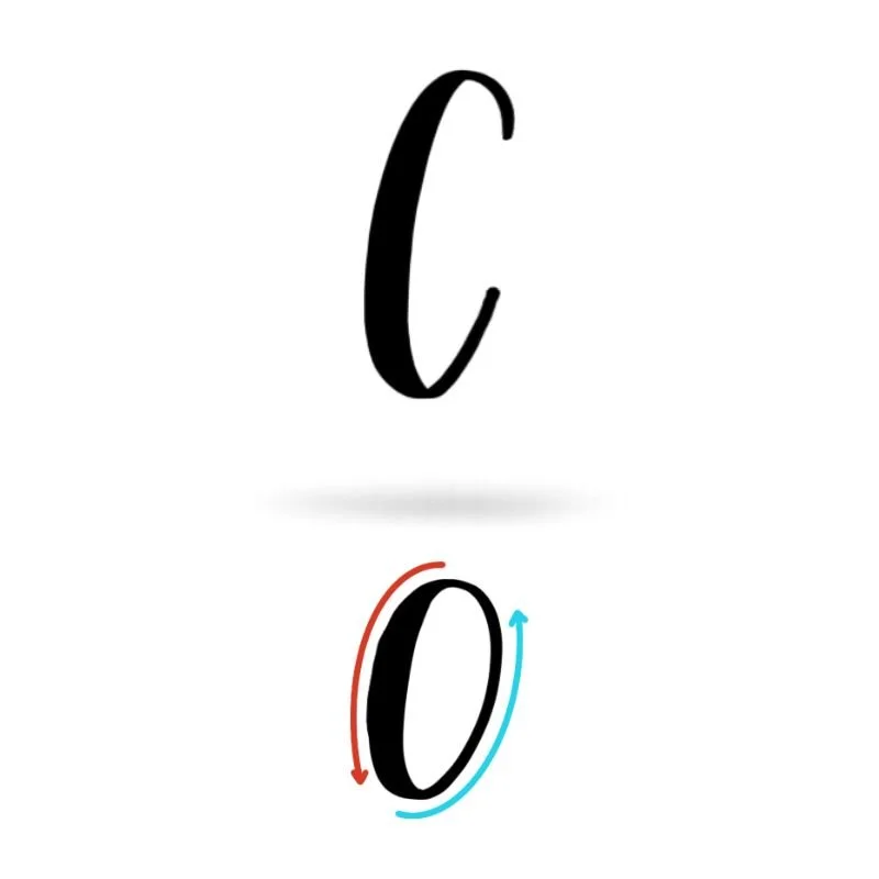
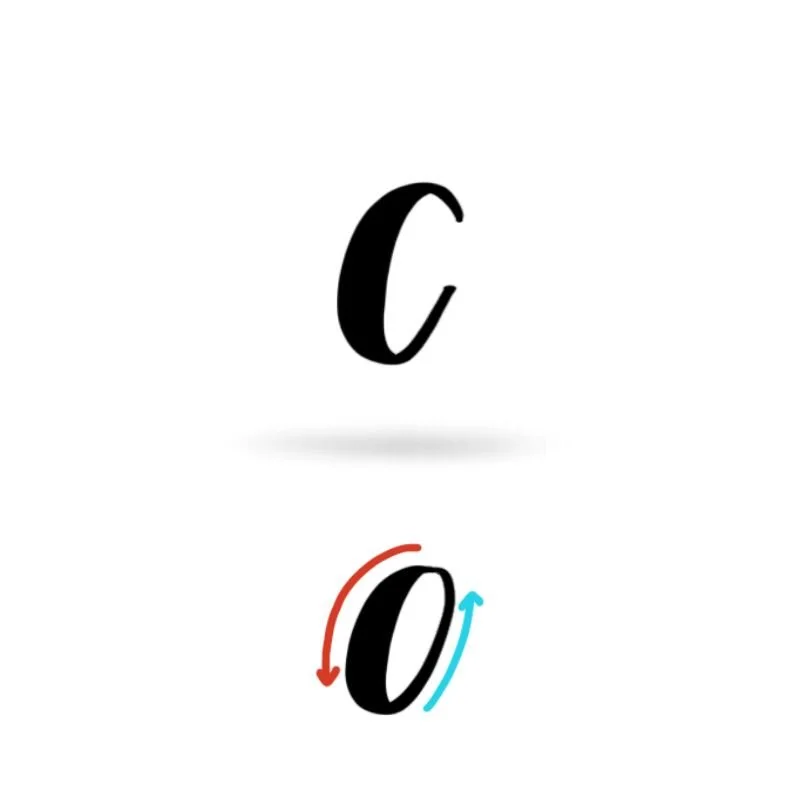
c ↔ o: Same oval motion, with o closing the shape
c ↔ e: Similar open curve with an added exit stroke
c ↔ a: Oval base shared with different finishing strokes.
Uppercase C also connects to other rounded capital letters:
C ↔ G: Similar open oval, with G adding a horizontal or inward stroke
C ↔ O: Same overall shape, with O closing the oval
If your C feels tight, uneven, or heavy, those same issues often show up in these related letters. Strengthening C improves not just one letter, but a whole family of curves across the alphabet.
Ready to learn?
Common Mistakes When Lettering B
The letter C looks simple, but small issues with pressure, spacing, and stroke control can make it feel awkward or inconsistent. If your C doesn’t look quite right yet, these are some of the most common problems learners run into.

1. Closing the Oval Too Much
One of the most frequent mistakes is turning the C into an O.
Ending the stroke too close to the starting point
Losing the open space on the right side
Leave a clear opening so the letter stays light and readable.
2. Uneven Pressure Throughout the Curve
Inconsistent thickness can make the C feel shaky or unbalanced.
Heavy upstrokes flatten the curve
Light downstrokes weaken the shape
Focus on light pressure as you move upward and slightly heavier pressure as the stroke descends.
3. Tight or Pinched Curves
Rushing the oval often leads to cramped shapes.
Curves that bend sharply instead of flowing
Narrow ovals that feel stiff
Slow down and think “round and open” as you draw the stroke.
4. Ending Too Abruptly
Stopping the stroke suddenly can make the letter feel unfinished.
Sharp cutoffs instead of a gentle taper
Awkward spacing before the next letter
Release pressure gradually and lift the pen smoothly to create a clean ending.
5. Ignoring Scale Differences
Writing uppercase and lowercase C the same size can throw off balance.
Uppercase C that feels too small
Lowercase c that looks oversized
Pay attention to the guidelines so each version sits comfortably in its space.
How to Improve Your Letter C Faster
Improving your letter C doesn’t come from writing it over and over — it comes from practicing the right movements with intention. Because C is built from a single, continuous curve, small adjustments in how you practice can lead to noticeable improvement very quickly.
Practice the Oval on Its Own
Instead of starting with full letters, spend time practicing open ovals by themselves. Focus on keeping the curve smooth, the spacing open, and the pressure changes intentional. When the oval feels consistent, both uppercase and lowercase C become much easier to control.
Slow Down and Write Larger
Writing C slightly larger than normal gives you more room to manage curves and pressure. Slowing your pace helps prevent pinched shapes and uneven thickness, allowing the stroke to stay fluid from start to finish.
Compare Uppercase and Lowercase Together
Since uppercase and lowercase C use nearly the same movement, practicing them side by side can be especially helpful. Notice how the same oval adapts to different sizes and starting points. This comparison builds confidence and reinforces muscle memory faster than practicing each in isolation.
Review One Small Adjustment at a Time
After finishing a line of practice, pause and look at your letters. Choose one thing to improve — such as keeping the opening wider or smoothing the downstroke — and apply that adjustment on the next line. This focused approach turns repetition into real progress.
Follow a Guided Learning Path
While self-guided practice works, many learners improve faster with structured instruction. A guided learning path removes the guesswork and helps you practice foundational strokes in the right order, so each letter builds naturally on the last. Programs like Lettering Leap™ are designed to strengthen these core movements across the entire alphabet.
Practice Resources for Calligraphy C


Frequently Asked Questions about Calligraphy C
How do you write the letter C in calligraphy?
To write the letter C in calligraphy, use a smooth, counterclockwise oval that stays open on the right side. Uppercase and lowercase C follow very similar movements, with the main difference being size and starting point. Light pressure on the upstroke and slightly heavier pressure on the downstroke help create a clean, balanced shape.
Why does my calligraphy C look like an O?
A calligraphy C often looks like an O when the oval closes too much at the end. Leaving a clear opening on the right side is what defines the C in calligraphy. Try stopping the stroke earlier and lifting the pen gradually instead of finishing the curve completely.
Is lowercase c harder than uppercase C in calligraphy?
Lowercase c is usually easier than uppercase C because it’s smaller and simpler to control. Since both letters use nearly the same oval motion, practicing lowercase c often helps improve uppercase C as well.
What stroke makes up the calligraphy of C?
The calligraphy of C is built from a single open oval stroke. This counterclockwise curve appears in many other letters, which makes C an important foundational letter for improving overall brush lettering skills.
Why does my calligraphy c look uneven?
Uneven calligraphy c shapes are often caused by rushed strokes or inconsistent pressure. Heavy upstrokes, shaky curves, or pinched ovals can all affect the letter’s appearance. Slowing down and practicing open ovals on their own usually fixes this quickly.
Should I practice uppercase or lowercase c first?
Most beginners benefit from practicing lowercase c first because it appears more often in words and helps develop smooth, controlled curves. Once the oval feels consistent, uppercase C becomes much easier to write.
How do I make my C in calligraphy smoother?
Smoother C shapes come from relaxed movement and continuous motion. Writing slightly larger and focusing on one fluid curve — instead of breaking the stroke into parts — helps improve flow and consistency.
What letters does calligraphy C help improve?
Practicing calligraphy C improves other curved letters that use similar oval shapes, such as o, e, a, and G. Strengthening your C often leads to better spacing, pressure control, and smoother curves across the alphabet.
What pen is best for practicing calligraphy c?
A flexible brush pen is ideal for practicing calligraphy c because it clearly shows contrast between thin and thick strokes. Beginners may find a firmer brush pen easier to control while learning consistent pressure.
How often should I practice the letter C?
Short, focused practice sessions are more effective than long, occasional ones. Practicing calligraphy C for a few minutes each day helps build muscle memory and improves consistency faster.
Ready to learn?