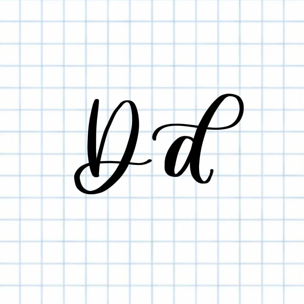
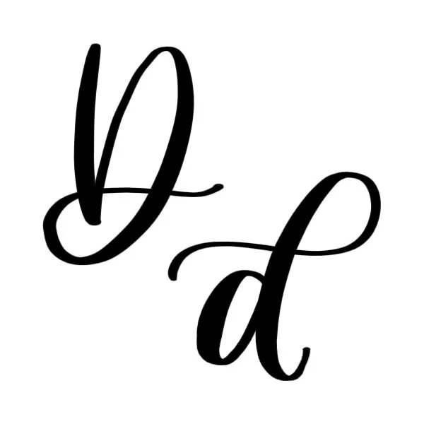
Calligraphy D: Uppercase, Lowercase, Strokes & Practice
A complete guide to calligraphy D, showing how to form it with brush lettering techniques
How to Write the Calligraphy Letter D
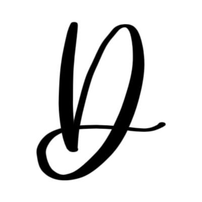
Uppercase D: Downstroke to the baseline, big overturn that blends into descending loop, finish with a light flourish.
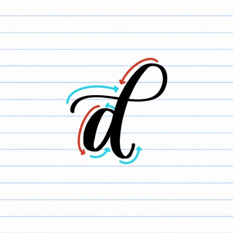
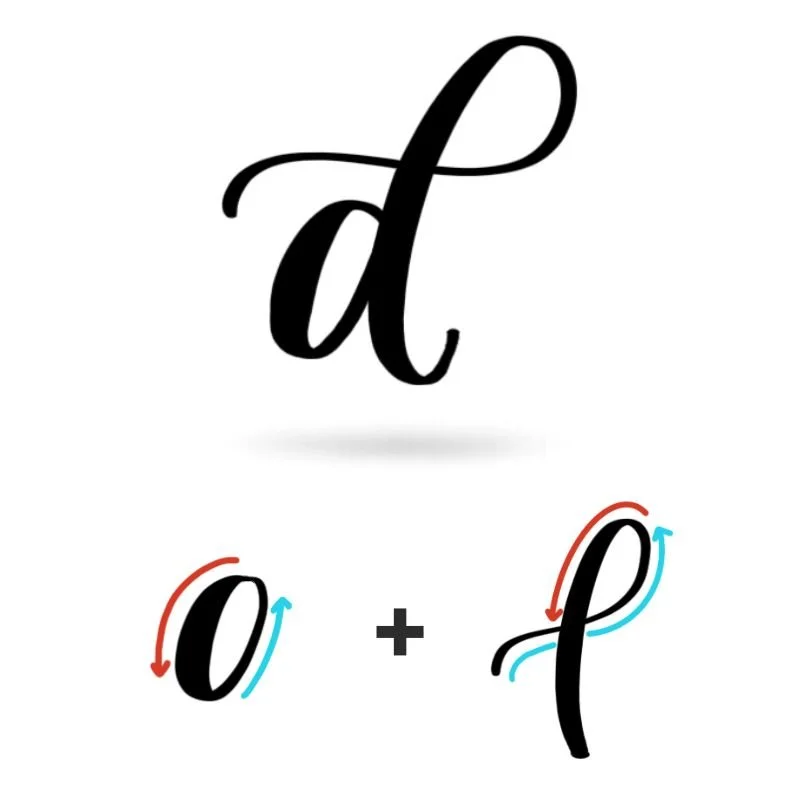
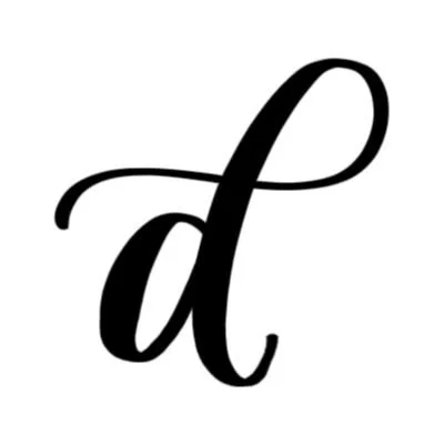
Lowercase d: Counterclockwise oval, then ascending loop with a generous starting tail.
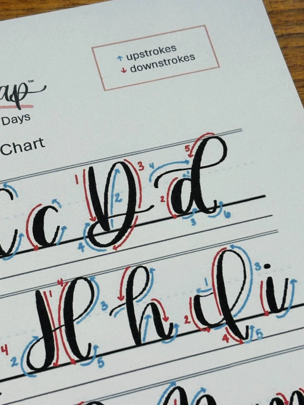
How to Write Uppercase Calligraphy D Step-by-Step
Start with a controlled downstroke.
Place your brush pen at the capital height and pull a steady downstroke straight down to the baseline. Use firm pressure on the way down to create a thick, confident line. This stroke forms the spine of the letter, so aim for smoothness over speed.Transition into an overturn that rises back up.
At the baseline, lighten your pressure slightly and curve the stroke to the right into an overturn. Guide the pen upward until you reach the capital height again, then allow the stroke to come back down with gradually increasing pressure. This movement creates the rounded outer edge of the D and should feel open rather than tight.Shift into a descending loop to complete the shape.
As the stroke comes down, smoothly transition into a clockwise descending loop. Maintain steady pressure as the loop dips about halfway between the baseline and the descender line, then begin easing off pressure as the stroke curves upward and to the right.Finish with a light upward flourish.
Release pressure as you complete the loop and let the stroke taper into a soft upward flourish on the right side. The ending should feel airy and intentional, giving the uppercase D movement without overpowering the main shape.
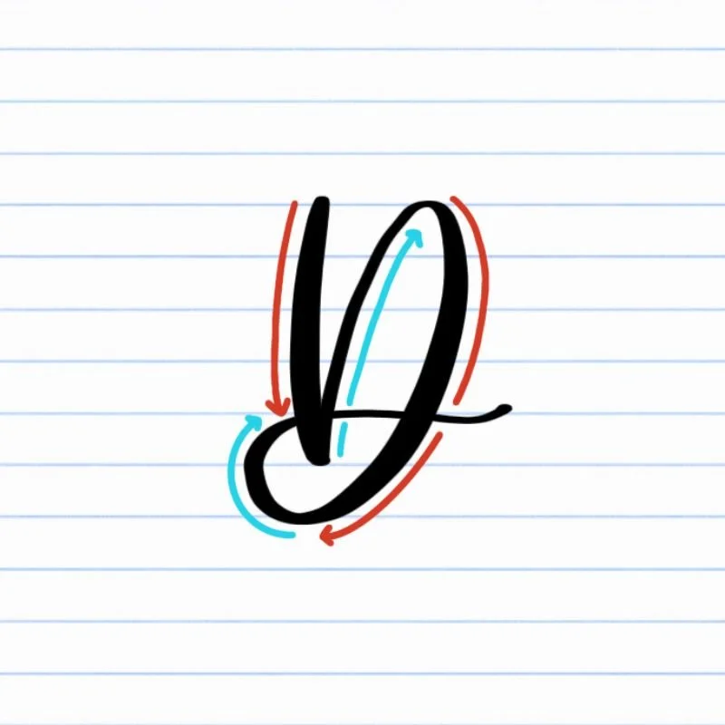
How to Write Lowercase Calligraphy d Step-by-Step
Begin with a counterclockwise oval.
Place your brush pen near the X-height and start a light upstroke into a counterclockwise oval. As the stroke curves downward, gradually increase pressure so the downstroke becomes thicker. Let the bottom of the oval rest gently on the baseline, keeping the shape open and balanced rather than narrow or pinched.Close the oval and release pressure.
Continue the oval back up toward the starting point. As you move upward, ease off pressure so the stroke becomes thin again. The oval should feel smooth and rounded, setting a stable base for the taller stroke that follows.Start the second stroke with a light flourish.
Lift your pen and place it slightly to the left of the oval, just above the X-height. Begin with a thin, flowing flourish that moves upward and to the right. Keep pressure very light to prepare for the loop.Shift into an ascending loop.
Guide the stroke into a counterclockwise ascending loop, increasing pressure as you move downward. Allow the loop to touch the ascender line at the top, then continue the stroke downward so it dips slightly below the baseline. This tall loop is what gives the lowercase d its signature shape.Finish with a gentle upturn.
As the stroke reaches its lowest point, release pressure and curve the pen into a small upturn. Let the line taper naturally so the letter ends cleanly and can connect easily to the next letter.
Experience a Clear Path to Lettering Confidence
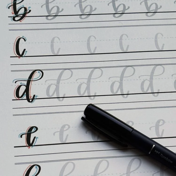
Basic Strokes for Calligraphy D
Basic Strokes That Make Up Uppercase D
The uppercase calligraphy D is built from three core strokes. Practicing these strokes on their own helps the letter feel smoother, more balanced, and easier to repeat. Once these movements click, you’ll also notice improvements in other loop-based capital letters.
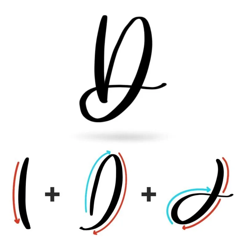
Stroke 1: Downstroke
The letter begins with a firm, nearly straight downstroke. This stroke sets the structure and weight of the uppercase D, so focus on steady pressure and a clean vertical line. Use heavier pressure as you move downward, letting the stroke end confidently on the baseline. A smooth downstroke keeps the letter from looking shaky or uneven.
Stroke 2: Overturn
From the baseline, the stroke jumps upward and curves slightly to the right, rising back up into an overturn. Pressure stays lighter as the stroke moves upward and increases again as it curves back down. This stroke creates the rounded outer edge of the D and should feel open and fluid, not tight or forced.
Stroke 3: Descending Loop
The final stroke is a clockwise descending loop that completes the letter. As the overturn moves downward, it transitions into the loop. Maintain steady pressure so the line stays thick and consistent. The loop dips below the baseline, sweeping generously to ungird the entire letter. Gradually release the pressure as the loop curves upward into a light flourish. This taper keeps the ending elegant and prevents the letter from feeling heavy.
Together, these strokes give uppercase D its strong spine, rounded shape, and graceful finish — a combination that appears throughout modern calligraphy capitals.
Basic Strokes That Make Up Lowercase d
The lowercase calligraphy d is built from two foundational strokes that appear throughout modern calligraphy. Mastering these movements not only improves your d, but also strengthens many other letters that rely on ovals and ascending loops.
Stroke 1: Oval
The first stroke is a counterclockwise oval that forms the body of the letter. This stroke begins with a light upstroke near the X-height and transitions into a thicker downstroke as the pen curves downward. The bottom of the oval should rest cleanly on the baseline, giving the letter stability.
Focus on keeping the oval open and evenly shaped. Narrow or rushed ovals often make the letter feel cramped and throw off the balance once the loop is added.
Stroke 2: Ascending Loop
The second stroke is a tall, counterclockwise ascending loop. It begins with a thin, flowing entry stroke that leads into the loop, rising up to the ascender line. As the stroke curves downward, gradually increase pressure so the line becomes thicker.
The loop dips slightly below the baseline before finishing, then releases pressure into a light upturn. This stroke gives the lowercase d its height and rhythm, and helps it connect smoothly to the next letter in a word.
Together, the oval and ascending loop create a lowercase d that feels grounded at the base and airy at the top — a balance that carries across many looped letters in the alphabet.
Want to learn calligraphy without guessing letter by letter?
Lettering Leap™ teaches modern calligraphy step by step — starting with basic strokes and building through the entire alphabet with guided daily practice.
Practice Drills for Calligraphy D
Practicing the letter D in calligraphy is all about learning to control tall loops, smooth curves, and consistent pressure. Because D combines strong vertical strokes with rounded movement, breaking it into drills helps your hand build confidence before writing the full letter.
Warm-Up Strokes
Begin with a few minutes of warm-ups to loosen your hand and dial in pressure control.
Slow, steady downstrokes from the capital height to the baseline
Light upstrokes that travel upward with minimal pressure
Counterclockwise oval motions that touch the baseline evenly
Tall ascending loop strokes that rise smoothly and return without wobble
These movements appear in both uppercase and lowercase D, so warming them up pays off quickly.
Partial Letter Drills
Next, isolate the main components of the letter.
Repeating ovals to reinforce balance and openness for lowercase d
Overturn shapes that rise and fall smoothly for the outer curve of uppercase D
Ascending loops practiced on their own, focusing on height and even pressure
Descending loop motions that dip below the baseline and release into a taper
Practicing these pieces separately helps eliminate hesitation and uneven curves when forming the full letter.
Full Letter Repetition
Now bring the strokes together into complete letters.
Write rows of uppercase D, focusing on consistent height and smooth outer curves
Practice lowercase d slowly, paying attention to the transition between the oval and loop
Alternate between uppercase and lowercase D to reinforce contrast and rhythm
Aim for steady, intentional strokes rather than speed. Consistency matters more than perfection.
Skill-Level Variations
Beginner: Trace example letters, then write slowly with larger spacing to maintain control
Intermediate: Write slightly smaller, tighten spacing, and experiment with subtle flourishes or bounce
As your confidence grows, focus on keeping your loops tall, your ovals open, and your pressure changes deliberate.
Want guided daily drills?
Lettering Leap™ includes 30 days of structured practice that builds every letter step by step — so you’re not guessing what to practice next.
What Guidelines Are Used by the Letter D?
Understanding how the letter D fits within the guidelines helps it feel balanced, readable, and consistent in both uppercase and lowercase forms. Because D includes tall loops and rounded shapes, the guidelines act as visual anchors that keep the letter from leaning, stretching, or collapsing.
The uppercase D begins on the baseline and extends up to the capital height. Its descending loop dips slightly below the baseline before finishing with an upward flourish, giving the letter movement without making it feel heavy.
The lowercase d combines a compact oval with a tall ascending loop. The oval sits comfortably between the baseline and the X-height, while the loop rises to the ascender line and dips just below the baseline before tapering into an exit stroke. This contrast in height is what gives lowercase d its recognizable structure.
Key things to watch for:
Both uppercase and lowercase D should sit cleanly on the baseline
Uppercase D reaches the capital height and includes a descending loop below the baseline
Lowercase d has an oval contained within the X-height and an ascending loop that reaches the ascender line
Descending portions should dip below the baseline lightly, not deeply
Consistent spacing keeps the rounded shapes from feeling crowded or uneven
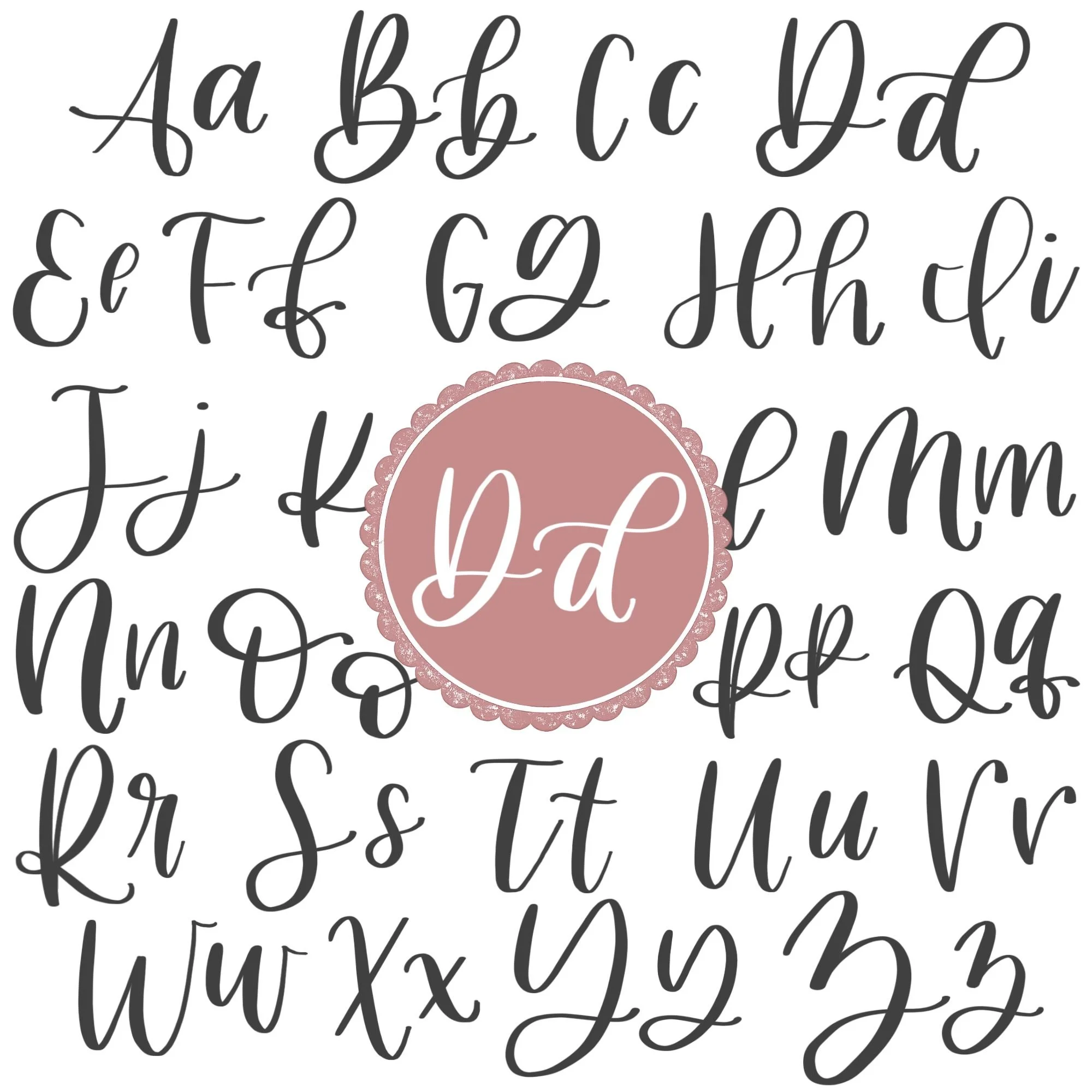
Letter D in the Complete Calligraphy Alphabet
The letter D plays an important role in the full calligraphy alphabet because it combines foundational strokes with tall looping movement. When you practice calligraphy D intentionally, you’re strengthening skills that carry directly into several other letters.
Letters That Share Similar Strokes
Lowercase d shares its core strokes with several other letters:
d ↔ o: Both rely on the same counterclockwise oval base
d ↔ a: Similar oval foundation, but a finishes with an underturn instead of a tall loop
d ↔ g: Same oval start, but g shifts into a descending loop instead
d ↔ b, h, l: These letters all use ascending loop strokes that rise to the ascender line
If your lowercase d feels uneven, you’ll often see similar issues in these letters — especially in the oval or the loop height.
Uppercase D also connects to other capital letters with looping structure:
D ↔ B: Both begin with a strong downstroke and include rounded outer forms
D ↔ P: Similar vertical spine with a curved upper structure
D ↔ R: Shares the upright foundation and curved outer movement
Because uppercase D blends structure with flow, improving it helps stabilize other capital letters that rely on vertical strength and rounded forms.
Ready to learn?
Common Mistakes When Lettering D
The letter D may look straightforward, but its combination of strong vertical strokes and looping curves can expose small inconsistencies in pressure and spacing. If your calligraphy D doesn’t look quite right yet, you’re not alone — these are some of the most common issues beginners experience.

1. Uneven Pressure Changes
In both uppercase and lowercase D, clear contrast matters.
Upstrokes that are too heavy make the loops look clunky
Downstrokes that are too light make the letter feel weak or shaky
Pressure that changes mid-stroke creates bumpy curves
Focus on intentional contrast: light on the way up, heavier on the way down.
2. Narrow or Collapsed Ovals (Lowercase d)
Because lowercase d begins with an oval, shape balance is critical.
Ovals that are too narrow make the loop feel oversized
Flattened bottoms can make the letter look unstable
Overlapping strokes close up the inner space
Aim for an open, rounded oval that rests cleanly on the baseline.

3. Loops That Lean or Wobble
Ascending and descending loops need steady motion.
Loops that lean too far left or right look off-balance
Inconsistent loop height disrupts rhythm in words
Hesitation mid-loop creates visible bumps
Practice the loop stroke on its own until the movement feels smooth and confident.
4. Overcrowded Outer Curves (Uppercase D)
Uppercase D includes a strong downstroke and a rounded outer shape.
Curves that sit too close to the vertical spine make the letter feel cramped
Tight overturns restrict the openness of the shape
A heavy finishing flourish can overpower the letter
Leave breathing room inside the curve so the letter feels bold but not bulky.
5. Rushing the Transition Between Strokes
Lowercase d has two separate strokes, and uppercase D shifts between movements.
Starting the loop too quickly can cause awkward overlaps
Failing to lift and reset properly can distort the structure
Moving too fast exaggerates pressure mistakes
Slow, deliberate transitions create smoother, more polished results.
How to Improve Your Letter D Faster
Improving your letter D doesn’t come from writing it over and over without direction — it comes from practicing the right movements with intention. Because calligraphy D combines structure and looping motion, small refinements in technique can make a noticeable difference quickly.
Focus on the Oval First (Lowercase d)
If your lowercase d feels inconsistent, start by isolating the oval. A clean, balanced oval makes the ascending loop easier to place and proportion correctly. Practice slow, rounded ovals that sit comfortably on the baseline before adding the second stroke. When the foundation feels stable, the full letter naturally improves.
Strengthen Your Loop Control
Both uppercase and lowercase D rely on confident looping strokes. Instead of writing the entire letter repeatedly, practice tall ascending loops and controlled descending loops on their own. Pay attention to consistent height and smooth pressure transitions. The more relaxed and continuous your loop motion becomes, the more polished your calligraphy D will look.
Slow Down and Write Larger
Writing slightly larger than normal gives you more room to see and correct uneven pressure or tight curves. Larger movements help build muscle memory and improve control. Once the shapes feel smooth at a bigger size, scaling down becomes much easier.
Practice One Version at a Time
Uppercase and lowercase D require different movements. Focusing on just one at a time allows your hand to fully learn the stroke sequence without hesitation. Mastering lowercase d first is often helpful since its oval foundation appears in many other letters.
Follow a Structured Learning Path
Self-guided practice can absolutely lead to progress — but structured instruction often accelerates it. When you follow a clear plan that builds from basic strokes through the full alphabet, you remove guesswork and avoid reinforcing bad habits.
Practice Resources for Calligraphy D


Frequently Asked Questions about Calligraphy D
How do you write the letter D in calligraphy?
To write the letter D in calligraphy, begin with controlled, deliberate strokes and clear pressure contrast. Uppercase calligraphy D starts with a strong downstroke, flows into an overturn, and finishes with a descending loop and light flourish. Lowercase d begins with a counterclockwise oval, followed by a tall ascending loop that rises and dips slightly below the baseline. Practicing each stroke individually helps improve consistency.
What strokes make up a lowercase d?
Lowercase d is made from two main strokes: an oval and an ascending loop. The oval forms the base of the letter, while the ascending loop gives it height and structure. These strokes also appear in other letters, which makes practicing d especially valuable.
Why does my calligraphy D look unbalanced?
An unbalanced D in calligraphy is often caused by uneven pressure, narrow ovals, or loops that lean too far left or right. In uppercase D, tight outer curves can make the letter feel cramped. In lowercase d, inconsistent loop height can disrupt the rhythm of a word.
Is lowercase d harder than other oval letters?
Lowercase d can feel trickier than letters like o or a because it combines a compact oval with a tall ascending loop. The contrast in height requires careful spacing and steady pressure control. Once the oval feels natural, adding the loop becomes much easier.
Why does my lowercase d loop look shaky?
Shaky loops usually happen when the pen is gripped too tightly or when the stroke is drawn too slowly with hesitation. Relaxing your grip and practicing smooth, continuous ascending loops on their own can improve stability.
How tall should the loop be in a modern calligraphy d?
In modern calligraphy d, the ascending loop should rise to the ascender line while the oval stays between the baseline and X-height. Keeping this proportion consistent helps the letter look polished and readable.
Why does my uppercase D look too heavy?
Uppercase calligraphy D can look heavy if the downstroke is overly thick or if the descending loop doesn’t taper properly. Releasing pressure gradually at the end of the stroke creates a lighter, more elegant finish.
How do I connect lowercase d to the next letter?
Lowercase d connects smoothly when the ascending loop finishes with a light upturn. Keeping that exit stroke thin makes it easy to transition into letters like a, e, i, o, and n without breaking flow.
Will practicing D help improve other letters?
Yes, practicing calligraphy letter D strengthens ovals and ascending loops, which directly improves letters like a, o, g, b, h, and l. Because these shapes repeat throughout the alphabet, improving D often leads to noticeable progress elsewhere.
What pen is best for practicing calligraphy D?
A flexible brush pen works best for practicing calligraphy D because it clearly shows contrast between thick downstrokes and thin upstrokes. Beginners may prefer a slightly firmer brush tip for better control while learning loops.
How often should I practice the letter D?
Short, focused daily practice sessions are more effective than long, infrequent ones. Even five to ten intentional minutes working on ovals and loops can noticeably improve your D quickly.
Do I need to perfect calligraphy D before moving on?
You don’t need to master D before learning other letters. In fact, continuing through the alphabet often helps reinforce the same strokes in new ways. Many learners find their D improves naturally as they practice related letters.
Ready to learn?