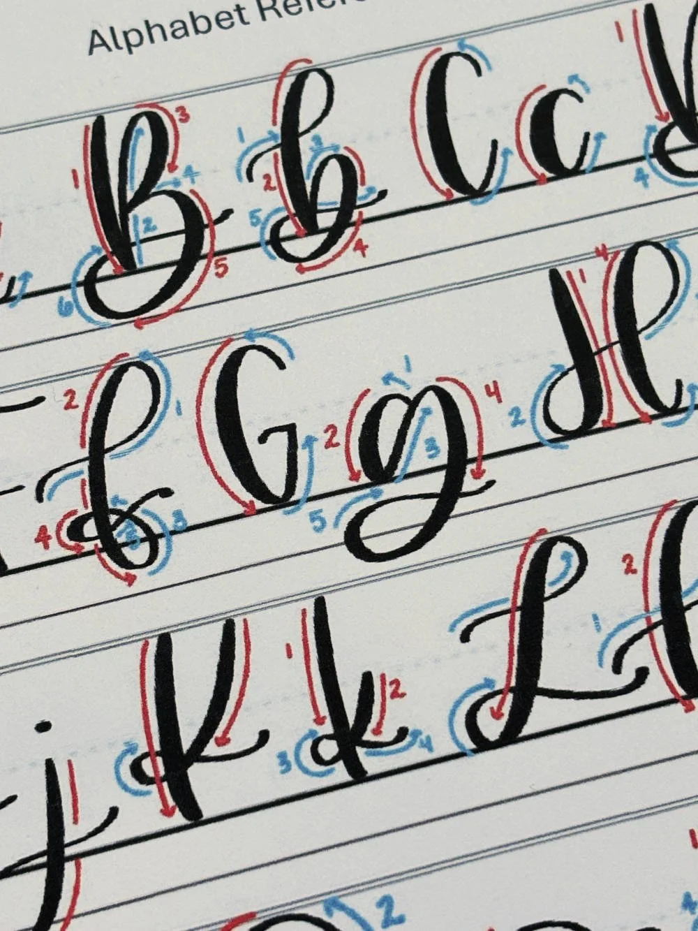
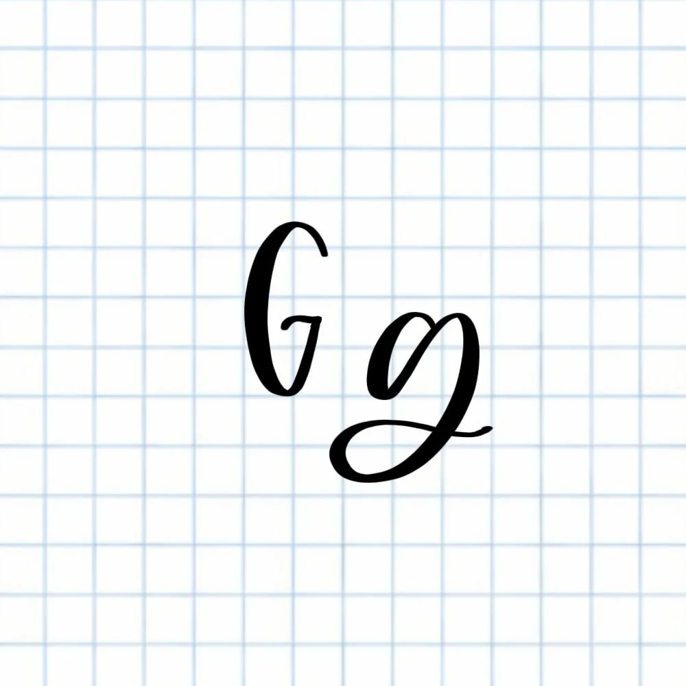
Calligraphy G: Uppercase, Lowercase, Strokes & Practice
A complete guide to calligraphy G, showing how to form it with brush lettering techniques
How to Write the Calligraphy Letter G
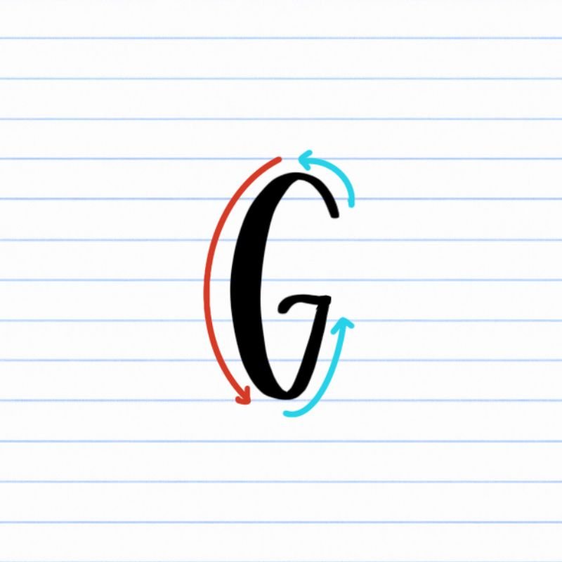
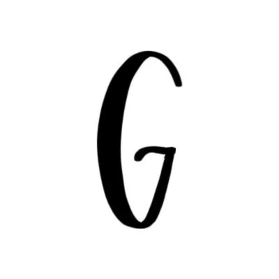
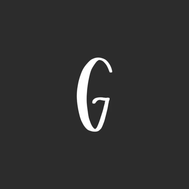
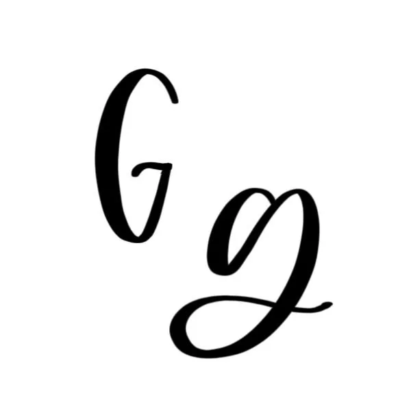
Uppercase G: Large, open oval drawn in a clockwise motion, with a very small compound curve in the middle opening.
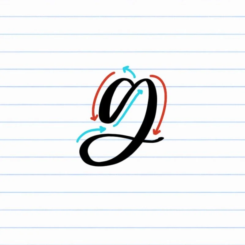
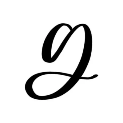
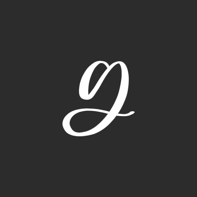
Lowercase g: Small oval that flows into a slight overturn and deep descending loop with a flourish.
How to Write Uppercase Calligraphy G Step-by-Step
Start slightly below the top and begin an open oval.
Place your brush pen a half-step below the capital height. Begin a light upstroke moving up and slightly to the left. Keep your pressure very light so the line stays thin and controlled.
Curve over and rotate counterclockwise.
As you reach the top of the letter, gently curve the stroke around in a counterclockwise motion, cresting the capital height. Gradually increase pressure as you move into the arced downstroke so the line becomes thicker.
Touch the baseline and continue the oval shape.
Maintain steady pressure as the stroke curves down to touch the baseline. The bottom of the oval should feel rounded and open — not flat or pinched. Aim for an egg shape.
Release pressure and stop halfway back up.
As the stroke travels upward along the right side of the oval, slowly ease off pressure so the line becomes thin again. Stop a little less than halfway up to the full height of the letter, leaving the oval open rather than closing it.
Finish with a slight, shallow compound curve.
From that stopping point, create a short compound curve to cap the open side. Start with a slight downward motion — right to left — using light pressure, then curve gently upward and release into a thin downward taper.
How to Write Lowercase Calligraphy g Step-by-Step
Start at the X-height and begin an oval.
Place your brush pen just below the X-height. Begin with a light upstroke moving slightly up and to the left, using very light pressure so the line stays thin.
Curve over and rotate counterclockwise.
Gently curve over the top and begin wrapping the stroke counterclockwise. As you move into the downstroke, gradually add pressure so the line becomes thicker.
Touch the baseline and complete the oval.
Continue the stroke down until it touches the baseline. Keep steady pressure through the bottom curve so it feels round and balanced — not flat. As you move back upward on the right side, slowly release pressure so the line becomes thin again. Finish the oval at the X-height.
Transition into a descending loop.
Without lifting your pen, shift into a slight overturn that immediately transitions into a descending loop. Add pressure as you move down so this portion is thicker and confident. Drop the loop down below the baseline.
Wrap the loop clockwise and return upward.
As the loop curves around, rotate clockwise and begin traveling back upward. Ease off pressure as you move upward so the stroke becomes thin again.
Finish with a light flourish to the right.
As you return toward the baseline, guide the stroke into a gentle rightward flourish. Let it taper naturally with light pressure so the letter feels open and graceful.
Experience a Clear Path to Lettering Confidence
Basic Strokes for Calligraphy G
Basic Strokes That Make Up Uppercase G
The uppercase calligraphy G is built from two primary strokes: an open oval and a shallow compound curve. Even though the letter looks somewhat unique, it’s actually built from familiar foundational movements used throughout the alphabet.
Stroke 1: Open Oval
The first and largest stroke of the uppercase G is an open oval. It curves counterclockwise, and instead of closing at the top, the oval stops halfway up, remaining open.
The key to this stroke is openness. If the oval becomes too narrow or tight, the entire letter can feel cramped. Aim for a balanced, spacious curve with clear contrast between thin and thick strokes.
Stroke 2: Shallow Compound Curve
The second stroke is a short compound curve that caps the open side of the oval. This stroke should remain light and subtle, curving gently and tapering slightly. The pressure remains controlled and relatively light throughout so the finishing stroke doesn’t overpower the oval. Think of this movement as a small wave: down slightly, then back up, finishing thin.
Basic Strokes That Make Up Lowercase g
The lowercase calligraphy g is built from two core strokes: an oval and a descending loop. If you’re comfortable with the lowercase a, the first half of this letter will feel very familiar. The added loop below the baseline is what gives g its distinctive movement.
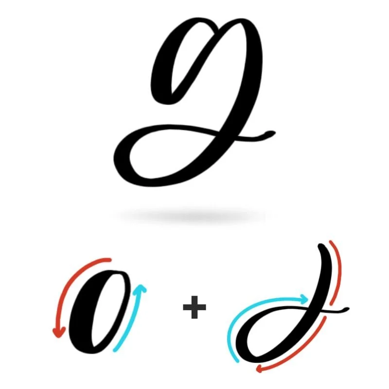
Stroke 1: Oval
The first stroke is a counterclockwise oval that starts and ends at the X-height. The oval should be slightly pitched to the right and shouldn’t be flattened or overly narrow. A similar oval appears in letters like a, d, and q, so strengthening it here improves several other letters at once.
Minor Stroke: Subtle Overturn
Before moving into the descending loop, a slight overturn helps guide the transition. This small curve begins at the top right of the oval. It’s light, controlled, and short — just enough of a curve to redirect the stroke downward smoothly. While subtle, this motion prevents the loop from feeling abrupt or disconnected. Think of it as a gentle hinge between the oval and the loop.
Stroke 2: Descending Loop
The final stroke is a descending loop that drops below the baseline, wraps clockwise, and finishes with a light rightward flourish that tapers naturally. The descending loop should feel rounded and spacious — not tight or pinched. When this stroke flows evenly, the entire lowercase g feels graceful and connected.
Want to learn calligraphy without guessing letter by letter?
Lettering Leap™ teaches modern calligraphy step by step — starting with basic strokes and building through the entire alphabet with guided daily practice.
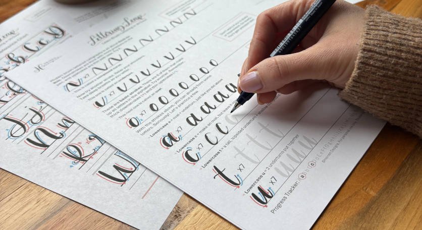
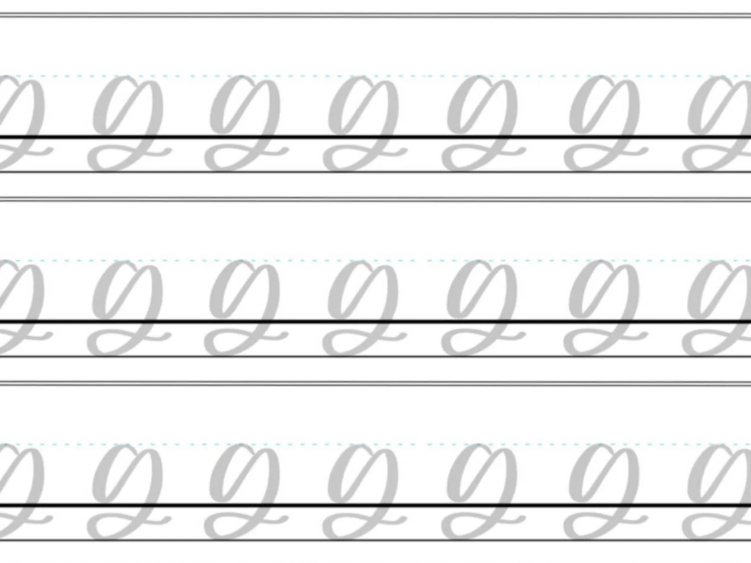
Practice Drills for Calligraphy G
Practicing the calligraphy G is all about smooth ovals, confident loops, and controlled pressure changes. Instead of writing full letters over and over, break the movement into smaller drills so your hand learns what correct feels like. Intentional repetition will always build skill faster than rushed rows of letters.
Warm-Up Strokes
Start by loosening your hand and reinforcing pressure control.
Light upstrokes moving upward and slightly left
Slow, steady downstrokes with heavier pressure
Counterclockwise oval motions that touch the baseline
Large looping strokes that dip below the baseline
These warm-ups directly prepare you for both uppercase and lowercase G.
Partial Letter Drills
Next, isolate the core pieces of the letter.
Open ovals that stop halfway up (for uppercase G)
Full ovals that return to the starting point (for lowercase g)
Short compound curves that feel like a small wave
Descending loops that wrap clockwise below the baseline
Focus on spacing and roundness. If a loop feels tight or uneven, slow down and give it more room.
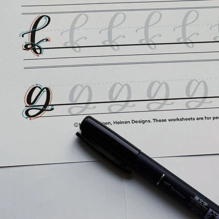
Full Letter Repetition
Now combine the strokes.
Write rows of uppercase G, paying attention to keeping the oval open and the finishing stroke subtle
Practice lowercase g slowly, ensuring the loop below the baseline stays smooth and rounded
Alternate between uppercase and lowercase to strengthen control
Aim for rhythm, not perfection. Each letter should feel like one continuous, confident motion.
Skill-Level Variations
Beginner: Trace examples first, then write larger letters with generous spacing. Focus on clean pressure contrast.
Intermediate: Reduce letter size slightly, tighten spacing, and experiment with longer finishing flourishes on lowercase g while keeping the structure intact.
If you’re unsure what to practice next or how to structure daily drills, guided repetition makes a big difference. A clear practice plan removes guesswork and helps you improve faster — one letter at a time.
Want guided daily drills?
Lettering Leap™ includes 30 days of structured practice that builds every letter step by step — so you’re not guessing what to practice next.
What Guidelines Are Used by the Letter G?
Understanding how the calligraphy G fits within your guidelines helps keep it balanced and readable. Because this letter includes both an oval and (in lowercase) a loop below the baseline, paying attention to vertical spacing is especially important.
The uppercase and lowercase forms use the same foundational lines, but they occupy the space differently.
Uppercase G stretches from the baseline to the capital height. Its open oval should feel centered within that space, and the finishing compound curve should sit comfortably without extending beyond the top.
Lowercase g is more compact at the top but extends below the baseline with its descending loop. The oval portion sits neatly between the baseline and the X-height, while the loop dips below before returning upward.
Key things to watch for:
The uppercase G should sit firmly on the baseline and reach the capital height
The lowercase oval should stay between the baseline and the X-height
The descending loop of lowercase g should extend below the baseline evenly and return smoothly
Both versions should maintain consistent slant and spacing with surrounding letters
When the G respects these guideline boundaries, it feels stable and proportional instead of oversized or cramped.
Letter G in the Complete Calligraphy Alphabet
The calligraphy G may look distinctive, but it’s built from strokes you’ll see throughout the alphabet. When you understand how G connects to other letters, it becomes much easier to write consistently — and improve multiple letters at the same time.
Letters That Share Similar Strokes
Lowercase g is especially connected to other oval-based letters.
g ↔ a: Same foundational oval shape at the top
g ↔ d: Similar oval base, with d extending upward instead of downward
g ↔ o: Similar oval motion without the added loop
g ↔ q: Both include the oval and a descending stroke below the baseline
If your lowercase g feels uneven, you’ll likely notice similar issues in these letters — especially with oval consistency or loop spacing.
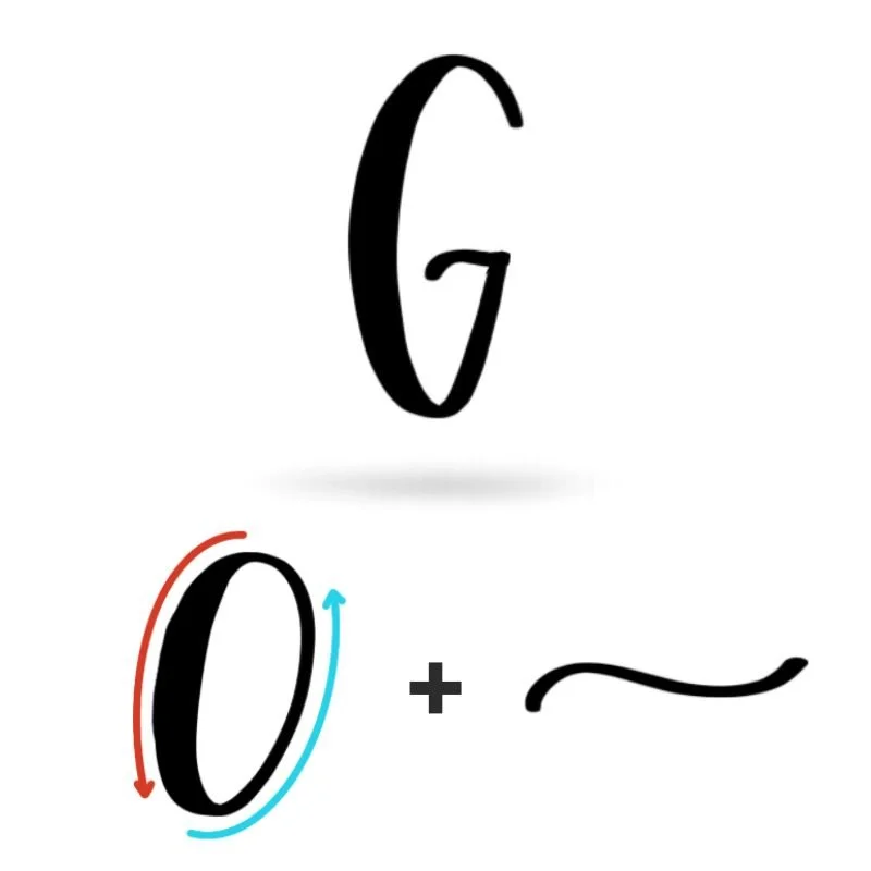
Uppercase G also shares structure with other rounded capitals.
G ↔ C: Both begin with a large counterclockwise oval motion
G ↔ O: Similar rounded form, with G remaining open
G ↔ F: Both use short, subtle compound curves
Mastering the letter G strengthens your control of ovals, loops, and compound curves — three movements that appear again and again in modern calligraphy.
Ready to learn?
Common Mistakes When Lettering G
The calligraphy G combines rounded ovals with a looped stroke, which can make it feel tricky at first. Small issues with pressure, spacing, or curves can quickly make the letter look cramped or uneven. If your G doesn’t feel quite right yet, these are some of the most common problems beginners run into.
1. Collapsed or Narrow Ovals
Both uppercase and lowercase G rely on a balanced oval shape.
Ovals that are too narrow make the letter feel tight
Flattened bottoms remove the smooth curve
Focus on drawing spacious, rounded ovals that touch the baseline naturally without looking squished.
2. Heavy Upstrokes
One of the most common brush lettering mistakes is applying too much pressure on the way up.
Upstrokes should stay thin and light
Thick upward strokes make the letter look clunky
Relax your grip and let the pen glide upward with minimal pressure.
3. Tight or Pinched Descending Loops
For lowercase g, the loop below the baseline should feel open and rounded.
Loops that are too small feel cramped
Pinched curves create awkward angles
Give the loop enough space to move smoothly below the baseline before returning upward.
4. Overpowering the Finishing Stroke (Uppercase G)
The small compound curve that finishes the uppercase G should stay subtle.
Heavy pressure can make the stroke look bulky
Large curves can overwhelm the oval
Keep this movement light and controlled so it complements the letter instead of dominating it.
5. Rushing the Letter
G involves several directional changes, which makes speed a common problem.
Fast strokes exaggerate uneven curves
Quick loops often lose their round shape
Slow, steady motion produces smoother results and helps maintain consistent pressure throughout the letter.
How to Improve Your Letter G Faster
Improving your calligraphy G comes from practicing the right movements — not just repeating the letter endlessly. Because G combines an oval with a loop, focused practice on those shapes will make the biggest difference.
Strengthen Your Ovals First
Both uppercase and lowercase G rely on a clean oval. If the oval is uneven or cramped, the whole letter will look off balance. Practice slow, counterclockwise ovals that touch the baseline evenly. Once the oval feels consistent, the rest of the letter becomes much easier to control.
Practice Descending Loops Separately
The loop below the baseline in lowercase g introduces extra movement. Practicing large descending loops on their own helps your hand learn the motion before combining it with the oval. Keep the loop open and rounded rather than tight or pinched.
Slow Down and Write Slightly Larger
Writing a little larger gives you more control over pressure and curves. It also makes it easier to see where shapes become uneven. Focus on smooth, steady motion instead of speed.
Review and Adjust Each Line
After finishing a row of practice, pause and look at your letters. Choose the strongest G, then identify one small adjustment to apply to the next line. This simple feedback loop turns repetition into real progress.
Follow a Guided Learning Path
Many beginners struggle with letters like G because they’re guessing what to practice next. A structured learning path helps you improve faster by building skills in the right order.
Practice Resources for Calligraphy G


Frequently Asked Questions about Calligraphy G
How do you write the letter G in calligraphy?
To write calligraphy G, start with the main rounded shape of the letter. Uppercase G is formed with an open oval followed by a short compound curve that finishes the letter. Lowercase g begins with an oval and transitions into a descending loop that drops below the baseline before finishing with a light flourish.
What strokes make up a lowercase g in calligraphy?
A lowercase g in calligraphy is built from two primary strokes: an oval and a descending loop. The oval forms the top portion of the letter, while the loop extends below the baseline and curves back upward before tapering off.
Why does my calligraphy g look uneven?
An uneven calligraphy g is usually caused by inconsistent ovals or tight loops below the baseline. If the oval is too narrow or the loop is rushed, the letter can feel cramped. Practicing smooth ovals and large loops separately often fixes this quickly.
Is the letter G hard to learn in brush lettering?
The brush lettering G can feel slightly more advanced because of the loop below the baseline, but it becomes much easier once you’re comfortable with ovals and pressure control. Most learners improve quickly after practicing those shapes on their own.
Why does my lowercase g look different every time?
Inconsistent g in calligraphy often comes from changing oval shapes or uneven pressure. If the oval shifts size or the loop below the baseline varies in width, the letter will look different each time. Practicing slow, consistent ovals helps stabilize the shape.
What letters are similar to the calligraphy letter g?
The calligraphy letter g shares strokes with several other letters. The oval at the top is similar to letters like a, d, and o. The descending loop below the baseline also appears in letters like q and some styles of y.
How do you make a smoother calligraphy g?
To create a smoother calligraphy g, focus on continuous motion and relaxed pressure changes. Writing slightly larger and slowing down helps maintain clean curves and prevents the loop from becoming tight or shaky.
What pen should I use to practice calligraphy G?
A flexible brush pen works best for practicing calligraphy G because it creates clear contrast between thin upstrokes and thick downstrokes. Beginners often benefit from a firmer brush tip for better control while learning the strokes.
How does lowercase g connect to other letters in cursive calligraphy?
The lowercase g in calligraphy usually finishes with a light rightward exit stroke. This makes it easy to connect to letters like a, e, n, m, and t when writing words.
Why does my calligraphy G look shaky?
A shaky calligraphy G is often caused by gripping the pen too tightly or writing too slowly without confident motion. Relaxing your hand and using smooth, continuous strokes usually improves the letter quickly.
Should I practice uppercase or lowercase g first?
Most beginners find it easier to start with lowercase g in calligraphy because it builds directly from the oval used in letters like a and o. Once you’re comfortable with those shapes, uppercase G becomes much easier to learn.
Will practicing calligraphy g help with other letters?
Yes, practicing the calligraphy letter g strengthens oval control, loop movement, and pressure changes. These skills transfer directly to other letters like a, d, o, and q, making the rest of the alphabet easier to write.
Ready to learn?