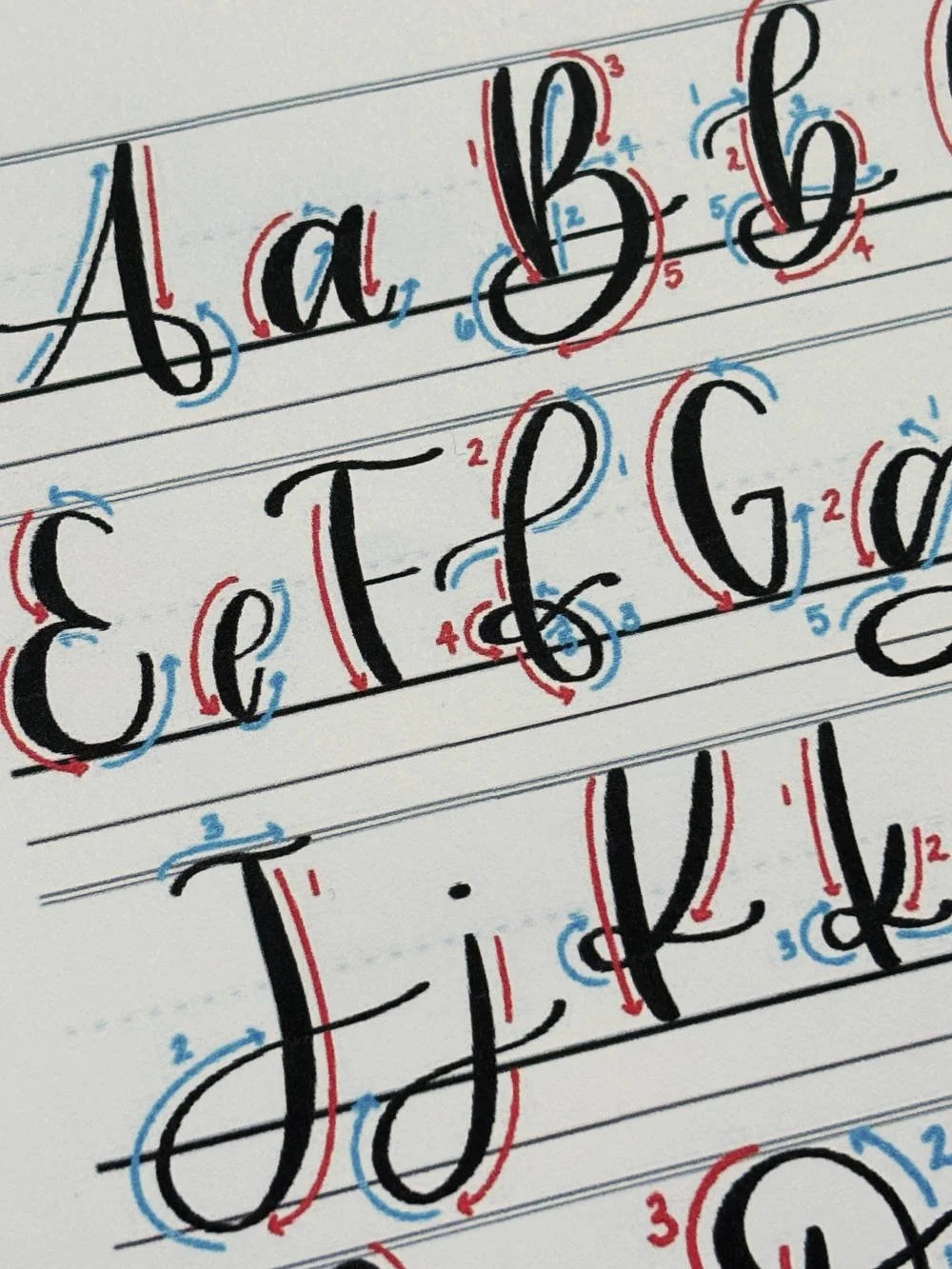
Calligraphy F: Uppercase, Lowercase, Strokes & Practice
A complete guide to calligraphy F, showing how to form it with brush lettering techniques
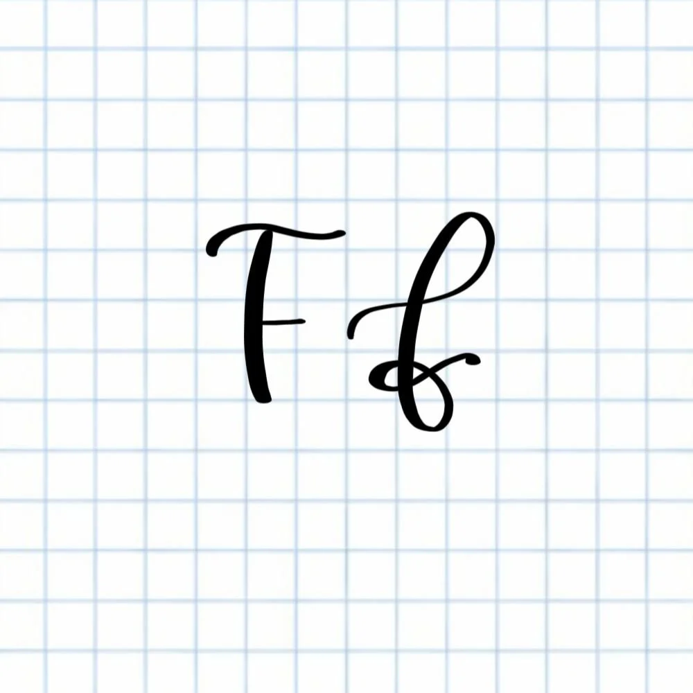
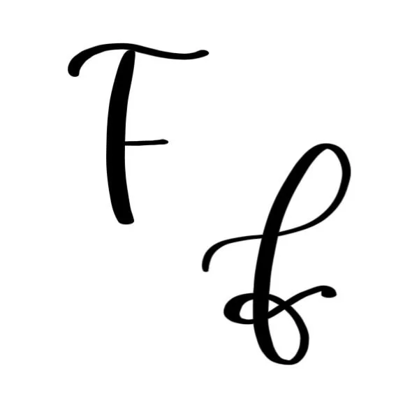
How to Write the Calligraphy Letter F
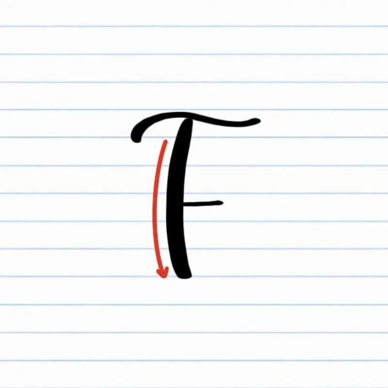
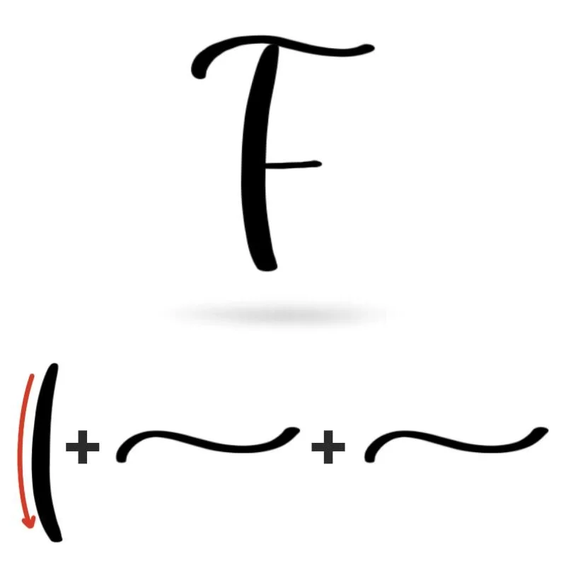
Uppercase F: Downstroke to the baseline, shallow compound curve on top, finish with a slight curve at the middle.
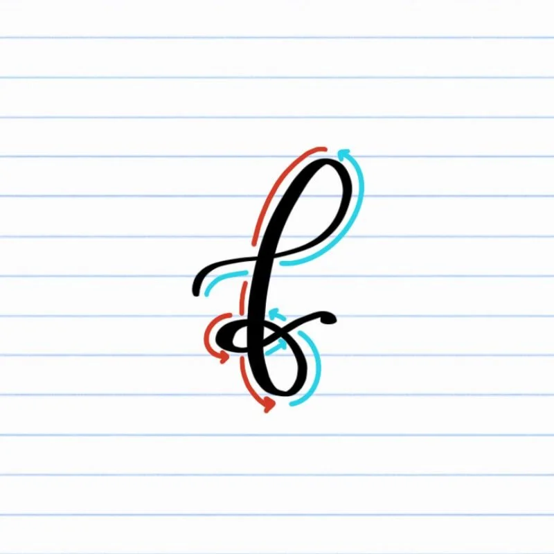
Lowercase f: Big ascending loop shifting into a descending loop at the bottom, finished with a flourishing compound curve.
How to Write Uppercase Calligraphy F Step-by-Step
Begin with a straight downstroke.
Start at the top with a firm, steady stroke down toward the baseline. Use controlled pressure on the downstroke so the line feels confident and even.
Add the top compound curve.
Near the top, transition into a shallow compound curve that moves from left to right. This should start slightly below the top of the downstroke, curving upward first and then sweeping down again after cresting the downstroke. Keep the movement smooth and connected.
Add the lower compound curve.
Around the middle of the downstroke, introduce a second compound curve that’s shorter than the first (and straighter). The bottom line can actually be a virtually straight line if desired. This lower line helps establish the cross-bar-like movement of the F and keeps the letter balanced from top to bottom.
How to Write Lowercase Calligraphy f Step-by-Step
Start with a light upstroke swirl.
Place your brush pen around the middle of where your letter will land and begin a thin, upward stroke. Use very light pressure as you guide the pen toward the right and up toward the top of the letter, curving slightly counterclockwise.Curve over into a loop at the top.
As you reach the top, gently curve the stroke to the left and begin forming a large loop. This loop should be rounded and controlled, not tight or pinched.Transition into a thick downstroke.
To complete the top loop, gradually add pressure as you move downward. This creates a thicker stroke as you pass through the initial light stroke and travel straight down toward the baseline. Keep the line steady and centered.Continue into a descending loop below the baseline.
Without lifting your pen, carry the stroke past the baseline and into a loop below it. Maintain heavier pressure on the downward portion of the loop, then gradually release pressure as the stroke curves back upward, rotating counterclockwise.Cross through the middle and tie it into a bow.
As the stroke rises from the lower loop, let it cross through the thick downstroke with light pressure. Continue to curve around counterclockwise, creating a looping bow to embellish the base of the letter.. Finish with a thin, right-leaning exit stroke that prepares the letter to connect smoothly to the next letter in a word.
Experience a Clear Path to Lettering Confidence
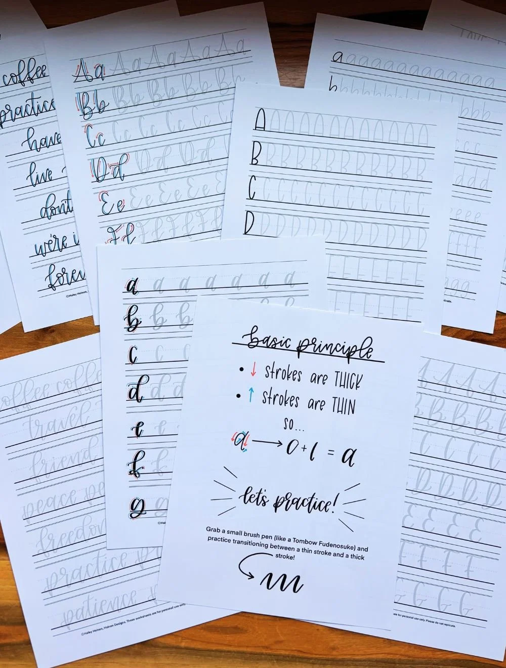
Basic Strokes for Calligraphy F
Basic Strokes That Make Up Uppercase F
The uppercase F in modern calligraphy is built from three foundational movements: a strong downstroke and two compound curves. When you practice these strokes individually, the full letter becomes much easier to control and repeat consistently.
Stroke 1: Downstroke
The first stroke is a firm, slightly bent downstroke from the top of the letter to the baseline. Apply steady pressure as you pull downward to create a clean, even thick line. This stroke appears in many other letters like B, D, K, and other, so improving it here strengthens your overall brush control.
Stroke 2: Top Compound Curve
The second stroke is a shallow compound curve placed on top of the downstroke. It moves slightly upward, then gently curves back toward the stem. Keep the upward motion lighter, adding subtle pressure as the stroke curves downward. The movement should feel smooth — not sharp or stiff.
Stroke 3: Lower Compound Curve
The third stroke is a shorter compound curve positioned below the midpoint of the letter. It mirrors the top curve but stays more compact and straighter. Use light pressure across the stroke to keep it subtle and short.
Basic Strokes That Make Up Lowercase f
The lowercase f in modern brush lettering is built from three flowing movements: an ascending loop, a descending loop, and a compound curve. Because this letter moves around significantly, smooth pressure transitions are especially important.
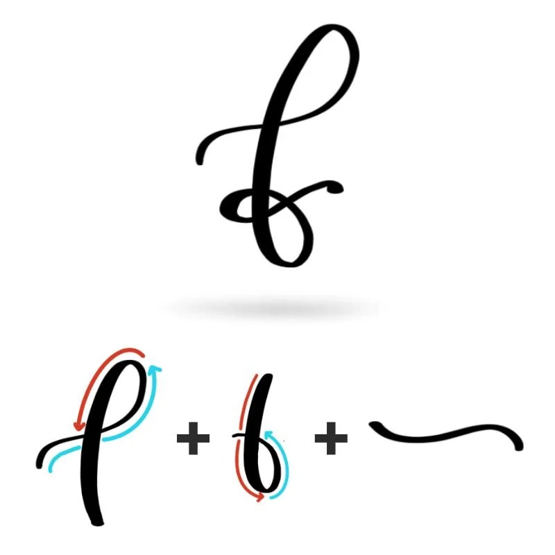
Stroke 1: Ascending Loop
The first stroke is an ascending loop that starts with a thin tail, curving into a large loop and wrapping around into a thick downward strokes.
Stroke 2: Descending Loop
From the top loop, transition the thick downstroke into the start of the descending loop. This stroke continues below the baseline and curves into a smaller lower loop. Maintain the pressure as you move downward, then slowly release it as the stroke curves back up. The loop should feel balanced and smooth.
Stroke 3: Compound Curve
As the stroke rises from the lower loop, it transitions into a compound curve that ties off the bottom of the letter into a bow and forms the exit stroke. Keep this movement light so the crossing stays clean and not bulky. The stroke should curve downward slightly, then back upward before tapering off.
Want to learn calligraphy without guessing letter by letter?
Lettering Leap™ teaches modern calligraphy step by step — starting with basic strokes and building through the entire alphabet with guided daily practice.
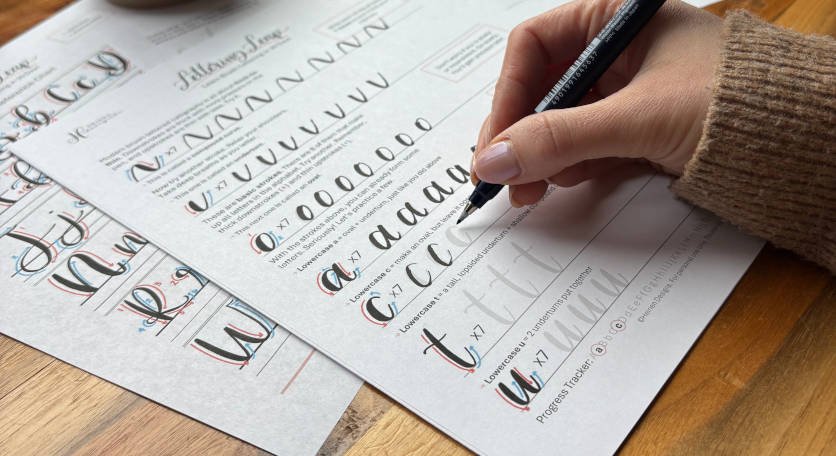
Practice Drills for Calligraphy F
Practicing the letter F in calligraphy is all about building control over loops, compound curves, and steady downstrokes. Because both uppercase and lowercase F use multiple curved movements, breaking the letter into smaller drills will help your hand learn the motion more naturally.
Warm-Up Strokes
Begin with a few minutes of simple pressure and curve exercises.
Light upstrokes moving upward and slightly to the right
Slow, steady downstrokes with consistent pressure
Large looping motions
Smaller loops that dip downward
These warm-ups prepare your hand for both the abundant loops in lowercase f and the subtle curves in uppercase F.
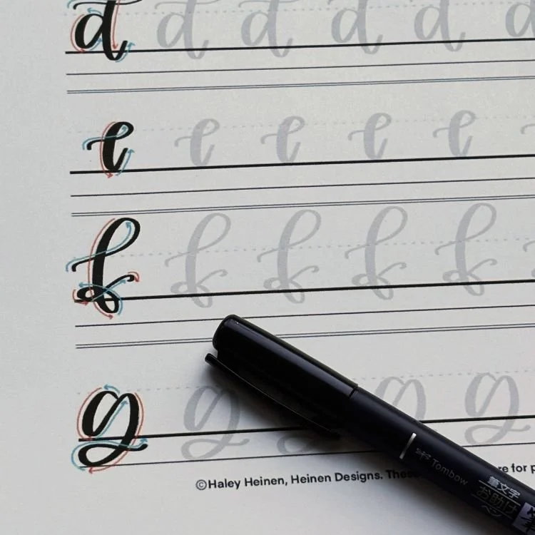
Partial Letter Drills
Next, isolate the main movements that make up the letter.
Practice rows of ascending loops that stay open at the top
Repeat descending loops that dip below the baseline evenly
Drill shallow compound curves for the uppercase F cross strokes
Practice straight downstrokes with clean starts and stops
If your F feels stiff or uneven, spend extra time here. Clean individual strokes make the full letter much easier.
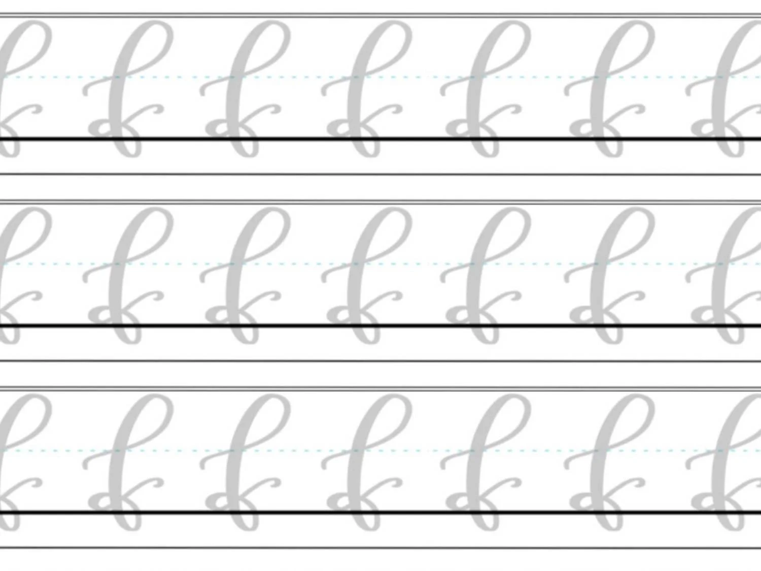
Full Letter Repetition
Now bring the strokes together into complete letters.
Write rows of uppercase F, focusing on balanced top and lower curves
Practice lowercase f slowly, keeping loops open and controlled
Alternate between uppercase and lowercase to build contrast awareness
Pay attention to spacing and rhythm. Aim for consistency, not perfection.
Skill-Level Variations
Beginner: Trace examples first, then write slowly with larger letters. Larger movements make it easier to see and fix mistakes.
Intermediate: Practice smaller sizes, tighten spacing, and experiment with slightly longer exits or subtle bounce — while maintaining control.
The goal of these drills isn’t just repetition — it’s awareness. When you practice the strokes intentionally, your calligraphy F will improve faster and feel more fluid each time you write it.
Want guided daily drills?
Lettering Leap™ includes 30 days of structured practice that builds every letter step by step — so you’re not guessing what to practice next.
What Guidelines Are Used by the Letter F?
Understanding how the letter F fits within your guidelines helps you keep both uppercase and lowercase versions balanced and consistent. Because this letter extends above and below the main writing space in its lowercase form, paying attention to vertical spacing is especially important.
The uppercase F sits firmly on the baseline and reaches up to the capital height. Its top compound curve stays near the capital height, while the lower compound curve sits around the x-height area.
The lowercase f is taller and more dynamic. Its ascending loop rises almost to the capital height, and its descending loop dips almost to the descender line below the baseline. The crossing compound curve should fall near the x-height, keeping the center of the letter visually balanced.
When the proportions are correct, the letter feels stable rather than stretched or crowded.
Key things to watch for:
Uppercase F should sit cleanly on the baseline and reach the capital height
The lower compound curve of uppercase F should align near the x-height
The middle crossing stroke of lowercase f should sit near the x-height
Loops should remain open without touching other guideline boundaries
Using your guidelines as visual anchors makes your F in calligraphy more consistent — especially when writing it inside full words.
Letter F in the Complete Calligraphy Alphabet
The letter F plays an important role in the calligraphy alphabet because it combines several foundational movements into one shape. When you learn to control its loops, compound curves, and downstrokes, you strengthen skills that transfer directly to many other letters.
Letters That Share Similar Strokes

Lowercase f is especially valuable because it blends three major stroke families.
f ↔ b, d, h, l: Share a similar ascending loop
f ↔ A, g, j, y: Use a descending loop below the baseline
f ↔ q: Often includes a crossing or midline movement depending on style
If your loops feel tight or uneven in f, you’ll likely notice the same issue in these letters.
Uppercase F connects closely with other structured capital letters.
F ↔ J, T: Balanced top structure with a strong vertical stem
F ↔ D, K, M, N, R: Relies on a confident vertical downstroke
Improving your calligraphy F strengthens your control over vertical balance and cross-stroke placement — two skills that show up across the entire uppercase alphabet.
Ready to learn?
Common Mistakes When Lettering F
The letter F can feel awkward at first — especially the lowercase version with its loops and crossing stroke. If your calligraphy F doesn’t look quite right yet, you’re not alone. These are some of the most common issues beginners run into.

1. Uneven Pressure
Inconsistent thick and thin strokes can make F look shaky or unbalanced.
Upstrokes that are too heavy remove contrast
Downstrokes that are too light make the letter look weak
Focus on clear pressure changes: light on the way up, heavier on the way down.
2. Tight or Collapsed Loops (Lowercase f)
Lowercase f relies on open, rounded loops. When the loops are too small or squeezed inward, the letter feels cramped.
Top loops that pinch closed
Lower loops that collapse into the downstroke
Slow down and aim for smooth, open curves instead of tight circles.

3. Misplaced Cross Stroke
The compound curve that crosses the middle of lowercase f (or the lower curve on uppercase F) can easily sit too high or too low.
Too high makes the letter feel top-heavy
Too low throws off balance and spacing
Keep the crossing movement centered around the middle of the letter’s main body.
4. Overly Straight or Wobbly Downstroke
The vertical stem anchors both uppercase and lowercase F. If it stands too straight up and down, leans inconsistently or wavers, the entire letter feels off.
Practice slow, controlled downstrokes separately before adding curves.
5. Rushing the Curves
F contains multiple curved movements. Writing too quickly often leads to sharp corners instead of smooth transitions.
If your letter feels stiff, reduce your speed and focus on continuous motion from one stroke into the next.
How to Improve Your Letter F Faster
Improving your letter F doesn’t come from writing it hundreds of times without thinking. It comes from practicing the right movements with focus and intention. Because F combines loops, downstrokes, and compound curves, small refinements can make a big difference quickly.
Practice the Loops on Their Own
Most issues with lowercase f come from tight or uneven loops. Instead of jumping straight into full letters, spend time practicing ascending and descending loops independently. When those loops feel smooth and open, the full letter becomes much easier to control.
Strengthen Your Downstroke Control
Both uppercase and lowercase F rely on a confident vertical stem. If your letter feels unstable, isolate your downstrokes and practice creating even thickness from top to bottom. Steady pressure builds consistency across the entire alphabet.
Slow Down the Crossing Movement
The compound curve that crosses the top of uppercase F often causes hesitation. Practice that crossing motion separately, keeping it light and controlled. A relaxed, thin stroke prevents the letter from looking bulky or cluttered.
Write Slightly Larger
If your F feels cramped, increase the size of your practice letters. Larger movements make it easier to see spacing problems and correct pressure inconsistencies before they turn into habits.
Follow a Structured Learning Path
While self-guided practice works, progress tends to accelerate when you follow a clear system. A structured approach ensures you’re building the right skills in the right order — not guessing what to fix next.
Practice Resources for Calligraphy F


Frequently Asked Questions about Calligraphy F
How do you write the letter F in calligraphy?
To write the letter F in calligraphy, begin with controlled pressure changes and smooth, connected strokes. Uppercase F is formed with a downstroke and two compound curves. Lowercase f uses an ascending loop, a descending loop below the baseline, and a light compound curve through the middle. Slowing down and focusing on clean pressure transitions makes the biggest difference.
What strokes make up a lowercase f?
Lowercase f is built from three strokes: an ascending loop, a descending loop, and a compound curve that crosses through the lower-center. These strokes combine light upstrokes and heavier downstrokes to create contrast and movement.
Why does my lowercase f look messy?
A messy calligraphy f is usually caused by tight loops, uneven pressure, or a heavy crossing stroke. Collapsed loops and inconsistent thickness can make the letter feel tangled. Practicing each stroke separately often fixes the problem quickly.
Is uppercase F harder than lowercase f?
Uppercase F is structurally simpler, but it requires careful placement of the compound curves to look balanced. Lowercase f can feel more challenging at first because of its multiple, winding curves.
Why do my loops look uneven?
Uneven loops in the calligraphy letter f often happen when pressure changes are rushed. If you press too hard on an upstroke or release pressure too late on a downstroke, the loop can lose its shape. Slow, steady movements help keep loops rounded and open.
How high should lowercase f extend?
Lowercase f in calligraphy rises almost to the capital height line and dips below the baseline but not quite to the descender line. These guidelines can be flexed for a stylistic change, but keeping the proportions consistent helps the letter look balanced inside words.
How do I keep the crossing stroke in calligraphy F from looking bulky?
Keep the crossing compound curve in both uppercase and lowercase f light. It should be a thin stroke with minimal pressure so it doesn’t overpower the loops or stem. Think of it as a gentle glide rather than a heavy mark.
What letters are similar to F?
Lowercase calligraphy f shares loops with letters like b, h, g, j, q, and y. Uppercase F shares structural similarities with J, K, M, N, and T because of its vertical stem and cross-stroke placement. Improving F often strengthens those letters too.
Why does my uppercase F look unbalanced?
If the top compound curve is too large or the lower one sits too low, the letter can feel top-heavy or stretched. Keeping both curves proportionate and aligned with your guidelines improves balance.
Should I practice uppercase or lowercase F first?
Many beginners start with uppercase F because it has fewer curves. However, practicing lowercase f early helps build loop control that transfers to several other letters. Either approach works — consistency matters more than order.
What pen should I use to practice calligraphy F?
A flexible brush pen works best for practicing modern calligraphy F because it clearly shows thick and thin contrast. Beginners may prefer a slightly firmer brush tip for better control while learning loops.
How often should I practice the letter F?
Short, focused practice sessions once per day or a few times per week are more effective than long, occasional sessions. Repeating loops and compound curves regularly helps build muscle memory faster.
Will practicing F help improve other letters?
Yes. Because F combines loops, downstrokes, and compound curves, mastering it strengthens foundational skills used throughout the alphabet. Improving your calligraphy F often improves multiple letters at the same time.
Ready to learn?