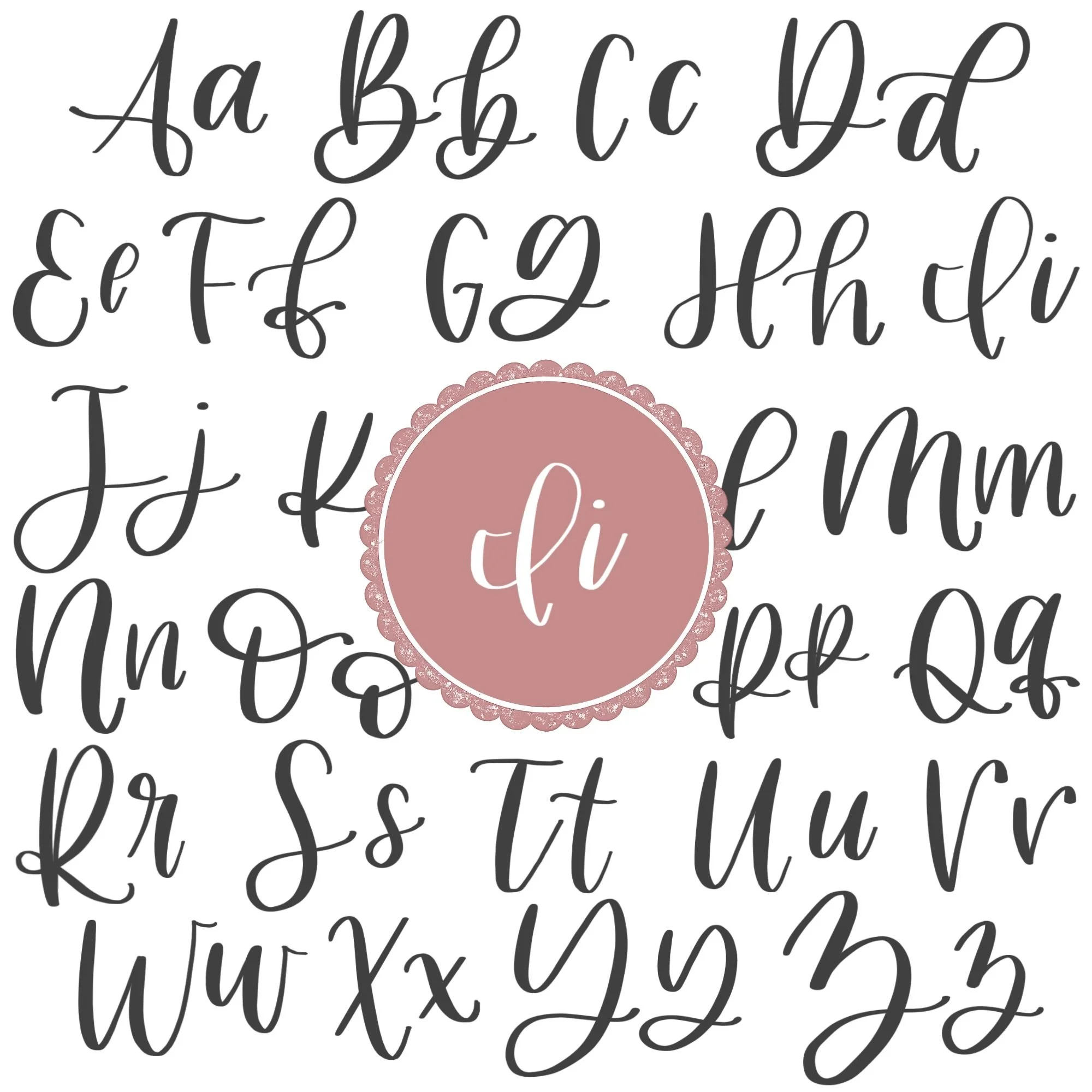
Calligraphy I: Uppercase, Lowercase, Strokes & Practice
A complete guide to calligraphy I, showing how to form it with brush lettering techniques
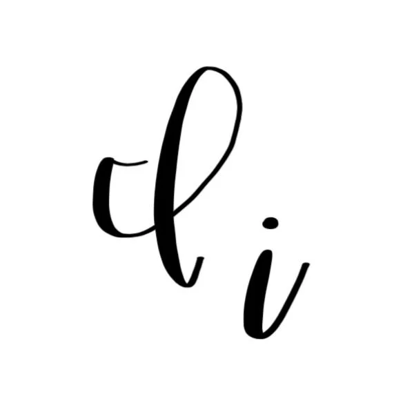
How to Write the Calligraphy Letter I
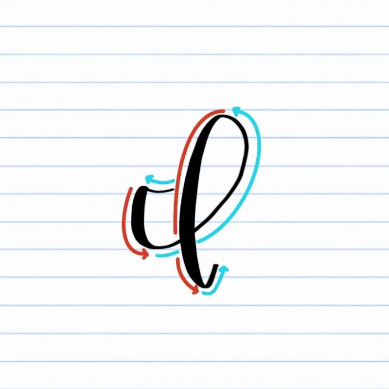
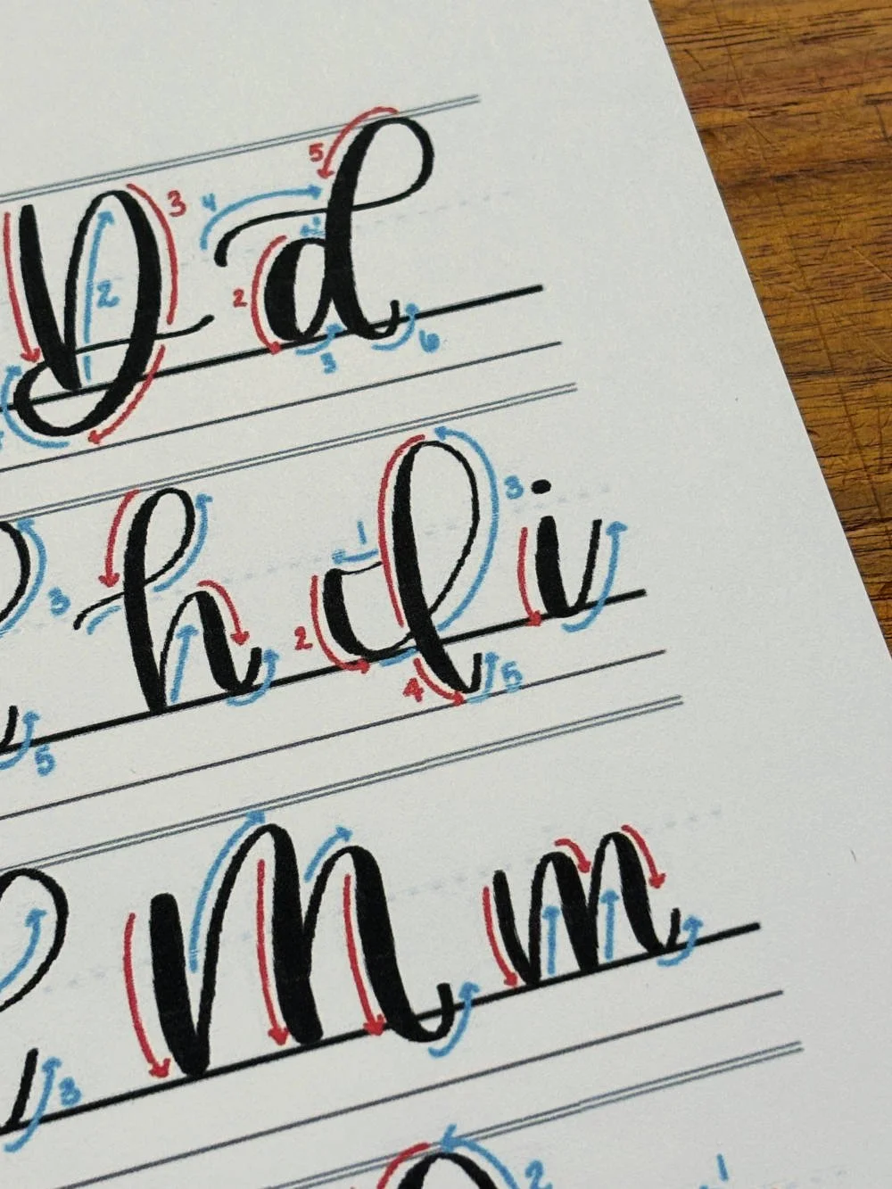
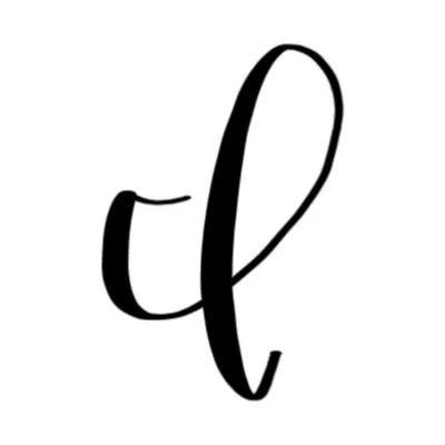
Uppercase I: Mini-underturn to the right, followed by a larger underturn, transitioning into a huge ascending loop with a light upturn.
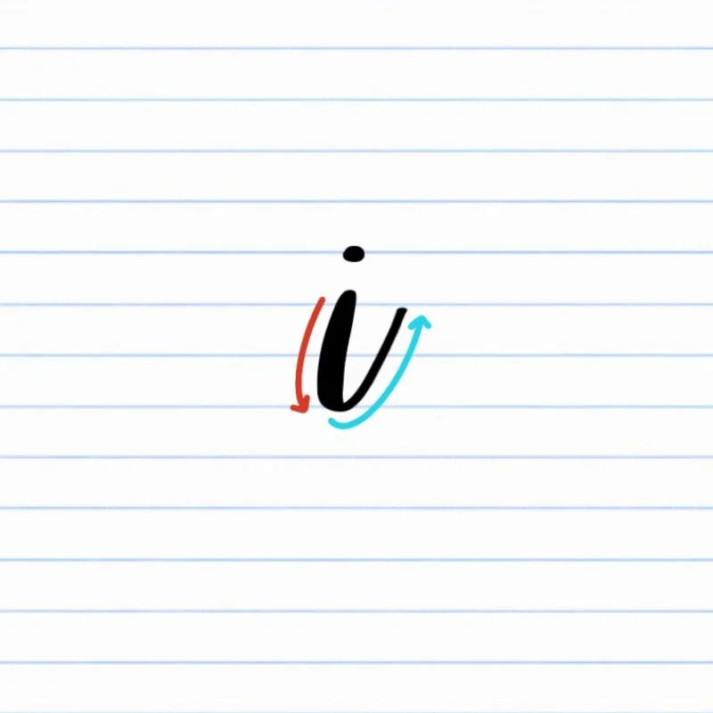
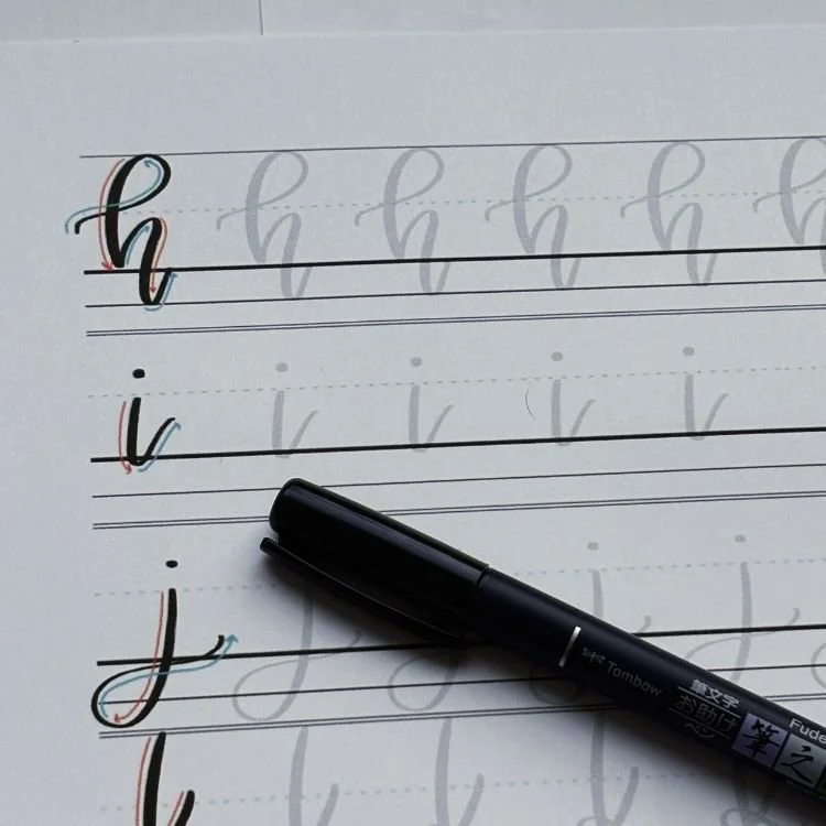
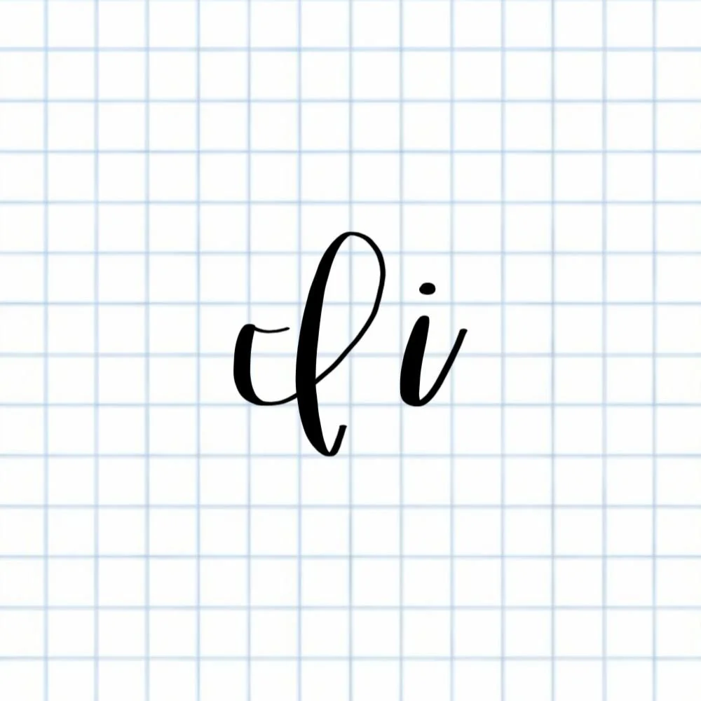
Lowercase i: Small underturn resting on the baseline with a dot above it.
How to Write Uppercase Calligraphy I Step-by-Step
Begin with a slight underturn at the X-height.
Place your brush pen at the X-height and start with a small underturn that curves gently to the left. Use light pressure so the stroke stays thin. This short movement creates a graceful entry into the larger motion that forms the rest of the letter.
Sweep rightward into a proper underturn.
From the mini-underturn, guide the pen downward, applying heavier pressure to create a thick line. As you move down, curve smoothly to the right, making a wide, sweeping stroke. Maintain pressure as the stroke curves downward toward the baseline, then release it as you bring the underturn back up again.
Carry the stroke up into a tall counterclockwise loop.
As the thin exit line of the underturn rises away from the baseline, transition into a large ascending loop. The loop should rise all the way to the capital height, veering counterclockwise, and then descend in a thick line below the baseline. The loop should feel open and airy.
Finish with a soft, upturned exit.
Gradually release pressure as your ascending loop reaches the bottom. Guide the pen into a gentle upturn to the right. This taper keeps the ending light and gives the letter an elegant but subtle flourish.
How to Write Lowercase Calligraphy i Step-by-Step
Start at the X-height with a thick entry.
Place your brush pen at the X-height and begin with heavy pressure. This stroke will become the start of a smooth underturn, so focus on keeping the line thiick and controlled.
Draw a downstroke toward the baseline.
As you guide the pen downward, keep the pressure strong so the stroke remains thick. Move steadily toward the baseline, arcing the line slightly.
Curve into the underturn and lift upward.
Once you reach the baseline, curve the stroke gently to the right and begin lifting the pen upward again. Gradually release pressure so the line becomes thin as it rises. Stop about halfway between the baseline and the X-height or continue as needed to create a bridge to the next letter.
Add the dot above the letter.
Lift your pen and place a small dot above the original starting point of the letter. Keep the dot centered over the main stroke and slightly above the X-height so the lowercase i stays clear and balanced.
Experience a Clear Path to Lettering Confidence
Basic Strokes for Calligraphy I
Basic Strokes That Make Up Uppercase I
The uppercase calligraphy I is built from a few connected brush lettering strokes that create its tall looping shape. When you break the letter down into these movements, it becomes much easier to control and repeat consistently.
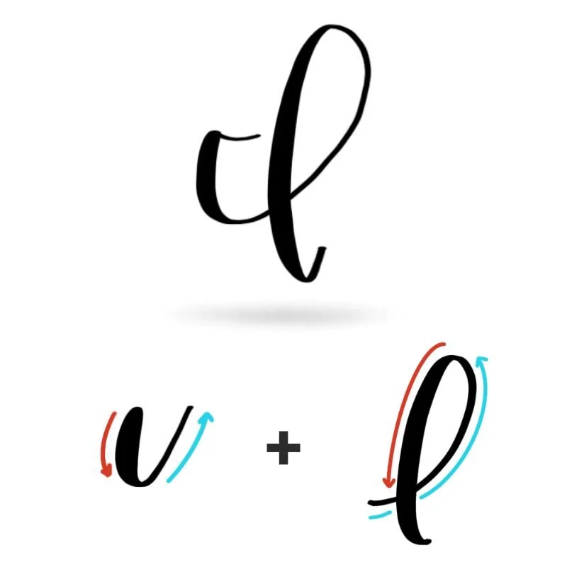
Stroke 1: Entry Underturn(s)
The letter begins with a small underturn at the X-height. This stroke is thin and brief with light pressure and curves slightly to the left before transitioning downward into a larger, proper underturn. This one sweep downward to the baseline and transitions into the next stroke without any obvious midpoint.
Stroke 2: Ascending Loop
From the upward curve of the underturn, the stroke transitions into a large ascending loop. The line should be thin and light. The loop rises all the way to the capital height, curving counterclockwise, before dropping downward again with increased pressure, forming the thick side of the loop. This stroke continues smoothly down below the baseline and forms the main body of the letter.
Bonus Stroke: Exit Upturn
At the bottom of the loop, pressure gradually releases and the stroke curves into a light upturn to the right. This thin exit stroke keeps the ending of the letter light and fluid.
Basic Strokes That Make Up Lowercase i
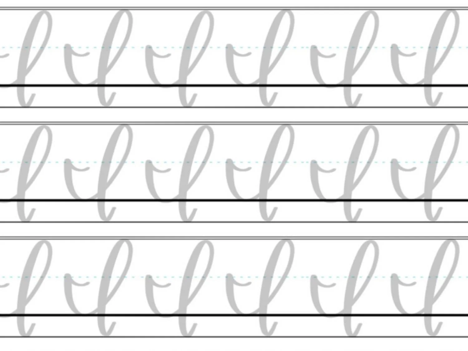
The lowercase calligraphy i is one of the simplest letters in modern brush lettering. It’s built from just two small strokes: an underturn and a dot. Even though the shape is simple, it’s a great letter for practicing clean pressure changes and smooth exits.

Stroke 1: Underturn
The main body of the letter is a single underturn. This stroke begins at the X-height with heavier pressure, creating a thick downstroke as the pen moves toward the baseline. This underturn creates the main structure of the letter and forms the exit stroke that allows the i in calligraphy to connect smoothly to the next letter.
Bonus Stroke: Dot
The second stroke, which isn’t really one of the true basic strokes of calligraphy, is the dot placed above the letter. After completing the underturn, lift the pen and place a small dot above the original starting point of the letter. Keeping the dot small and balanced helps the calligraphy letter i remain clean and readable.
Want to learn calligraphy without guessing letter by letter?
Lettering Leap™ teaches modern calligraphy step by step — starting with basic strokes and building through the entire alphabet with guided daily practice.
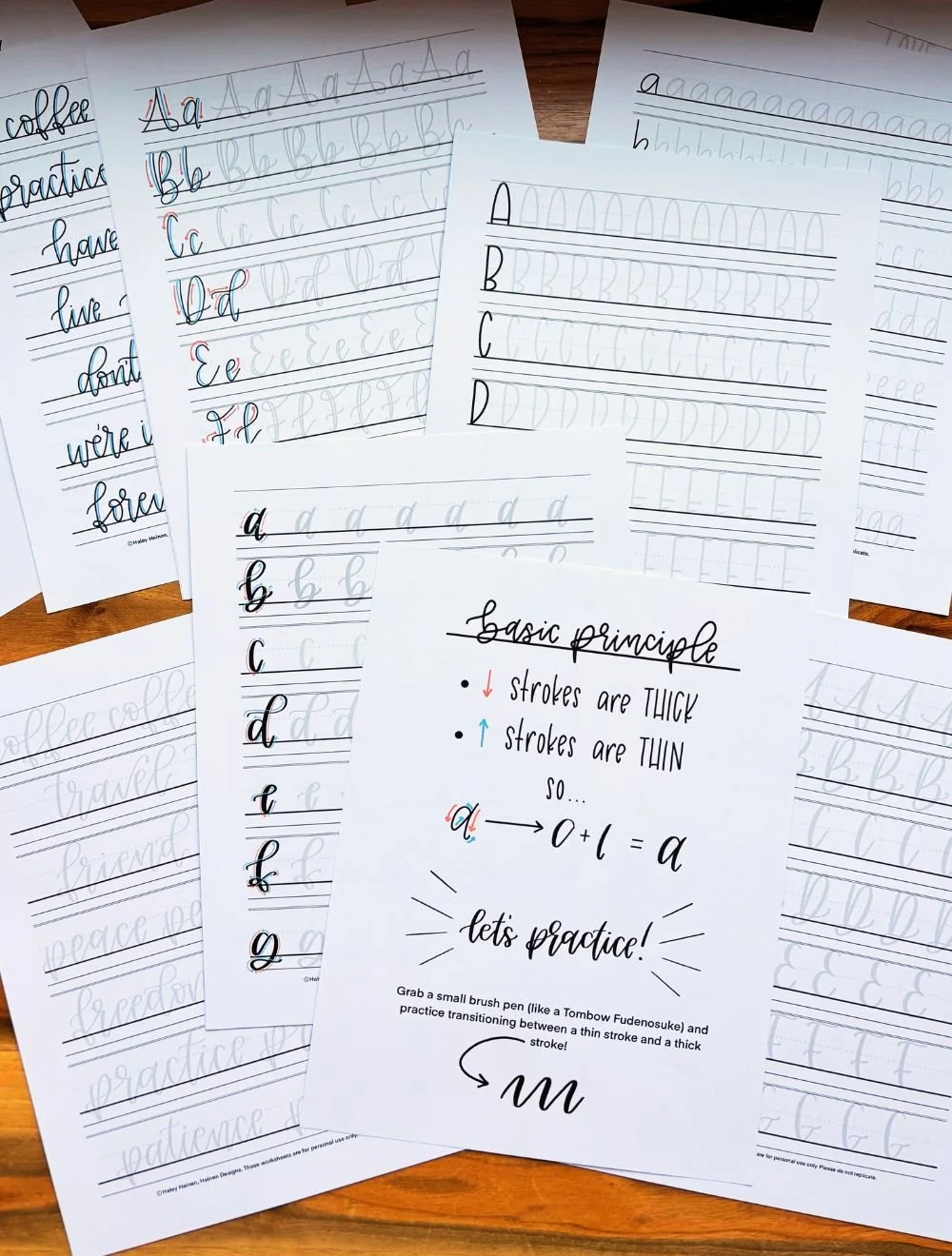
Practice Drills for Calligraphy I
Practicing the calligraphy letter I is all about building control over underturns, large loops, and clean pressure transitions. Instead of jumping straight into full letters, break the movement into smaller drills so your hand can learn the shapes first.
Warm-Up Strokes
Start with a few minutes of simple strokes to loosen your hand and reinforce pressure control.
Thick downstrokes from the X-height to the baseline
Thin exit strokes rising upward and to the right
Repeating underturn shapes that dip to the baseline and lift back up
These movements appear in both uppercase and lowercase brush lettering I.
Partial Letter Drills
Next, isolate the core pieces of the letter.
Rows of underturns starting at the X-height and finishing halfway up
Large counterclockwise loops for the uppercase I
Loop drills that travel above and below the baseline smoothly
Practicing these shapes on their own helps eliminate wobble and uneven pressure.
Full Letter Repetition
Now combine the strokes into the full letter.
Write rows of uppercase I, focusing on open, balanced loops
Practice lowercase i slowly to keep the underturn smooth
Add the dot last so the spacing stays consistent
Focus on steady rhythm rather than speed.
Skill-Level Variations
Beginner: Trace examples, then write slowly with wide spacing
Intermediate: Write smaller letters and practice connecting lowercase i within short words
Want guided daily drills?
Lettering Leap™ includes 30 days of structured practice that builds every letter step by step — so you’re not guessing what to practice next.
What Guidelines Are Used by the Letter I?
Guidelines help keep the calligraphy letter I balanced and consistent. Even though the letter is built from simple strokes, its tall loop and long movement make it easy to accidentally stretch too far or lose alignment without clear visual anchors.
The uppercase calligraphy I travels through several guideline areas. It begins at the X-height, dips to the baseline during the underturn, then rises into a large loop that reaches the capital height before descending below the baseline. The lowercase i in calligraphy is much more compact, staying mostly between the X-height and baseline with a small dot placed above.
Paying attention to where each part of the letter sits helps maintain consistent proportions across your lettering.
Key things to watch for:
The lowercase i begins at the X-height and returns toward the middle of the space after the underturn
The dot should sit slightly above the X-height and align with the main stroke
The uppercase I rises to the capital height and descends below the baseline
Both versions should stay vertically aligned so the letter feels upright and balanced
Letter I in the Complete Calligraphy Alphabet
The calligraphy letter I may look simple, but it plays an important role in building core brush lettering skills. Both the uppercase and lowercase versions rely on strokes that appear throughout the alphabet, which makes practicing I surprisingly valuable.
Letters That Share Similar Strokes

The lowercase i in calligraphy is built from a single underturn followed by a dot. That underturn movement shows up in several other letters that use similar exit strokes.
i ↔ u: Both rely on repeated underturn shapes
i ↔ t: The same underturn motion appears as the main structure of the letter
i ↔ w: The base stroke is identical and repeated
If your underturns feel uneven in calligraphy i, you’ll often notice similar inconsistencies in these letters.
The uppercase calligraphy I also shares movement with other looped letters. Its tall counterclockwise loop and descending stroke appear in several expressive uppercase forms.
I ↔ l: Both use large sweeping loops that form the core structure of the letter
I ↔ H: Similar looping motion and pressure changes
I ↔ f: Shares the tall looping structure and downward movement
Because of these shared strokes, improving your I in calligraphy helps strengthen several other letters across the alphabet.
Ready to learn?
Common Mistakes When Lettering I
The calligraphy letter I looks simple, but small issues with pressure, spacing, or proportions can make it feel awkward or unbalanced. If your I in calligraphy doesn’t look quite right yet, these are some of the most common problems beginners run into.

1. Uneven Pressure
Because the letter relies on clear contrast between thin and thick strokes, inconsistent pressure can make it look shaky.
Downstrokes that are too light weaken the letter
Upstrokes that are too heavy make the loops look clumsy
Focus on strong pressure on downstrokes and light pressure when the pen moves upward.
2. Collapsed Uppercase Loops
The uppercase calligraphy I uses a tall, open loop. When the loop becomes too tight or narrow, the letter can feel cramped.
Loops that pinch inward lose their elegance
Overlapping strokes make the letter harder to read
Aim for a wide, airy loop that feels relaxed.

3. A Flat or Stiff Underturn (Lowercase i)
The lowercase i depends on a smooth underturn. When this stroke becomes too straight or angular, the letter loses its flow.
Flat curves make the letter look mechanical
Sudden direction changes create sharp corners
Keep the motion rounded and continuous.
4. Misplaced Dot
The dot may seem minor, but poor placement can throw off the balance of the entire letter.
Dots placed too far to the side feel disconnected
Dots that sit too low crowd the letter
Keep the dot centered above the stroke and slightly above the X-height.
5. Rushing the Letter
Because the calligraphy letter i is short, it’s easy to write it too quickly.
Fast strokes create wobbly curves
Skipping the pressure changes removes contrast
Slow down and focus on smooth, controlled movement before increasing speed.
How to Improve Your Letter I Faster
Improving your calligraphy letter I comes down to practicing the right movements with intention. Because the letter is built from a few simple strokes, small adjustments in pressure and spacing can quickly make it look smoother and more confident.
Practice Clean Underturns
The lowercase i in calligraphy relies entirely on a well-formed underturn. If this stroke feels stiff or uneven, spend time repeating the underturn motion on its own before writing the full letter. Focus on starting with strong pressure on the downstroke and gradually releasing pressure as the line curves upward. Smooth, rounded underturns will instantly improve the overall look of the letter.
Keep Uppercase Loops Open
The uppercase calligraphy I depends on a large, airy loop. If your loops feel tight or cramped, try writing the letter slightly larger than normal. Larger movements make it easier to control the curve and maintain consistent pressure as the stroke rises and falls.
Separate the Dot from the Stroke
Many beginners place the dot too quickly after finishing the letter. Instead, pause for a moment after writing the stroke and then add the dot deliberately. This small pause helps you center the dot correctly and keeps the calligraphy letter i looking balanced.
Slow Down the Motion
Speed often hides small mistakes in lettering. Writing calligraphy I slowly allows you to feel the pressure transitions and keep the curves smooth. Once the movements feel comfortable, your speed will naturally increase without sacrificing control.
Practice Resources for Calligraphy I


Frequently Asked Questions about Calligraphy I
How do you write the letter I in calligraphy?
To write the calligraphy letter I, start with controlled pressure changes and smooth curved strokes. The uppercase I uses a sweeping underturn that flows into a tall loop before finishing with a light exit stroke. The lowercase i in calligraphy is created with a single underturn followed by a centered dot above the letter.
What strokes make up a lowercase i in calligraphy?
The calligraphy i is made from two strokes: an underturn and a dot. The underturn forms the main body of the letter, starting with a thick downstroke and finishing with a thin upward exit. The dot is placed slightly above the X-height and centered over the main stroke.
Why does my calligraphy I look uneven?
An uneven calligraphy letter I is usually caused by inconsistent pressure or rushed strokes. Heavy upstrokes, weak downstrokes, or tight loops can all make the letter look unbalanced. Slowing down and focusing on clear pressure changes typically improves the letter quickly.
How do you place the dot on a calligraphy i?
The dot in calligraphy i should sit slightly above the X-height and align with the main vertical stroke. It should be small and centered rather than large or off to one side. Taking a moment to place the dot carefully helps keep the letter balanced.
Is the letter I hard to learn in modern calligraphy?
The calligraphy I is considered a beginner-friendly letter because it uses only a few strokes. However, the uppercase version includes a large loop that can take practice to control smoothly. With slow, intentional practice, most beginners learn the letter quickly.
Why does my lowercase i look stiff?
A stiff i in calligraphy usually happens when the underturn is too straight or angular. The stroke should curve smoothly at the baseline and rise back upward with a relaxed motion. Practicing rows of underturn strokes helps restore natural flow.
How do you connect the letter i to other letters in calligraphy?
The lowercase calligraphy i connects to the next letter through its thin exit stroke. Letters like n, m, u, and t often follow naturally because they begin with similar entry strokes. Practicing the letter inside simple words helps build smoother connections.
What pen is best for practicing calligraphy I?
A flexible brush pen works best for practicing the calligraphy letter I because it clearly shows the contrast between thick downstrokes and thin upstrokes. Many beginners prefer a slightly firmer brush tip for better control while learning pressure changes.
Why does my uppercase calligraphy I look cramped?
If your uppercase calligraphy I feels cramped, the loop is often too tight or narrow. Try writing the letter slightly larger and focusing on an open, rounded loop that reaches the capital height before descending.
How often should I practice the calligraphy letter I?
Short, focused practice sessions work best when learning calligraphy I. Spending a few minutes practicing underturns, loops, and full letters each day helps build muscle memory faster than occasional long practice sessions.
Will practicing the letter I help improve other calligraphy letters?
Yes, the strokes used in calligraphy I, especially the underturn, appear in many other letters such as t, u, and w. Strengthening these basic movements will make several other letters in the alphabet easier to write.
Should I learn lowercase or uppercase I first?
Most beginners start with the lowercase i in calligraphy because it appears more often in words and uses a simpler stroke structure. Once the underturn feels comfortable, the uppercase calligraphy I becomes easier to learn.
Ready to learn?