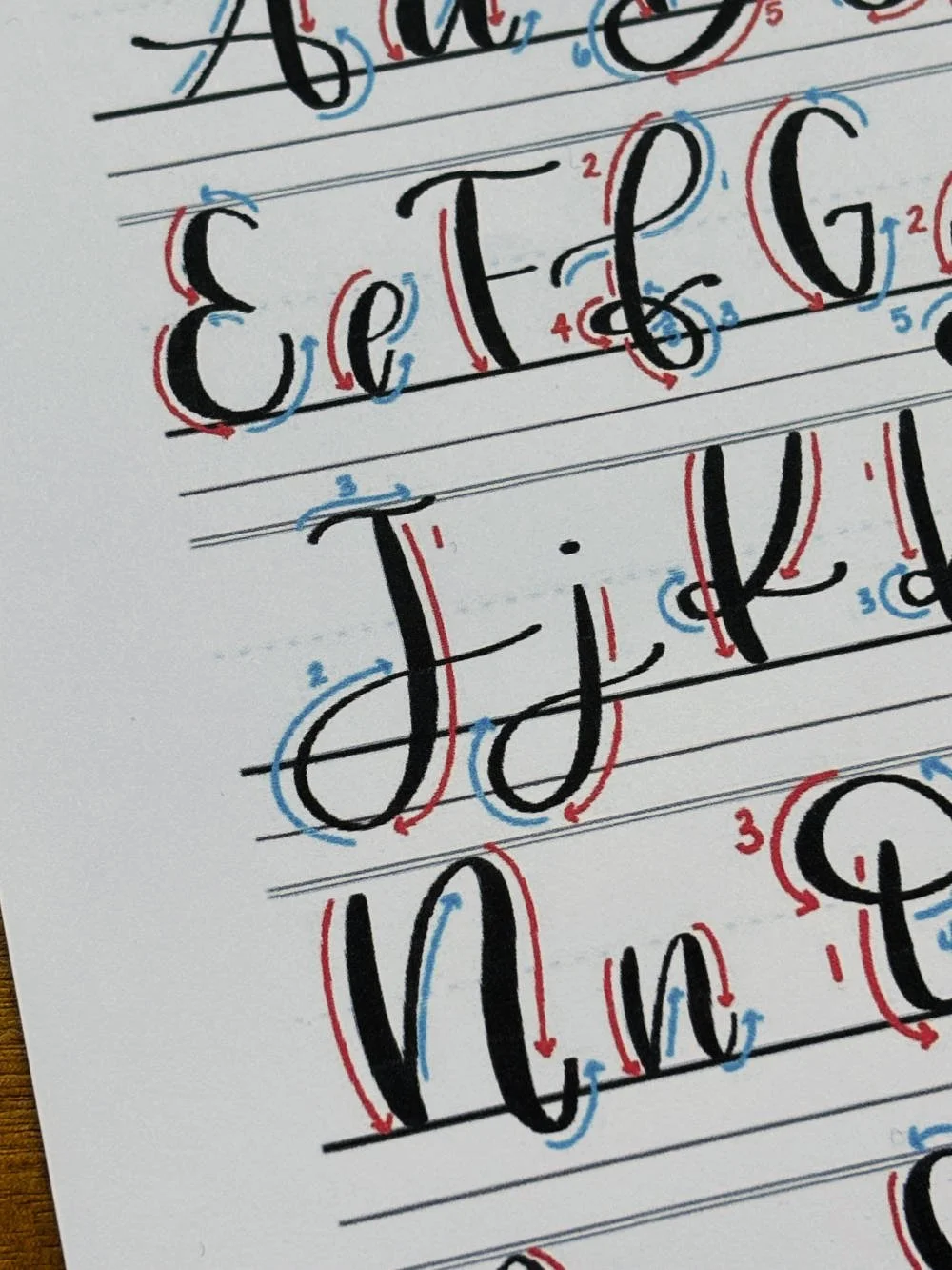
Calligraphy J: Uppercase, Lowercase, Strokes & Practice
A complete guide to calligraphy J, showing how to form it with brush lettering techniques
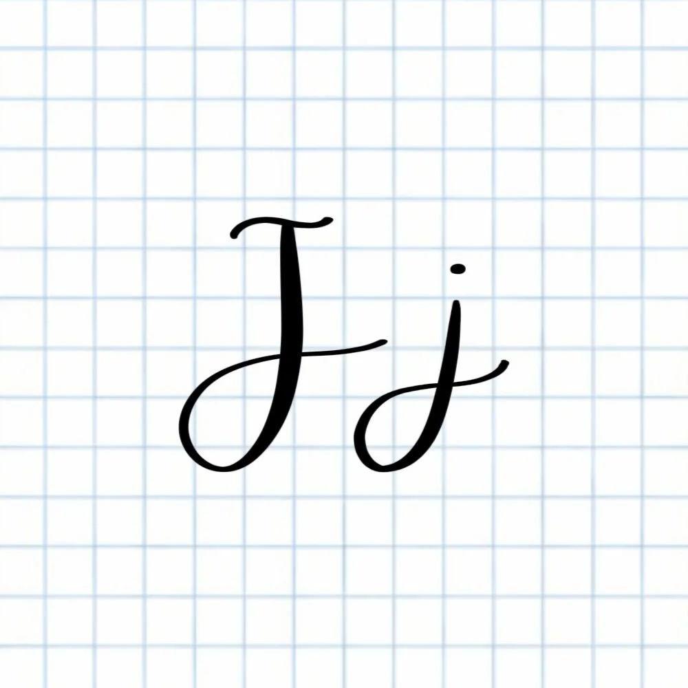
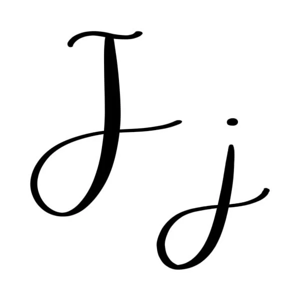
How to Write the Calligraphy Letter J
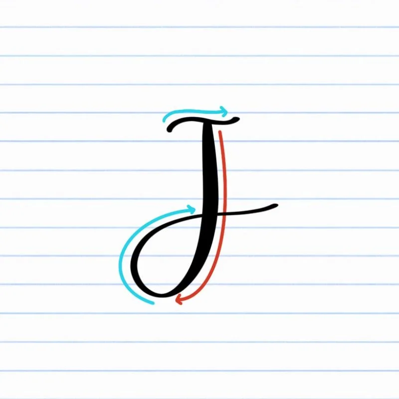
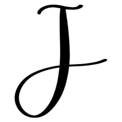
Uppercase J: Large, sweeping ascending loop that dips below the baseline, topped with a thin, shallow compound curve.
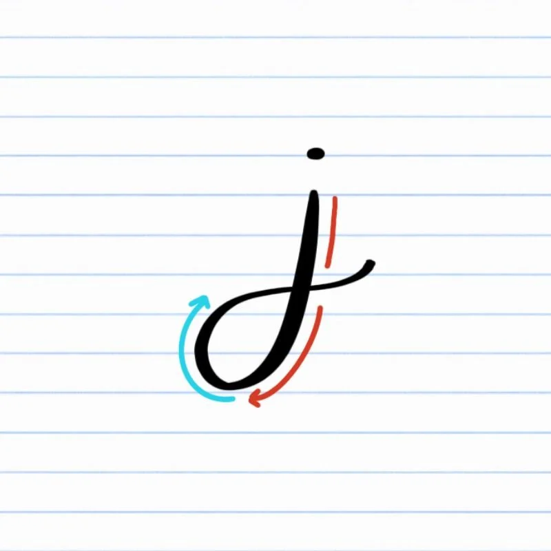
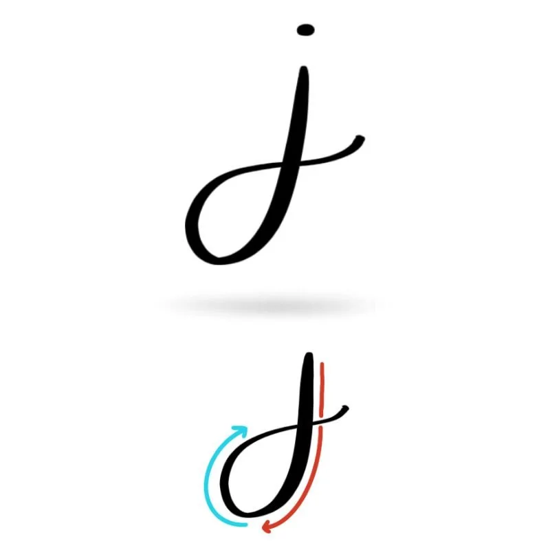
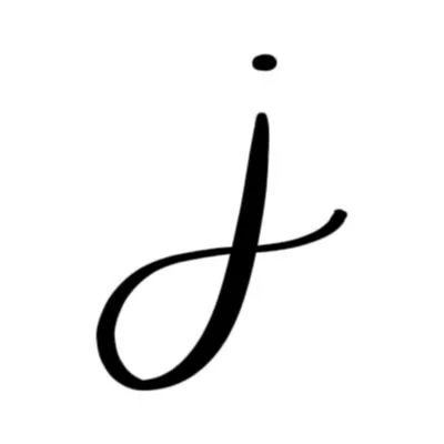
Lowercase j: Large, sweeping descending loop that dips below the baseline and has a dot above it.
How to Write Uppercase Calligraphy J Step-by-Step
Start at the top and begin a descending loop.
Place your brush pen near the top of the letter space and begin moving downward with a thick, slightly curved stroke. As the stroke descends, keep the pressure on so the line remains thick and bold, forming the backbone of the letter. Continue the stroke below the baseline, releasing pressure slightly as you start into the loop.
Curve through the bottom of the loop.
Let the line veer to the left. As the stroke reaches the lowest point, curve it in a clockwise direction and lighten the pressure to form a large, open loop. Keep the pressure light as the stroke curves upward so the bottom of the J feels airy but balanced rather than tight or pinched. Conclude the loop with a long, thin tail trailing off to the right to connect to the next letter, if needed.
Transition into a compound curve.
For the final stroke, begin again at the top of the letter. Guide the pen into a very shallow compound curve that caps the top of the letter. Keep the line thin and light. Let it taper naturally to create a clean, elegant finish.
How to Write Lowercase Calligraphy j Step-by-Step
Begin at the top and start a descending loop.
Place your brush pen near the top of the letter space and begin a heavy downward stroke, veering slightly to the left. As the stroke moves downward, maintain the pressure so the line stays thick. Pass through the baseline. As you begin to reach the bottom, veer more and more to the right, preparing to enter the loop.
Curve around the bottom of the loop.
Continue into the loop as the stroke reaches the lowest point. Start to release the pressure as the pen curves smoothly around near the descender line, and sweep wide with your stroke to ensure the loop feels open and rounded rather than tight.
Release pressure and finish above the baseline.
As the stroke begins rising again, release the pressure so the line becomes thin. Guide the pen upward and slightly to the right, finishing the stroke just above the baseline with a long, trailing tail.
Add the dot above the letter.
Lift your pen and place a small dot above the starting point of the letter. The dot should sit above the top of the main stroke and feel centered so the lowercase j looks balanced and easy to read.
Experience a Clear Path to Lettering Confidence
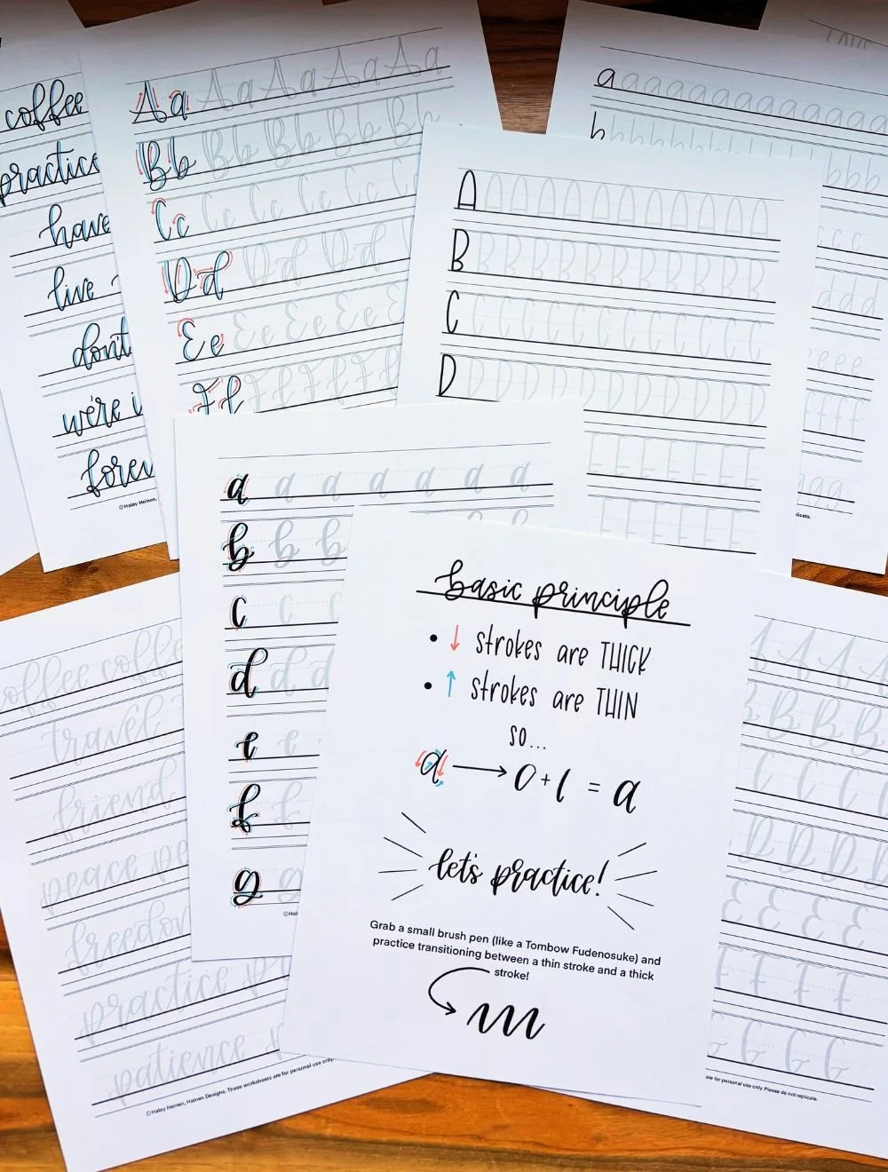
Basic Strokes for Calligraphy J
Basic Strokes That Make Up Uppercase J
The uppercase J in calligraphy is built from two primary strokes: a descending loop and a light compound curve at the top.
Stroke 1: Descending Loop
This stroke forms the main body of the uppercase J. It begins as a thick downstroke that travels from the top of the letter space toward the baseline and continues below it. As the stroke approaches the lowest point of the letter, the pressure gradually lightens so the line can transition smoothly into a wide clockwise loop. The loop should feel open and relaxed rather than tight. A spacious loop helps the letter maintain a graceful shape and prevents the bottom of the J from feeling cramped. As the stroke rises out of the loop, the line becomes thin and finishes with a light trailing tail that adds movement to the letter.
Stroke 2: Shallow Compound Curve
The top of the uppercase J is finished with a light compound curve that caps the letter. This stroke is written with very light pressure so it stays thin and delicate. The motion gently curves up and then down again and up once more, creating a subtle S-shaped movement. The result is a soft, elegant top stroke that balances the heavier descending loop below.
Basic Strokes That Make Up Lowercase j
The lowercase calligraphy j uses a descending loop similar to the uppercase version, along with a small dot placed above the letter.
Stroke 1: Descending Loop
The primary stroke of the lowercase j is a descending loop, just like the uppercase J. It has a descending downstroke that extends below the baseline before turning into a loop near the descender line. The stroke begins thick, maintaining pressure as it moves downward. As the pen curves around the bottom of the letter, the pressure gradually releases so the loop can open smoothly. The stroke then rises upward in a thin line and finishes with a light exit tail just above the baseline. Keeping the loop wide and rounded helps the letter feel balanced and prevents the lower portion from appearing crowded.
Bonus Stroke: Dot
The final element of the lowercase j is the dot placed above the letter. Though small, it plays an important visual role in completing the shape. A well-placed dot sits centered above the starting point of the stroke and aligns naturally with the vertical movement of the letter below.
Want to learn calligraphy without guessing letter by letter?
Lettering Leap™ teaches modern calligraphy step by step — starting with basic strokes and building through the entire alphabet with guided daily practice.
Practice Drills for Calligraphy J
Practicing the calligraphy J is mostly about gaining control over long descending strokes and relaxed looping movement. Because both the uppercase and lowercase versions extend below the baseline, this letter is a great opportunity to practice smooth loops and consistent pressure changes.
Warm-Up Strokes
Start with a few minutes of warm-up movements that prepare your hand for the strokes used in J in calligraphy.
Slow, controlled downstrokes with steady pressure
Light upward strokes that taper smoothly
Large looping motions that move below the baseline
These exercises loosen your hand and help reinforce the pressure contrast needed for clean brush lettering.
Partial Letter Drills
Next, isolate the main movements that form the letter J.
Practice large descending loops that dip below the baseline and return upward
Repeat wide looping curves that stay open and evenly rounded
Write thin compound curves to mimic the light top stroke of the uppercase J
Focusing on these pieces separately helps eliminate cramped loops and uneven pressure before forming the entire letter.
Full Letter Repetition
Once the individual movements feel comfortable, begin practicing full letters.
Write rows of uppercase J, focusing on tall, balanced loops
Practice lowercase j with smooth descending loops and light exit strokes
Add the dot to each lowercase j carefully so it stays centered and consistent
Aim for a steady rhythm as you practice. Smooth motion and clear pressure contrast are more important than speed.
Skill-Level Variations
Beginner: Write the letters slowly and slightly larger than normal. Large movements make it easier to control loops and pressure.
Intermediate: Practice writing smaller J shapes while keeping the loops open. You can also experiment with slightly longer tails or subtle stylistic variations once the basic shape feels natural.
Want guided daily drills?
Lettering Leap™ includes 30 days of structured practice that builds every letter step by step — so you’re not guessing what to practice next.
What Guidelines Are Used by the Letter J?
Understanding how the calligraphy letter J fits within the guidelines helps keep the letter balanced and consistent. Because both the uppercase and lowercase J extend below the baseline, the descender area plays an important role in shaping the letter.
The uppercase J begins high in the letter space and travels downward in a long stroke before looping below the baseline. The lowercase j follows a similar path, but it starts at the x-height and finishes with a dot placed above the main stroke. Paying attention to where the strokes sit within the guidelines helps the letter feel intentional rather than oversized or cramped.
Key things to watch for:
The uppercase J begins at the capital height and descends below the baseline
The lowercase j begins at the x-height and also dips into the descender space
The bottom loop of both letters should reach near the descender line without extending far past it
The dot of the lowercase j sits slightly above the x-height, aligned above the main stroke
Both letters should maintain open space inside the loop so the shape stays readable
Using the guidelines as visual anchors makes it easier to keep the J in calligraphy consistent when writing multiple letters or forming words.
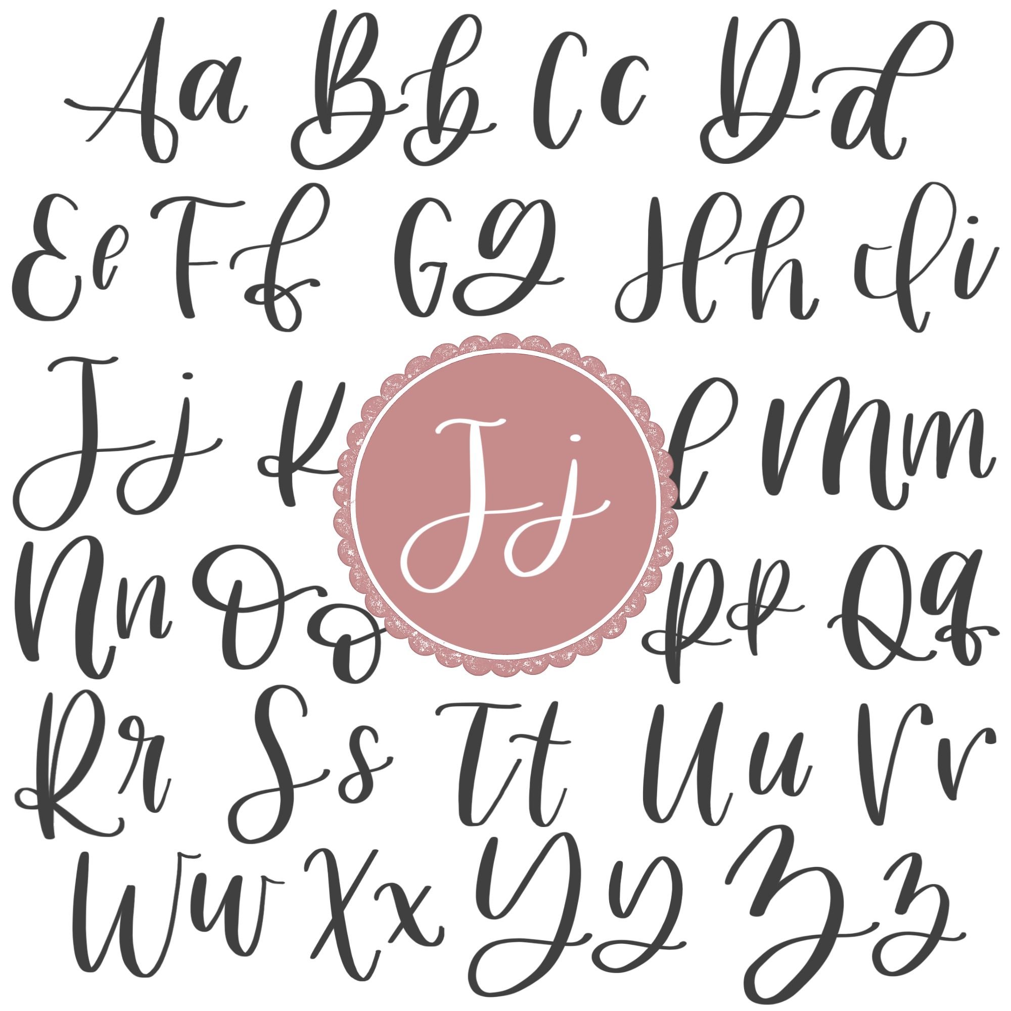
Letter J in the Complete Calligraphy Alphabet
The calligraphy letter J introduces an important movement used throughout modern brush lettering: the descending loop. Learning to control this long downward stroke helps build confidence with letters that extend below the baseline.
Letters That Share Similar Strokes
Because the j in calligraphy relies on a large loop and smooth pressure transitions, it shares structural similarities with several other letters in the alphabet.
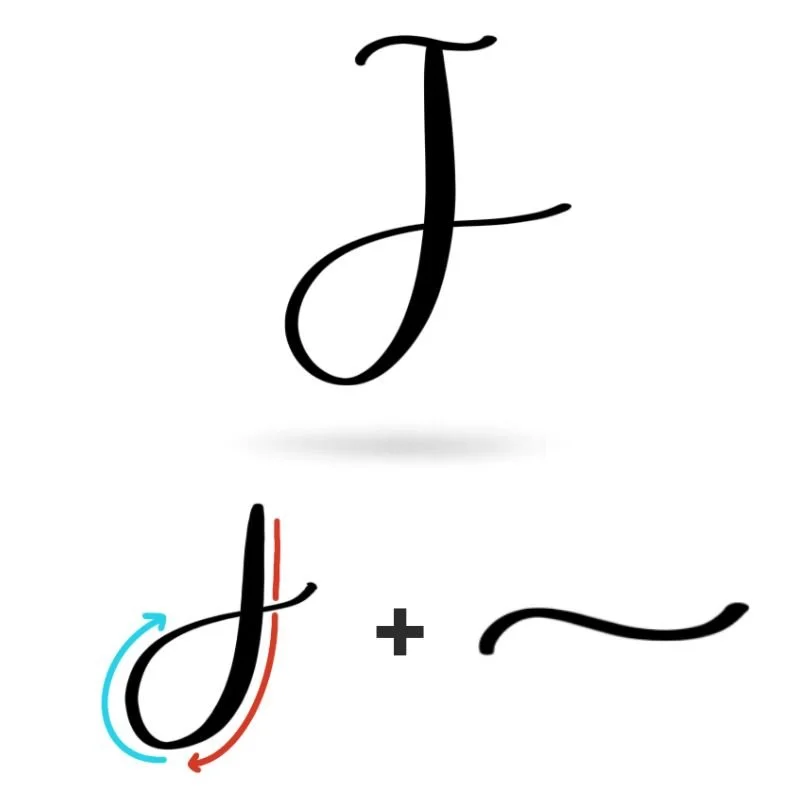
j ↔ g: Both letters use a descending loop that dips into the descender space before returning upward. Practicing one often improves the other.
j ↔ y: The lowercase y also travels below the baseline with a curved return stroke, reinforcing similar motion and spacing.
Likewise, the looping movement used in uppercase J appears in a number of other capital letters.
J ↔ D: Both letters rely on a strong primary downstroke that defines the main structure of the letter before transitioning into a curved movement.
J ↔ Y: The long descending stroke of the uppercase J mirrors the extended vertical movement used in uppercase Y, helping develop control over tall letterforms.
J ↔ T: The shallow compound curve that caps the top of J appears in the topper stroke of uppercase T, reinforcing the same light, delicate finishing motion.
Ready to learn?
Common Mistakes When Lettering J
The calligraphy letter J looks simple, but the long descending stroke and looping movement can make it tricky to balance at first. Small issues with pressure, spacing, or loop size can quickly make the letter feel awkward or uneven.

1. Loops That Are Too Tight
The descending loop is the defining feature of the letter J, but it often becomes too small or cramped.
Loops that are narrow make the letter feel stiff
Tight turns at the bottom create sharp corners instead of smooth curves
Focus on letting the loop stay wide and open so the stroke feels relaxed and flowing.
2. Inconsistent Pressure on the Downstroke
The main downstroke of the J should be thick and confident, but beginners often lose pressure too early.
Downstrokes that suddenly become thin look weak
Uneven pressure creates wobbly thickness through the stroke
Try maintaining steady pressure through most of the downward movement before gradually releasing it as the loop begins.

3. Descending Too Far Below the Baseline
Because J dips into the descender space, it’s easy to extend the loop farther than intended.
Overly long descenders make the letter feel oversized
Inconsistent loop depth causes uneven lines when writing words
Aim to keep the bottom of the loop near the descender line rather than far below it.
4. A Heavy or Awkward Top Stroke
The shallow compound curve at the top of the uppercase J should stay light and subtle.
Pressing too hard makes the top stroke look bulky
Overly dramatic curves can throw off the balance of the letter
Keeping this stroke thin helps contrast nicely with the heavier loop below.
5. Misplaced Dots on Lowercase j
The dot above the lowercase j is small, but it strongly affects how the letter reads.
Dots that sit too far to the side feel disconnected from the letter
Oversized dots can overpower the delicate loop
Place the dot centered above the starting point of the stroke and keep it small so it complements the letter rather than dominating it.
How to Improve Your Letter J Faster
Improving the calligraphy letter J comes down to developing control over long descending strokes and relaxed looping movement. Because the letter travels below the baseline and then returns upward, it requires steady pressure control and smooth motion through the loop.
Practice the Descending Loop on Its Own
The most important part of the letter J is the descending loop. If this movement feels stiff or cramped, the entire letter will feel off. Spend time practicing large looping strokes that dip below the baseline and return upward. Focus on keeping the loop open and rounded while gradually releasing pressure as the stroke curves around the bottom. When the loop feels smooth, the full letter becomes much easier to write.
Slow Down the Downstroke
The main stroke of the J is longer than many other letters, which makes it easy to rush. Writing too quickly often leads to uneven pressure or shaky lines. Try writing the letter slightly larger and slower than normal. Larger movements give you more control over pressure and make it easier to guide the pen smoothly through the loop.
Pay Attention to Loop Size and Balance
A well-formed J depends on the balance between the upper portion of the letter and the loop below the baseline. If the loop becomes too small, the letter can look stiff. If it becomes too large, the letter may feel exaggerated. Reviewing your practice lines and adjusting the loop size helps you find a balanced shape that feels natural.
Practice Resources for Calligraphy J


Frequently Asked Questions about Calligraphy J
How do you write the letter J in calligraphy?
To write the calligraphy J, begin with a descending stroke that moves below the baseline and curves into a wide loop. For uppercase J, the loop is followed by a light compound curve at the top of the letter. The lowercase j in calligraphy uses a similar descending loop and finishes with a small dot placed above the starting point of the stroke.
What strokes make up a calligraphy J?
The calligraphy letter J is built primarily from a descending loop. Uppercase J also includes a thin compound curve at the top of the letter, while lowercase j adds a small dot above the main stroke. Practicing descending loops helps improve control for both versions of the letter.
Why does my calligraphy J look uneven?
An uneven J in calligraphy is usually caused by inconsistent pressure or loops that are too tight. If the downstroke becomes thin too early or the loop collapses inward, the letter can feel unbalanced. Slowing down and practicing wide, open loops helps create a smoother result.
Why does the loop on my calligraphy J look cramped?
A cramped loop usually happens when the stroke turns too sharply at the bottom of the letter. The loop should stay open and rounded as it curves around the descender area. Thinking of the movement as a wide circular motion often helps keep the loop relaxed.
How far below the baseline should a calligraphy J go?
In most modern calligraphy styles, the bottom of the calligraphy J reaches down toward the descender line. The loop should extend clearly below the baseline but not drop excessively far, which can make the letter look oversized compared to other letters.
Where should the dot go on a lowercase j?
The dot of the lowercase j in calligraphy should sit slightly above the top of the main stroke and align with where the letter begins. Keeping the dot centered over the stroke helps the letter look balanced and easy to read.
Why does my lowercase j look different every time?
Inconsistent calligraphy j shapes usually come from uneven loop size or pressure changes during the downstroke. Practicing descending loops on their own helps stabilize the shape so the letter looks more consistent across repeated attempts.
What letters are similar to J in calligraphy?
The letter J in calligraphy shares looping movements with letters like g and y, which also extend below the baseline. Uppercase J also shares structural similarities with letters like D, Y, and T because of its structural descending loop and shallow compound curve at the top.
Is J a difficult letter to learn in brush lettering?
The calligraphy J can feel slightly challenging at first because of its long descending stroke and loop below the baseline. Once you become comfortable controlling pressure through longer strokes, the letter becomes much easier to write.
What pen should I use to practice calligraphy J?
A flexible brush pen works best for practicing the calligraphy letter J because it clearly shows the contrast between thick downstrokes and thin upstrokes. Many beginners prefer a slightly firmer brush pen while learning descending loops and pressure control.
How can I make my calligraphy J smoother?
Smoother J in calligraphy forms usually come from slowing down your strokes and relaxing your grip on the pen. Practicing larger loops and focusing on continuous motion through the bottom curve can also help eliminate shakiness.
Will practicing J improve other calligraphy letters?
Yes, practicing the calligraphy J strengthens your control over descending loops and long strokes. These same movements appear in several other letters, so improving J often makes letters like g, y, and f easier to write as well.
Ready to learn?