Calligraphy O: Uppercase, Lowercase, Strokes & Practice
A complete guide to calligraphy O, showing how to form it with brush lettering techniques
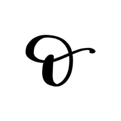
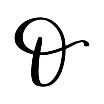
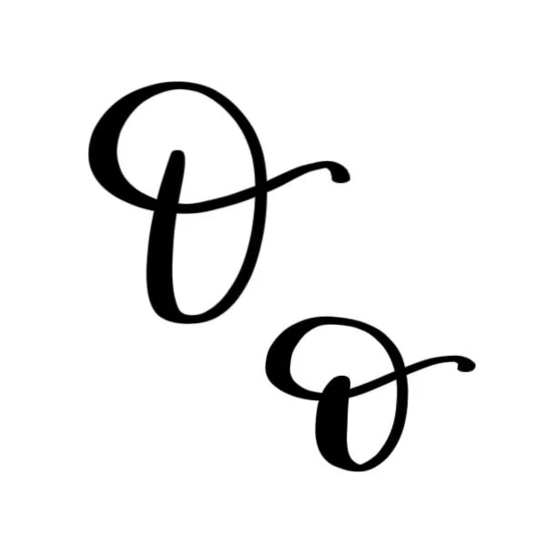
How to Write the Calligraphy Letter O
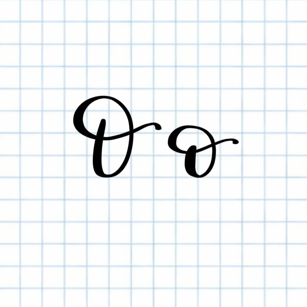
Uppercase and lowercase O: Open oval that transitions into a long compound curve.
How to Write Upper & Lowercase Calligraphy O Step-by-Step
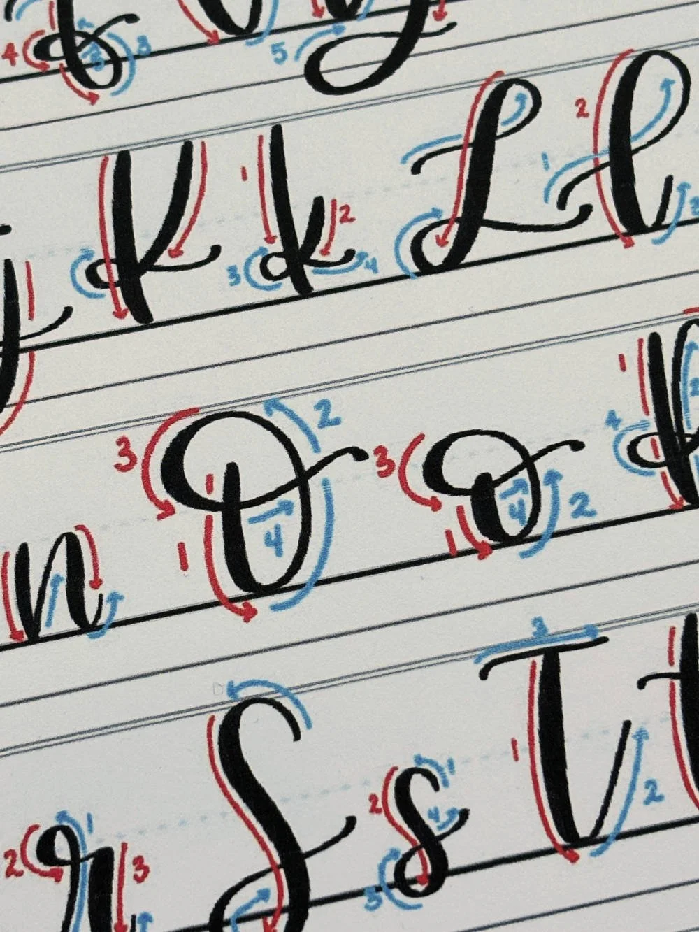
The uppercase and lowercase calligraphy O are built using the same strokes: an oval combined with a compound curve. The only real difference is size and proportion: the uppercase O is taller and more open, while the lowercase o is smaller and more compact. Because of this, you can learn both forms with one consistent set of steps.
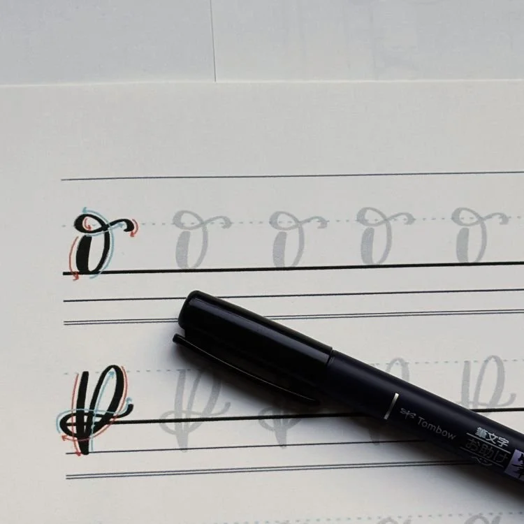
Start at the upper left of your oval shape
For uppercase O, begin about three-quarters of the way between the baseline and the top of the letter. For lowercase o, start about halfway up. Use firm pressure to begin a thick downstroke.
Move into a counterclockwise oval
Curve down and to the right, maintaining steady pressure until you reach the baseline. As you curve along the baseline, release the pressure so the stroke becomes thinner. Loop around and move back upward with a thin upstroke, continuing counterclockwise. Keep the shape rounded and open; avoid making it too narrow or tight.
Leave the oval open and extend into a compound curve
Instead of closing the shape, continue the stroke by arcing over the top of your original starting point. As you begin to drop down again, increase the pressure once more to thicken the line. Transition into the compound curve, dipping below the starting point and passing through the initial downstroke. Allow the line to become thin as it sweeps upward again and passes through the right side of the oval. Finish with a subtle but definitive flourish, like a thick water droplet.
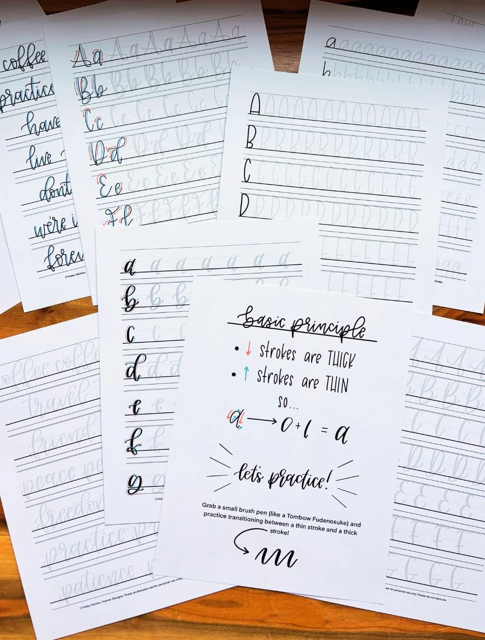
Experience a Clear Path to Lettering Confidence
Basic Strokes for Calligraphy O
Basic Strokes That Make Up the Letter O
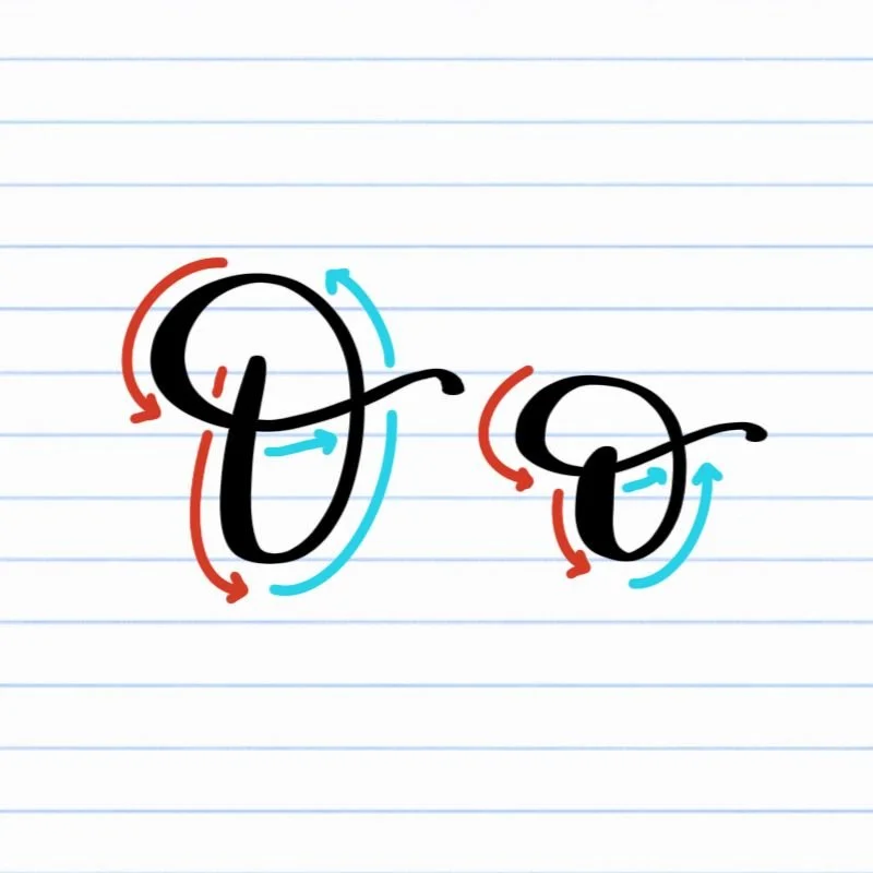
The calligraphy letter O — both uppercase and lowercase — is built from the same two core strokes: an oval and a compound curve. The only difference is size and proportion, not structure. Because of this, you can focus on mastering these two movements once and apply them to both forms.
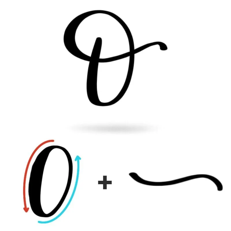
Stroke 1: Oval
The oval is the backbone of the letter O. It defines the overall shape, spacing, and balance. This isn’t just a circle — it’s a slightly tilted, open oval that carries contrast between thick and thin strokes. The downstroke side should feel stable and grounded, while the upstroke side stays light and effortless. That contrast is what gives the letter its calligraphic style. A well-formed oval should feel smooth and continuous, without corners or hesitation. If the motion is too tight, the letter looks stiff. If it’s too loose, the shape loses structure. The goal is a confident, even curve that feels intentional from start to finish.
Stroke 2: Compound Curve
The compound curve is what brings the letter to life. Rather than simply closing the oval, this stroke adds motion, direction, and a sense of flow. It shifts between thick and thin as it changes direction, creating a rhythm that feels fluid instead of static. Visually, the compound curve adds contrast and overlap, which gives the O more personality than a basic loop. It also establishes how the letter will connect to others in a word, especially for the lowercase o.
The key here is continuity. The compound curve should feel like a natural extension of the oval — not a separate stroke layered on top. When done well, the entire letter feels like one uninterrupted motion.
Want to learn calligraphy without guessing letter by letter?
Lettering Leap™ teaches modern calligraphy step by step — starting with basic strokes and building through the entire alphabet with guided daily practice.
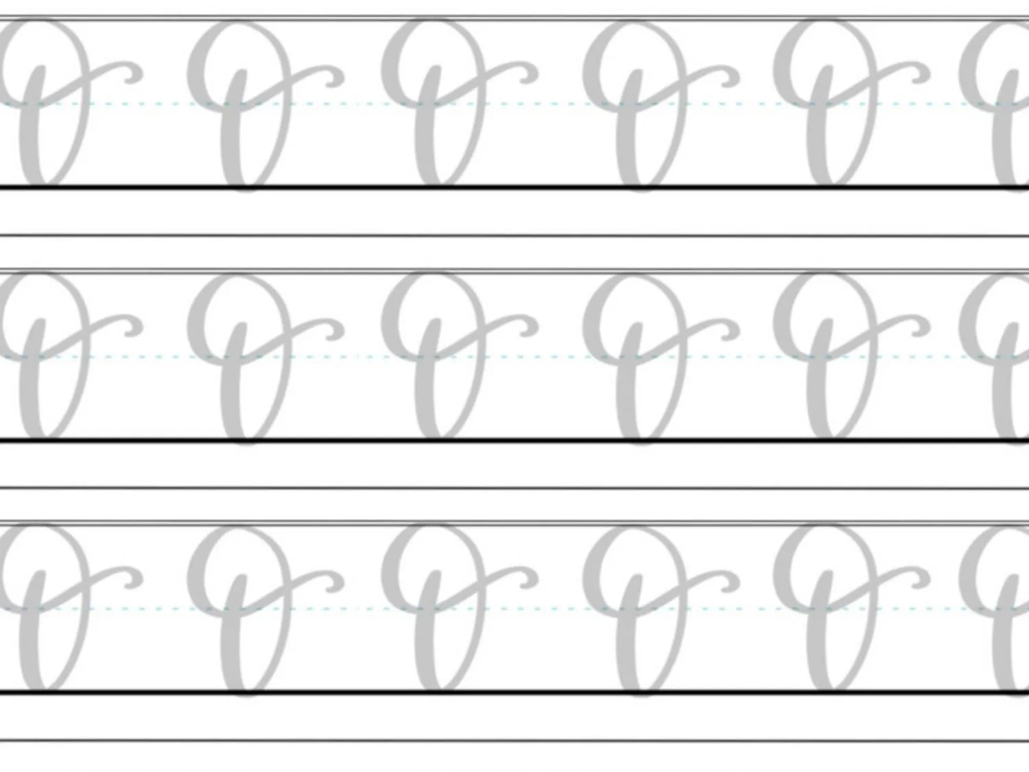
Practice Drills for Calligraphy O
Practicing the letter O is all about building control over smooth curves and consistent pressure transitions. Because both uppercase and lowercase O rely on the same two strokes, focused drills will quickly improve both forms at the same time.
Warm-Up Strokes
Start by loosening your hand and reinforcing the core movements.
Light upstrokes moving upward and slightly to the right
Controlled downstrokes with steady, even pressure
Large, slow oval motions to build muscle memory
These warm-ups help establish smooth motion and prevent stiffness before you begin forming the letter.
Partial Letter Drills
Next, isolate the key shapes that make up the O.
Repeating open ovals, focusing on consistent width and spacing
Practicing pressure transitions — thick on the downstroke, thin on the upstroke
Compound curves on their own, working on smooth direction changes
This is where most improvement happens. Clean, confident strokes here will carry directly into your full letters.
Full Letter Repetition
Now bring the strokes together into complete letters.
Write rows of uppercase O, focusing on height and openness
Practice lowercase o, keeping the shape compact and balanced
Alternate between uppercase and lowercase to reinforce control across sizes
Focus on steady, intentional movement rather than speed. Each letter should feel like one continuous motion.
Skill-Level Variations
Beginner: Trace ovals and full letters, then write slowly with larger shapes to build control
Intermediate: Reduce letter size, tighten spacing, and refine the compound curve for smoother flow
Consistent, focused practice with these drills will make the O feel natural much faster. Because this letter shares its core strokes with so many others, the time you spend here will pay off across the entire calligraphy alphabet.
Want guided daily drills?
Lettering Leap™ includes 30 days of structured practice that builds every letter step by step — so you’re not guessing what to practice next.
What Guidelines Are Used by the Letter O?
Understanding how the letter O fits within your guidelines helps you keep your shapes consistent, balanced, and easy to read. Because O is built from a single continuous form, its placement on the lines plays a big role in how polished it looks.
Both uppercase and lowercase O rely on the same structure, but they occupy the space differently.
The uppercase O extends from the baseline to the capital height, with an open, centered oval. Its compound curve passes through the shape and may dip slightly below the baseline for added movement.
The lowercase o sits between the baseline and the x-height, with a smaller, balanced oval. Its compound curve crowns the shape and may rise slightly above the x-height to create a natural exit stroke.
Key things to watch for:
Both uppercase and lowercase O should sit cleanly on the baseline
The uppercase O reaches the capital height, while the lowercase o stays within the x-height
Ovals should be centered within their space, not leaning too far left or right
Compound curves may cross slightly outside the main shape but should not feel exaggerated
Consistent sizing and spacing help the letter O stay readable within words
When your guidelines are working for you, the letter O feels stable, smooth, and easy to repeat — no matter the size.
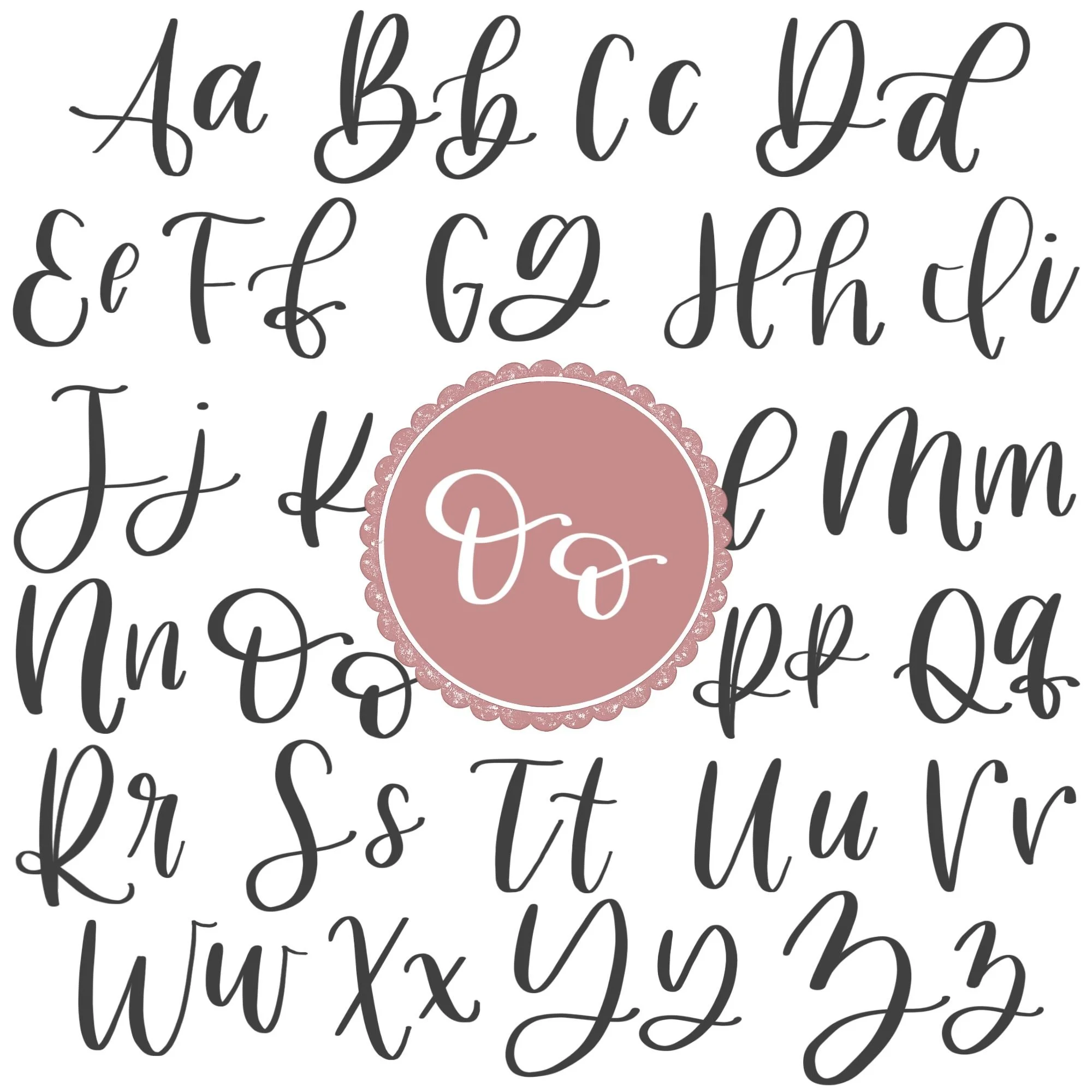
Letter O in the Complete Calligraphy Alphabet
The letter O is one of the most foundational shapes in modern calligraphy. Because it’s built from an oval and a compound curve, it directly influences many other letters in the alphabet. If your O feels smooth and consistent, you’ll often see that improvement carry over automatically.
Letters That Share Similar Strokes
Several letters rely on the same oval structure as O:
o ↔ a: Same oval base, with a different exit stroke
o ↔ d: Oval foundation with an added ascending loop
o ↔ g: Oval base with a descending loop added below
o ↔ q: Oval combined with a descending stroke on the right
The compound curve used in O also connects to other flowing, directional strokes throughout the alphabet. It helps build the control needed for smooth transitions and clean connections between letters.
Because the O is essentially a pure expression of the oval, it acts as a checkpoint for your technique. It reveals how well you control pressure, spacing, and shape — all in a single letter.
Ready to learn?
Common Mistakes When Lettering O
The letter O may look simple, but it quickly exposes issues with pressure, shape, and control. If your O feels off, it’s usually tied to one of these common mistakes.

1. Uneven Pressure Throughout the Oval
Inconsistent pressure can make the letter look shaky or unbalanced. Upstrokes that are too heavy or downstrokes that are too light reduce contrast and make the shape feel unclear. Focus on clean transitions — thick on the way down, thin on the way up.
2. Pinched or Misshapen Ovals
A common issue is making the oval too narrow, too round, or slightly angular. This often happens when the stroke is rushed or drawn in segments instead of one smooth motion. Aim for a relaxed, continuous curve that feels open and evenly shaped.
3. Closing the Oval Completely
The O should not be a fully closed shape. Closing the oval removes the natural flow of the letter and makes the compound curve feel forced or disconnected. Leave space for the finishing stroke to move through the shape.

4. Disconnected Compound Curve
When the compound curve feels like a separate stroke, the letter loses its flow. This usually happens when there’s a pause or hesitation between the oval and the finishing movement. Keep the motion continuous so the entire letter feels like one stroke.
5. Overly Heavy or Exaggerated Finish
It’s easy to overdo the compound curve at the end. Too much pressure or an oversized flourish can throw off the balance of the letter. Keep the finish controlled and proportional to the oval.
6. Inconsistent Size and Proportion
Uppercase and lowercase O should follow clear size differences. If they’re too similar in size — or if the oval shape changes from one repetition to the next — the lettering can feel uneven. Use your guidelines to keep proportions consistent.
7. Rushing the Shape
Writing O too quickly often leads to wobble and uneven curves. Because the letter relies on smooth motion, slowing down is key. Controlled, intentional strokes will always look better than fast, inconsistent ones.
How to Improve Your Letter O Faster
Improving your letter O comes down to refining control over one of the most important shapes in calligraphy: the oval. Because this letter is so foundational, small adjustments in how you practice can lead to noticeable progress quickly.
Focus on the Oval First
If your O feels inconsistent, the oval is almost always the reason. Spend time practicing ovals on their own before adding the compound curve. When the base shape feels smooth and balanced, the full letter becomes much easier to control.
Slow Down Your Transitions
The shift between thick and thin strokes is where most issues show up. Slowing down as you move through the downstroke and into the upstroke helps you apply pressure more intentionally. This creates cleaner contrast and smoother curves.
Practice One Size at a Time
Switching between uppercase and lowercase too quickly can make both feel inconsistent. Practice them separately so your hand can adjust to each proportion, then combine them once both feel more natural.
Write Larger to Build Control
Practicing at a slightly larger size gives you more room to see and correct mistakes. Bigger movements make it easier to control curves and pressure, which translates into cleaner, more consistent letters when you scale back down.
Practice Resources for Calligraphy O


Frequently Asked Questions about Calligraphy O
How do you write the letter O in calligraphy?
To write the letter O in calligraphy, create a counterclockwise oval with clear thick and thin contrast, then finish with a compound curve that passes through the shape. Both uppercase and lowercase O use the same strokes, with the main difference being size and proportion.
Why is my calligraphy O not smooth?
A rough or shaky O is usually caused by inconsistent pressure or drawing the shape in segments. Practicing slow, continuous ovals and focusing on steady motion helps smooth out the curves.
Should the calligraphy O be closed or open?
The O should remain slightly open. Instead of closing the oval, the stroke continues into a compound curve, which creates a more natural flow and a cleaner, more modern calligraphy style.
What strokes make up a calligraphy O?
The letter O is made from two strokes: an oval and a compound curve. These same strokes appear in many other letters, making O an important foundation for learning calligraphy.
Why does my O look uneven or lopsided?
An uneven O is often the result of inconsistent spacing or a rushed oval. Slowing down and focusing on keeping both sides of the oval balanced will help create a more stable shape.
Is the letter O hard to learn in brush lettering?
The O is one of the most important letters to learn because it teaches the oval shape, but it can feel challenging at first. Once the motion becomes familiar, it gets much easier and improves many other letters.
How do I make my calligraphy O more consistent?
Consistency comes from repeating the same motion with control. Practicing ovals and compound curves separately, then combining them, helps build reliable muscle memory.
Should I practice uppercase or lowercase O first?
You can start with either one since they use the same strokes. Many beginners start with the lowercase o because it appears more often in words and is slightly easier to control.
Why does my O look too tight or narrow?
This usually happens when the oval is drawn too quickly or with too much tension. Relaxing your hand and focusing on a wider, more open shape will improve the overall look.
What pen is best for practicing calligraphy O?
A flexible brush pen works best because it allows you to create clear contrast between thick and thin strokes. Beginners may benefit from a slightly firmer brush tip for better control.
Ready to learn?