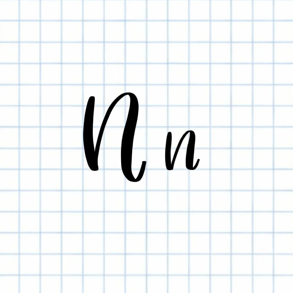
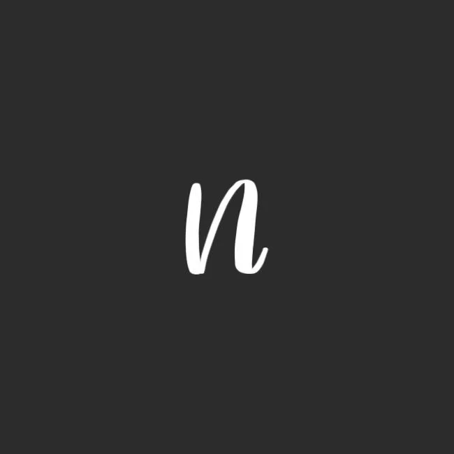
Calligraphy N: Uppercase, Lowercase, Strokes & Practice
A complete guide to calligraphy N, showing how to form it with brush lettering techniques
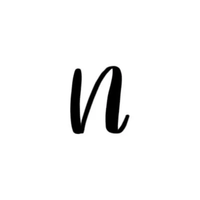
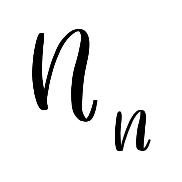
How to Write the Calligraphy Letter N
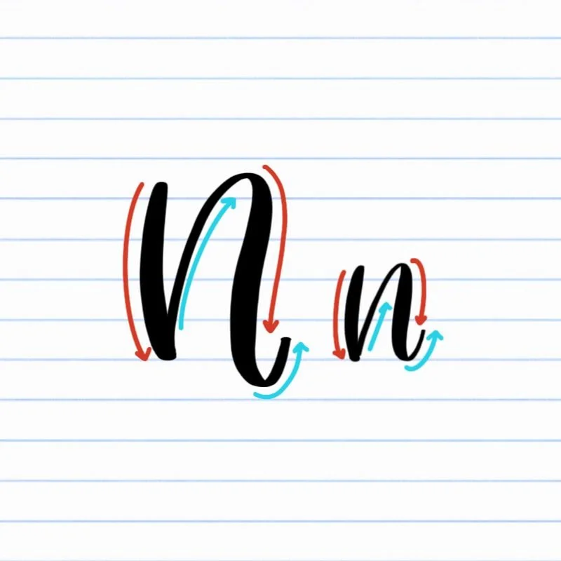
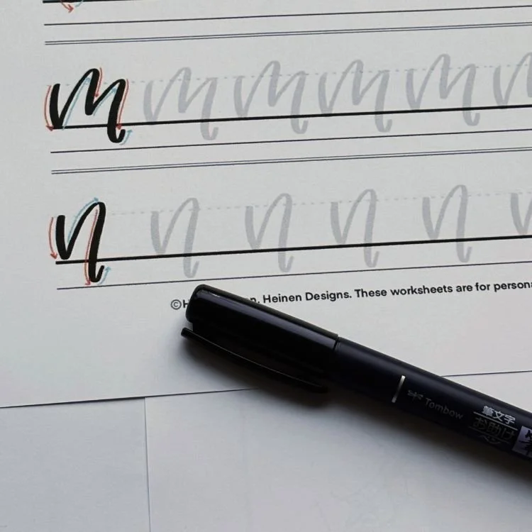
Uppercase and lowercase N: Downstroke, followed by a generous compound curve.
How to Write Upper & Lowercase Calligraphy N Step-by-Step
The calligraphy letter N is built from a strong downstroke followed by a flowing compound curve. Both uppercase and lowercase versions use the same core movement. The main difference is where the letter starts and how tall the curve reaches. Once you understand the rhythm of this shape, both versions will start to feel natural.
Start with a controlled downstroke.
Place your brush pen at the top of your letter space — capital height for uppercase N or x-height for lowercase n. Apply firm pressure and draw a straight downstroke to the baseline. Keep the stroke steady and confident.
Begin a light upstroke into a compound curve.
Using very light pressure, curve upward and slightly to the right. This is the start of the second stroke, a compound curve. For lowercase n, this initial line should reach just above the x-height. For uppercase N, extend all the way to the capital height.
Transition into a thick downstroke.
Bring the curve to its peak and begin to arch it downward again. As you do, gradually increase pressure on the pen tip. This creates the thick portion of the compound curve and brings the stroke back toward the baseline.
Finish with a soft exit stroke.
As you approach the baseline, begin to release the pressure again and let the stroke taper into a light, rightward trailing curve. For lowercase n, this exit curve should sit on or very nearly on the baseline and flow easily into the next letter. For uppercase N, allow a slightly deeper dip and more expressive finish.
Experience a Clear Path to Lettering Confidence
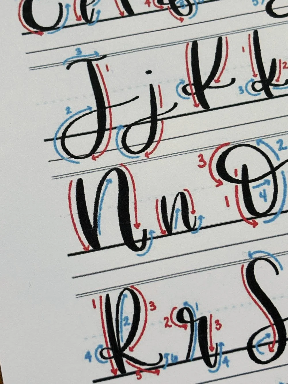
Basic Strokes for Calligraphy N
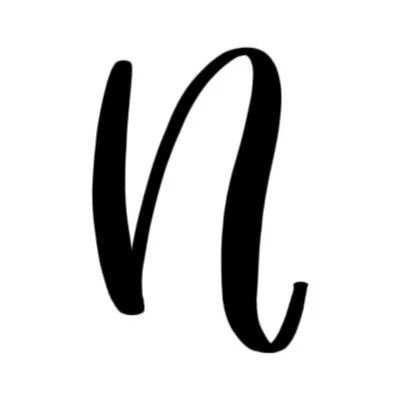
Basic Strokes That Make Up the Letter N
The calligraphy letter N is built from two core strokes: a grounded downstroke and a flowing compound curve. Together, these create a balance between structure and movement — the N should feel stable on the left and fluid on the right.
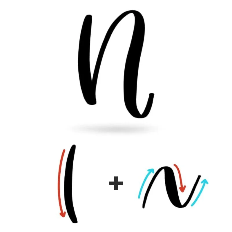
Stroke 1: Downstroke
The downstroke is the anchor of the letter. It provides stability and sets the tone for the entire shape. This stroke should feel solid, straight, and confident from top to baseline. It acts as a visual starting point, giving the eye a place to land before the motion of the second stroke begins. If the downstroke is uneven or wobbly, the entire letter will feel off-balance.
Even though it’s simple, this stroke plays an important role: it contrasts the movement of the compound curve and keeps the letter from feeling too loose or uncontrolled.
Stroke 2: Compound Curve
The compound curve is where the letter N comes to life. It introduces rhythm, motion, and flow. This stroke begins with a light upward movement, arches over, and returns downward with added pressure before tapering into a soft exit. The key is in the transition. This stroke should feel continuous and smooth, not broken into separate parts.
Visually, the curve should feel open and rounded at the top. The thick downstroke portion should mirror the weight of the first stroke without overpowering it, creating a sense of balance between the two. The exit stroke should feel effortless, curving up lightly from the baseline and guiding the eye forward.
Want to learn calligraphy without guessing letter by letter?
Lettering Leap™ teaches modern calligraphy step by step — starting with basic strokes and building through the entire alphabet with guided daily practice.
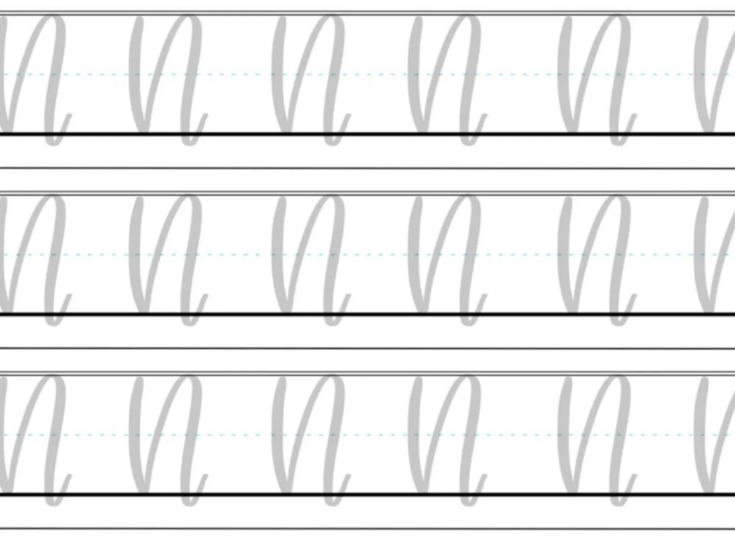
Practice Drills for Calligraphy N
Practicing the calligraphy letter N is all about building control over contrast and learning the rhythm of the compound curve. Instead of jumping straight into full letters, these drills break the movement into smaller pieces so your hand can learn what smooth, balanced strokes actually feel like.
Warm-Up Strokes
Start by loosening your hand and dialing in pressure control.
Light upstrokes moving upward and slightly to the right
Slow, steady downstrokes with consistent pressure
Gentle arching motions to mimic the top of a compound curve
These warm-ups prepare you for both parts of the N: structure and flow.
Partial Letter Drills
Next, isolate the most important movement in the letter, the compound curve.
Repeat compound curves on their own, focusing on a smooth transition from thin upstroke to thick downstroke
Practice the “arch and return” motion, making sure the top of the curve feels rounded, not pointed
Drill exit strokes that taper cleanly along the baseline without dipping too low
You can also practice pairing a downstroke with just the beginning of the curve to reinforce spacing and rhythm between the two strokes.
Full Letter Repetition
Once the individual pieces feel more comfortable, start putting them together.
Write rows of uppercase N, focusing on consistent height and balanced spacing between strokes
Practice lowercase n slowly, paying attention to how the exit stroke flows into the next letter
Alternate between uppercase and lowercase to reinforce control at different sizes
Focus on steady, intentional movement rather than speed.
Skill-Level Variations
Beginner: Work larger and slower. Trace examples if needed, and pause between strokes to reset your hand position.
Intermediate: Tighten your spacing and begin writing at a more natural size. Experiment with slightly deeper curves or subtle variations in the exit stroke to develop your style.
Want guided daily drills?
Lettering Leap™ includes 30 days of structured practice that builds every letter step by step — so you’re not guessing what to practice next.
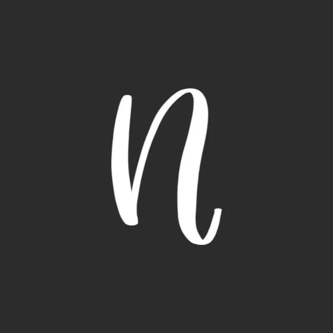
What Guidelines Are Used by the Letter N?
Understanding how the letter N fits within the guidelines helps you keep your strokes consistent, balanced, and easy to read. Both uppercase and lowercase versions follow the same general structure, but they occupy different amounts of vertical space and use the guidelines in slightly different ways.
The uppercase N starts at the baseline and extends to the capital height, with its compound curve reaching fully to the top before returning downward. The lowercase n is more compact, beginning at the x-height and returning to the baseline, with a curve that may slightly overshoot before settling back down.
Even though the shapes are similar, the difference in scale changes how the letter feels on the page — uppercase N appears more open and expressive, while lowercase n feels tighter and more controlled.
Key things to watch for:
Both uppercase and lowercase N should sit grounded on the baseline
The uppercase N reaches the capital height, while the lowercase n stays within the x-height range
The compound curve should peak at the appropriate height before returning downward
Downstrokes should remain vertical and consistent in thickness
Exit strokes should taper along the baseline without dipping too far below
Keeping these guidelines in mind helps your N feel intentional and consistent, especially when writing words where spacing and alignment matter.
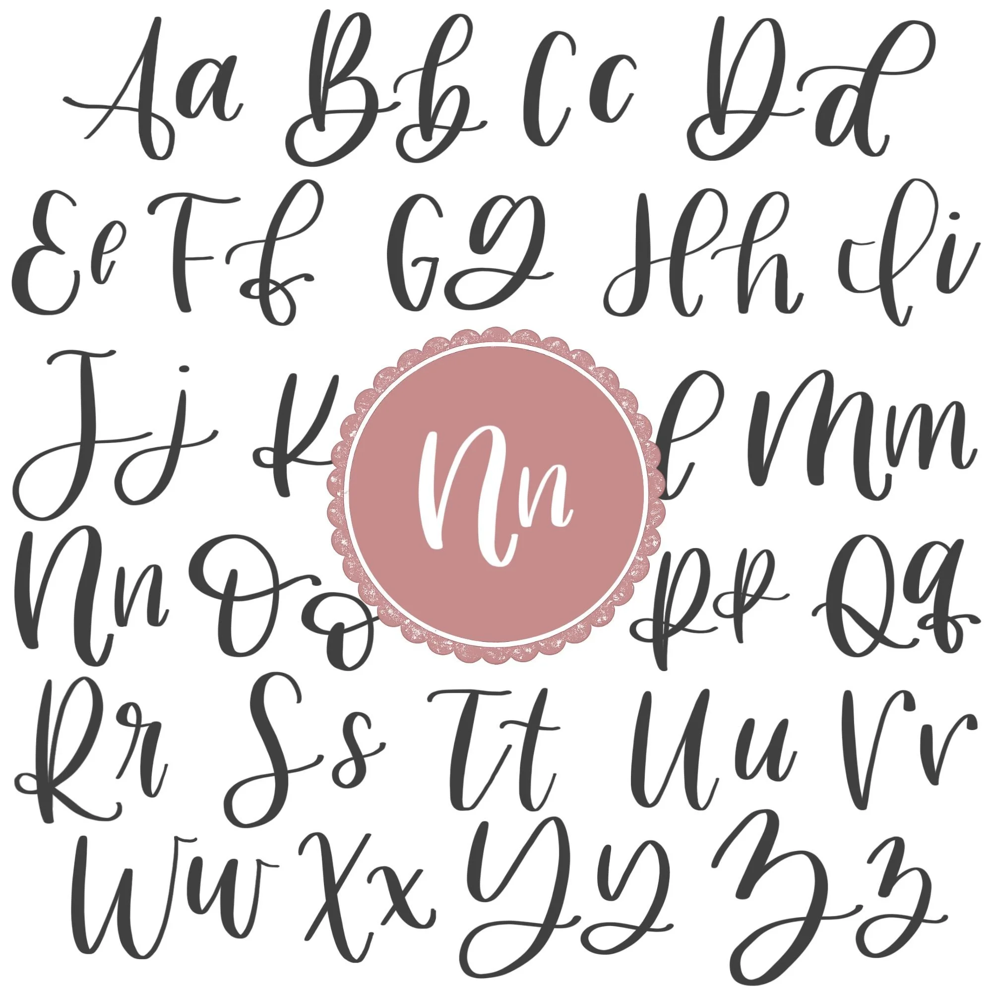
Letter N in the Complete Calligraphy Alphabet
The calligraphy letter N helps reinforce one of the most important movements in brush lettering: the downstroke paired with a compound curve. This same motion appears throughout the alphabet, making N a key letter for building consistency.
Letters That Share Similar Strokes
The structure of N shows up clearly in other key letters, especially in the lowercase set.
n ↔ m: The n forms the first part of m, so consistency here directly carries over.
n ↔ h: Both use the same compound curve, with h extending higher before returning down.
n ↔ p: Both use a compound curve, but p extends lower, adding a descending variation of the same movement.
Uppercase N shares its compound curve structure with other expressive, curve-based capitals.
N ↔ M: Both rely on strong downstrokes paired with returning curves, creating a similar rhythm.
N ↔ P: Both begin with a strong downstroke and finish with a compound curve, though P also includes an ascending loop and a different curve shape.
As you improve your N, you’re building the control and rhythm needed for a large portion of the alphabet, not just a single letter.
Ready to learn?
Common Mistakes When Lettering N
The calligraphy letter N is simple in structure, but small issues in pressure, spacing, and stroke shape can make it feel awkward or unbalanced. If your N doesn’t look quite right yet, these are some of the most common problems to watch for.
1. Uneven Pressure Between Strokes
If your downstroke is too light or your compound curve is too heavy, the letter can feel mismatched. Both thick strokes should feel consistent in weight.
2. Pointed or Sharp Compound Curves
The top of the curve should feel rounded and smooth. If it comes to a point, the letter loses its natural flow.
3. Overly Narrow or Collapsed Shape
When the curve is pulled too close to the downstroke, the letter feels cramped. Give the shape enough space to stay open and readable.
4. Wobbly Downstroke
A shaky first stroke throws off the entire letter. This line should feel straight, steady, and confident from top to baseline.
5. Inconsistent Curve Height
If the compound curve doesn’t reach the correct height (too low or too high), the letter can look uneven compared to others in a word.
6. Heavy or Drooping Exit Stroke
Pressing too hard at the end or dipping too far below the baseline makes the letter feel weighed down. The exit should taper lightly and stay controlled.
7. Breaking the Motion Mid-Stroke
Stopping or hesitating during the compound curve creates visible bumps or angles. The stroke should feel continuous and fluid.
8. Rushing the Letter
Writing too quickly often leads to loss of control in both pressure and shape. Slowing down helps you maintain smooth curves and clean transitions.
How to Improve Your Letter N Faster
Improving your calligraphy N comes down to refining one key movement: the compound curve. When you focus on how the strokes feel — not just how they look — you’ll start to see faster, more consistent progress.
Focus on the compound curve first
Most issues with N come from the second stroke. Practice the compound curve on its own, paying close attention to the transition from a light upstroke into a heavier downstroke. The smoother this motion feels, the more natural your full letter will look.
Match your downstrokes
The initial downstroke and the thick portion of the compound curve should feel equal in weight and pressure. If one is heavier than the other, the letter can feel unbalanced. Slowing down your downstrokes helps build consistency.
Slow down at the top of the curve
The peak of the compound curve is where many letters fall apart. If you rush this moment, the curve becomes pointed or uneven. Slowing down slightly at the top helps you create a smooth, rounded arch before transitioning downward.
Refine your exit stroke
The exit stroke should taper gradually and follow the baseline without dipping too low. Practicing this release of pressure will make your lettering feel more fluid and improve how your N connects to other letters.
Practice with intention, not repetition
Instead of filling a page with N’s, pause after each row and evaluate your work. Look for one specific adjustment — like spacing or curve shape — and apply that correction to the next line.
Practice Resources for Calligraphy N


Frequently Asked Questions about Calligraphy N
How do you write a capital N in modern calligraphy?
A capital N is written with a strong downstroke followed by a large compound curve that reaches back to the top, then returns downward with pressure and finishes in a light trailing stroke. The key is balancing structure with smooth, flowing movement.
How is lowercase n different from uppercase N in calligraphy?
Lowercase n is more compact and starts at the x-height, while uppercase N is taller and more expressive. Both use the same downstroke and compound curve, but the scale and spacing change how the letter feels.
What is a compound curve in calligraphy N?
A compound curve is a stroke that moves up lightly, arches over, then comes back down with heavier pressure before tapering off. It creates the arch shape that defines the letter N.
Why does my lowercase n not look like other letters in my word?
This usually happens when the height or spacing doesn’t match your other lowercase letters. Keeping the n consistent with the x-height and baseline helps it blend naturally into words.
How do you make a smooth arch in calligraphy n?
Focus on slowing down at the top of the curve and maintaining continuous motion. A smooth arch comes from steady movement, not forcing the shape.
Why does my calligraphy N look too stiff?
A stiff N is often caused by treating the strokes as separate pieces instead of one flowing motion. The compound curve should feel connected and fluid, not rigid or mechanical.
What is the hardest part of lettering N?
Most beginners struggle with the compound curve, especially transitioning cleanly from thin to thick and back to thin again. This stroke takes practice to feel natural.
How wide should a calligraphy N be?
A calligraphy N should feel open and balanced, not narrow or compressed. The space between the downstroke and the curve should allow the shape to breathe while still feeling cohesive.
How do you fix a calligraphy N that looks too bouncy?
If your N rises too high or dips too low, focus on keeping the curve controlled within the guideline space. Consistent height and a stable baseline will reduce unwanted bounce.
Can you add flourishes to the letter N?
Yes, especially with uppercase N. The exit stroke can be extended into a flourish, but it should still feel connected to the natural motion of the letter rather than forced.
Why does my N look different every time I write it?
Inconsistency usually comes from changes in pressure or curve shape. Practicing the compound curve repeatedly helps build muscle memory and stabilizes the letter.
Do you lift your pen when writing calligraphy N?
Yes, the letter N is typically written in two strokes. Lifting your pen between the downstroke and the compound curve can help keep each stroke clean and controlled.
Is calligraphy N used often in hand lettering?
Yes, the lowercase n appears frequently in words, making it an important letter to practice. Improving your n will noticeably improve the overall look of your lettering.
Ready to learn?