Calligraphy P: Uppercase, Lowercase, Strokes & Practice
A complete guide to calligraphy P, showing how to form it with brush lettering techniques
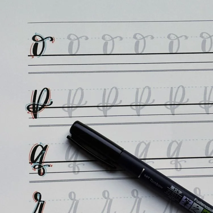
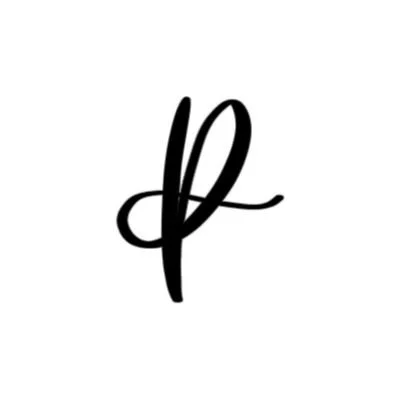
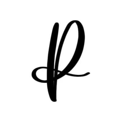
How to Write the Calligraphy Letter P
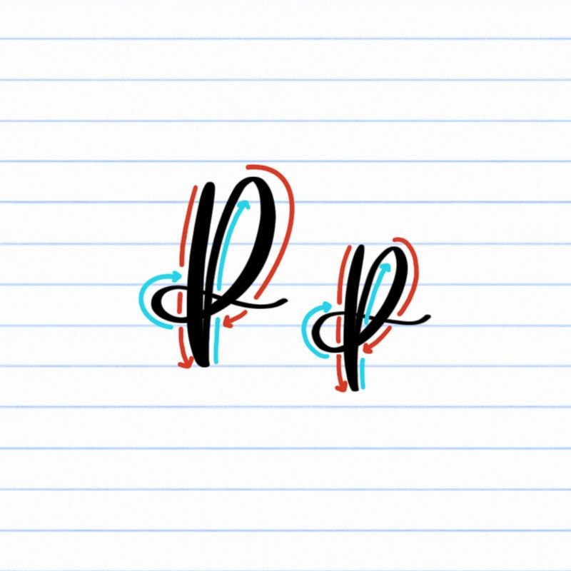
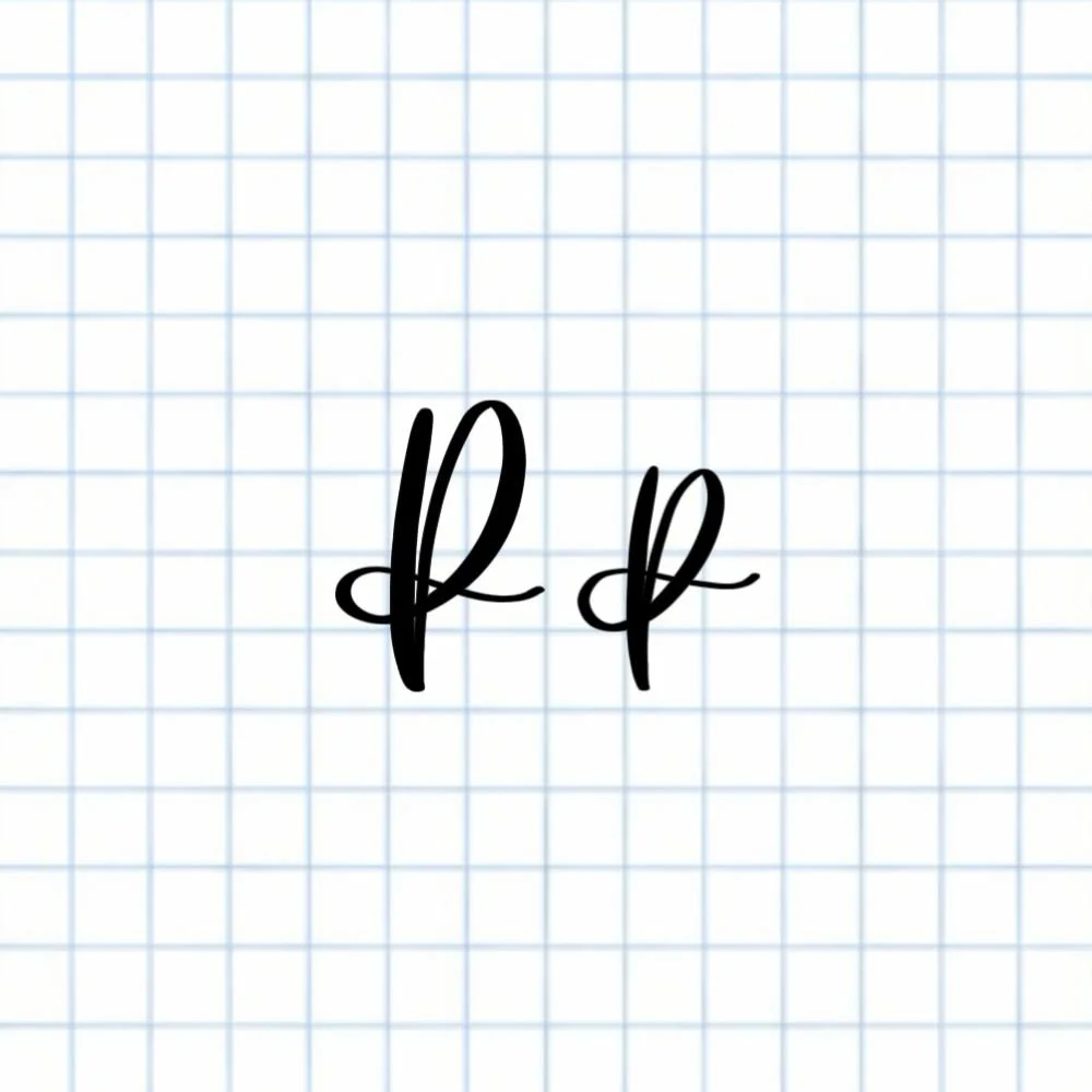
Uppercase and lowercase P: Strong downstroke, followed by a large, sweeping ascending loop and bow-tied with a compound curve.
How to Write Upper & Lowercase Calligraphy P Step-by-Step
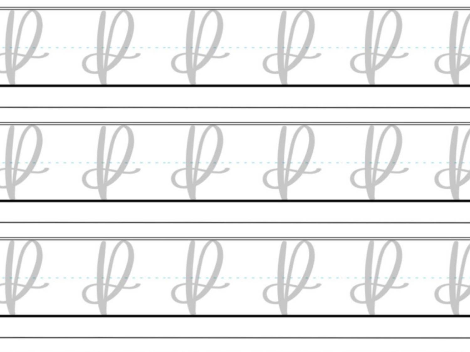
The uppercase and lowercase calligraphy P share the same core structure: a strong downstroke followed by an ascending loop that flows into a soft compound curve. Once you understand the motion, you can apply it to both versions with only slight adjustments in height.
Start with a steady downstroke.
Place your brush pen at the top of the letter and draw a fairly straight, controlled downstroke. Apply firm pressure as you move downward. Keep this stroke smooth and confident — it sets the foundation for the entire letter.
Lift and begin the ascending loop.
Start back up again with a light, upward motion, using very light pressure as you rise to the top of the letter once more and begin curving ever so slightly into a clockwise loop.
Curve down and pass through the stem.
As the loop rounds over at the top, begin adding pressure while moving downward. Guide the stroke through the original downstroke, keeping the loop sweeping and rounded rather than tight or pinched.
Finish with a shallow compound curve.
After crossing the stem, continue the motion around in a smooth clockwise curve. As the stroke comes back up, release pressure and transition into a light, rightward trailing curve that crosses back through the downstroke — like tying a knot. This exit stroke should feel soft and controlled, giving the letter a clean, balanced finish.
Experience a Clear Path to Lettering Confidence
Basic Strokes for Calligraphy P
Basic Strokes That Make Up the Letter P
The calligraphy letter P is defined by contrast, motion, and balance. Its structure combines a grounded vertical stroke with a looping form that introduces movement and personality. Because uppercase and lowercase P share the same construction, these strokes create the same visual effect, just at different heights.
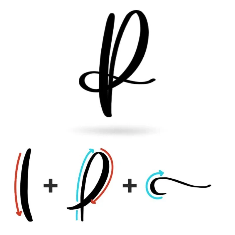
Stroke 1: Downstroke
The downstroke gives the letter its strength and stability. It’s bold, steady, and visually anchors the entire form. This thick stroke creates contrast against the lighter lines that follow, making the letter feel structured rather than loose or drifting. A clean, confident downstroke sets the tone for everything else.
Stroke 2: Ascending Loop
The ascending loop introduces lift and elegance. In contrast to the weight of the downstroke, this stroke is light and airy, curving upward in a smooth clockwise motion. Its openness is what gives the letter breathing room. This loop is where the letter begins to feel expressive rather than purely structural.
Stroke 3: Compound Curve
The compound curve carries the motion forward, adding a sense of flow and continuity. This stroke balances pressure and release, thick to thin, creating a natural rhythm that ties the letter together almost like a bow. The soft trailing exit keeps the form from feeling heavy and allows it to connect seamlessly into the next letter.
Want to learn calligraphy without guessing letter by letter?
Lettering Leap™ teaches modern calligraphy step by step — starting with basic strokes and building through the entire alphabet with guided daily practice.
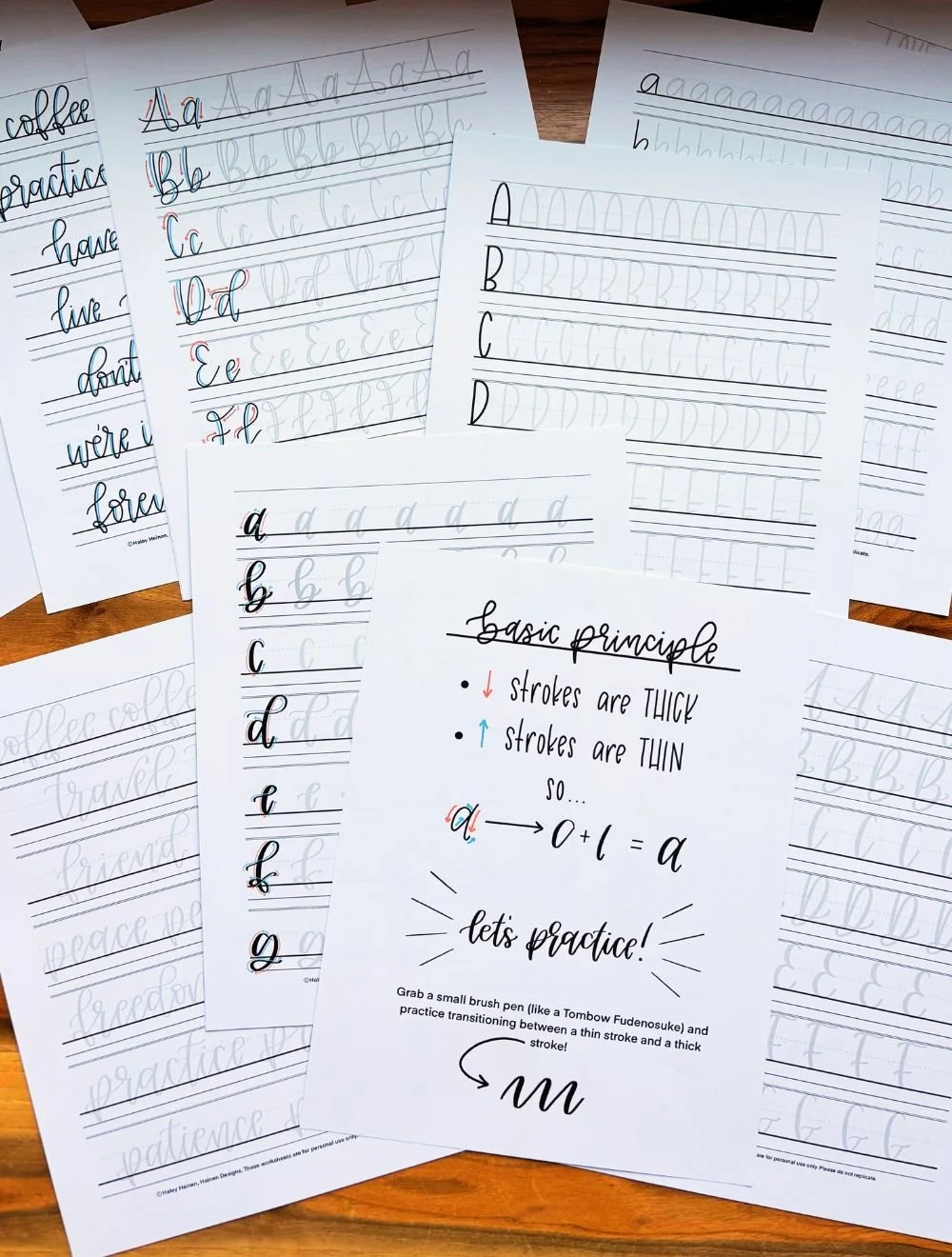
Practice Drills for Calligraphy P
Practicing the letter P is all about learning how to balance structure with movement. The downstroke requires control and consistency, while the loop and exit stroke rely on smooth, continuous motion. Breaking the letter into smaller drills helps you build both without feeling overwhelmed.
Warm-Up Strokes
Start by loosening your hand and dialing in pressure control.
Light upstrokes moving upward in a slight curve
Slow, steady downstrokes with consistent pressure
Large clockwise loops to build muscle memory for the main shape
These warm-ups mirror the exact motions used in the letter P, helping your hand settle into the right rhythm before forming the full letter.
Partial Letter Drills
Next, isolate the key movements that define the letter.
Repeating downstrokes that stay straight and even
Clockwise loops that remain open and consistent in size
Loop-and-cross drills where you practice passing cleanly through a vertical stem
This is where most improvement happens. Focusing on these pieces helps eliminate wobble, uneven spacing, and awkward overlaps before you put everything together.
Full Letter Repetition
Once the strokes feel more comfortable, begin writing the full letter.
Practice rows of uppercase P, focusing on height and spacing
Practice lowercase p, paying attention to the longer downstroke and smooth loop
Alternate between the two to reinforce consistency in shape and movement
Keep your strokes slow and intentional. The goal is not speed—it’s building a repeatable, balanced form.
Skill-Level Variations
Beginner: Write larger letters and trace examples to build confidence with the motion
Intermediate: Practice smaller, more controlled versions and experiment with slight variations in loop size or exit strokes
As you practice, focus on how the strokes connect rather than treating them as separate parts. The letter P improves fastest when it’s written as one continuous, flowing motion.
Want guided daily drills?
Lettering Leap™ includes 30 days of structured practice that builds every letter step by step — so you’re not guessing what to practice next.
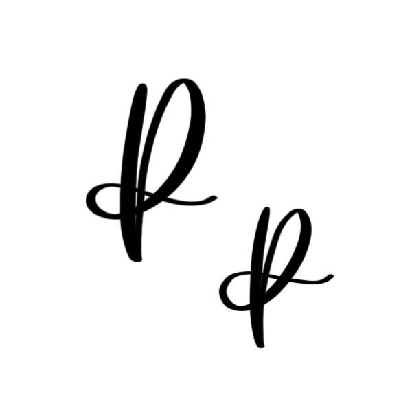
What Guidelines Are Used by the Letter P?
Understanding how the letter P fits within the guidelines helps you keep it consistent, balanced, and easy to read. While the structure stays the same between uppercase and lowercase, the main difference is how far the downstroke extends.
The uppercase P sits firmly on the baseline and reaches up to the capital height, with its loop filling the upper portion of the space. The lowercase p follows a similar shape but stretches downward, using the descender space to create contrast and visual interest. In both cases, the loop stays more compact near the top, while the downstroke defines the overall height of the letter.
Because the loop crosses through the stem, spacing becomes especially important. Keeping the shapes open and centered prevents the letter from feeling cramped or uneven.
Key things to watch for:
The main downstroke should sit straight and anchored on the baseline
Uppercase P reaches the capital height; lowercase p extends to the descender line
The loop stays in the upper portion of the letter and doesn’t collapse inward
The crossing point should feel centered — not too high or too low
Exit strokes should taper lightly and move naturally to the right
When these guidelines are followed, the letter P feels balanced and readable, with a clear relationship between its height, loop, and flowing exit stroke.
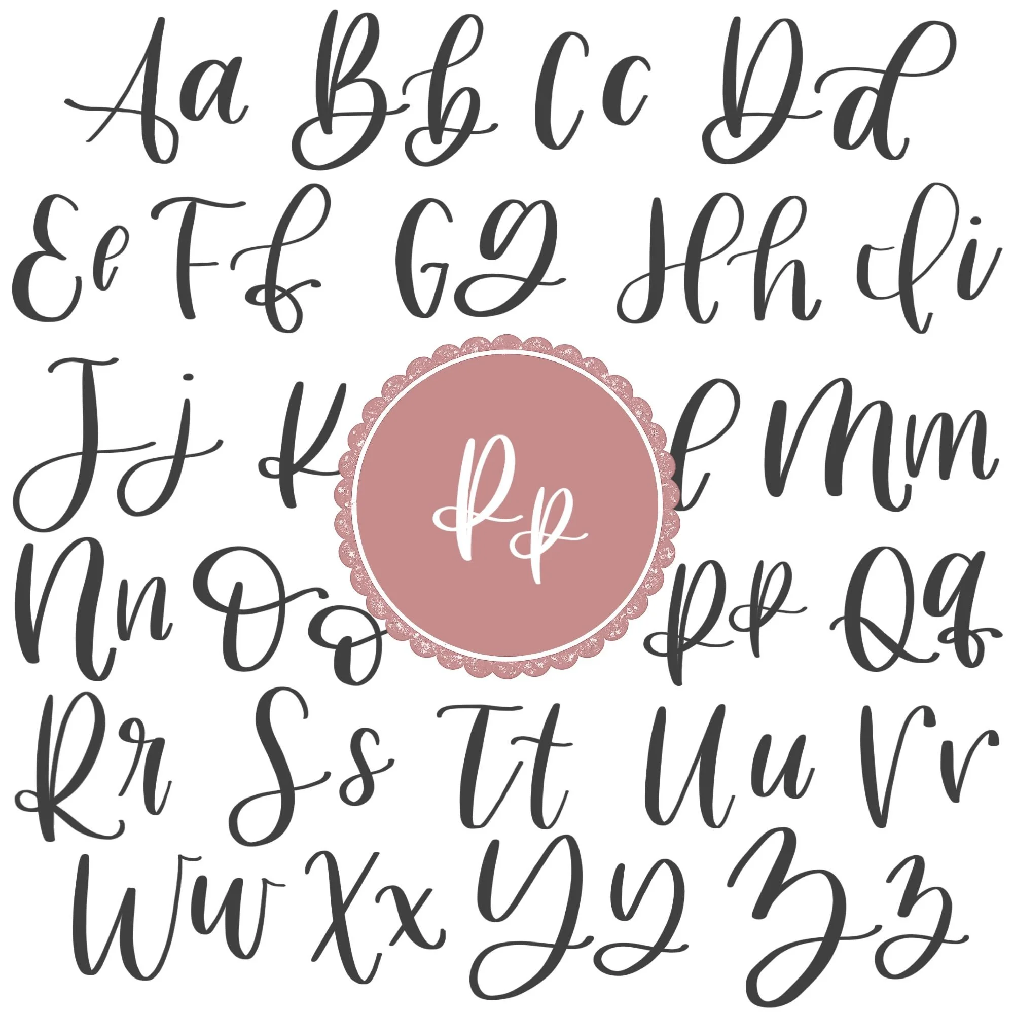
Letter P in the Complete Calligraphy Alphabet
The letter P introduces one of the most important combinations in modern calligraphy: a strong vertical stem paired with a looping, crossing stroke. This structure shows up in several other letters, which means the skills you build here transfer directly as you continue through the alphabet.
Letters That Share Similar Strokes
The ascending loop and crossing motion in P connect closely to other loop-based letters.
p ↔ b: Both share a similar looped form that crosses through a stem, just mirrored in direction and placement
p ↔ h: The upward loop motion and transition into a downstroke follow a similar rhythm
p ↔ k: The crossing action and controlled exit stroke require the same sense of timing and spacing
The extended downstroke in lowercase p also connects it to other descender letters.
p ↔ g, y, j: These letters all rely on confident strokes that move below the baseline without becoming heavy or uneven
Uppercase P shares structure with other tall, stem-based capitals.
P ↔ B, R, D: Each uses a strong vertical stem combined with a curved or looping form attached to it
Ready to learn?
Common Mistakes When Lettering P
The letter P can feel smooth when everything clicks, but small issues in pressure, spacing, or timing can quickly make it look off. If your P doesn’t feel quite right yet, these are some of the most common problems to watch for.

1. Uneven Pressure Between Strokes
One of the biggest issues is losing contrast between thick and thin lines. Upstrokes that are too heavy make the loop feel clunky, while downstrokes that are too light weaken the structure. Focus on clear pressure changes: light on the way up, firm on the way down.
2. Collapsed or Tight Loops
The loop is what gives the letter its shape and style. If it’s too tight or pinched, the letter feels cramped and loses its flow. Keep the loop open and rounded so it has space to breathe.
3. Misplaced Crossing Point
Where the loop passes through the stem matters more than most people expect. Crossing too high makes the letter feel top-heavy, while crossing too low throws off the balance. Aim for a natural midpoint that feels visually centered.

4. Wobbly or Curved Downstroke
The downstroke should feel steady and straight. If it wobbles or curves, the entire letter starts to look unstable. Slow down and focus on a confident, controlled motion from top to bottom.
5. Disconnected or Hesitant Motion
Breaking the letter into separate pieces often leads to awkward transitions. The loop, crossing, and exit stroke should feel like one continuous movement. Pausing too much between strokes can make the letter feel stiff instead of fluid.
6. Heavy or Abrupt Exit Stroke
The ending of the letter should feel light and natural. Pressing too hard at the end or stopping too suddenly makes the letter look weighed down. Gradually release pressure so the stroke tapers off smoothly.
7. Rushing the Loop
The loop is where most of the shape is formed, and rushing it usually shows. Fast movement often leads to uneven curves, poor spacing, and messy crossings. Slowing down here makes a noticeable difference in overall quality.
How to Improve Your Letter P Faster
Improving your letter P comes down to refining how the strokes work together — not just practicing the letter over and over. Small adjustments in how you approach practice can make a noticeable difference quickly.
Focus on the Loop First
The loop is where most of the personality of the letter lives. If your P feels off, this is usually why. Spend time practicing open, rounded loops on their own before adding the downstroke. When the loop feels smooth and consistent, the rest of the letter becomes much easier to control.
Slow Down the Transition Points
Most inconsistencies happen where strokes change direction — at the top of the loop and as it curves back down. Slowing down at these moments helps you maintain control of both shape and pressure. The goal is a smooth, continuous motion rather than a rushed curve.
Write Slightly Larger Than Normal
Practicing at a larger size gives you more control over pressure and spacing. It also makes it easier to spot issues like tight loops or uneven crossings. Once the letter feels consistent at a larger scale, it becomes much easier to size it down without losing quality.
Compare and Adjust Intentionally
After each line of practice, pause and evaluate your letters. Look for patterns—are your loops too narrow, or your crossings inconsistent? Pick one small adjustment and apply it to the next line. This kind of focused feedback turns repetition into real progress.
Practice Resources for Calligraphy P


Frequently Asked Questions about Calligraphy P
How do you write the letter P in calligraphy?
To write the letter P in calligraphy, start with a strong downstroke, then add a light ascending loop that curves clockwise and passes through the stem. The letter finishes with a soft compound curve that tapers into a smooth exit stroke. Keeping the motion continuous helps the letter feel balanced and fluid.
What strokes make up a lowercase p?
A lowercase p is made from three core movements: a downstroke that extends to the descender line, a light ascending loop, and a compound curve that crosses the stem and finishes with an exit stroke. These same strokes are used in the uppercase version, just with a shorter downstroke.
Why does my calligraphy P look uneven?
An uneven P is usually caused by inconsistent pressure, a misaligned loop, or a crossing point that sits too high or low. Tight loops and wobbly downstrokes can also throw off the balance. Slowing down and focusing on each stroke individually often fixes these issues.
Is the letter P hard to learn in brush lettering?
The letter P is moderately challenging because it combines multiple movements into one continuous form. The loop and crossing motion can take time to feel natural, but once those are learned, the letter becomes much easier to repeat consistently.
Should I practice uppercase or lowercase P first?
Lowercase p is often a better starting point because it reinforces descender control and loop formation, which appear in many other letters. However, since both versions share the same structure, practicing either one will help you improve the other.
Why does my loop look too tight or cramped?
Tight loops usually come from using too much pressure on the upstroke or rushing the curve. Focus on using very light pressure as you move upward and think about drawing a more open, rounded shape to give the loop space.
How do I make my calligraphy P smoother?
Smoother P shapes come from slowing down and maintaining steady motion through the loop and crossing. Avoid stopping between strokes, and try writing slightly larger to improve control over curves and pressure changes.
What pen should I use to practice the letter P?
A flexible brush pen works best for practicing P because it allows you to clearly see the contrast between thick downstrokes and thin upstrokes. Beginners often benefit from a slightly firmer tip for better control.
Why does my P look shaky?
Shaky lines are often caused by gripping the pen too tightly or moving too slowly without confidence. Relaxing your grip and focusing on continuous motion can help smooth out your strokes.
How often should I practice the letter P?
Practicing the letter P for a few focused minutes each day is more effective than long, infrequent sessions. Consistent, intentional practice helps build muscle memory and improves control over time.
Will practicing P help me improve other letters?
Yes, practicing P helps develop loops, downstrokes, and crossing motions that appear in letters like b, h, k, and g. Improving P often leads to noticeable progress in those letters as well.
Do I need to master P before moving on?
You don’t need to fully master P before learning other letters. It’s better to continue through the alphabet while revisiting P over time, allowing your skills to improve naturally through repetition and experience.
Ready to learn?