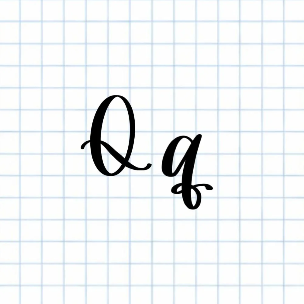
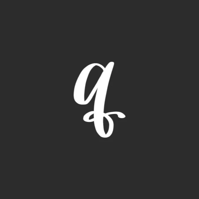
Calligraphy Q: Uppercase, Lowercase, Strokes & Practice
A complete guide to calligraphy Q, showing how to form it with brush lettering techniques
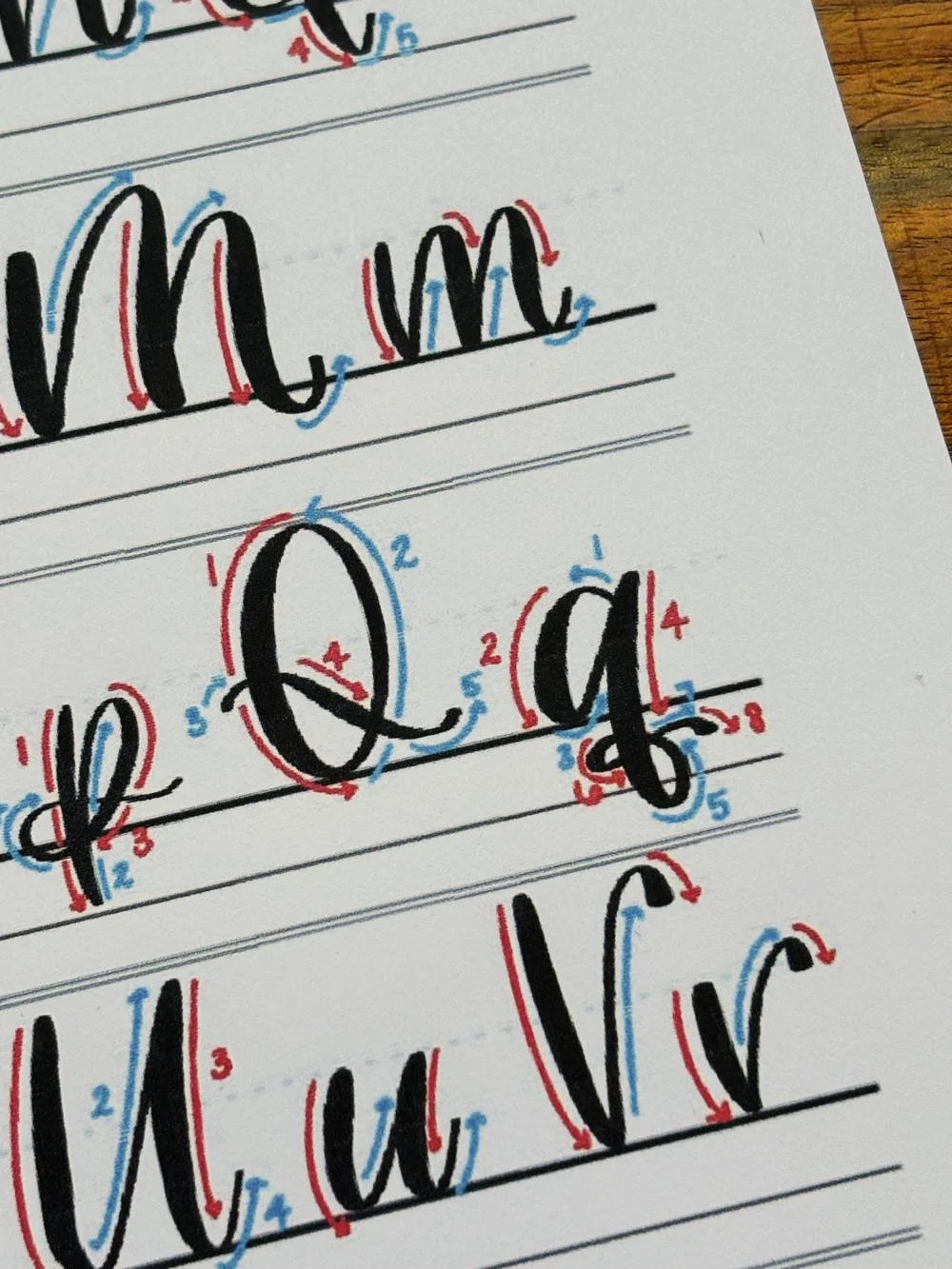
How to Write the Calligraphy Letter Q
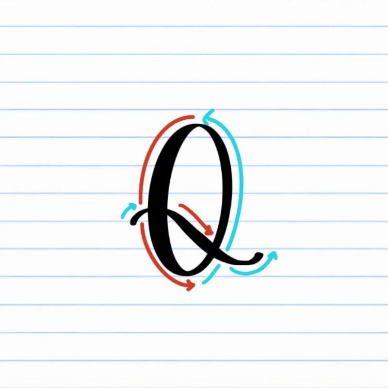
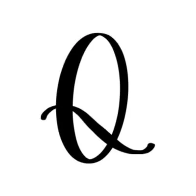
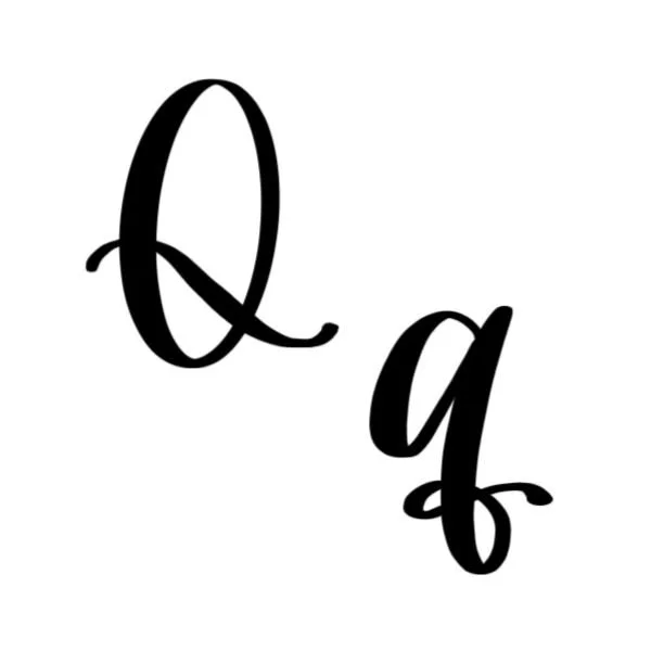
Uppercase Q: Large counterclockwise oval with a semi-shallow compound curve passing through it.
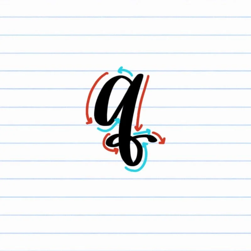
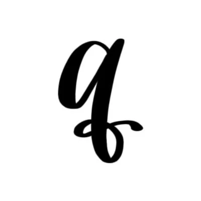
Lowercase q: Small, tilted oval with a descending loop that transitions into a tight, shallow compound curve.
How to Write Uppercase Calligraphy Q Step-by-Step
Begin a large oval near the top of the letter.
Place your brush pen near the top of the letter and begin a smooth, counterclockwise oval that curves down to the baseline and back upward. Keep heavier pressure on the downstroke and light pressure on the upward portion of the stroke so the letter has clear contrast and movement.
Close the oval with a balanced shape.
Continue the stroke until it meets the starting point again near the top of the letter. Focus on keeping the oval open and evenly rounded rather than narrow or pinched. The shape should feel clean and stable on the baseline.
Start the compound curve through the oval.
Lift your pen and reposition it near the left side of the oval around the midpoint, halfway up. Begin a light curved stroke that passes through the thick downstroke of the oval. Let the motion feel smooth and flowing.
Pull the stroke below the baseline.
As the curve moves downward, gradually add pressure to create a thicker stroke. Extend the line toward the bottom of the oval before curving it outward.
Release pressure into a tapered finish.
As the stroke passes through the light upstroke of the oval, slowly ease off pressure so the line becomes thin again. Allow the tail to end naturally with a soft upward taper that trails off toward the right.
How to Write Lowercase Calligraphy q Step-by-Step
Begin the oval near the top of the letter.
Place your brush pen near the top of where the final letter will sit and begin a smooth oval stroke that curves counterclockwise downward to the baseline and back upward. Like the uppercase Q oval, keep pressure heavier on the downstroke and light on the upstroke.
Close the oval at the top.
Continue the stroke upward until it reconnects near the starting point. Focus on keeping the oval open and slightly tilted toward the right. A clean oval creates the foundation for the rest of the lowercase q.
Pull a descending loop downward.
Slightly above the point where the oval finished, begin a thick downstroke along the right side of the oval. Extend the stroke below the baseline toward the descender line. As the stroke reaches the bottom, curl it counterclockwise into a smooth loop. Keep the motion relaxed so the loop feels flowing and curly.
Pass back through the stem of the loop.
Release pressure as the loop curves upward so it becomes a thinner, lighter line. Continue the loop around in a tight curl so it crosses through the vertical portion of the thick descender line or stem.
Finish with a shallow compound curve.
As the loop continues to curve around in a tight counterclockwise knot, guide it into a small compound curve that passes once more through the thick descender line and the bottom loop. Taper the compound curve naturally at the end, keeping this final movement light and controlled so the letter finishes cleanly without feeling overly decorative.
Experience a Clear Path to Lettering Confidence
Basic Strokes for Calligraphy Q
Basic Strokes That Make Up Uppercase Q
The uppercase calligraphy Q combines a broad oval with a sweeping compound curve stroke, giving the letter a balance of structure and movement. While the oval creates stability and presence, the descending compound curve introduces motion and personality. Together, these two strokes give the uppercase Q its distinctive elegance.
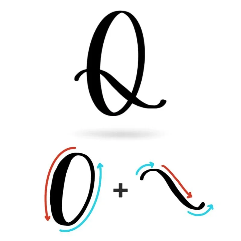
Stroke 1: Oval
The oval forms the main body of the uppercase Q. It should feel open, balanced, and smoothly rounded with clear contrast between thick downstroke and thin upstroke. A well-shaped oval gives the letter a calm, confident appearance and keeps it from feeling cramped or uneven.
Stroke 2: Compound Curve
The second stroke passes through the oval in a smooth compound curve. This stroke introduces movement and helps distinguish the Q from other rounded uppercase letters, particularly the uppercase O. The curve should feel fluid rather than rigid, with a gradual transition between thick and thin pressure. A tapered finish keeps the stroke light and prevents the bottom of the letter from feeling too heavy.
Basic Strokes That Make Up Lowercase q
The lowercase calligraphy q is built from three connected strokes: an oval, a descending loop, and a finishing compound curve. Together, these movements create a letter that feels anchored at the top and flowing below the baseline.
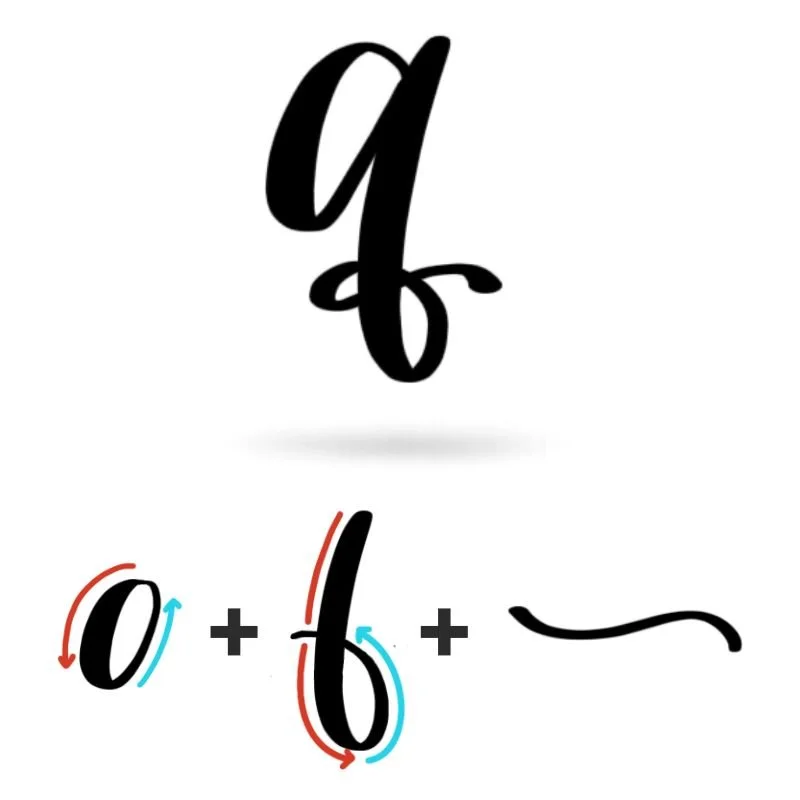
Stroke 1: Oval
The oval forms the main body of the lowercase q and establishes the structure of the letter. It should feel open, slightly tilted, and smoothly rounded with clear contrast between thick and thin areas. A clean oval helps the letter feel stable and readable. If the shape becomes too narrow or uneven, the entire letter can start to feel compressed.
Stroke 2: Descending Loop
The descending loop extends downward from the oval and gives the lowercase q its distinctive motion. This stroke carries heavier pressure as it moves below the baseline before curling counterclockwise into a smooth loop. The loop should feel flowing but tight. Its length adds elegance and helps balance the compact oval above.
Stroke 3: Compound Curve
The final compound curve finishes the letter with a small, controlled exit stroke. This movement balances the bottom of the letter and ties the loop into a bow-like knot, giving the q its elegant, signature flourish.
Want to learn calligraphy without guessing letter by letter?
Lettering Leap™ teaches modern calligraphy step by step — starting with basic strokes and building through the entire alphabet with guided daily practice.
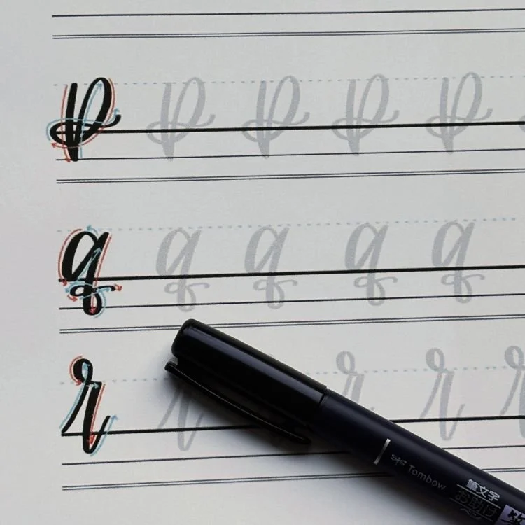
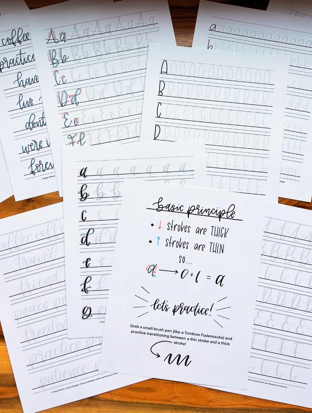
Practice Drills for Calligraphy Q
Practicing the letter Q in calligraphy is all about building comfort with rounded shapes, smooth descenders, and controlled transitions between strokes. Breaking the letter into smaller movements helps develop consistency and makes the full form feel more natural over time.
Warm-Up Strokes
Start by warming up the movements that appear most often in uppercase and lowercase Q.
Large oval motions with smooth pressure transitions
Slow descending loops that extend below the baseline
Small compound curves with light tapered finishes
These drills help loosen your hand and improve control before forming the complete letter.
Partial Letter Drills
Next, focus on isolated sections of the letter.
Repeating ovals that stay balanced on the baseline
Descending loops that curl counterclockwise smoothly
Compound curves that feel controlled instead of sharp or stiff
Practicing these shapes individually helps build cleaner transitions and steadier pressure changes.
Full Letter Repetition
Once the individual movements feel comfortable, begin practicing the complete letter.
Write rows of uppercase Q, focusing on spacious ovals and smooth descenders
Practice lowercase q slowly, paying attention to the relationship between the oval and loop
Alternate between uppercase and lowercase Q to reinforce contrast and consistency
Focus on rhythm and flow rather than speed.
Skill-Level Variations
Beginner: Practice larger letters with slower, deliberate strokes
Intermediate: Tighten spacing, refine descender loops, and experiment with more fluid movement
Want guided daily drills?
Lettering Leap™ includes 30 days of structured practice that builds every letter step by step — so you’re not guessing what to practice next.
What Guidelines Are Used by the Letter Q?
Understanding how the letter Q fits within calligraphy guidelines helps the letter feel balanced and consistent. Because both uppercase and lowercase Q rely heavily on rounded shapes and descending strokes, the guidelines help control spacing, proportion, and movement.
The uppercase Q begins at the capital height and rests on the baseline with a large oval structure. Its descending stroke extends slightly below the baseline, adding movement without making the letter feel overly heavy. The lowercase q stays more compact at the top, with its oval sitting between the baseline and x-height while the descending loop reaches down to the descender line.
Key things to watch for:
Both uppercase and lowercase Q should sit cleanly on the baseline
The uppercase Q should feel broad and open rather than narrow
Lowercase q should maintain a balanced oval before extending downward
Descending loops should reach below the baseline smoothly without becoming oversized
Consistent spacing keeps the letter readable and flowing within words
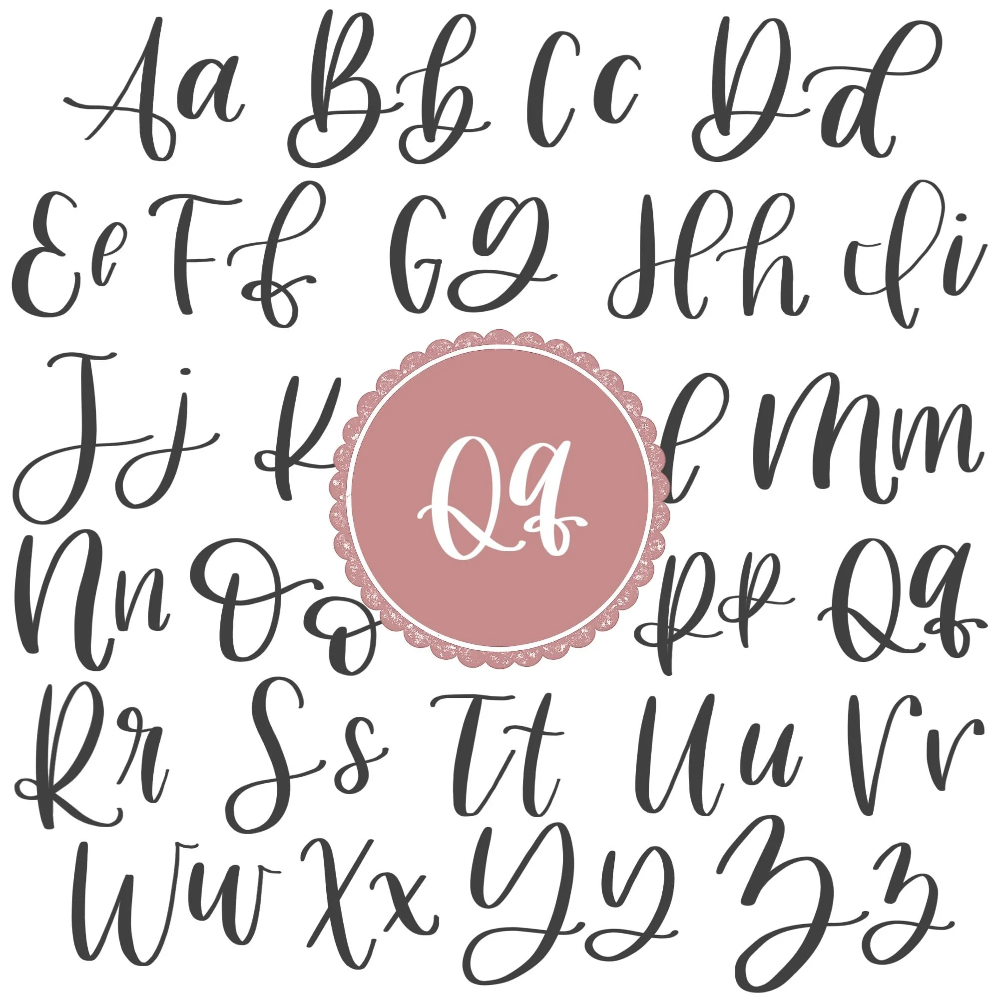
Letter Q in the Complete Calligraphy Alphabet
The letter Q combines foundational oval shapes with flowing descenders, making it an important bridge between rounded letters and looped letters in the calligraphy alphabet. The movements used in Q appear throughout both uppercase and lowercase lettering, especially in letters that rely on smooth curves and extended downward strokes.
Letters That Share Similar Strokes
Lowercase q shares its oval foundation with several other lowercase letters.
q ↔ a: Similar oval structure with a connected finishing stroke
q ↔ o: Rounded oval shape and smooth pressure transitions
q ↔ g: Oval combined with a descending loop below the baseline
These letters all rely on balanced ovals and controlled curve transitions. If your lowercase q feels uneven, you may notice similar issues appearing in these letters as well.
Uppercase Q also shares movement with other rounded capital letters.
Q ↔ O: Large oval structure
Q ↔ X: Similar flowing compound curve movement
Learning the letter Q helps strengthen control over both rounded forms and descending loops, which carry across many other letters in modern calligraphy.
Ready to learn?
Common Mistakes When Lettering Q
The letter Q can feel tricky because it combines rounded shapes with long descending movement. Small issues in spacing, pressure, or loops can quickly make the letter feel awkward or unbalanced.

1. Uneven Ovals
Both uppercase and lowercase Q rely on smooth ovals.
Narrow shapes can make the letter feel cramped
Uneven curves often make the letter sit awkwardly
Focus on keeping the oval rounded with consistent movement.
2. Heavy Descenders
One of the most common problems is applying too much pressure below the baseline.
Thick descenders can overpower the rest of the letter
Oversized loops may make the Q feel clumsy instead of elegant
Aim for controlled pressure and smooth tapering as the stroke finishes.
3. Stiff Compound Curves
The finishing strokes in both uppercase and lowercase Q should feel flowing and relaxed.
Sharp direction changes interrupt movement
Straight tails can make the letter feel rigid
Think of the stroke as a smooth curve rather than a separate attachment.
4. Collapsed Interior Spacing
When the oval closes too tightly, the inside of the letter loses clarity.
Tight spacing reduces readability
Overlapping strokes can make the shape feel messy
Leave enough open space inside the letter to keep the form clean and balanced.
5. Rushing the Descending Loop
Many learners move too quickly once the stroke drops below the baseline.
Fast loops often become uneven or shaky
Inconsistent pressure creates rough transitions
Slowing down through the descender helps the letter maintain smooth rhythm and control.
How to Improve Your Letter Q Faster
Improving your letter Q comes from building confidence in rounded shapes and controlled descenders. Because Q combines both compact curves and long flowing movement, practicing the letter intentionally helps it feel much smoother and more natural over time.
Focus on Smooth Ovals First
Most issues with Q begin in the oval. If the oval feels uneven, cramped, or shaky, the rest of the letter will usually feel off too. Spend time practicing large, relaxed ovals on their own before adding descenders or finishing strokes.
Practice Descenders Separately
The descending strokes in both uppercase and lowercase Q often become stiff when practiced too quickly. Isolating loops and compound curves helps build smoother motion and more consistent pressure below the baseline.
Slow Down Through Transitions
Q depends heavily on smooth directional changes, especially where the descender passes through or away from the oval. Slowing down slightly during these transitions helps the letter feel connected instead of pieced together.
Write Larger While Learning
Practicing Q at a slightly larger size makes it easier to control curves, spacing, and pressure changes. Larger practice also helps you notice uneven loops or crowded spacing before those habits become permanent.
Follow a Structured Practice Plan
Consistent guided practice usually improves letters faster than random repetition. Working through intentional drills and alphabet-focused exercises helps strengthen the exact movements that make Q feel smooth and balanced in modern calligraphy.
Practice Resources for Calligraphy Q


Frequently Asked Questions about Calligraphy Q
Why is lowercase q difficult in brush lettering?
Lowercase q can feel challenging because it combines several movements into one letter, particularly the curling descending loop and compound curve combination. Many beginners struggle with keeping the curl tight but natural, while maintaining correct pressure throughout.
What strokes make up a lowercase q?
Lowercase q is built from three strokes: an oval, a descending loop, and a finishing compound curve. These movements also appear in several other lowercase calligraphy letters.
Why does my calligraphy Q look awkward?
An awkward-looking Q is often caused by misplacement of the compound curve or inconsistent pressure changes. If the compound curve is placed too high or doesn’t pass through the correct points of the oval, it can make the whole letter feel unbalanced.
How do I improve the descender on lowercase q?
Practice descending loops separately before writing the full letter. Slowing down through the curve below the baseline helps create smoother motion and cleaner pressure transitions.
How do I make uppercase Q look more elegant?
Focus on creating a spacious oval and a relaxed finishing stroke. Uppercase Q usually looks more elegant when the compound curve feels smooth and integrated into the letter instead of overly dramatic.
Why does my lowercase q look too heavy?
This usually happens when too much pressure is applied below the baseline. Keeping the descending loop lighter and tapering the exit stroke helps the letter feel more balanced.
Should the tail of uppercase Q cross through the oval?
Yes, in many modern calligraphy styles, the finishing stroke passes through two parts of the oval. This creates movement and gives the letter a touch of elegance.
What pen is best for practicing calligraphy Q?
A flexible brush pen works best because it allows clear contrast between thick and thin strokes. Many beginners prefer firmer brush pens at first since they provide more control through loops and descenders.
How often should I practice the letter Q?
Short, focused practice sessions a few times a week are usually more effective than long sessions done occasionally. Consistent repetition helps build smoother curves and stronger muscle memory.
Will practicing Q improve other calligraphy letters?
Yes, practicing Q strengthens skills used throughout the alphabet, especially ovals, descending loops, and compound curves. These movements appear in many other uppercase and lowercase letters.
How is calligraphy Q different from regular cursive Q?
Modern calligraphy Q typically uses more dramatic contrast between thick and thin strokes than standard cursive writing. The shapes are also more curvy and stylized, especially in the descender and finishing strokes, which creates a more expressive look.
What is the hardest part of writing a calligraphy Q?
For many beginners, the hardest part is controlling the descender without making it too heavy or oversized. Keeping the oval balanced while maintaining smooth flow through the lower loop takes practice.
Should lowercase q have a large loop?
The descending loop should feel smooth and proportional to the oval above it. Oversized loops can make the letter feel unbalanced, while loops that are too tight can look stiff and cramped.
How do you connect lowercase q in cursive calligraphy?
Lowercase q usually connects through its finishing compound curve just below the baseline. Keeping the exit stroke light and controlled helps it transition smoothly. However, a clear, linear transition isn’t always necessary when lettering modern calligraphy.
Does the lowercase q always go below the baseline?
In modern calligraphy and brush lettering, the lowercase q includes a descender loop that usually extends below the baseline. This downward movement is one of the defining features of the letter. However, in more stylized fonts, such as exaggerated bounce lettering, a q may be written in such a way that it remains above the baseline.
Can you add flourishes to a calligraphy Q?
Yes, both uppercase and lowercase Q work well with flourishes because of their curved structure and descending movement. However, flourishes usually look best after the basic letterform feels stable and consistent.
Is uppercase or lowercase Q easier to learn?
Most beginners find uppercase Q easier because it relies on broader, simpler movements. Lowercase q often requires more control because of the tilted oval and knotted descending loop.
Why does my calligraphy Q look shaky?
Shaky strokes are often caused by gripping the pen too tightly or hesitating during curved movements. Relaxing your hand and practicing continuous oval motions can help smooth out the letter.
What calligraphy drills help improve the letter Q?
Oval drills, descending loop drills, and compound curve exercises are especially helpful for improving Q. These movements build the exact muscle memory needed for smooth, balanced lettering.
Ready to learn?