

Calligraphy R: Uppercase, Lowercase, Strokes & Practice
A complete guide to calligraphy R, showing how to form it with brush lettering techniques
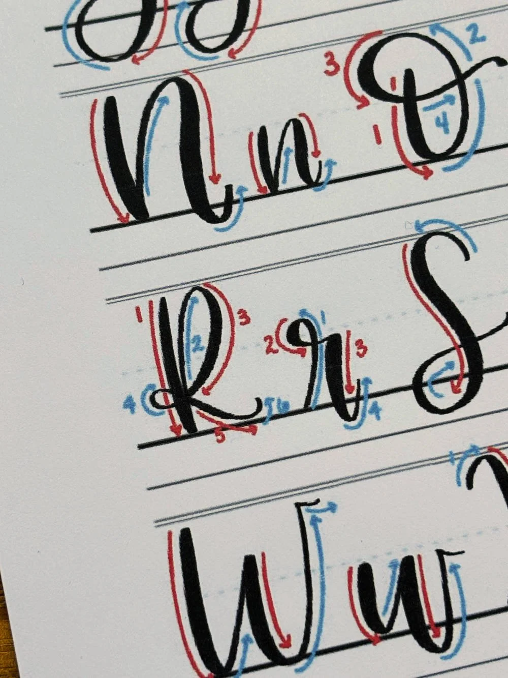
How to Write the Calligraphy Letter R
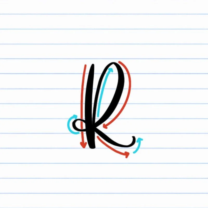
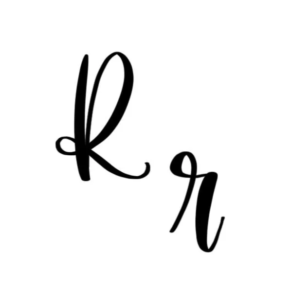
Uppercase R: Thick vertical downstroke, followed by a large sweeping ascending loop that finishes with a tight curl and compound curve.
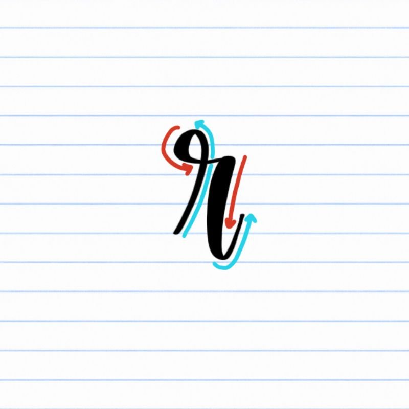
Lowercase r: Small, tight ascending loop, following by a lopsided underturn.
How to Write Uppercase Calligraphy R Step-by-Step
Begin with a strong downstroke from the top to the baseline.
Place your brush pen at the top-left corner of where your letter will be placed and pull a steady downstroke toward the baseline. Apply firm pressure throughout the stroke so the line is thick and confident. This first stroke creates the anchor of the uppercase R, so make it bold!
Lift into a large ascending loop.
Once you reach the baseline, release pressure and transition into a thin upstroke moving back upward and slightly to the right. Continue the motion into the start of a tall ascending loop that rises back toward the top. Keep the line thin all the way up.
Curve back downward in a large loop.
At the top of the loop, gently curve over and begin descending downward with added pressure. The line should curve outward generously, sweeping back toward the base and passing through the original downstroke around the lower-middle of the letter.
Wrap around to make a small bow.
As the stroke passes through the anchoring downstroke, guide it into a tight clockwise curve along the back side. Keep the line thin with reduced pressure, and keep the curve small, but avoid making it too sharp or angular.
Finish with a graceful trailing exit stroke.
After curving around on the left side of the downstroke, transition into a compound curve, increasing pressure to thicken the line as it trails down and to the right. After touching the baseline, the ending stroke should taper slightly upward to keep the letter airy and elegant.
How to Write Lowercase Calligraphy r Step-by-Step
Begin with a thin ascending loop from the baseline.
Place your brush pen on the baseline and begin a light upstroke moving upward and slightly to the right. Keep the pressure very light as the stroke rises above the X-height into a tall ascending loop.
Rotate counterclockwise at the top of the loop.
As you reach the top of the ascending stroke, gently curve the line around to the left and begin rotating counterclockwise. Keep the loop small and tight. As you rotate around and curve back into a downstroke, increase the pressure to thicken the line, but quickly release it once more as the loop closes and trails off to the right.
Descend back downward with controlled pressure.
After completing the top of the loop, begin descending downward toward the baseline, applying heavy pressure once more. This creates the thicker downstroke that forms the start of the underturn stroke.
Complete the lopsided underturn.
Allow the downstoke stroke to dip slightly below the baseline before curving back upward and to the right. Reduce pressure as the line begins rising again so the exit stroke becomes thinner and lighter. Let the exit stroke trail rightward, creating a natural connection point for the next letter in a word.
Experience a Clear Path to Lettering Confidence
Basic Strokes for Calligraphy R
Basic Strokes That Make Up Uppercase R
The uppercase calligraphy R combines bold structure with flowing movement. While the letter looks complex at first, it’s really built from a few foundational brush lettering strokes working together. Learning these individual movements first makes the full letter feel much more manageable and consistent.
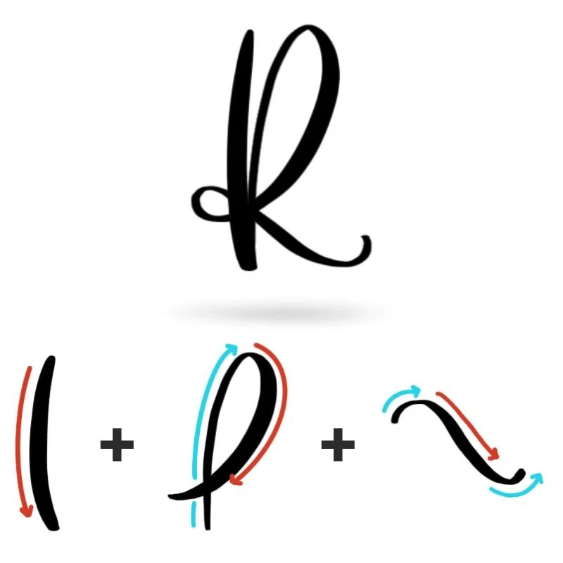
Stroke 1: Downstroke
The downstroke forms the backbone of the uppercase R. It should feel bold, smooth, and confident, giving the letter a strong foundation before the more decorative movements begin. A slight bow in the downstroke is preferrable over a straight, vertical line.
Stroke 2: Ascending Loop
The ascending loop adds fluidity to the letter. Its thin upward motion creates contrast against the heavier stem, while the large looping curve gives the uppercase R its graceful, sweeping appearance.
Stroke 3: Compound Curve
The final compound curve carries the letter outward with movement and energy. This stroke should feel flowing and slightly playful, with smooth pressure transitions and a light tapered finish that keeps the letter airy.
Basic Strokes That Make Up Lowercase r
The lowercase calligraphy r is built from two connected strokes that create a compact but flowing shape. The tall ascending loop gives the letter lift and elegance, while the underturn adds softness and forward motion.
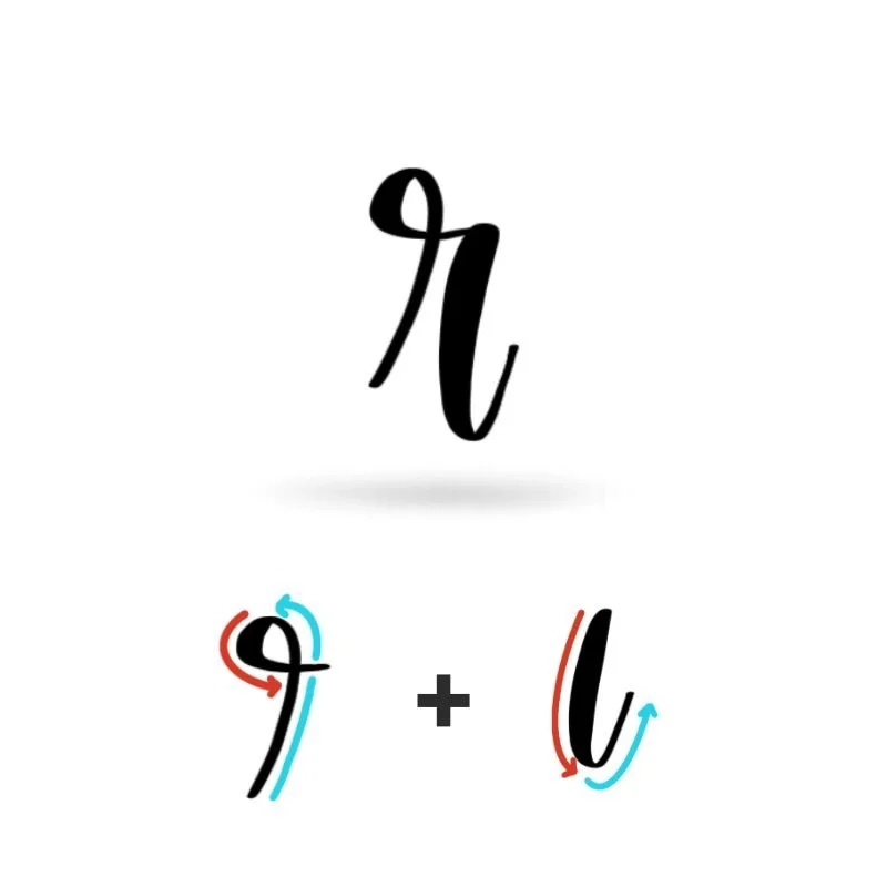
Stroke 1: Ascending Loop
The ascending loop creates the height and personality of the lowercase r. It should feel delicate and uncomplicated, with a tight counterclockwise loop near the top. Much of the stroke should consist of thin lines, but the downstroke of the loop should be intentionally thicker.
Stroke 2: Underturn
The underturn brings the letter back downward before sweeping gently upward into the exit stroke. This movement gives the lowercase r a soft, connected feel, anchoring the entire letter to the baseline. A relaxed taper at the end keeps the stroke light and ready to flow naturally into the next letter.
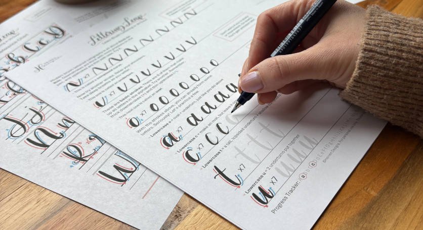
Want to learn calligraphy without guessing letter by letter?
Lettering Leap™ teaches modern calligraphy step by step — starting with basic strokes and building through the entire alphabet with guided daily practice.
Practice Drills for Calligraphy R
Practicing the letter R in calligraphy is all about learning how to balance structure with movement. The uppercase R relies on confident loops and flowing transitions, while the lowercase r focuses on compact control and smooth pressure changes. Breaking the letter into smaller drills helps build consistency without feeling overwhelming.
Warm-Up Strokes
Start by loosening your hand with a few foundational movements:
Heavy downstrokes with even pressure
Thin ascending loops that stay narrow and controlled
Underturn strokes that dip slightly below the baseline
Compound curves that transition smoothly from thick to thin
Partial Letter Drills
Next, isolate the key movements that define the letter:
Practice large looping strokes for the uppercase R without adding the final curve
Repeat small clockwise “bow” shapes to build control in the center of the uppercase letter
Drill narrow ascending loops for the lowercase r, focusing on smooth counterclockwise turns
Practice connected underturns with relaxed exit strokes
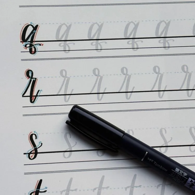
Full Letter Repetition
Once the strokes feel more comfortable, begin writing complete letters:
Write rows of uppercase R, paying attention to the balance between the heavy stem and flowing finish
Practice lowercase r slowly to keep the loop compact and the underturn smooth
Alternate between uppercase and lowercase R to improve control over scale and movement
Aim for steady, intentional motion rather than speed.
Skill-Level Variations
Beginner: Practice larger letters with exaggerated loops and slower pressure transitions
Intermediate: Tighten spacing, refine the compact loops, and experiment with longer trailing exits on the uppercase R
The more comfortable these movements become on their own, the more natural the full letter will feel in words and phrases.
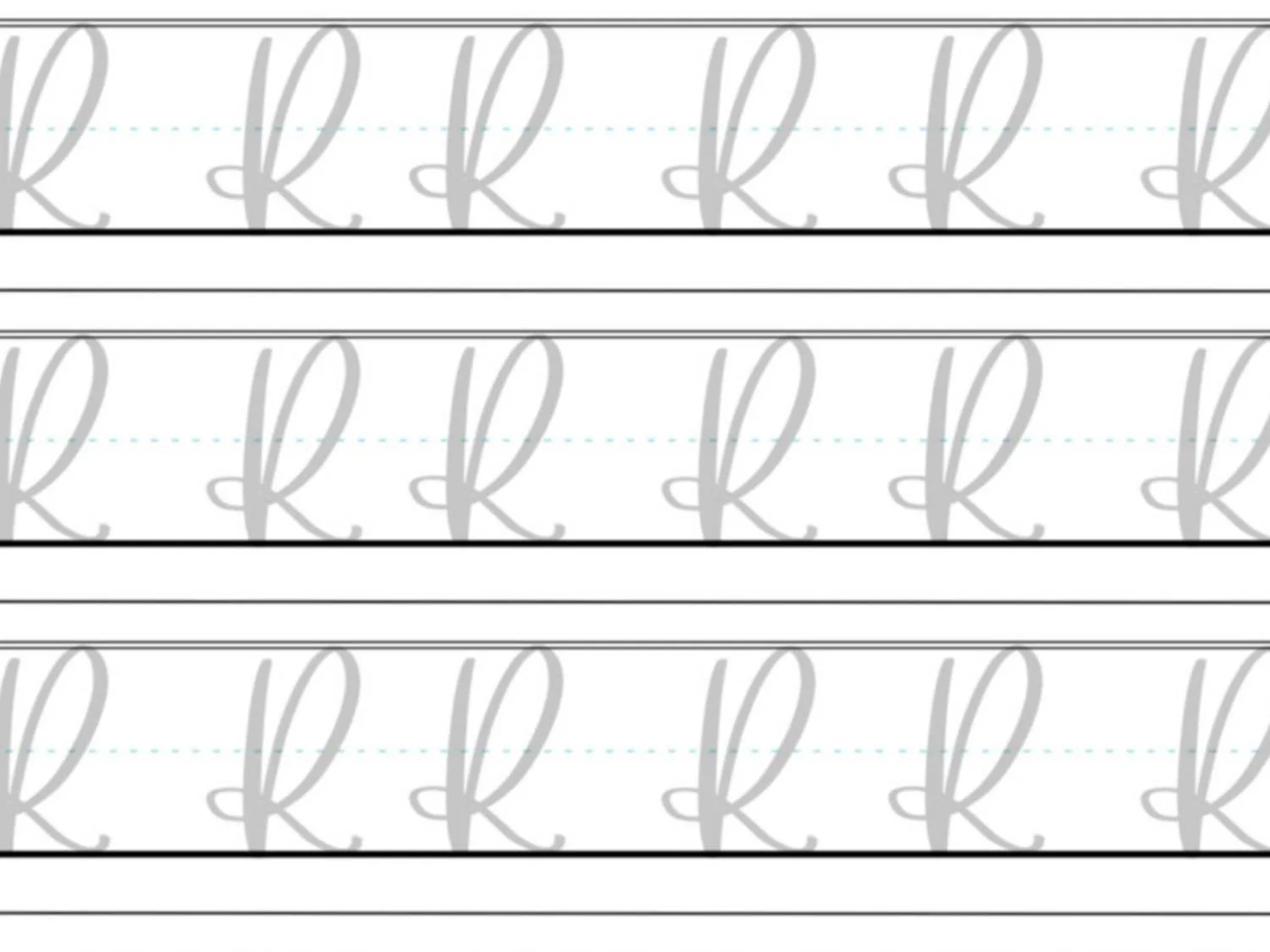
Want guided daily drills?
Lettering Leap™ includes 30 days of structured practice that builds every letter step by step — so you’re not guessing what to practice next.
What Guidelines Are Used by the Letter R?
Understanding how the letter R fits within calligraphy guidelines helps the loops, curves, and transitions feel balanced instead of awkward or uneven. Because both uppercase and lowercase R combine tall looping strokes with flowing exits, the guidelines help control the overall proportion and rhythm of the letter.
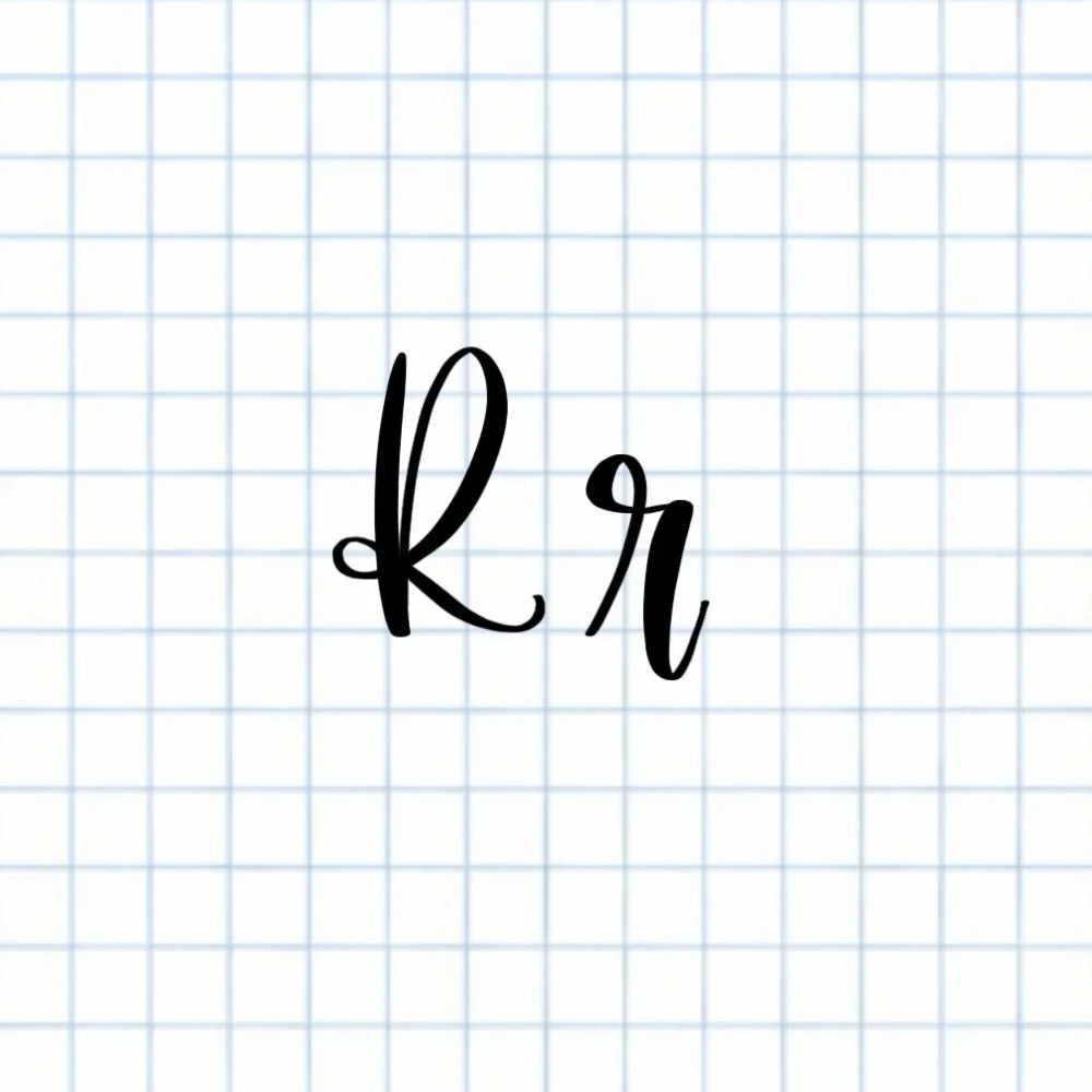
The uppercase R begins at the capital height and stretches down to the baseline. Its large ascending loop fills much of the upper space, while the finishing compound curve extends outward along the baseline.
The lowercase r is much more compact, but it still relies heavily on the guidelines for consistency. The ascending loop rises above the X-height before transitioning into a thick descending stroke and a soft underturn that dips slightly below the baseline.
Key things to watch for:
Both uppercase and lowercase R should sit cleanly on the baseline
The uppercase R uses more height and sweeping movement than the lowercase version
Underturns and exit strokes should dip below the baseline lightly, not heavily
Consistent spacing keeps the loops from feeling cramped or tangled
Letter R in the Complete Calligraphy Alphabet
The letter R combines several foundational calligraphy movements into one expressive shape. Between its looping ascenders, bold downstrokes, underturns, and compound curves, the letter helps reinforce skills that appear throughout the rest of the alphabet.
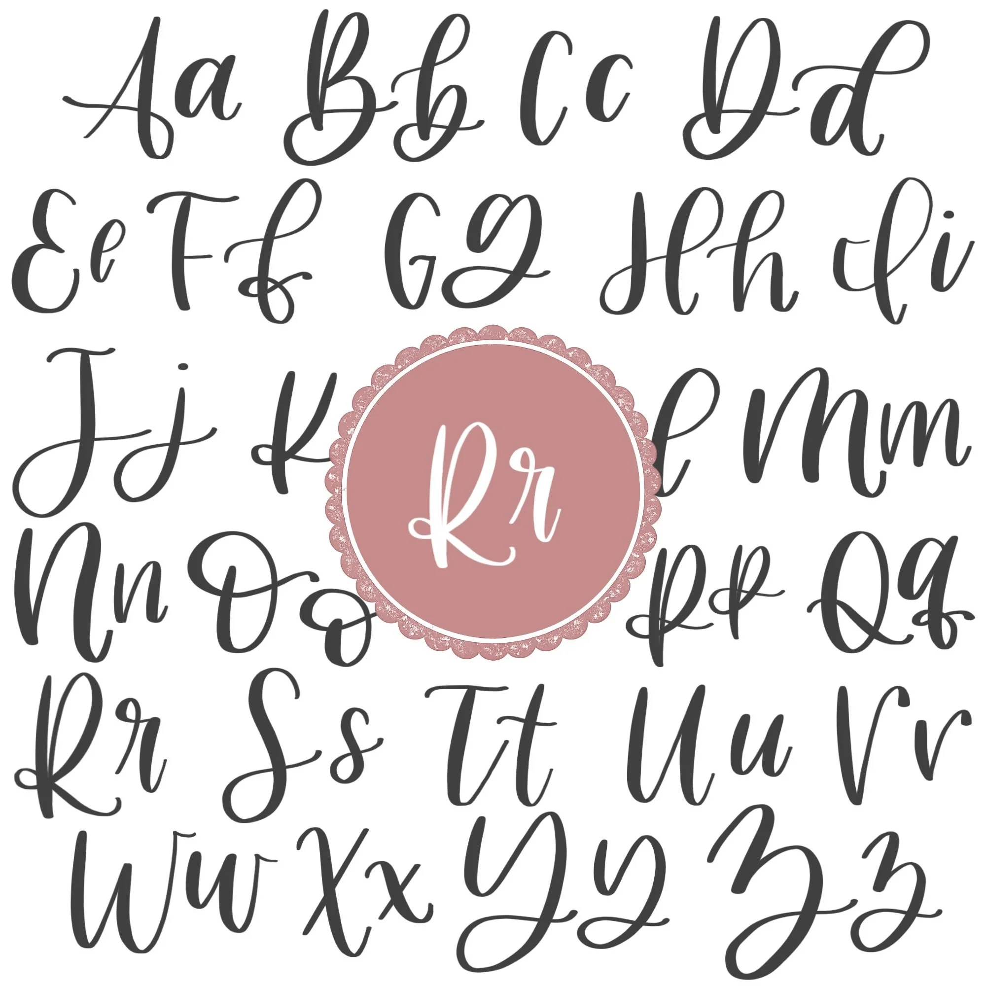
Letters That Share Similar Strokes
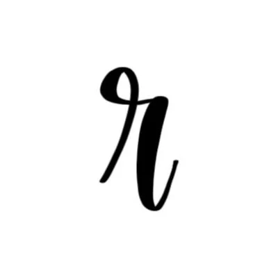
The lowercase r shares its ascending loop with some taller lowercase letters:
r ↔ h: Similar ascending loop and thick descending stem
r ↔ k: Similar loop structure with a more decorative finish
Its underturn also connects closely to foundational lowercase letters:
r ↔ n: Similar underturn movement and exit stroke
r ↔ u: Same dipping motion below the baseline
r ↔ y: Similar flowing transition into a trailing exit
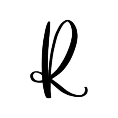
The uppercase R also overlaps with several structured capital letters:
R ↔ P: Similar heavy stem and upper looping structure
R ↔ B: Shared bold downstroke with rounded upper movement
R ↔ K: Similar balance of structure and sweeping finishing strokes
Because the letter R combines both strong structure and flowing movement, improving it often strengthens overall brush control across the alphabet.
Ready to learn?
Common Mistakes When Lettering R
The letter R can feel tricky because it combines several different calligraphy movements into one shape. Between the loops, pressure transitions, and flowing finishes, it’s easy for the letter to start feeling tangled or uneven. These are some of the most common issues beginners run into when practicing calligraphy R.

1. Disproportionate Loops
One of the most common problems is making the loops too tight or too big.
The loop of uppercase R tends to get squeezed too narrow
The lowercase r loop tends to become too big or exaggerated
Slow down when making your loops and visualize where the stroke will lead.
2. Uneven Pressure Changes
The letter R relies heavily on contrast between thin and thick strokes.
Heavy upstrokes can make the letter feel monotonous
Weak downstrokes can make it look shaky or unfinished
Focus on intentional, directional pressure and smooth transitions.

3. Tangled Center Strokes
In uppercase R, the looping stroke passes through the main downstroke before wrapping around into the finishing curve.
Crossing too high can make the letter feel awkward
Tight spacing can cause the center to look crowded
Leave enough breathing room inside the letter so the stroke stays readable and distinct.
4. Stiff Underturns
The lowercase r depends on a smooth underturn to create flow.
Sharp corners can make the letter feel rigid
Abrupt endings interrupt connections into the next letter
Aim for a relaxed curve that dips gently below the baseline before tapering outward.
5. Rushing the Finishing Stroke
The final curve of uppercase R often becomes messy when written too quickly.
Fast exits can wobble or lose their shape
Heavy finishes can make the letter feel bottom-heavy
Slow down through the final compound curve and allow the stroke to taper naturally.
How to Improve Your Letter R Faster
Improving your calligraphy R comes down to learning how to control contrast, loops, and flowing transitions without rushing the letter.
Practice the Loops Separately
Both versions of the letter rely heavily on looping strokes. Instead of jumping straight into full letters, spend time practicing ascending loops on their own first. Focus on keeping them narrow, smooth, and evenly shaped. Once the loops feel natural, the rest of the letter becomes much easier to control.
Slow Down Through Pressure Changes
The letter R contains several quick transitions between thin and thick strokes. Many inconsistencies happen when pressure changes too abruptly. Slowing down during the turns and curves helps create smoother contrast and cleaner shapes throughout the letter.
Keep the Uppercase R Open
Uppercase R can easily start to feel cramped in the middle where the strokes overlap. Writing the letter slightly larger while practicing gives the loops and curves more room to breathe. This helps the shape feel cleaner and more balanced overall.
Focus on Smooth Exits
Both uppercase and lowercase R finish with trailing strokes that create movement into the next letter. If these exits feel stiff or abrupt, the entire letter can feel disconnected. Practice tapering the endings lightly so the letter feels fluid rather than heavy.
Practice Resources for Calligraphy R

Frequently Asked Questions about Calligraphy R
Why is uppercase R so difficult in modern calligraphy?
Uppercase R can feel challenging because it combines several movements into one letter. The large loop, overlapping center stroke, and flowing finish all require good pressure control and spacing to keep the letter from feeling crowded or tangled.
What strokes make up a lowercase r?
Lowercase r is built from two main strokes: an ascending loop and an underturn. The ascending loop creates the height of the letter, while the underturn forms the flowing exit stroke that connects into the next letter.
Why does my calligraphy R look messy?
A messy-looking R is usually caused by uneven pressure, loops that are too wide or narrow, or rushed finishing strokes. Tight spacing in the center of uppercase R can also make the letter feel cluttered or awkward.
How do I make my uppercase R look more elegant?
Focus on keeping the loops open and the finishing stroke relaxed. A smooth compound curve and gradual pressure transitions help the letter feel graceful.
Why does my lowercase r look too stiff?
Lowercase r often looks stiff when the underturn becomes too sharp or the exit stroke ends abruptly. Keeping the underturn rounded and allowing the stroke to taper naturally helps the letter feel softer and more fluid.
How do I connect lowercase r to other letters?
The lowercase r connects through its trailing underturn stroke. Keeping the exit light and slightly upward helps the letter flow naturally into other letters.
What pen is best for practicing calligraphy R?
A flexible brush pen works best for practicing calligraphy R because it creates clear contrast between thick and thin strokes. Beginners often benefit from firmer brush pens since they make pressure control easier to manage.
How can I improve my calligraphy R faster?
Breaking the letter into smaller drills is one of the fastest ways to improve. Practicing loops, underturns, and compound curves separately helps build muscle memory before combining the strokes into the full letter.
Does practicing R help improve other calligraphy letters?
Yes. The movements used in R appear throughout the alphabet. Practicing the loops, downstrokes, and compound curves in R often improves letters like P, B, K, h, n, and u at the same time.
Why does my uppercase R feel unbalanced?
Uppercase R can feel unbalanced when the finishing curve becomes too large or the upper loop becomes too narrow. Keeping the main stem bold and the loops evenly spaced helps the letter feel more stable and intentional.
How often should I practice the letter R?
Short daily practice sessions are usually more effective than occasional long sessions. Spending even a few focused minutes practicing loops and pressure transitions consistently will improve your calligraphy R over time.
Ready to learn?
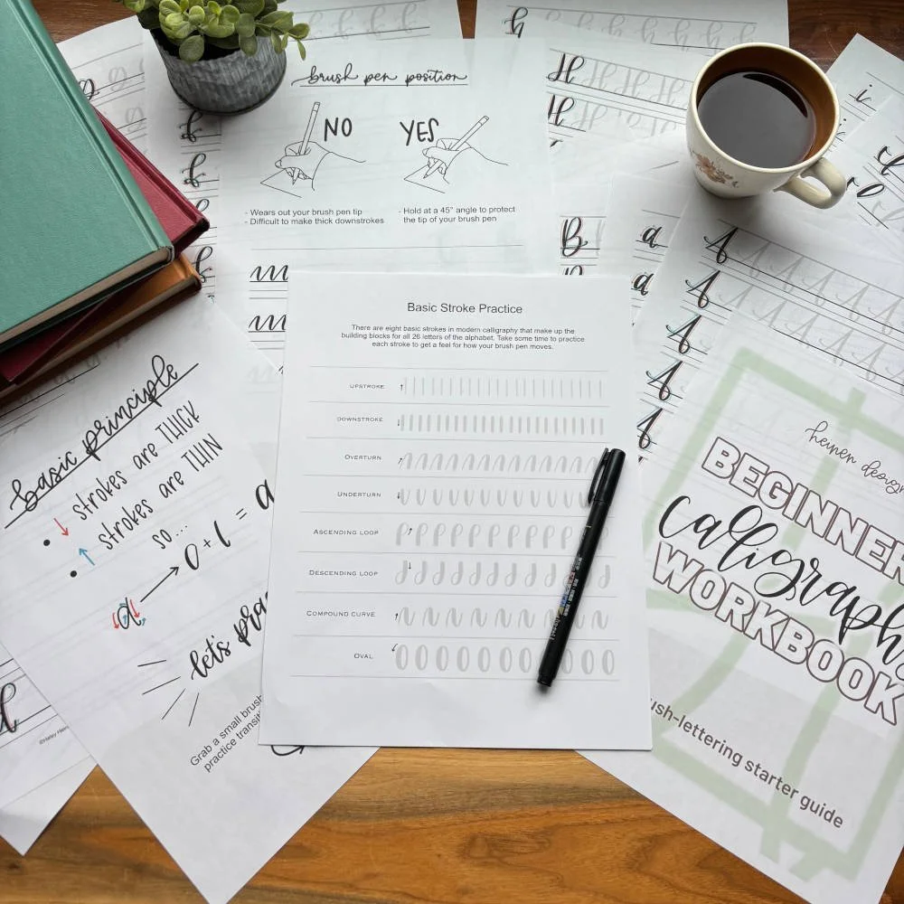
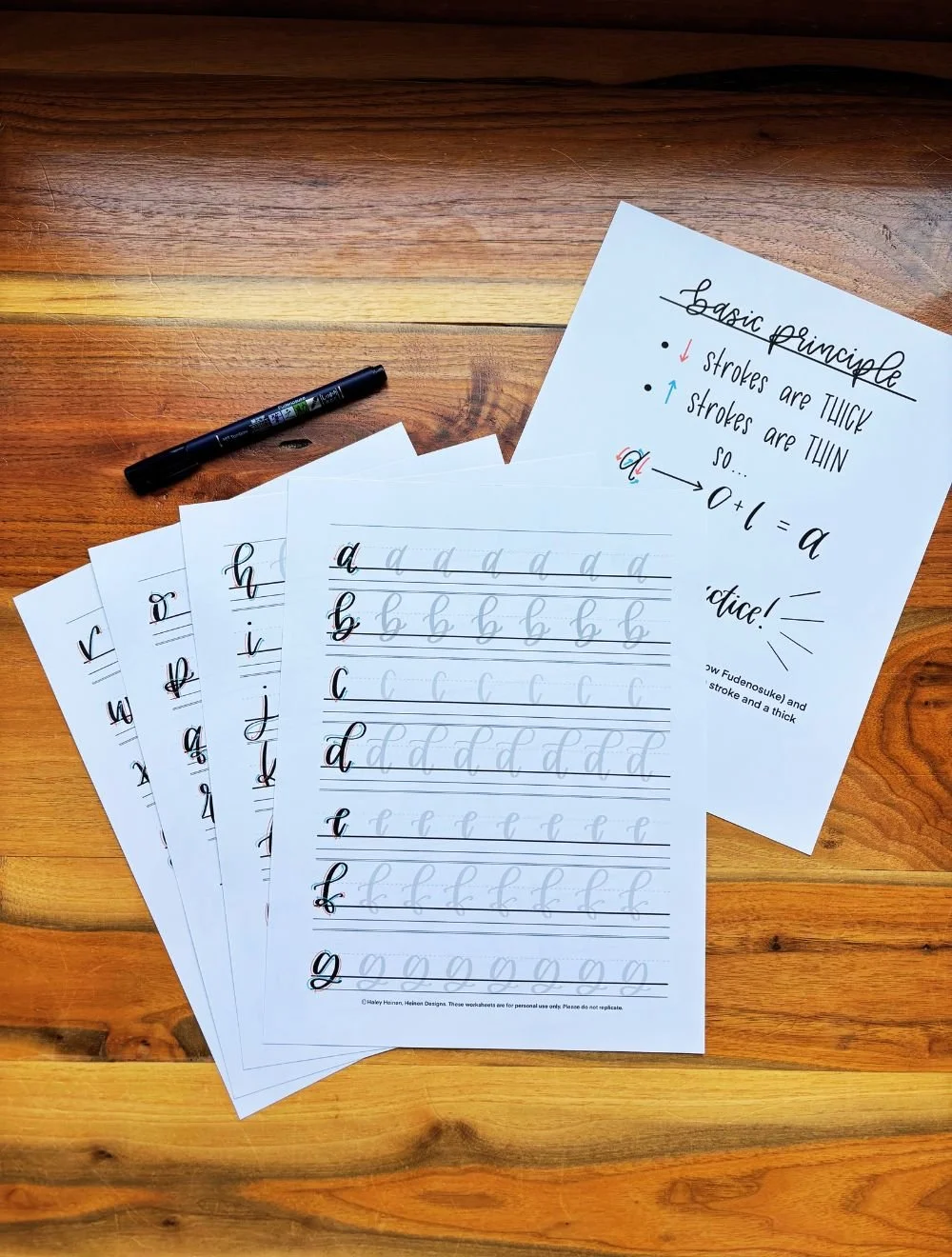
The Heinen Designs Hand-Lettering Starter Pack is a beginner-friendly printable bundle that teaches five popular lettering styles with guided tutorials, traceable alphabets, and real word practice. With 68 structured pages, you’ll build confidence and improve your lettering step-by-step.
68-page printable packet delivered as an instant downloadable PDF
5 beginner-friendly lettering styles: brush lettering, faux calligraphy, monoline, neat & clean, and tall & thin
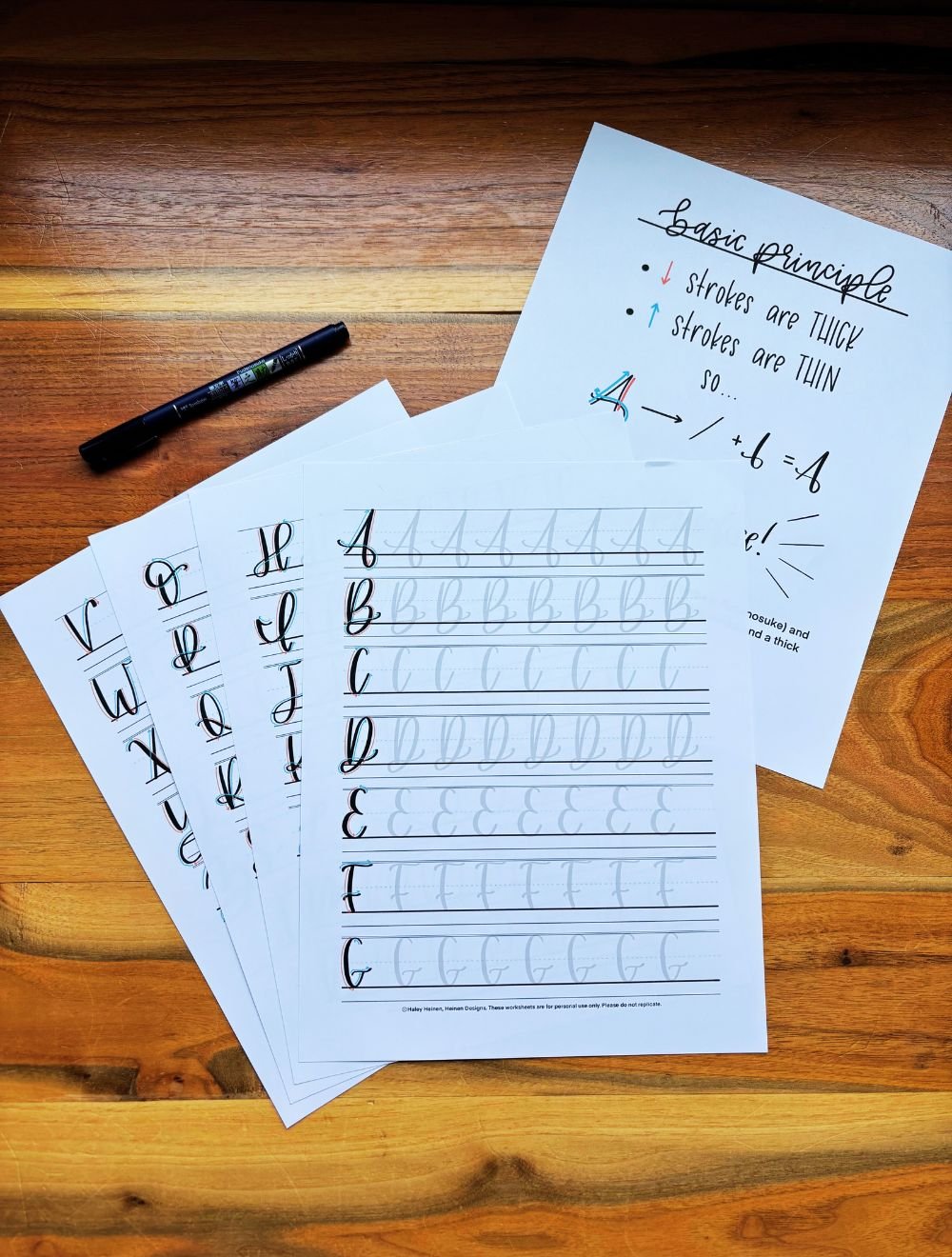
24 traceable alphabet pages to build muscle memory for every letter
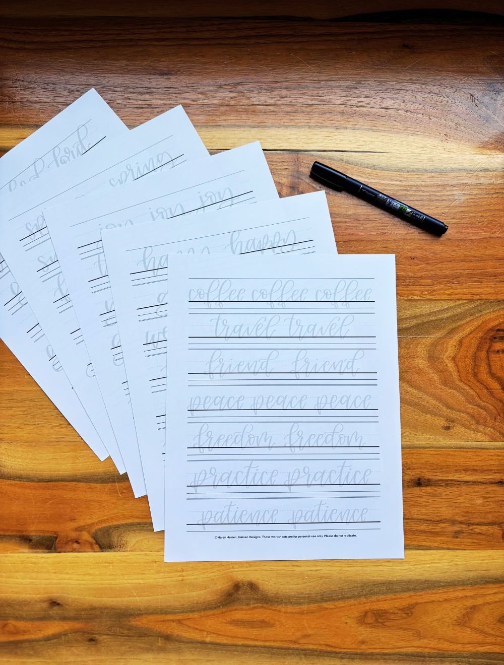
24 word practice pages to help you learn natural lettering flow
13 guided brush lettering practice pages
20 faux calligraphy practice pages
15 monoline-style lettering practice pages
Step-by-step tutorials showing how to write letters correctly
Color-coded guideline sheets to help you practice basic strokes and letter proportions
Both uppercase and lowercase alphabets included
Practice with just two simple tools: a brush pen and a regular pen (not included)