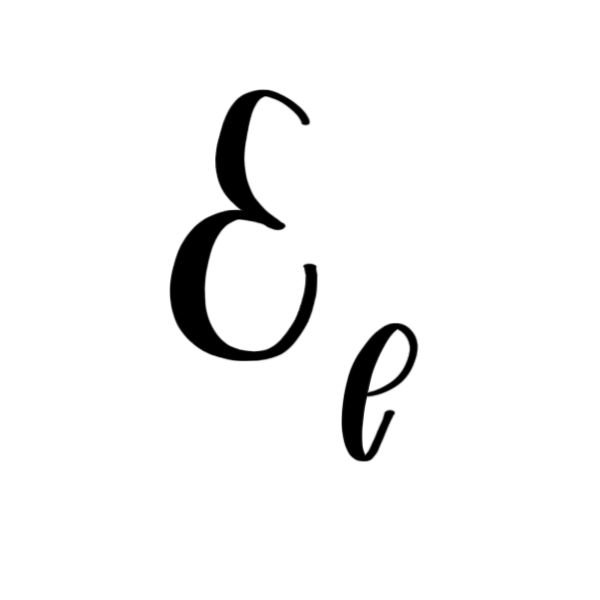
Calligraphy E: Uppercase, Lowercase, Strokes & Practice
A complete guide to calligraphy E, showing how to form it with brush lettering techniques
How to Write the Calligraphy Letter E
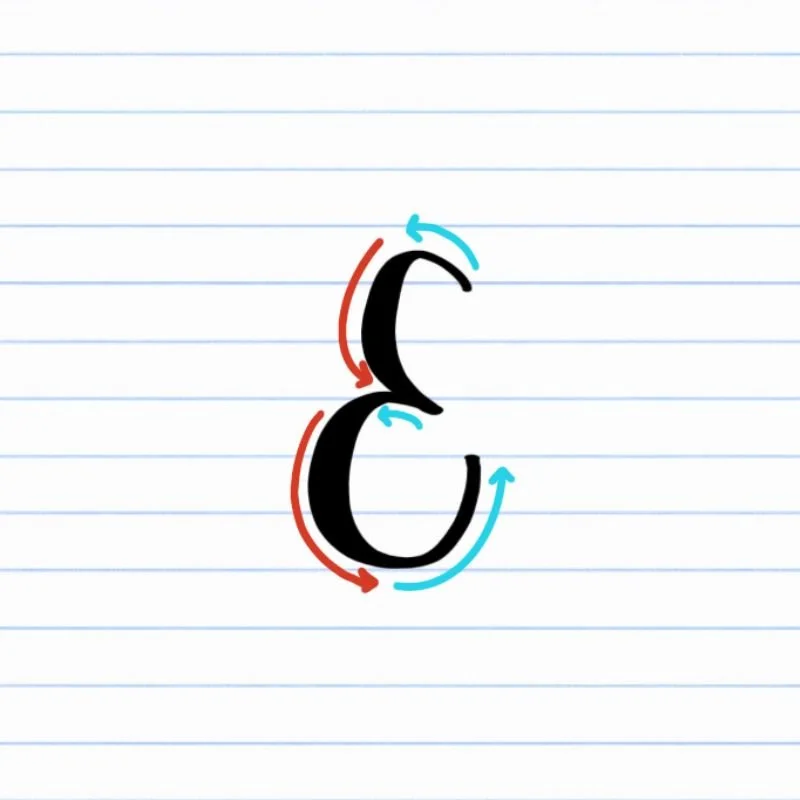
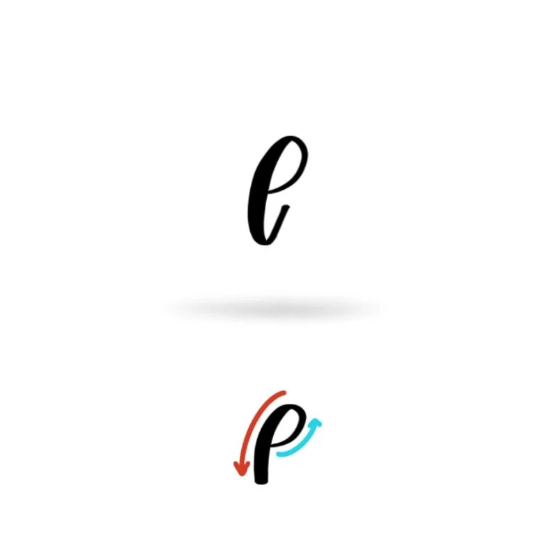
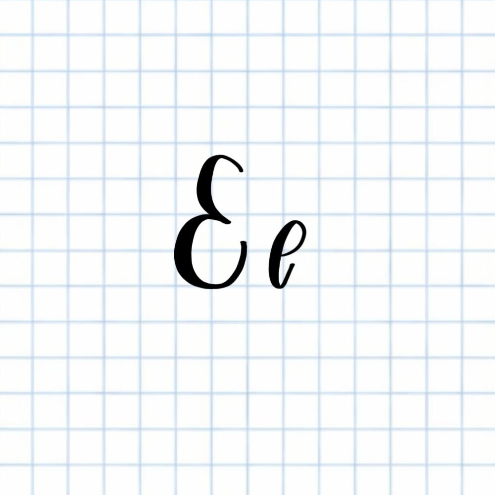
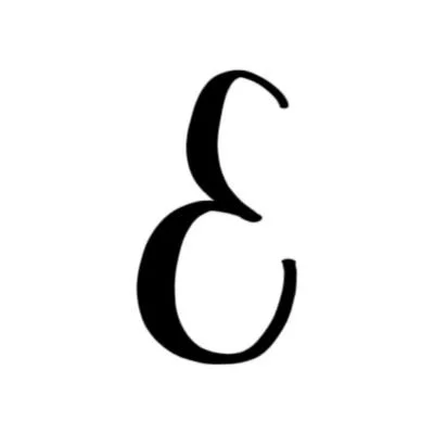
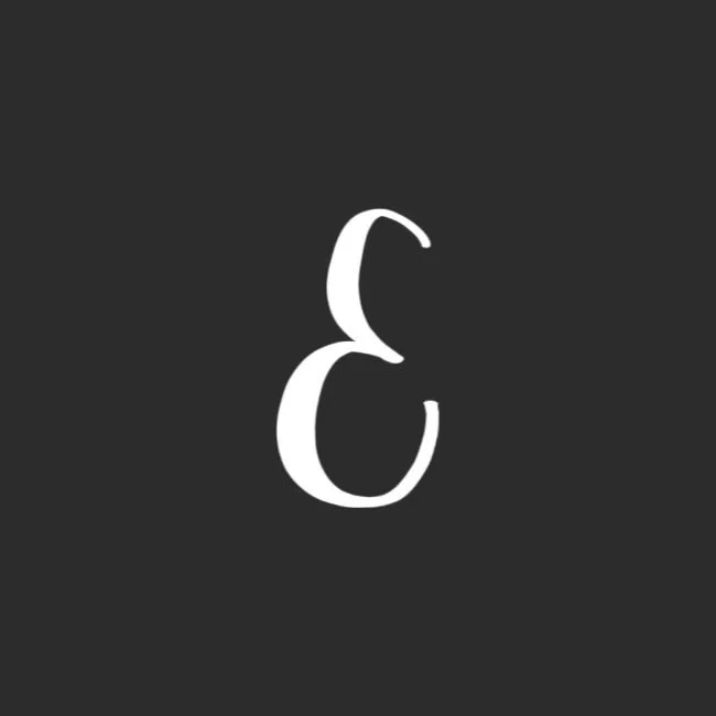
Uppercase E: Counterclockwise half-ovel on top with another near-full oval on the bottom.
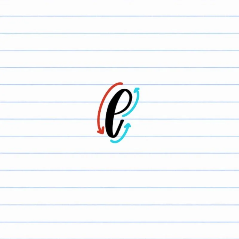
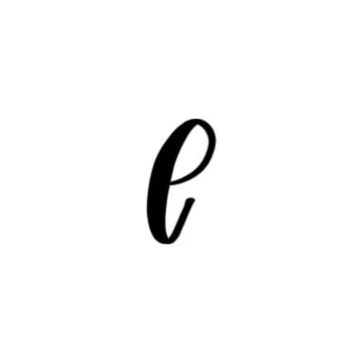
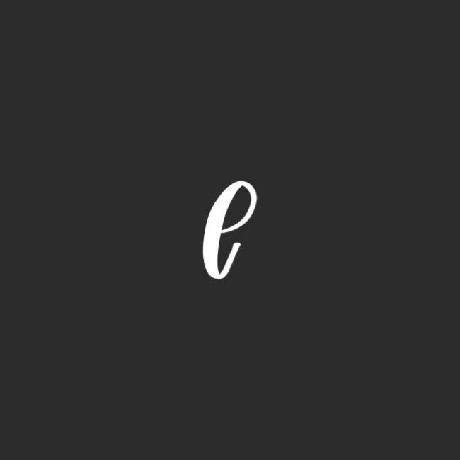
Lowercase e: Small ascending loop with a slight underturned tail.
How to Write Uppercase Calligraphy E Step-by-Step
Start just below the top and create a half oval.
Place your brush pen slightly below the capital height and begin a counterclockwise curve with light pressure. As the stroke curves downward, gradually increase pressure so the line becomes thicker. Then, ease off pressure and finish around the midline. This half-oval forms the structured top of the letter.
Begin a second counterclockwise oval.
Keeping your pen at the same point where the previous half-ovel ended, begin another counterclockwise motion using light pressure. As you curve around and downward, increase pressure to create a thick downstroke that reaches the baseline. Keep the movement smooth and continuous.
Leave the oval open and finish midway up.
After touching the baseline, guide the stroke around and upward while gradually releasing pressure. Instead of closing the oval, stop about halfway or even three-quarters of the way up toward the midline. The open ending gives the uppercase E its modern, airy feel.
How to Write Lowercase Calligraphy e Step-by-Step
Begin just below the midline and form an ascending loop.
Place your brush pen slightly below the midline and start with light pressure. Curve upward and to the left to create a small ascending loop. Keep the motion smooth and controlled so the loop feels rounded rather than narrow.
Bring the stroke down to the baseline.
As the stroke curves over the top of the loop, gradually increase pressure and guide the pen downward. Allow the downstroke to touch the baseline with steady, even thickness. Focus on a clean, confident descent instead of rushing.
Finish with a light upturn to the right.
Once you reach the baseline, release pressure and curve the stroke gently upward and to the right into an upturn. Let the line taper naturally at the end. This light exit stroke allows the lowercase e to connect smoothly to the next letter in a word.
Experience a Clear Path to Lettering Confidence
Basic Strokes for Calligraphy E
Basic Strokes That Make Up Uppercase E
The uppercase calligraphy E is built from two oval-based movements. When you understand these shapes individually, the full letter feels much more natural and repeatable. Both strokes rely on smooth counterclockwise motion and controlled pressure changes.
Stroke 1: Half Oval
The first stroke is a counterclockwise half oval that forms the top of the letter.
Begin with light pressure as you curve upward and around. Gradually increase pressure as the stroke moves downward, then ease off slightly as it finishes near the midline. A balanced half oval keeps the letter open rather than narrow.
Stroke 2: Open Oval
The second stroke is a counterclockwise oval that stays open.
Start lightly near the top, add pressure as you curve down to the baseline, then release pressure as the stroke moves upward. Stop midway up instead of closing the shape.
This open oval gives the uppercase E its airy, modern feel and builds control for other rounded capital letters.
Basic Strokes That Make Up Lowercase e
The lowercase calligraphy e is built from one continuous ascending loop with a controlled exit stroke. Although it looks simple, it teaches smooth looping motion and clean pressure transitions — skills that show up throughout the alphabet.
Stroke 1: Ascending Loop
The letter begins with a small ascending loop just below the midline.
Start with light pressure as you curve upward and around to form the loop. Keep the shape rounded and open rather than tight. As the stroke curves downward, gradually increase pressure to create a thicker line that reaches the baseline.
This looping motion appears again in letters that use similar entry strokes, so taking time to smooth it out will strengthen multiple letters at once.
Extra Stroke: Underturn
After the downstroke touches the baseline, release pressure and guide the pen into a light underturn to the right.
This thin exit stroke gives the lowercase e forward movement and makes it easy to connect to the next letter. A relaxed, tapered finish keeps the letter feeling fluid instead of stiff.
Want to learn calligraphy without guessing letter by letter?
Lettering Leap™ teaches modern calligraphy step by step — starting with basic strokes and building through the entire alphabet with guided daily practice.
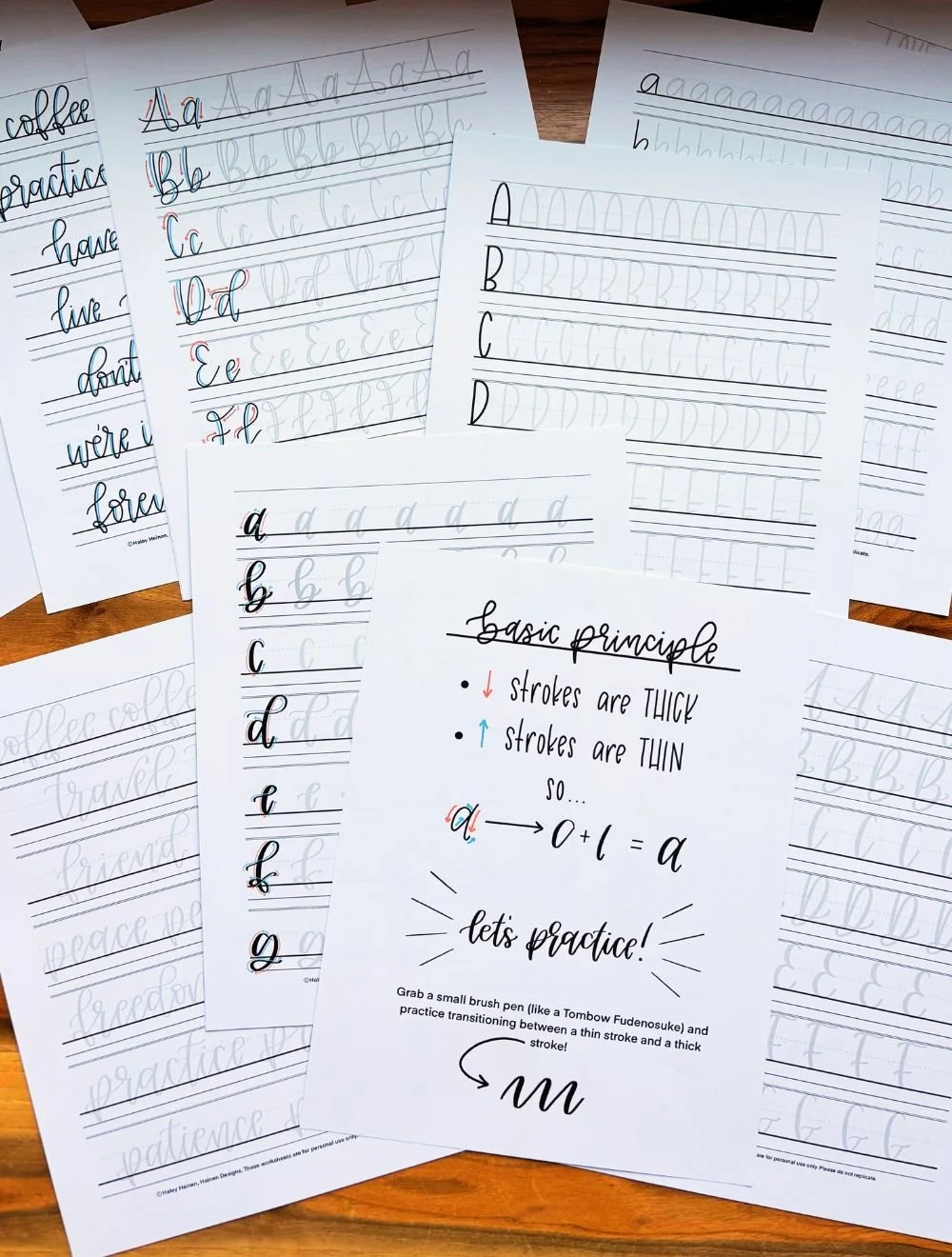
Practice Drills for Calligraphy E
Practicing the calligraphy E is all about mastering smooth oval motion and clean pressure transitions. Instead of writing full letters right away, break the shape into smaller movements so your hand learns what correct feels like.
Warm-Up Strokes
Begin with a few minutes of simple drills to loosen your hand and reinforce contrast.
Light counterclockwise oval motions
Thick, steady downstrokes to the baseline
Thin upturn strokes moving up and to the right
These movements directly prepare you for both the uppercase and lowercase E.
Partial Letter Drills
Next, isolate the core shapes of the letter.
Repeating half ovals (for uppercase E)
Open ovals that stop midway instead of closing
Small ascending loops just below the midline (for lowercase e)
Focus on keeping the interior space open and the pressure changes smooth.
Full Letter Repetition
Now combine the strokes into complete letters.
Write rows of uppercase E, watching for consistent width and openness
Practice lowercase e slowly, keeping the loop rounded and balanced
Alternate between uppercase and lowercase to reinforce control
Aim for steady rhythm instead of speed.
Skill-Level Variations
Beginner: Write larger letters and pause between strokes to check spacing.
Intermediate: Practice smaller sizing, tighter spacing, and smooth word connections (like ever or elegant).
Intentional practice — not rushed repetition — is what makes the letter E feel natural and confident.
Want guided daily drills?
Lettering Leap™ includes 30 days of structured practice that builds every letter step by step — so you’re not guessing what to practice next.
What Guidelines Are Used by the Letter E?
Understanding how the calligraphy E fits within the guidelines helps you keep your letters consistent and balanced. The lines act as visual anchors, showing where each stroke should begin, curve, and finish.
The uppercase E begins slightly below the capital height and curves down to rest on the baseline. The top oval stroke rests on the midline or X-height, and the lower oval should touch the baseline cleanly, creating a grounded, stable shape.
The lowercase e stays more compact. Its ascending loop rises to the midline before curving down to the baseline. The slight, final underturn remains light and controlled, setting up an easy connection to the next letter.
Key things to watch for:
Both uppercase and lowercase E should sit firmly on the baseline
The uppercase E extends toward the capital height with open, rounded curves
The lowercase e loop should reach the midline without stretching too high
Interior spacing should remain open and readable
Exit strokes should stay light and controlled for smooth connections
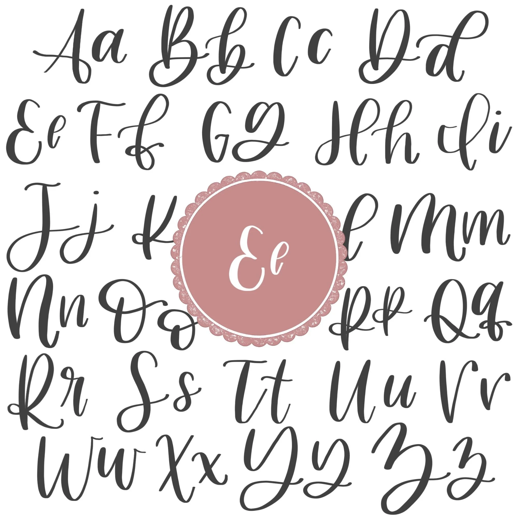
Letter E in the Complete Calligraphy Alphabet
The calligraphy E plays an important role in the full alphabet because it strengthens your control of loops, ovals, and open shapes. Once you feel confident with E, many other letters start to feel more natural.
Letters That Share Similar Strokes
Lowercase e is built from an ascending loop and a light exit stroke — movements that appear throughout the alphabet.
e ↔ l: Both use an ascending loop that rises smoothly before transitioning downward.
e ↔ b: The initial loop motion is similar, even though b continues into a taller stroke.
e ↔ h: The controlled downstroke and light exit help reinforce similar rhythm and flow.
If your lowercase e feels tight or uneven, you may notice similar tension in these letters.
Uppercase E also connects to other rounded capital forms.
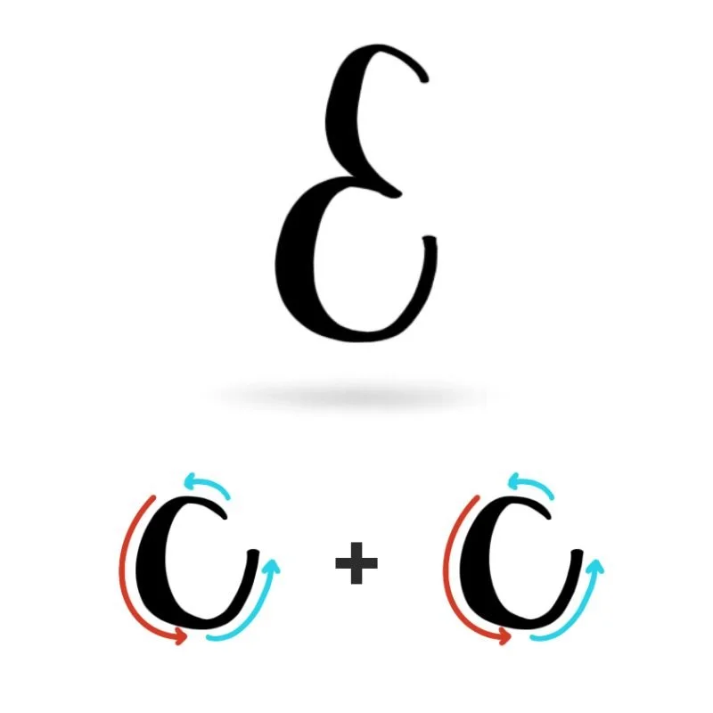
E ↔ C: Both rely on open, counterclockwise curves.
E ↔ O: Similar oval structure, with different stopping points.
E ↔ D: Uses rounded movement that depends on smooth pressure changes.
Because the uppercase E is built from open oval shapes, mastering it improves your ability to keep capital letters airy and balanced rather than stiff or crowded.
Ready to learn?
Common Mistakes When Lettering E
The calligraphy E may look simple, but small issues with curves and pressure can quickly make it feel awkward or unbalanced. If your E doesn’t look quite right yet, these are some of the most common reasons why.
1. Tight or Pinched Ovals
Uppercase E depends on open, rounded curves.
If the half oval or open oval feels too narrow, the letter can look stiff or compressed. Focus on widening your curves slightly and allowing more breathing room inside the shape.
2. Closing the Open Oval (Uppercase E)
One of the biggest mistakes is closing the second oval too much or not enough.
The uppercase E should feel open and airy. If the stroke connects fully, the letter can lose its modern look and appear heavy in the center.
3. Uneven Pressure Changes
Inconsistent contrast makes the letter look messy.
Heavy upstrokes or weak downstrokes reduce clarity. Remember: light on the way up, firm on the way down. Clear pressure contrast brings structure to both uppercase and lowercase E.
4. Overly Large or Tight Loop (Lowercase e)
The lowercase e loop should be balanced and relaxed.
If the loop stretches too high, the letter looks disproportionate. If it’s too small, the shape feels cramped. Aim for a loop that reaches the midline without crossing it.
5. Abrupt or Heavy Exit Strokes
The lowercase e should finish with a light upturn.
If the exit stroke is too thick or stops suddenly, the letter feels choppy and harder to connect in words. Keep the ending thin and tapered for smooth flow.
Most of these issues come from rushing. Slowing down, practicing the individual strokes, and checking your spacing will quickly improve the overall look of your E.
How to Improve Your Letter E Faster
Improving your calligraphy E doesn’t come from writing rows of E’s without thinking. It comes from slowing down, isolating the right movements, and practicing with intention.
Focus on the Oval Motion First
Both uppercase and lowercase E rely on smooth counterclockwise curves. If your letter feels stiff or uneven, go back to practicing simple oval motions on their own. When the curve feels natural in your hand, the full letter becomes much easier to control.
Practice Uppercase and Lowercase Separately
Work on one version at a time instead of switching back and forth. The uppercase E requires open, balanced spacing, while the lowercase e focuses on a controlled ascending loop. Giving each version focused attention builds confidence faster.
Slow Down and Write Slightly Larger
Writing a bit larger than normal helps you clearly see pressure contrast and spacing. Larger strokes make it easier to adjust curves, refine openness, and smooth out tension before shrinking your size again.
Review Before Repeating
After each line of practice, pause. Choose your strongest E and identify what makes it work — maybe the openness, the contrast, or the smooth loop. Then apply that one adjustment to the next line. This feedback loop turns repetition into real progress.
Follow a Structured Practice Plan
If you want to improve faster, guided instruction makes a difference. Instead of guessing what to practice next, a structured program walks you through stroke control, spacing, and letter formation in a logical order.
Practice Resources for Calligraphy E


Frequently Asked Questions about Calligraphy E
How do you write the letter E in calligraphy?
To write the calligraphy E, focus on smooth, counterclockwise curves and clear pressure contrast. The uppercase E is formed from a half oval and an open oval, while the lowercase e is created with an ascending loop that finishes with a light upturn. Slow, controlled strokes make the biggest difference.
What strokes make up a lowercase e?
A lowercase e in calligraphy is built from an ascending loop followed by a thin exit stroke. The loop rises to the midline, curves down to the baseline with added pressure, and finishes with a light upturn for connection.
Why does my calligraphy E look tight or cramped?
A cramped E in calligraphy usually comes from loops that are too small or ovals that close too tightly. Widening your curves slightly and keeping the interior space open will help the letter feel more balanced.
Why does my calligraphy E look uneven?
Uneven E shapes are often caused by inconsistent pressure. Heavy upstrokes or weak downstrokes reduce contrast and clarity. Focus on light pressure moving upward and firm pressure moving downward.
Is the letter E hard to learn in brush lettering?
The letter E is beginner-friendly, but it requires control of curved motion. Because it relies heavily on ovals and loops, it’s an excellent letter for building foundational brush control.
How do I connect a lowercase e to other letters?
The lowercase e naturally connects through its light upturn. Keep the exit stroke thin and slightly angled upward so it flows smoothly into other letters.
Why does my lowercase e look different every time?
Inconsistency usually comes from uneven loops or changing pressure mid-stroke. Practicing small ascending loops separately helps stabilize the shape and improve repetition.
What pen is best for practicing calligraphy E?
A flexible brush pen works best for practicing modern calligraphy E because it clearly shows the difference between thin upstrokes and thick downstrokes. Beginners may prefer a slightly firmer tip for more control.
How often should I practice the letter E?
Short, focused practice sessions a few times per week are more effective than long, infrequent sessions. A few intentional minutes spent on loops and ovals can noticeably improve your E over time.
Will improving E help with other letters?
Yes, the oval and loop motions used in E appear throughout the alphabet. Strengthening your control here will improve letters that rely on similar curved strokes.
Why does my uppercase E look too heavy in the center?
If your uppercase calligraphy E feels heavy, you may be pressing too hard on the second oval or closing the shape too much. Focus on releasing pressure as the stroke moves upward and keep the interior space open so the letter feels airy instead of dense.
How high should the lowercase e loop go?
The loop of a lowercase e should rise to the midline without crossing above it. If it stretches too high, the letter can look disproportionate. Keeping the loop controlled and compact helps maintain consistency in words.
Why does my E look flat instead of rounded?
Flat-looking curves often happen when you rush the stroke or hesitate mid-curve. Commit to a smooth counterclockwise motion and think “round” as you write. Relaxing your grip can also help the curves feel more natural.
Can I add a flourish to the uppercase E?
Yes, but keep it subtle. The uppercase E already has open, rounded movement, so an added flourish should feel light and intentional — not distracting. It’s best to master the basic form first before experimenting with extra movement.
What words should I practice to improve my e?
Practicing short words with multiple e’s — like ever, elevate, or serene — helps reinforce consistent loops and smooth connections. Writing the letter in context builds rhythm and makes your calligraphy of E feel more natural in real words.
Ready to learn?