Calligraphy K: Uppercase, Lowercase, Strokes & Practice
A complete guide to calligraphy K, showing how to form it with brush lettering techniques
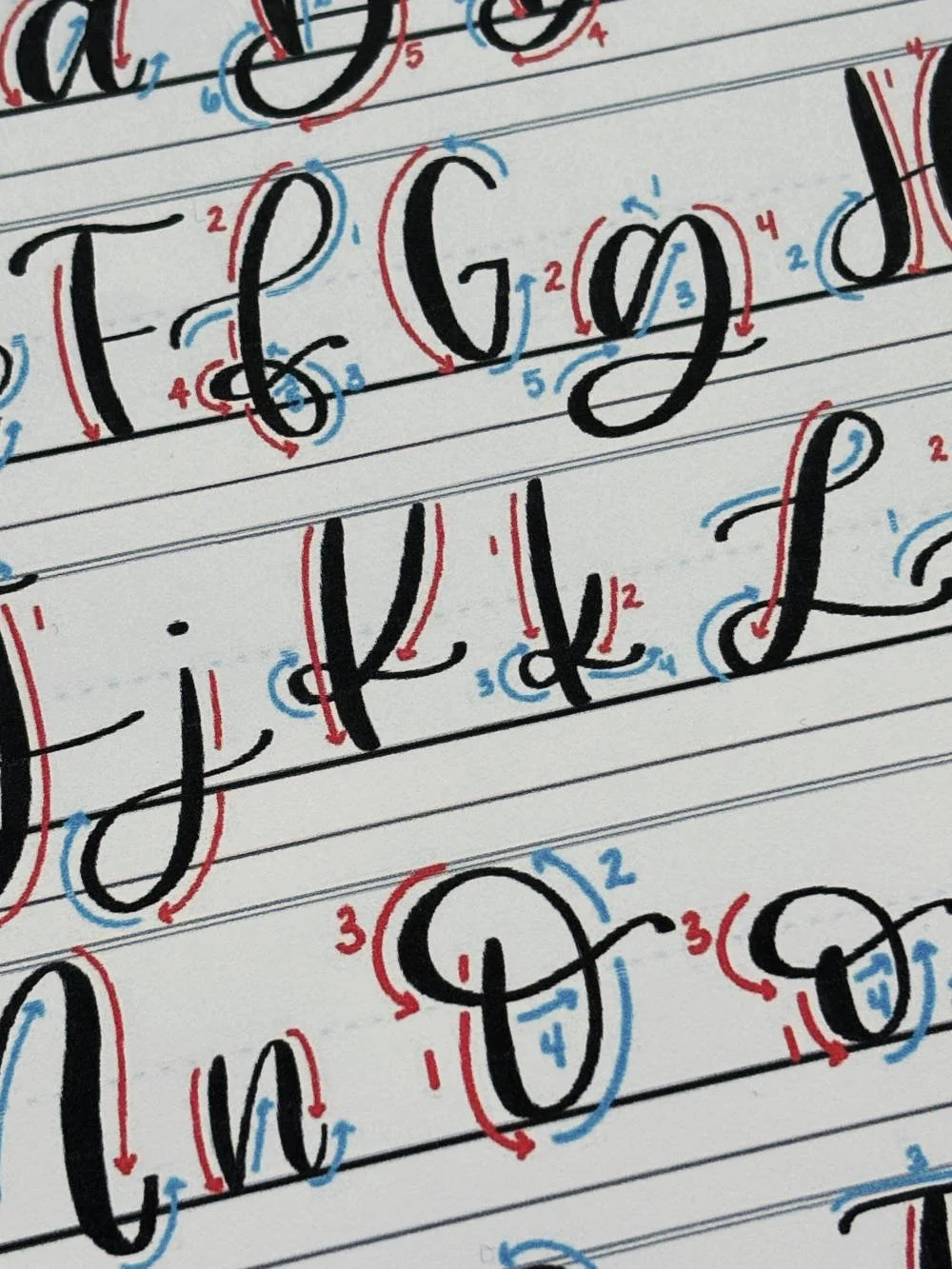
How to Write the Calligraphy Letter K
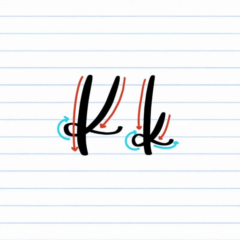
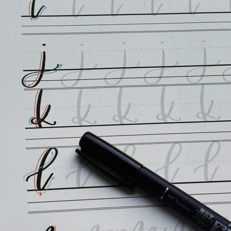
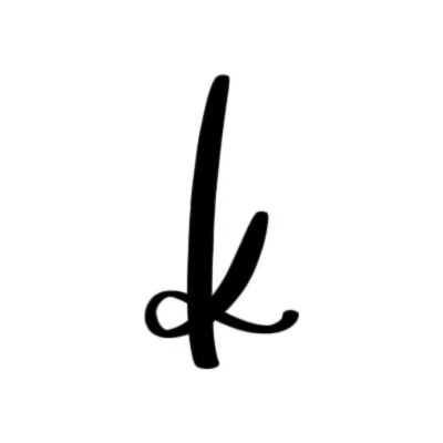
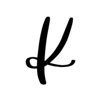
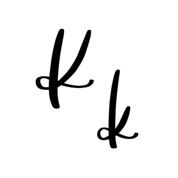
Uppercase and lowercase K: Downstroke, followed by an intersecting descending loop with a tight curl.
How to Write Upper & Lowercase Calligraphy K Step-by-Step
The calligraphy K combines a strong vertical foundation with a flowing loop that creates movement and balance. Both the uppercase and lowercase versions begin with a confident downstroke, followed by a looping stroke that crosses the stem and finishes with a graceful flourish.
Start with a downstroke.
Begin at the top of the space where your letter will be written. Draw a firm downstroke straight to the baseline. Apply steady pressure so the stroke is thick and confident.
Begin the second stroke at the top.
Move your pen to the right of the first stroke and start another stroke near the top. If it’s a capital K, start at the capital height. If it’s lowercase k, start a little more than halfway up. Curve the stroke downward in a sweeping arc toward the first downstroke. Cross the stem and continue the curve clockwise, forming a tight loop. The loop should pass smoothly through the middle of the downstroke, and then continue its descent.
Finish with a flourish.
Continue the stroke into a graceful curve that ends on the right side of the letter. This curve should become a small tail that follows the baseline or hovers slightly above it. Finish off the tail with a slight upturn for an elegant flourish.
Experience a Clear Path to Lettering Confidence
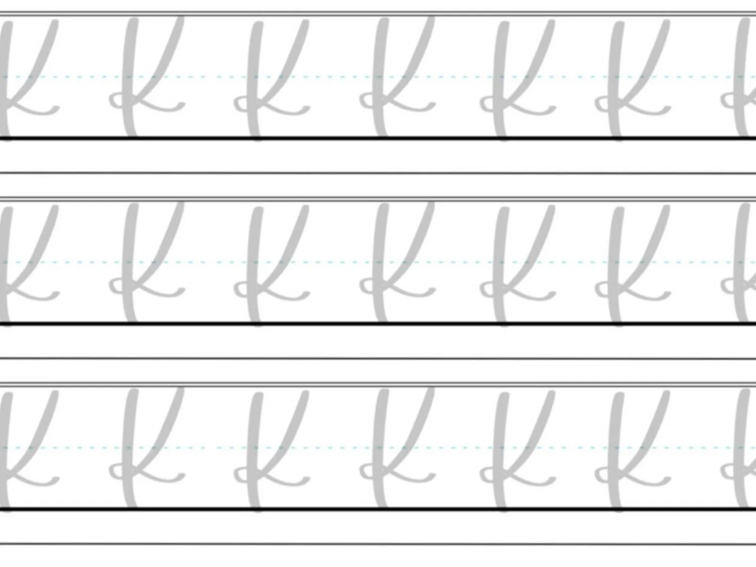
Basic Strokes for Calligraphy K
Basic Strokes That Make Up the Letter K
The calligraphy K is built from just two core strokes: a strong vertical downstroke and a flowing descending loop. Together, these strokes create the structure and movement that define the letter. Both the uppercase and lowercase K in calligraphy follow this same basic formula. The only difference is where the loop begins and how large the flourish becomes.
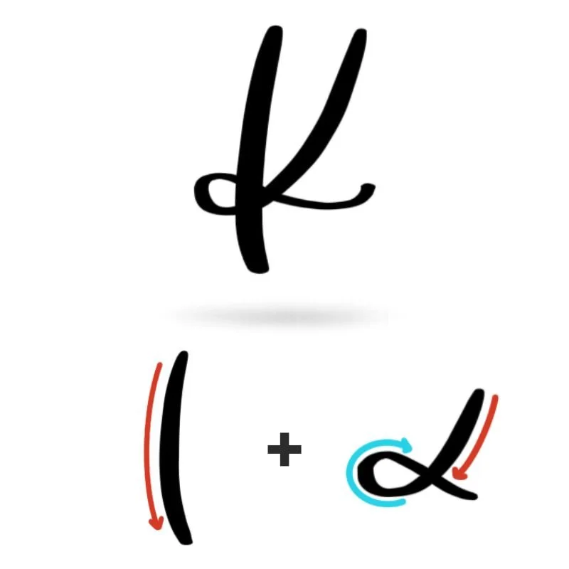
Stroke 1: Downstroke
Every version of the calligraphy letter K begins with a straight vertical downstroke. Start at the top guideline and pull the brush pen downward to the baseline while applying steady pressure. This pressure creates a thick stroke that forms the backbone of the letter. This downstroke acts as the anchor for the rest of the letter. Because the second stroke crosses through it, keeping this line straight and confident helps the finished K look balanced.
Stroke 2: Descending Loop
The second stroke of the modern calligraphy K is a descending loop that curves downward before crossing the stem and tying around it almost like a bow. This stroke begins with heavy pressure, then curves downward in a clockwise motion. As the loop wraps around the vertical downstroke, the pressure releases slightly to create a thinner line. After crossing the downstroke, the loop opens outward and finishes with a light, flowing flourish to the right.
Want to learn calligraphy without guessing letter by letter?
Lettering Leap™ teaches modern calligraphy step by step — starting with basic strokes and building through the entire alphabet with guided daily practice.
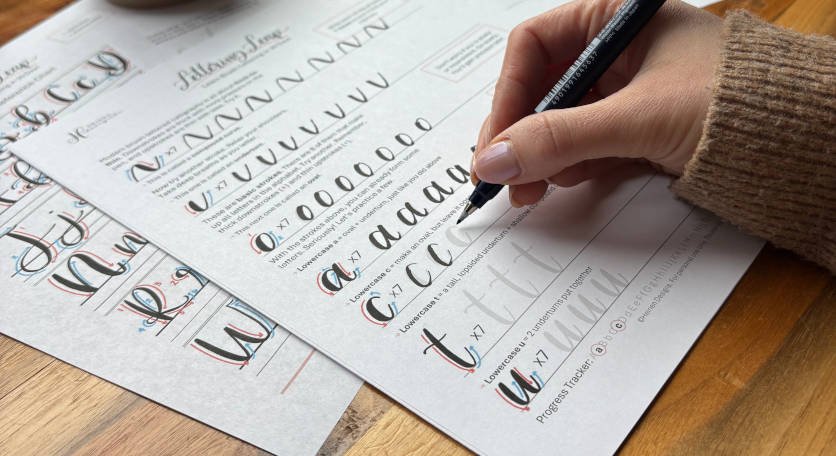
Practice Drills for Calligraphy K
The calligraphy letter K becomes much easier once the two core strokes — the vertical downstroke and the descending loop — feel natural in your hand. Instead of jumping straight into full letters, start with simple drills that isolate each movement.
Warm-Up Strokes
Begin by warming up the individual strokes used in the letter.
Practice a page of straight vertical downstrokes, moving from the top guideline to the baseline. Focus on applying steady pressure so each stroke looks consistent in thickness.
Next, practice descending loops on their own. Start with light pressure, curve downward in a clockwise motion, and allow the loop to cross an imaginary vertical line before finishing with a light upward flourish.
These loops should feel smooth and continuous, without sharp corners or uneven pressure.
Partial Letter Drills
Once the individual strokes feel comfortable, begin combining them.
Start by drawing the vertical downstroke, then practice adding the descending loop as a second stroke. Focus on where the loop crosses the stem and how the flourish opens outward to the right.
Repeat this partial form several times so the crossing point and loop shape become consistent.
This drill helps train the coordination needed for both the uppercase and lowercase calligraphy K.
Full Letter Repetition
Now begin practicing the entire letter.
Write rows of uppercase K, paying attention to the size of the descending loop and where the flourish ends. The finish should land comfortably on the right side of the letter rather than crowding the stem.
Then practice lowercase k, focusing on where the loop begins along the stem and how it flows outward.
At this stage, try writing slowly and deliberately. It’s better to produce a few well-formed letters than to rush through a full page of uneven ones.
Skill-Level Variations
Beginners: Beginners should focus on consistency and clean loops. Aim for even spacing between the stem and the flourish so the letter feels balanced.
Intermediate: As you become more comfortable, experiment with slightly larger loops and longer flourishes. This helps develop control while also exploring the expressive side of modern calligraphy.
These variations will make your calligraphy K feel more natural when you begin using it in words and phrases.
Want guided daily drills?
Lettering Leap™ includes 30 days of structured practice that builds every letter step by step — so you’re not guessing what to practice next.
What Guidelines Are Used by the Letter K?
The calligraphy letter K relies on the same guideline structure used throughout the modern calligraphy alphabet. These guidelines help keep the letter balanced while ensuring the stem, loop, and flourish sit comfortably within the writing space.
Both the uppercase and lowercase K in calligraphy are built around a strong vertical stem that stretches from the top guideline (capital height) down to the baseline. The descending loop then crosses through the stem and extends outward, creating the distinctive shape of the letter.
Quick Checklist for Letter K Guidelines
When practicing your calligraphy K, check for these alignment points:
The vertical stem runs straight from the top guideline to the baseline
The lowercase loop begins near the X-height
The loop crosses the stem around the middle of the letter
The descending loop briefly enters the descender space
The finishing flourish ends slightly above the baseline on the right
Following these guidelines helps the calligraphy letter K maintain the same visual rhythm as the rest of the alphabet, making it easier to combine with other letters when writing words.
Letter K in the Complete Calligraphy Alphabet
The calligraphy letter K plays an interesting role in the modern calligraphy alphabet because it combines two important ideas: a strong structural stem and a flowing looped flourish. That combination makes the letter feel expressive while still staying grounded in the same stroke patterns used throughout the rest of the alphabet.
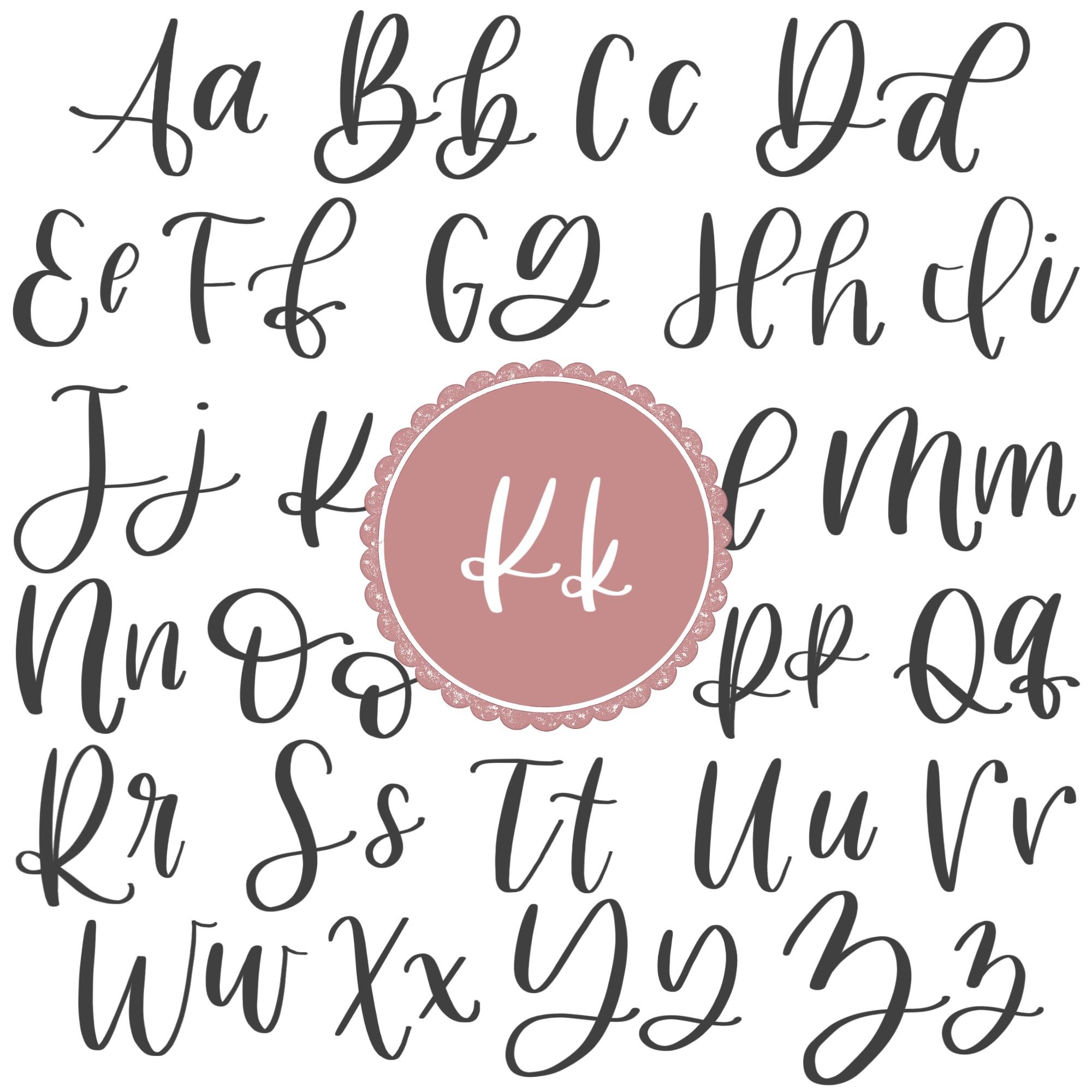
Letters That Share Similar Strokes
The vertical downstroke that forms the backbone of the calligraphy K appears in many uppercase letters, including B, D, F, M, N, P, R, and V.
Practicing these letters helps reinforce the same steady pressure and straight alignment needed for the K’s stem.
The second stroke — the descending loop — connects K to several more expressive letters in the alphabet.
The bowtie-style descending loop is fairly unique to the letter K, but the lowercase b, g, p, s, y, and even uppercase L share a similar loop.
Ready to learn?
Common Mistakes When Lettering K
The calligraphy letter K may look simple at first glance, but the combination of a straight stem and a looping second stroke can create a few challenges for beginners. Most problems come from uneven pressure, awkward loop placement, or finishing the flourish in the wrong spot.

1. Crooked or Unsteady Downstrokes
The vertical stem is the backbone of the entire letter. If the downstroke leans too far left or right, the rest of the letter will look off balance. Focus on pulling a straight, confident downstroke from the top guideline to the baseline with steady pressure. A stable stem gives the loop a clear place to cross.
2. Starting the Loop in the Wrong Place
Another common issue is beginning the loop too high or too low along the stem. For the uppercase K, the looping stroke should begin near the capital height. For the lowercase k, the loop should start closer to the middle of the letter. Starting in the wrong spot can make the letter feel cramped at the top or overly stretched at the bottom.
3. Loops That Are Too Tight
When the descending loop is drawn too small, the stroke can look stiff and crowded where it crosses the stem. Give the loop enough space to curve naturally as it moves downward. A slightly larger loop creates smoother movement and a more balanced letter.

4. Uneven Pressure Through the Loop
The second stroke should transition smoothly between light and heavy pressure. Many beginners either press too hard the entire time or forget to increase pressure as the loop descends. Try starting the loop with light pressure, increasing pressure as the stroke curves downward, and then releasing pressure again as the flourish moves upward.
5. Finishing the Flourish Too Low
The final flourish should finish slightly above the baseline on the right side of the letter. Ending too low can make the calligraphy K feel heavy at the bottom, while finishing too high can make the letter look disconnected from the baseline. Aim for a gentle upward finish that keeps the letter visually balanced.
6. Crossing the Stem Too High or Too Low
The point where the loop crosses the stem should land roughly around the middle of the letter. If the crossing point is too high, the loop will feel cramped. If it’s too low, the flourish can look overly stretched. Keeping the crossing point centered helps the calligraphy letter K maintain a smooth, natural flow.
How to Improve Your Letter K Faster
If your calligraphy K feels inconsistent, a few small practice adjustments can make a big difference. Because this letter is built from a vertical stem and a descending loop, improving those movements individually will quickly improve the full letter.
Practice the Loop Motion on Its Own
The descending loop is the most distinctive part of the calligraphy letter K. Spend time practicing smooth clockwise loops by themselves before writing the full letter. Focus on light pressure at the start, heavier pressure as the stroke moves downward, and a light release as the flourish curves upward.
Slow Down the Crossing Point
The moment where the loop crosses the stem is what defines the shape of the K in calligraphy. Slow down at this point and guide the stroke smoothly through the stem. A controlled crossing makes the entire letter look more balanced.
Build Confidence with Straight Downstrokes
The stem anchors the entire letter. Practicing rows of straight downstrokes will help you build consistent pressure and alignment. When the stem is stable, the loop naturally falls into the right position.
Practice Uppercase and Lowercase Together
The uppercase and lowercase calligraphy K share the same basic strokes. Practicing them back-to-back helps reinforce the looping motion and builds faster muscle memory. You’ll quickly notice how the same movement appears in both versions of the letter.
Watch the Size of Your Loop
If the loop is too tight, the letter can feel stiff. If it’s too large, the calligraphy K may look unbalanced. Aim for a loop that curves naturally through the center of the letter without crowding the stem.
Practice Resources for Calligraphy K


Frequently Asked Questions about Calligraphy K
How do you write a calligraphy K?
To write a calligraphy K, begin with a straight downstroke from the top guideline to the baseline. Then add a second stroke that forms a descending loop. The loop curves downward in a clockwise motion, crosses through the stem, and finishes with a light flourish to the right. Both the uppercase and lowercase K in calligraphy follow this same basic structure.
Why is the calligraphy letter K difficult for beginners?
The calligraphy letter K can feel challenging because it combines a straight structural stroke with a looping flourish. Many beginners struggle with where the loop should begin and where it should cross the stem. Once you practice the descending loop separately, the full modern calligraphy K becomes much easier to control and repeat consistently.
Where should the loop cross the stem in a calligraphy K?
In most modern styles, the loop crosses the stem at the middle of the letter; the lowercase version crosses lower. If the crossing point is too high, the loop will look cramped. If it is too low, the flourish can feel stretched. Keeping the crossing near the center helps the calligraphy K maintain balance and flow.
What strokes make up the calligraphy letter K?
The calligraphy K is built from two main strokes: a vertical downstroke that forms the stem and a descending loop that crosses the stem and finishes with a flourish. These same movements appear in several other letters throughout the calligraphy alphabet.
How do you improve your calligraphy K?
The fastest way to improve your calligraphy letter K is to practice the two core strokes separately. Practicing straight downstrokes builds control and alignment, while practicing descending loops improves smooth motion and pressure transitions. Once those movements feel comfortable, combining them into the full letter becomes much easier.
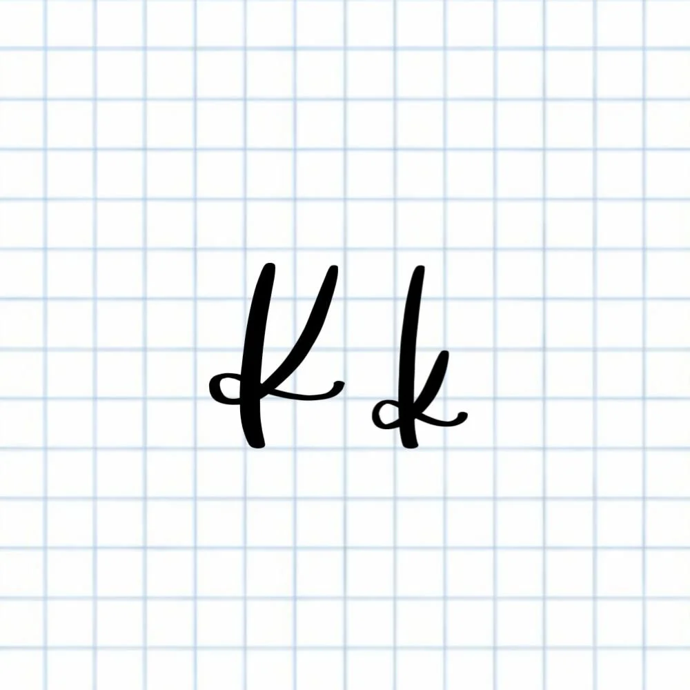
What’s the difference between uppercase and lowercase calligraphy K?
The uppercase and lowercase calligraphy K use the same basic strokes, but the loop begins in a different place. The uppercase loop begins near the capital height, while the lowercase loop starts around the middle of the letter. This difference helps the lowercase k stay visually balanced with the rest of the lowercase alphabet.
Do you have to add a flourish to the calligraphy K?
No, the flourish at the end of the calligraphy letter K is optional. Many modern calligraphy styles include a gentle flourish because it helps the letter flow into the next character when writing words. However, a shorter finish works just as well, especially for beginners practicing the basic letterform.
How long does it take to learn the calligraphy K?
Most beginners can learn the basic structure of the calligraphy K in a short practice session. The key is developing control over the descending loop and the point where it crosses the stem. With consistent practice, the letter usually becomes comfortable within a few days of focused lettering practice.
Can beginners learn the calligraphy letter K easily?
Yes, beginners can learn the calligraphy letter K fairly quickly because it’s built from just two main strokes: a straight downstroke and a descending loop. The key challenge is controlling the loop and where it crosses the stem, as well as the thickness of the loop line at its different points. With a little focused practice on those two movements, most beginners can start forming a consistent K in calligraphy within a short amount of time.
What brush pen works best for practicing calligraphy K?
Any beginner-friendly brush pen with a flexible tip works well for practicing the calligraphy K. Pens that offer good pressure control make it easier to create the thick downstroke and lighter upstrokes needed for the loop and flourish. The most important factor is choosing a pen that allows smooth pressure changes while practicing modern calligraphy.
Should the loop of a calligraphy K go below the baseline?
Yes, in many modern calligraphy styles the descending loop briefly dips below the baseline before curving back upward. This small movement into the descender space gives the calligraphy letter K a more natural flow and prevents the loop from feeling cramped inside the main writing area.
How do you keep the calligraphy K balanced?
Balance in a calligraphy K comes from three main factors: a straight vertical stem, a loop that crosses near the middle of the letter, and a flourish that finishes slightly above the baseline. When these elements are evenly spaced, the letter looks smooth and visually stable within the calligraphy alphabet.
Does the calligraphy K connect easily to other letters?
Yes, the finishing flourish of the calligraphy K often makes it easy to connect to the next letter when writing words. The upward curve at the end naturally leads into many lowercase letters, which helps maintain a smooth rhythm when writing in modern calligraphy.
Ready to learn?