Calligraphy L: Uppercase, Lowercase, Strokes & Practice
A complete guide to calligraphy L, showing how to form it with brush lettering techniques
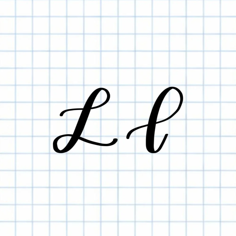
How to Write the Calligraphy Letter L
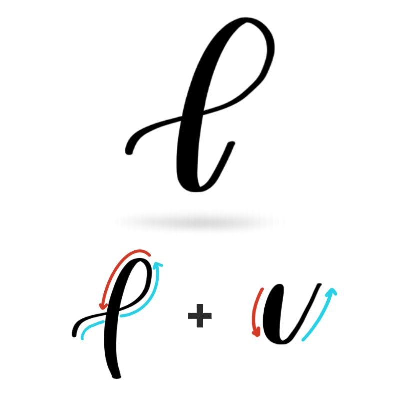
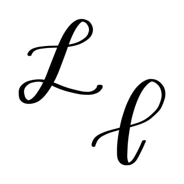
Uppercase L: Flourishing ascending loop at the top that transitions into a flourishing descending loop along the bottom.
Lowercase l: Generous, sweeping ascending loop that transitions into a slight underturn at the bottom.
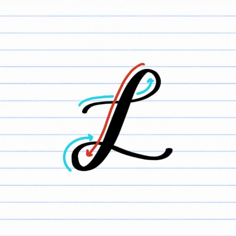
How to Write Uppercase Calligraphy L Step-by-Step
Start at the x-height and begin the ascending loop.
Place your brush pen at the x-height and begin a light upstroke before sweeping over to the right to start the ascending loop. Use very light pressure as you move through the upward stroke, guiding it smoothly toward the top of the letter.
Create a counterclockwise loop.
As you reach the top of the letter, curve the stroke counterclockwise to form a rounded loop. Keep the pressure light all the way to the top but then transitioning into a heavy stroke as the line begins to curve downward again.
Transition into a descending loop.
As the loop moves downward, keep the pressure on, maintaining a nice, thick line. As you approach the bottom, let the line veer to the left, curving into the start of the descending loop. The transition between the ascending and descending loop should be fluid and undetectable.
Continue the loop along the baseline.
Curve the descending loop around in a clockwise motion. Focus on keeping the loop open and balanced, avoiding a tight or pinched shape. As it curves up again, release the pressure to create a thin line once more. As you cross over the thick downstroke, let the line sweep rightward, dropping slightly toward the baseline.
Release into a rightward flourish.
As you finish, guide the stroke into a light flourish that trails to the right. Let the stroke taper naturally for a smooth, elegant finish.
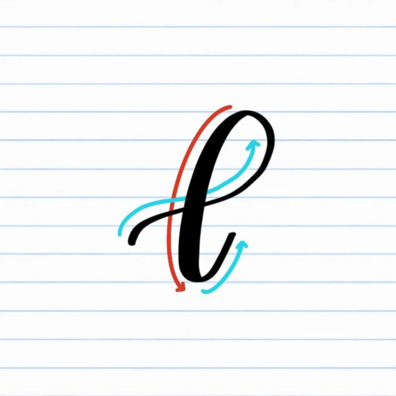
How to Write Lowercase Calligraphy l Step-by-Step
Start a light upstroke about a quarter of the way up.
Place your brush pen about halfway between the baseline and the middle of where the letter will be positioned. Begin a thin upstroke using very light pressure, guiding the stroke upward slightly before sweeping to the right in a smooth, controlled motion.
Form a tall ascending loop.
Continue the stroke up to the full height of the letter, curving counterclockwise. Keep the pressure light and allow the loop to curve wide, so it stays clean, delicate, and open.
Transition into the downstroke.
As you reach the full height of the letter, turn the loop downward, adding pressure to increase the thickness of the line. Keep the motion continuous so the loop flows naturally into the descending stroke.
Bring the stroke down to the baseline.
Maintain steady pressure as you move down toward the baseline. Focus on a smooth, even line with consistent thickness.
Finish with an underturn to the right.
As you reach the baseline, release pressure and guide the stroke into a gentle underturn that curls up and to the right. Let the stroke taper naturally to create a clean exit for connecting to the next letter.
Experience a Clear Path to Lettering Confidence
Basic Strokes for Calligraphy L
Basic Strokes That Make Up Uppercase L
The uppercase calligraphy L is built from two looping movements that flow seamlessly into each other. When you practice these strokes individually, the full letter becomes much easier to control and repeat.
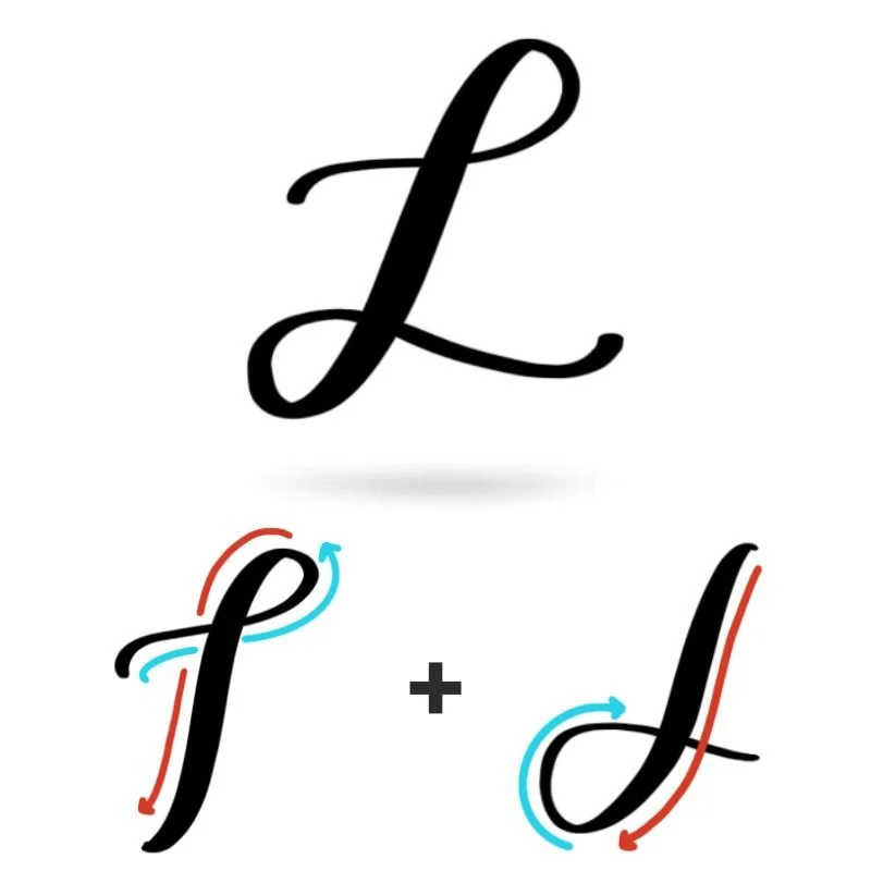
Stroke 1: Ascending Loop
The letter begins with a thin, upward stroke that curves into a counterclockwise loop at the top. This stroke sets the height and overall shape of the letter. Keep your pressure very light as you move upward, allowing the loop to stay open and rounded. This same ascending loop appears in other tall, looped letters, so building consistency here will carry over.
Stroke 2: Descending Loop with Flourish
From the top of the ascending loop, the stroke transitions into a thicker, clockwise descending loop. As you move downward, apply steady pressure to create a bold, smooth line. Near the baseline, the stroke curves around and begins to open back up, eventually releasing into a light, rightward flourish. This combination of thick downstroke and tapering exit creates the signature movement of the uppercase L.
Basic Strokes That Make Up Lowercase l
The lowercase calligraphy l is simpler in structure, but it relies heavily on clean pressure transitions and smooth motion. It’s built from two foundational strokes that appear throughout the alphabet.
Stroke 1: Ascending Loop
The first stroke is a tall, counterclockwise ascending loop. It begins with a thin upstroke and rises to the full height of the letter before looping back down. Keep the pressure light on the way up so the loop stays clean and controlled. This stroke shows up in several other tall lowercase letters, making it an important one to master.
Stroke 2: Underturn
After the loop transitions into a downstroke, the letter finishes with an underturn at the baseline. This stroke starts with heavier pressure as it comes down, then gradually releases as it curves upward and to the right. The underturn creates a clean exit stroke, allowing the letter to connect naturally to the next letter in a word.
Together, these strokes teach control, contrast, and flow — skills that will show up again and again as you continue through the alphabet.
Want to learn calligraphy without guessing letter by letter?
Lettering Leap™ teaches modern calligraphy step by step — starting with basic strokes and building through the entire alphabet with guided daily practice.
Practice Drills for Calligraphy L
Practicing the letter L in calligraphy is all about developing smooth loops, controlled pressure changes, and confident transitions. Instead of jumping straight into full letters, these drills help you isolate each movement so your hand learns how the letter should feel.
Warm-Up Strokes
Start by loosening your hand and reinforcing basic control.
Light upstrokes moving upward and slightly to the right
Controlled downstrokes with steady, heavier pressure
Large looping motions to build comfort with both counterclockwise and clockwise curves
These movements show up directly in both uppercase and lowercase L.
Partial Letter Drills
Next, focus on the individual components of the letter.
Repeating ascending loops, keeping them tall, narrow, and consistent
Practicing descending loops, focusing on smooth transitions and open shapes
Underturn drills that start thick and release into a clean, thin exit stroke
Work slowly here so each stroke feels intentional rather than rushed.
Full Letter Repetition
Now begin forming the complete letter.
Write rows of uppercase L, focusing on smooth loop transitions and balanced spacing
Practice lowercase l with consistent height and clean underturns
Alternate between uppercase and lowercase to reinforce control and contrast
Pay attention to rhythm and flow rather than speed.
Skill-Level Variations
Beginner: Trace loops and letters first, then write slowly with larger spacing
Intermediate: Practice smaller sizes, refine loop shapes, and experiment with longer exit flourishes
Consistent, focused practice will help the loops feel more natural and the letter more fluid over time.
Want guided daily drills?
Lettering Leap™ includes 30 days of structured practice that builds every letter step by step — so you’re not guessing what to practice next.
What Guidelines Are Used by the Letter L?
Understanding how the letter L fits within the guidelines helps you keep your loops consistent, your spacing clean, and your overall lettering balanced.
The uppercase and lowercase L both rely heavily on vertical space and looping movement, but they occupy that space differently. The uppercase L begins at the x-height, rises to the capital height with a large ascending loop, then descends back to the baseline before extending into a flourish. The lowercase l also features a tall ascending loop that reaches the capital height, but it finishes more simply with an underturn at the baseline.
Because both versions are tall, narrow letters, staying consistent with your vertical proportions is key to keeping them readable and visually balanced.
Key things to watch for:
Both uppercase and lowercase L should reach the capital height with their ascending loops
The uppercase L begins at the x-height, while the lowercase l starts slightly above the baseline
Downstrokes should return cleanly to the baseline without overshooting
Loops should stay open and not collapse inward
Exit strokes (flourish or underturn) should flow naturally along the baseline
Using the guidelines as a reference helps prevent uneven height, crowded loops, and awkward spacing — especially when writing multiple L’s in a word.
Letter L in the Complete Calligraphy Alphabet
The letter L plays an important role in modern calligraphy because it reinforces control over tall loops and smooth transitions — two skills that show up across many other letters.
Letters That Share Similar Strokes
The lowercase l shares its core structure with several other looped letters:
l ↔ d: Same ascending loop, followed by a different exit or added shape
l ↔ h: Ascending loop combined with a rounded shoulder
l ↔ e: Similar loop structure and underturn with different proportions
If your l feels inconsistent, you’ll likely notice similar issues in these letters.
The uppercase L also connects to other loop-based capitals:
L ↔ H: Similar use of tall vertical structure, but strokes are in reversed order
L ↔ J: Heavy reliance on thick descending loop downstroke to form the letter structure
L ↔ B: Comparable flowing strokes but with very different execution
Many uppercase letters rely on smooth transitions between thin upstrokes and thicker downstrokes. Practicing L helps strengthen that contrast and improves your overall control.
Ready to learn?
Common Mistakes When Lettering L
The letter L looks simple at first, but its loops and tall structure make it easy to lose control of shape and spacing. If your L feels off, chances are you’re running into one of these common issues.

1. Collapsed or Tight Loops
Loops that are too narrow or pinched can make the letter feel cramped. Both uppercase and lowercase L should have open, rounded loops that breathe.
2. Inconsistent Pressure on the Downstroke
If the downstroke shifts between thick and thin, the letter can look shaky. Focus on steady, even pressure as you move downward.
3. Heavy Upstrokes
Applying too much pressure on the way up removes contrast and makes the loops feel clunky. Keep all upward movement light and controlled.

4. Uneven Loop Height
Loops that don’t consistently reach the same height can make your lettering look messy. Both versions of L rely on a tall, consistent loop reaching the capital height, especially alongside other tall letters in the same word.
5. Overextended or Drooping Flourishes
For uppercase L, a flourish that drops too far below or stretches too long can throw off balance. Keep the flourish light, controlled, and aligned with the baseline.
6. Stiff or Angular Underturns (Lowercase l)
The underturn should feel smooth and natural. Sharp corners or stiff curves can make the letter feel mechanical instead of fluid.
7. Rushing the Loops
Writing too quickly often leads to uneven shapes and wobbly lines. Slowing down helps you maintain control and create smoother, more consistent loops.
How to Improve Your Letter L Faster
Improving your letter L comes down to mastering loops and pressure control — not just repeating the letter over and over. A more focused approach will help you build consistency much faster.
Focus on Loop Control First
Both uppercase and lowercase L rely heavily on clean, open loops. If your loops feel inconsistent, the entire letter will too. Spend time practicing ascending and descending loops on their own, paying attention to width, spacing, and smooth curves. When the loop feels natural, the rest of the letter becomes much easier to execute.
Slow Down Your Loops
Rushing through loops is one of the fastest ways to lose control of your letter L. When you move too quickly, loops tend to collapse, become uneven, or lose their smooth, rounded shape. Slowing down — especially at the top and bottom of each loop — gives you time to guide the curve intentionally. Focus on steady, continuous motion so each loop feels open, balanced, and controlled rather than rushed or forced.
Practice Pressure Separately
Before combining everything, isolate your pressure control. Practice thin upstrokes and thick downstrokes independently so your hand learns the difference. When you return to the full letter, those pressure changes will feel more automatic and consistent.
Write Slightly Larger Than Normal
Working at a slightly larger size gives you more room to refine your loops and see where things go wrong. It’s much easier to spot uneven curves or inconsistent pressure when the letter isn’t cramped into a small space.
Practice Resources for Calligraphy L


Frequently Asked Questions about Calligraphy L
Why does my calligraphy L look too narrow or squeezed?
This usually happens when the loops don’t open wide enough. The letter L relies on tall, oval-shaped loops, so if you keep them too tight, the letter will feel compressed. Focus on widening your loops slightly while keeping them smooth and controlled.
How wide should the loops be in a calligraphy L?
The loops in a calligraphy L should feel balanced, not too skinny and not overly stretched. A good guideline is to keep the loop width consistent from top to bottom so the letter feels stable rather than top-heavy or uneven.
Why does my uppercase L feel unbalanced?
Uppercase L can feel off when the ascending and descending loops don’t complement each other in terms of size and flow. If the top loop is too large or more open than the bottom, the letter loses symmetry. Aim to make the bottom loop the foundation that supports the top loop.
How do I keep my loops smooth instead of wobbly?
Wobbly loops often come from hesitating mid-stroke. Try using a steady, continuous motion and reduce how often you pause. Practicing large, slow loops helps your hand build confidence and smoothness.
Where should the lowercase l start in brush lettering?
The lowercase l starts about halfway between the baseline and the x-height. Beginning the stroke too low can make the loop feel cramped, while starting higher gives you space to form a clean, tall loop.
How do I avoid making my lowercase L look like an I?
The difference comes down to the opening strokes. A calligraphy lowercase L should have a flourishing tail at the beginning and then start into the ascending loop. The uppercase I should start with a slight dip to the left (barely an underturn), then a big sweeping underturn down to the baseline, before flowing into the ascending loop.
Should the loops in L cross over themselves?
Yes, both uppercase and lowercase L include a crossover point where the loop overlaps the downstroke. Keeping this crossover clean and slightly above the baseline helps maintain clarity and structure.
Why does my L look messy in words but fine on its own?
When placed in words, spacing and exit strokes become more noticeable. If your underturn or flourish is inconsistent, the letter can disrupt the flow. Practicing L in simple words like “hello” or “loop” helps improve real usage.
How do I make my L look more elegant?
Elegance comes from spacing and flow. Keep your loops open, your pressure transitions smooth, and your exit strokes light. Avoid overworking the shape — clean, confident strokes always look more refined.
Is it okay to add flourishes to every uppercase L?
It’s best to use flourishes intentionally. While uppercase L works well with a flourish, adding one every time can make your lettering feel cluttered. Use flourishes when they enhance the word, not overwhelm it.
Why is the letter L important in calligraphy practice?
The letter L trains your hand to control tall loops and smooth directional changes. These skills show up in many other letters, so improving L helps build a stronger overall foundation in brush lettering.
What’s the biggest mistake beginners make with the letter L?
The most common mistake is rushing the loops. When loops are drawn too quickly, they lose shape, spacing, and smoothness. Slowing down and focusing on each curve makes a noticeable difference.
How long does it take to get comfortable with calligraphy L?
Most beginners start to feel more confident with L after a few focused practice sessions. Because it uses repeatable loop shapes, improvement tends to come quickly when you practice intentionally.
Ready to learn?