Calligraphy M: Uppercase, Lowercase, Strokes & Practice
A complete guide to calligraphy M, showing how to form it with brush lettering techniques
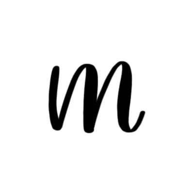
How to Write the Calligraphy Letter M
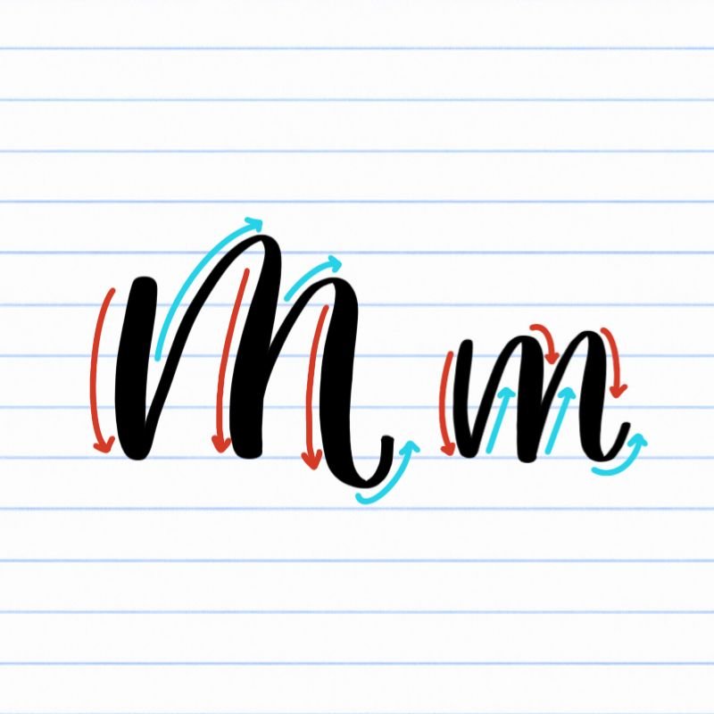
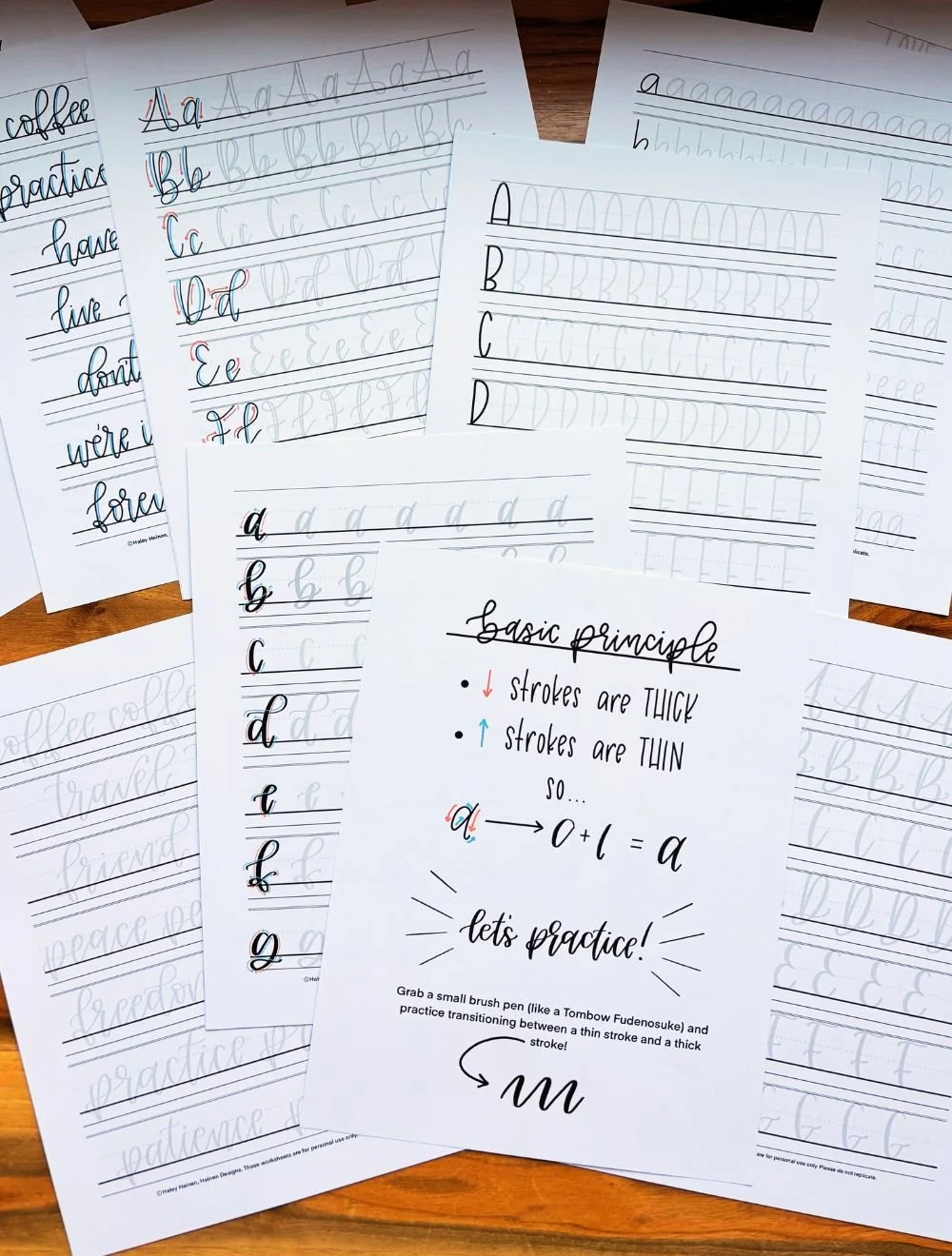
Uppercase and lowercase M: Downstroke, followed by a large overturn, finished with compound curve.
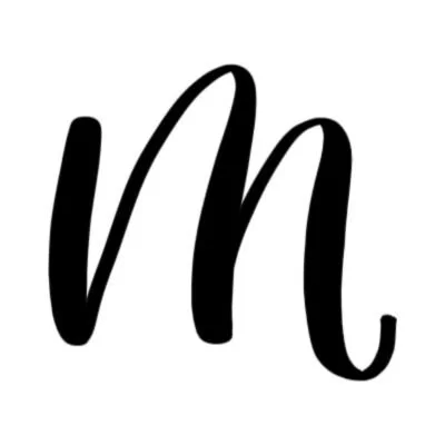
How to Write Upper & Lowercase Calligraphy M Step-by-Step
The uppercase and lowercase calligraphy M follow the same core stroke pattern: a downstroke, followed by an overturn, and finished with a compound curve. Once you understand this rhythm, both versions of the letter will start to feel natural and repeatable.
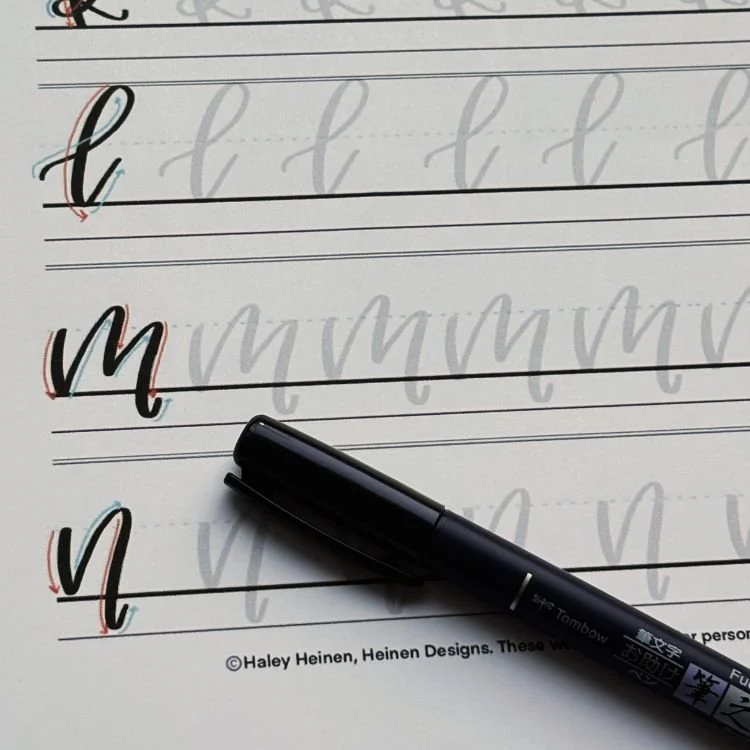
Start with a strong downstroke from top to baseline.
Place your brush pen at the top-left corner of where the letter will appear and apply firm pressure as you pull a straight downstroke to the baseline. Keep the stroke steady and controlled to establish a solid backbone for the letter.
Transition into a large overturn.
Release pressure as you start upward again into a thin upstroke. Let the stroke rise back toward the top of the letter, then gently curve over and begin descending again. As you come down, increase pressure so the line thickens. This movement should feel rounded and open, not tight or pointed.
Finish with a flowing compound curve.
From the bottom of the overturn, transition into a thin upstroke again. Let the stroke rise to about the top of the letter, then curve over and pull down with added pressure, dipping near or below the baseline. Finally, release pressure as you curve back up into a light exit stroke that finishes just above the baseline.
Experience a Clear Path to Lettering Confidence
Basic Strokes for Calligraphy M
Basic Strokes That Make Up the Letter M
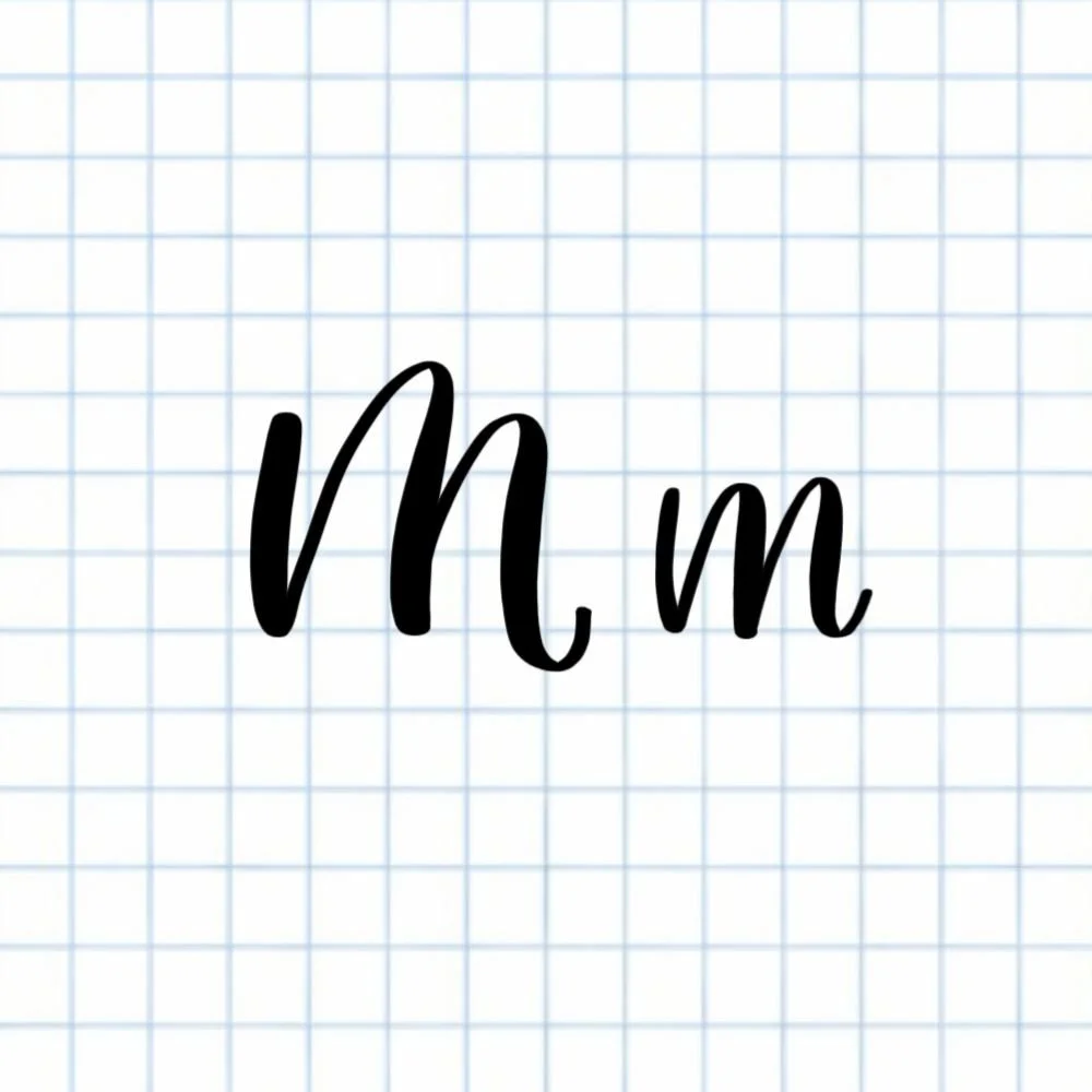
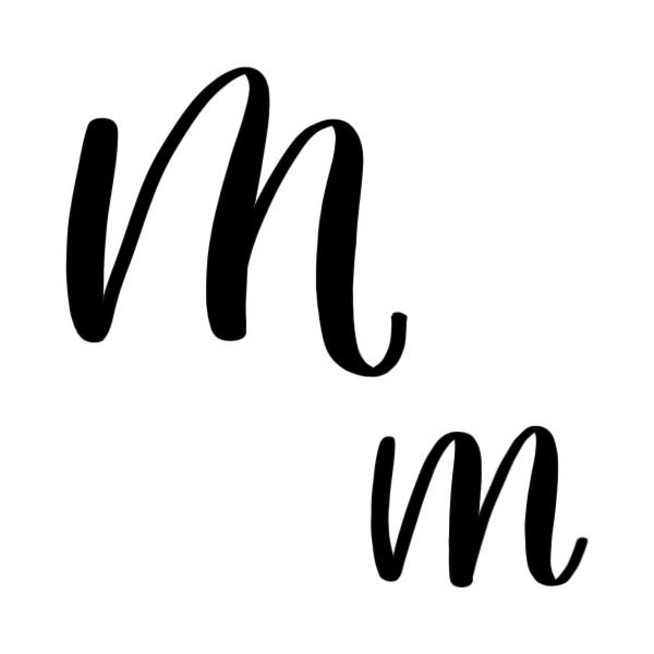
The calligraphy M — both uppercase and lowercase — is built from the same three core strokes: a downstroke, an overturn, and a compound curve. The only difference is scale. Uppercase M uses larger, more extended versions of these strokes, while lowercase m keeps them more compact.
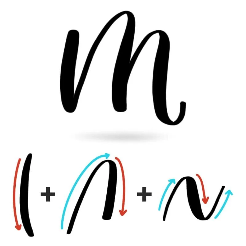
Stroke 1: Downstroke
The downstroke acts as the anchor of the letter. Visually, it should feel strong, straight, and confident — like a steady starting point the rest of the letter can build from. A good downstroke in M isn’t just thick — it’s consistent. If the weight wobbles or tapers unintentionally, the entire letter can feel unstable. This stroke also sets the spacing for what follows, so its placement influences how open or narrow the M will look overall.
Stroke 2: Overturn
The overturn introduces the first curve and begins to give the letter its rhythm. This stroke should feel like a smooth, rounded arch — not a sharp peak or pointed corner. What matters most here is openness. A well-shaped overturn has enough space inside the curve to feel breathable, while still maintaining a clear connection back into the downstroke. If it’s too tight, the letter feels cramped. If it’s too wide, the structure starts to fall apart. This stroke also establishes the visual flow of the M, guiding the eye upward and then back down in a controlled, continuous motion.
Stroke 3: Compound Curve
The compound curve is where the letter comes to life. It mirrors the overturn, but with more movement and a sense of forward motion. This stroke should feel fluid and slightly more expressive, rising and falling in a gentle wave. The transition between thin and thick is especially important here — smooth changes in pressure create that signature contrast that makes brush lettering feel dynamic. The bottom of the curve often dips near or just below the baseline, which adds a sense of motion and prevents the letter from feeling stiff. As it finishes, the exit stroke should feel light and effortless, setting up a natural connection to whatever comes next.
Want to learn calligraphy without guessing letter by letter?
Lettering Leap™ teaches modern calligraphy step by step — starting with basic strokes and building through the entire alphabet with guided daily practice.
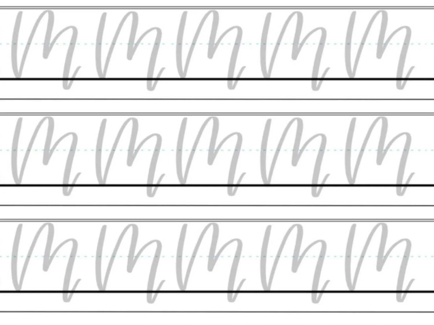
Practice Drills for Calligraphy M
Practicing the calligraphy M is all about building a smooth, repeatable rhythm between downstroke, overturn, and compound curve. Instead of jumping straight into full letters, these drills help you develop control over spacing, shape, and flow — so the letter feels consistent every time you write it.
Warm-Up Strokes
Start by loosening your hand and reinforcing the core movements used in M.
Light upstrokes moving upward in a slight curve
Steady, controlled downstrokes with consistent pressure
Repeating arch shapes (like small rainbows) to prep for the overturn
Gentle wave motions to simulate the compound curve
These warm-ups help you focus on smooth transitions instead of stiff or segmented strokes.
Partial Letter Drills
Next, isolate the key combinations that make up the letter.
Downstroke + overturn repeated across a row
Overturn + compound curve sequences, focusing on even spacing between the two humps
Continuous “m-like” waves without lifting your pen to build flow and rhythm
This step helps you feel how the strokes connect, rather than treating them as separate pieces.
Full Letter Repetition
Now bring everything together into complete letters.
Write rows of uppercase M, focusing on consistent height and open, rounded arches
Practice lowercase m with even spacing between each hump
Alternate between uppercase and lowercase to reinforce the shared structure
Aim for steady, intentional movement. Consistency matters more than speed.
Skill-Level Variations
Beginner: Write larger letters with extra spacing between strokes. Focus on keeping each curve smooth and open rather than perfectly shaped.
Intermediate: Tighten spacing slightly and work on making both humps of the M match in size and shape. Experiment with a slightly quicker rhythm while maintaining control.
The goal of these drills isn’t just repetition — it’s awareness. Pay attention to how each stroke feels and how the shapes relate to each other. That’s what turns practice into real progress.
Want guided daily drills?
Lettering Leap™ includes 30 days of structured practice that builds every letter step by step — so you’re not guessing what to practice next.
What Guidelines Are Used by the Letter M?
Understanding how the letter M fits within your guidelines helps you keep the letter balanced, readable, and consistent, especially since it includes multiple arches that can easily become uneven.
Both uppercase and lowercase M rely heavily on the baseline and overall height structure to maintain their rhythm. Because the letter repeats similar shapes, small inconsistencies can quickly compound if the guidelines aren’t used intentionally.
The uppercase M starts at the baseline, reaches up to the capital height, and uses large, flowing arches that extend downward with movement. The lowercase m is more compact, sitting between the baseline and X-height, but still uses the same repeating structure of arches to create its form.
Key things to watch for:
The first downstroke should start cleanly at the correct height (capital height for uppercase, X-height for lowercase)
Both versions should sit firmly on the baseline without drifting above or below
Downstrokes should align vertically to avoid a leaning or wobbly appearance
Any dips below the baseline should feel intentional and consistent, not exaggerated
Spacing between each stroke should remain even to keep the letter open and readable
Because M repeats similar shapes, the guidelines act as a checkpoint for consistency. When each stroke hits the same visual targets, the letter feels smooth and controlled instead of uneven or rushed.
Letter M in the Complete Calligraphy Alphabet
The calligraphy M is a rhythm-based letter built from repeating arches. Once you understand how its strokes flow together, you’ll start to recognize the same movement patterns throughout the alphabet.
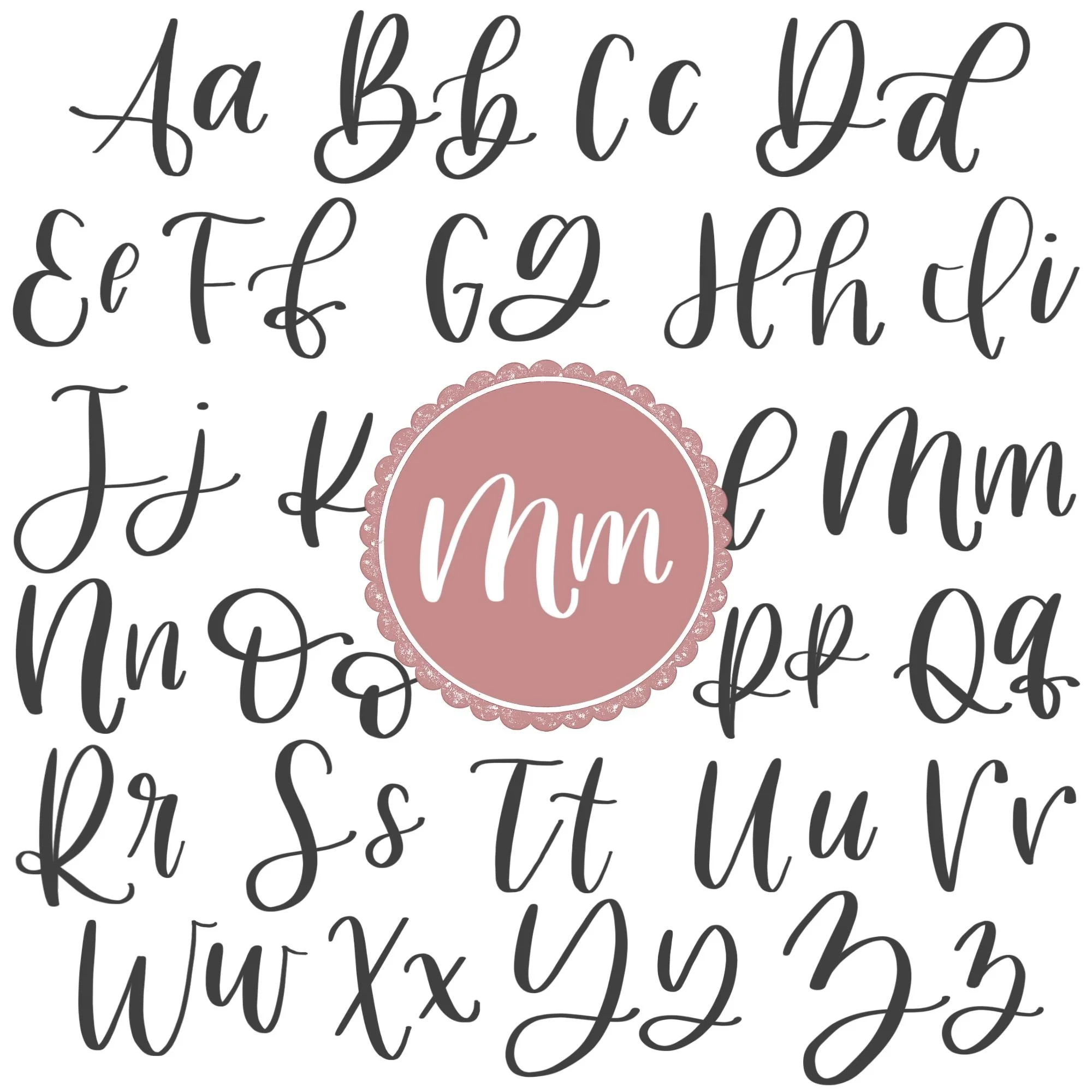
Letters That Share Similar Strokes
The structure of M — downstroke, overturn, and compound curve — appears directly in several other lowercase letters:
m ↔ n: Same stroke pattern, just fewer humps in n
m ↔ h: Similar exit stroke, using the compound curve
m ↔ w: Uses the same curved rhythm, but inverse
If your M feels uneven or inconsistent, you’ll often see the same issues show up in these letters as well. Improving one tends to improve the others.
Uppercase M also shares its rhythm with other capital letters that rely on repeated curved strokes and directional changes:
M ↔ N: Similar foundational downstroke and compound curve (no overturn in N)
M ↔ W: Inverse structure with similar repeating motion and spacing challenges
The letter M is one of the clearest examples of rhythm in brush lettering. It teaches you how to repeat the same shape consistently while maintaining even spacing and smooth transitions.
Ready to learn?
Common Mistakes When Lettering M
The calligraphy M is all about rhythm and repetition — which means small inconsistencies can quickly make the letter feel uneven. If your M doesn’t look quite right yet, these are some of the most common issues to watch for.

1. Inconsistent Pressure Transitions
M relies on smooth contrast between thick downstrokes and thin upstrokes. If pressure changes feel abrupt or uneven, the letter can look shaky or disjointed. Focus on gradual, controlled transitions, especially in the compound curve.
2. Overly Tight or Pinched Curves
When the overturn or compound curve is too narrow, the letter loses its openness. This often happens when trying to “fit” the letter into a small space. Give each arch enough room to breathe so the shapes stay rounded and relaxed.
3. Too Much Space Between Strokes
On the opposite end, spacing that’s too wide can break the letter apart. The strokes should feel connected and cohesive, not like separate pieces. Look for even spacing that keeps the letter unified without crowding it.
4. Wobbly or Unstable Downstroke
The first downstroke sets the structure for the entire letter. If it’s shaky, curved unintentionally, or inconsistent in thickness, the rest of the M will feel off. A strong, confident downstroke makes everything else easier to control.
5. Rushing Through the Second Half
Many beginners start strong, then speed up as they move into the second arch. This often leads to a smaller or sloppier compound curve. Try to maintain the same pace and attention through the entire letter.
How to Improve Your Letter M Faster
Improving your calligraphy M comes down to refining consistency and rhythm. Because the letter repeats the same movements, small adjustments can make a noticeable difference quickly.
Keep Your Spacing Even
The spacing between each stroke is what holds the letter together. If the gaps are too tight, the M will feel cramped. If they’re too wide, it can look disconnected. As you practice, pay attention to the negative space between the downstroke, overturn, and compound curve. Try to keep those spaces visually consistent so the letter feels balanced and easy to read.
Build a Smooth, Continuous Rhythm
M works best when it’s written as a flowing sequence rather than a series of separate strokes. If you pause too much between movements, the letter can feel stiff or uneven. Instead, focus on maintaining a steady pace from start to finish. Practicing slow, wave-like motions can help you develop that natural rhythm so the transitions feel smooth and connected.
Slow Down the Compound Curve
The final stroke is where many M’s fall apart. It’s common to rush through the compound curve, which leads to uneven pressure or a rushed finish. Be intentional about slowing down as you enter this last section. Give it the same attention and space as the earlier strokes so the letter finishes as strong as it starts.
Write Slightly Larger Than Normal
If your M feels inconsistent, try increasing the size. Writing larger gives you more room to shape each curve and control your pressure changes. It also makes it easier to see where things are going wrong — whether it’s spacing, stroke thickness, or curve shape — so you can correct those issues more quickly.
Practice the Transitions Between Strokes
Instead of only practicing full letters, spend time focusing on how one stroke flows into the next. The transitions between downstroke → overturn and overturn → compound curve are where most inconsistencies happen. Smoothing out these connection points will make your entire letter feel more natural and controlled.
Practice Resources for Calligraphy M


Frequently Asked Questions about Calligraphy M
How do you write the letter M in calligraphy?
To write a calligraphy M, you use a downstroke, followed by an overturn, and finish with a compound curve. The key is smooth transitions between strokes and consistent spacing so the letter feels balanced and fluid.
What strokes make up the M in brush lettering?
A brush-lettered M is made of three strokes: a downstroke, an overturn, and a compound curve. These create the two rounded humps that define the letter’s structure.
Why does my calligraphy M feel awkward to write?
The letter M can feel awkward because it repeats similar movements back-to-back. If the rhythm isn’t consistent, the second half of the letter often feels forced. Practicing the motion as a continuous flow helps it feel more natural.
How do I keep my calligraphy M from looking “bumpy”?
A bumpy M usually comes from uneven transitions between strokes. Focus on smoothing out the curves at the top of each arch so they feel rounded and continuous rather than sharp or segmented.
Why does the second half of my M look worse than the first?
This is very common and usually happens because of rushing or losing focus mid-letter. The second arch often gets less space or less control. Slowing down and giving equal attention to the second half improves balance quickly.
Why does my calligraphy M look uneven?
An uneven M is typically caused by inconsistent spacing or uneven pressure. If the gaps between strokes vary or the thickness changes unpredictably, the letter can feel unbalanced.
How much should the calligraphy M dip below the baseline?
The dip in the compound curve should be subtle — just enough to add movement without pulling the letter too far down. If it dips too low, the letter can feel heavy or uneven.
Should both arches of a lowercase m be identical?
They should feel consistent, but not perfectly identical. The goal is visual balance — similar height, width, and curve — so the letter feels intentional without looking rigid.
Why does my calligraphy M look too stiff?
Stiffness usually comes from pausing between strokes or drawing the shapes too carefully. Keeping your motion continuous and relaxed helps the letter feel more fluid.
How do I keep my M from leaning too much?
Leaning often happens when downstrokes aren’t aligned or curves drift off direction. Focus on steady vertical downstrokes and controlled curves to keep the letter upright.
What’s the biggest difference between a good M and a great M?
A good M has the correct strokes, but a great M has consistent rhythm, spacing, and smooth transitions. The letter feels natural and balanced from start to finish.
Why does my M look fine on its own but messy in words?
Spacing becomes more noticeable in words. If your arches are too wide or your exit stroke is too heavy, the letter can crowd others. Practicing M within simple words helps improve consistency.
How do I make my calligraphy M look smoother?
Smoother M shapes come from steady pressure changes and fluid motion. Slowing down and focusing on clean transitions — especially in the compound curve — helps eliminate shakiness.
Is the letter M hard to learn in calligraphy?
M can feel challenging at first because it requires repeating the same shape consistently. Once the rhythm clicks, it becomes much easier and helps improve many other letters.
How often should I practice the letter M?
Short, focused daily practice sessions are more effective than long, occasional ones. Even a few minutes spent refining spacing and rhythm can lead to steady improvement.
Ready to learn?